Tuesday, 13 November 2018

Four Redone: Building a Better Base


  The last couple of weeks I have felt invigorated to return to developing my first proper story. Which so far has played out in the for mof a revision to the environments I had designed originally. With confidence I've found I am much more confident creating detailed models while also playing around with tricks to get the look just right. Right now the main work has been on the texturing for leather and some of the walls. Some of these kits were arranged to share textures for ease of rendering.


  It has also been a time for inspiration. Today came flooding with ideas on what the chambers such as the biolab could look like with a little bit of polish and planning. I had strong inspirations from 2001 A Space Odyssey with this approach, which could give a lot more character to Ceti Base's airlock and layout even if the design will also be staying mostly true to that 1960s and 1970s space aesthetic.

This time around I definitely plan to add a few more doors so the whole place doesn't feel like a series of tunnels. Maybe some furniture for the airlocks like spacesuit racks or some corridor furniture like trolleys or scattered cables. I'll look into that. For now the priority has been on a look for the rooms themselves.

I'm planning to keep at least some of the basic layouts.


Sunday, 11 November 2018

Media Reviews: Demons of the Punjab

Forward: It has been honestly years since I last posted something on this site. I want to thank everyone who has been curious despite the inactivity, and with some recent vigor this might change. Time to bring back something that was once a ritual for me with a review.

  For most of my life I've always found science fiction to be one of the most magical of genres. From the medieval space adventures of Star Wars to the FTL-less explorations of space of Leviathan Wakes. Hard or soft, plausible or magical, whether Star Trek has been a wagon train to the stars or Stargate with more space ships, science fiction has had a rather unique position in the cultural sphere.

This is what particularly hit me with tonight's Doctor Who episode Demons of the Punjab.

  First off, I can already imagine some might see political commentary in this episode. I've kind of had my head in American politics for a while and I can see the episode's mention of "angry men on the radio" speaking of something seen in divides on both sides of the Atlantic Ocean. This is something the latest season of Doctor Who has been doing though I personally though find this is one of the strongest series to date. Despite the messages laid within we've had some a very compelling and emotionally gripping stories.

It goes without saying, if you have not seen the episode then I'm going to be dropping a few spoilers.

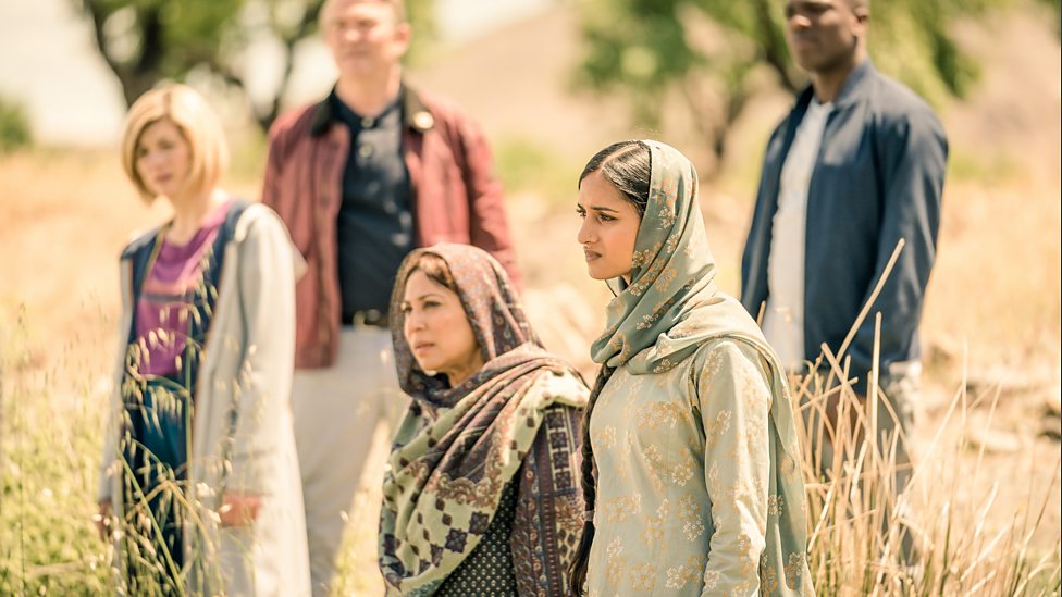
Sample 1: So far the series has been in plenty of remote locations. But this has its advantages. [BBC, 2018]

  This episode is set in Lahore as the Partition of India gets underway. It's 1947. The separation of Pakistan from India after tension between Hindus and Muslims reaches a boiling point. The British Empire is waning, only just starting to recover from the Second World War while memories of famine remain fresh on local minds. But a lot of these tectonic shifts are largely in the background for the episode - the partition is explored by the Doctor's Pakistani-British companion Yaz discovering her grandmother's husband was a Hindu, and the division this creates with her grandfather's younger brother, a staunch Indian patriot. About halfway through the episode, it is brought up that this younger brother has his head deep in the revolutionary words spoken over the radio. He doesn't say any creative slurs (which has been all too easy in modern political discourse), but he does make it clear his vision for his country does not include his Muslim neighbors. Not only that, but while angry radio voices are mentioned, it isn't argued if these voices are right or wrong in what they say.

Fear and anger can spur people to do terrible things. As we find out.

  Science Fiction, for me, is at its best when its story is three things: Mindful of the past, thinking of the future, and observant of the present. Some of my favourite stories in science fiction use the past or the future to hold a mirror up to the present. The Partition of India was not pleasant, there was a lot of unrest with the establishment of these two nations. Lives were lost, blood was shed along the new border, but Demons of the Punjab never shows this. Not even at the climax when history's course reveals itself do we see a life lost on screen. The unrest is invisible yet its effects are a driving force of the plot. When we discover it was not the visiting aliens who killed a local holy man, but a man who believes he is doing what is right. Two thirds of the way through, the demons in the title are implied to not be the visiting aliens, but human beings who would make their neighbors to be monsters to build their vision of a brighter future.

  Having grown up in a household with rich thoughts on the wars, what comes to mind for me when Yaz's grandfather tries to talk sense into his brother are accounts in the Great War where soldiers of both sides came to realise the enemy weren't so different from themselves. This is something at the forefront of my mind, especially as on this particular celebration as the London ceremony was graced by the president of Germany. At the ground level, whatever your leanings be they spiritual, social or otherwise, the ones who think or sit differently likely have the same problems you do. Others may disagree with your ideas, but that does not make them something to remove.

  The story is not all about political division and the atrocities which can be committed in the name of a righteous vision. At first it seems like the "demons" of the episode are the aliens. Which the Doctor describes as an ancient race who have molded themselves into the perfect assassins (which makes them peers of the Weeping Angels and the Carrionites). Turns out these assassins reformed after finding themselves on the verge of extinction. what is left now wander time and space collecting imprints of people who have died alone. They didn't come because Earth was special or that they had an interest in someone important. Yet they were very civil once their true nature was revealed, which just goes to show that a dreaded reputation does not mean you are dealing with heartless monsters. On the day the participating nations of two devastating wars take time to remember the fallen, it warms the heart to see a group who would trek across space and time to do the same for everyone who has ever lived or shall live. Not just soldiers or those in service, but everyone who departs out of reach of those who care about them.
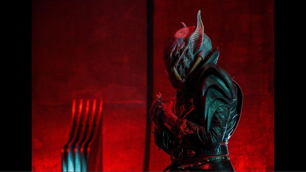
Sample 2: Not all which is alien are monsters. Not all monsters are alien. [BBC, 2018]

  The eleventh of November is a time to remember those who gave their lives to protect their homes and their families. Risking everything but getting caught up in the maelstrom of war. The catalyst was a war to end all wars that ended nothing. The soldiers who fought in it do not choose who to fight, and the ones they are set up to oppose are probably no different from they are when you strip away ideology or higher-level principles.

Demons of the Punjab held a mirror to what we're doing to ourselves right now, but it was also a welcoming tribute to those who gave their lives to protect those they cared about or those who helped the unfortunate, who in their final moments had no one beside them. Offering a light that maybe we are not alone in this remembrance. However your Sunday has been, remember this as a day of remembrance of all the fallen for all the nations.

Image Sources


Tuesday, 29 May 2018

Back to Basics with Digital Drawing


  I've been going back to basics lately with my drawing skills. I've had a nagging feeling for honestly quite a while that my colour depth palette has been rather muddy. I've noticed I get lost in getting the shade just right at the expense of how clear the composition is. So, back to basics; getting familiar with the essentials of blocking colour first before moving on to tackling light and shadow.

  After all, many projects are 20% crunch, 80% cruft. You want to get that 20% foundation right or the whole thing just doesn't work.


  This new approach I feel has also given me a chance to back away from relying on dark lines to delineate shape. The pictures I have been drawing lately have been moderately popular on Reddit which is good for exposure. I'm getting plenty of feedback and starting plenty of conversations about what I've been working on. It could be some time before I'm back to full-shade digital painting like I've been doing before: I'm taking this one step at a time, so when I am ready to start adding shade again I am definitely ready.


  Moving away from the same old character subject, I've experimented with map design using Adobe Illustrator. I've found it and PDFs amazing for condensing enormous images into something I can easily send to clients. When I tried buildign something like this on Photoshop, it would slow my computer down as the images, plus layers, might be over a gigabyte in size. Which my computer did not like.

  But it was mostly fun to try map-making, which I have found to be an amazing way to build a setting as they say you can tell a lot about a place by reading into how the local inhabitants drew their maps.


Sunday, 13 May 2018

Finalist nomination: Red and the Kingdom of Sound


   Word on the grapevine is that Red and the Kingdom of Sound, the animation project I contributed to back in the second half of 2017, has been named a finalist of the 2018 Le Petit Cannes film festival. I wasn't in attendance, as I was but a humble animator on the project and it was the district and project leads who got to tour Europe with the film. But it is wonderful news to hear that the final outcome did so well at Cannes and is being so well received across the continent and beyond.

  Win those accolades Red! It was an amazing experience and a beautiful project to lend a hand with and I couldn't be prouder of being a part of making this massive accomplishment happen.

Tuesday, 1 May 2018

First Week with Zbrush


  The past week or so I've been experimenting with Zbrush. It's quite advanced compared to Mudbox and I can see why a lot of studios are asking for experience with it. It's versatile, complex, and I've found I can get an outline of something after about half a day of working.


  So for now I've mostly been trying to see what I can make out of a single ball. As I had hoped, my experience with Mudbox translated well. I've yet to try texturing, that's going to be something of a later stage experiment.


  Considering how long it has been since I last touched sculpting software I was slightly surprised at how well I was able to create a face I've had people describe as handsome and good-looking, That's likely a very good thing when this is my first attempt at human features and started out with a generic template head. The drawing classes  msut have contributed considerably to that.


  Overall, I've enjoyed the product so far. Really glad I invested in it. I've already been asked by friends if I could sculpt their own characters with this, which means I'm either appealing to eager friends or I might have a creative skillset I can really sell.

Monday, 9 April 2018

Megacity Skyline and Structures


  Getting back into design I had the incentive to look at a few building ideas. Although for experimentation I might try something more...familiar. Artstation has a new challenge going on so I might try that, get some practice looking to the days of the Old West.

  It'll be far less monolithic than this weekend's drawing, far less colossal but as a period before the kind of construction we know today it's also an avenue for more characterful architecture.


Friday, 30 March 2018

Personal: Monsters Misfits and Serpents


  I promised myself I'd try something a little more alien and out there and for the most part I think I'm on the right track.some of these still have that dinosaur DNA but others (my particular favourites of this being 3, 5 and 9) are more bizarre, more something unknown.

  I believe there is enough character in each of these to tell a story for each one. What they are like to speak with, what their tastes are, maybe even what they consider to be artful or in good taste. I've grown to like turning rough shapes into creatures, a few of these I had a clear picture in mind but others started off quite vague and abstract. 9 I believe was quite random to begin with and some unexpected things came out of 5's outline.

At a pinch, it is possible that all or most of these could exist within the same universe, perhaps under the same banner.

Thursday, 29 March 2018

Personal: Signing off an Old Design


  Circumstances on my end has calmed down a little, as March was a very busy and unexpected month. So as way of an unwinding I went back to an old favourite of mine. The way I keep drawing something similar suggests one of two things: Either I have run out of ideas for modifications, or I have hit upon a final design, long time coming this is true. But that means one part is out of the way for something potentially more fun and creative to explore:

Costumes!

  The other good sign is I've shown this pose to a few friends and they said it looked "noble," "majestic" and "regal" which is what I'm largely going for. With the icons out of the way, I can approach something more out-there or alien with a clear head and a confident approach now that one of the more major designs in my head feels settled. I need ot get my head out of this one design and into the more weird and wonderful world of other aliens and monsters .

It should be a more wild endeavour from here on out.

Monday, 19 March 2018

Personal: Heart of an Empire


  I've wanted to get back into creating with Maya now that I am in a more confident place at home. It was a surprising lesson these past couple of months how your environment can influence your motivation. Bygones are bygones now, and I want to get back into my A-game. 


  I've been tweaking and polishing this planet today, making the city lights appear more convincing and giving substance to the ring around it (a discussion session online suggested to me their old distance might risk exposing visitors and occupants to highly lethal levels of radiation. I suppose high-tech science fiction shielding could protect them, and there was even a suggestion the ring-builders could have found a way to clear the radiation belts, but that distance was also impractical for ferrying freight and commerce, which benefits from a low-hanging belt. Shorter transit distances and all that.


  I thought about adding more than one ring because the engineers would not be limited to one orbital structure, and could hang more off the first (maybe even, fur, five, or ten!) And even this massive ring might have its limits for a civilisation connected to millions of other planets. So like any ground project, the infrastructure could have been expanded in times past to meet increasing demand.

 If I ever get this animated, it could be fun to surround the planet with dancing particles that represent hundreds to thousands of incoming and outgoing starships. Watching The Expanse lately I've been enamored with the introduction sequence, particularly the streaks of light that represent 100 years of interplanetary shipping and the timelapses showing urban growth and the great projects undergone in the series' backstory.


   I believe the Expanse has been one of my major influences regarding this project. Studying satellite photographs of the Earth at night helped a lot in building a convincing night-time illumination.A place can be as much a character as a person or an object, it's all about knowing how to convey that story without words.

Sunday, 25 February 2018

Mosquitro Redesign: The Needle


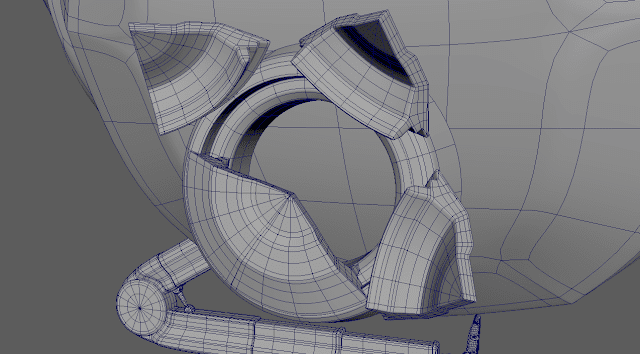
  I spent some time today modifying the head of my mosquito model. After adjusting the lenses so the pole would be pointing outward, the whole shape appeared to nestle more smoothly into the gap designed for it.There was some adjustment needed but these were only a few tweaks. There does appear to be a fair amount more flow, however as the geometry for the eyes runs more in line with the cavity for the head..


  The next big challenge was the port for the mosquito's proboscis, which in the mechanical model would function like a powerful injector. I had a stroke of inspiration that the port would open up like a flower. The mechanisms for this however, might require some thinking as the needle would either push these petals out or they'd open out in preparation for the needle extending..


  The model is quite detailed, so I am planning to look into making a normal map for a simplified model for more full-body shots of the vehicle.


Wednesday, 14 February 2018

Mosquito Redesign: Working Legs


  I didn't have much success implementing an IK nor getting it to compress, but they say the simplest solution is often the most effective. In the case of my piston the simple solution was to parent each of the pistons with each other, tie them to 'aim' themselves at the opposing hinge and create a few driven keys to mimic the pistons extending and compressing.


  After that it was a simple matter of constraining each of the hinges. and the pistons so they stop at a fixed instance into and out of their sockets. By adding a fifth segment to the leg I am able to extend its reach to a motion window of between 92 and 168 degrees (any more open and the piston will collide with the knee hinge). Which might be one of them ore complicated elements of the model out of the way.


From what has been assembled so far, I think I can easily fit six of the legs into the main body with plenty of room to spare.


Tuesday, 13 February 2018

Mosquito Redesign: Leg Hydraulics and Industrial Fun


  Much of this afternoon has been spent reworking the leg to make it something more industrial. I've looked into completely redesigning the limb using the hydraulic system idea to give the legs weight and balance. What I've got so far appears to work to a decent degree, even if the geometry might be a little heavy. I'll look into fixing the UVs before the leg is repeated.

  The piston that would appear to keep the leg unbent will use some manner of spline to adjust itself. I'll need to perform some experiments to get a system that can extend the segments - what is on display is the furthest the leg can bend with this but with some clever re-positioning I might be able to extend the leg further. I can also use the freedoms presented by the digital medium to make it easier for the base to compress into the pivot it's connected to, allowing the sections to fold in and extend automatically and the pivots to rotate appropriately. This further tweaking might also allow the lower leg to more easily fold in.


  That still leaves how to fit six of these inside the body. The folding in isn't the most efficient use of space, it could be the legs are arranged diagonally and drop through hatches in the mosquito's underside (which will be fun to build and set up). Only one leg will be worked on until the UVs, bones and controls are set up, which will be reproduced five times.


  Overall, it appears to be quite a flexible setup. The leg bends in the right place, the lower joint provides most of the positional mobility and the foot has full free rotation so it can plant itself flat in a large variety of poses. An IK/FK system could be used for deployment, positioning and resting as one thing that could be implemented are shock-absorbers at the ankle - a simple tube that compresses into the body to give the feeling the machine is bearing weight when its turns its engines off.


It's about ready for the UVs

Saturday, 10 February 2018

Mosquito Redesign: Early Stages and Legs


  I'be been thinking for a couple of days now about going back and redesigning one of my old projects. Namely the mosquito craft from one of my first year university projects. This design was ambitious, even back then and the video it came with was somewhat popular so I thought why not go back and rebuild the thing with better creative knowledge, problem solving skills etc.?


   One thing I really wanted to try out in the old design was some form of foot. In the original model I believe they were just spikes due to time pressures. With a better grasp of Maya's rigging and component system I feel confident I can do a proper foot as well as better joints. For fun I could design all kinds of bells and whistles: Brake flaps, redesigned landing gear bays, ailerons, a probe bay, maybe even rotary blades in the wings and a segmented design to allow for full-wing tilting and proper VTOL.


   I've mostly been inspired by the ship designs made by Cloud Imperium for Star Citizen. I tried the game out once during a free weekend and was amazed at all the little animated components the one-man ships had whether it was for doors, maintenance hatches, thrusters, airlocks, you'd think they brought in mechanical engineers to work out all the components. I might not go that far, the mosquito in the sequence primarily concerns landing and takeoff but no lie, it would be fun to try and build some sort of open folding mechanism for the front probe or the landing gear.


   I might keep the hydraulic system. It was quite useful for compacting the legs into the body (all six of them) and this time around I could go an extra step, maybe include the tubes for the hydraulic fluid that could be linked to the model via a spline curve.


  I am definitely going to need some kind of control rig to sort out all the moving parts I already have. It would definitely make accessing the components for animation a lot easier, too.


Saturday, 20 January 2018

Dwarf Fort - Geometry Cleanup


  Things have been quiet on the front of the fortress as I have mostly been polishing model UVs ready for textures. Although I have made significant progress, I must have done something I probably shouldn't as Maya has gotten into the habit of crashing. This was fixed with a driver update for my graphics card and so far it all looks good, more progress can be made now things are more stable.


  Although the plan is for a uniform arrangement, the inclusion of the ramp means that in order for the rest of the decoration to fit, the structure needs to flow, so the skirting will likely follow the ramp. Redoing the wall als ogave me a chance to even up the geometry of the walls and floor.


   For the ceiling of this room, I'm thinking of building it so the ramp is ceilingless, the ceiling will connect to the rest of the structure by the columns which support the ramp..

Friday, 5 January 2018

Crest Design Experiments


  Taking a minor break from writing I was sorely tempted to go back into logo design. What I had in mind was a bit more elaborate than a typical brand logo and more of a crest or insignia for a nation. You have to start with the basics, which in this case was the core element. For this insignia the core would be the arms of a galaxy, representing the nation's dominance or an assertion of supremacy.


  I went though a few revisions, settling on something less angular and blocky. The other core were the four great vassals of the nation, which would be represented by how they are bound to the galaxy in the centre - the core and the home realm. The gem at the top felt less cliche than two heads looking in opposite directions, and helped to congeal some of the other elements.


  This was all based on a drawing I had worked on ages ago that was supposed to be a coat of arms. I never really went back to it. This insignia could perhaps be depicted everywhere - against starships, on offical forms and declarations, letters, tanks, aircraft, pretty much something that could be stenciled or easily applied.