Showing posts with label contact sheet. Show all posts

Friday, 30 March 2018

Personal: Monsters Misfits and Serpents


  I promised myself I'd try something a little more alien and out there and for the most part I think I'm on the right track.some of these still have that dinosaur DNA but others (my particular favourites of this being 3, 5 and 9) are more bizarre, more something unknown.

  I believe there is enough character in each of these to tell a story for each one. What they are like to speak with, what their tastes are, maybe even what they consider to be artful or in good taste. I've grown to like turning rough shapes into creatures, a few of these I had a clear picture in mind but others started off quite vague and abstract. 9 I believe was quite random to begin with and some unexpected things came out of 5's outline.

At a pinch, it is possible that all or most of these could exist within the same universe, perhaps under the same banner.

Wednesday, 8 March 2017

Four: Branding, Fonts and Scripts

  Taking a small break from modelling I took some time to try and refine the other elements of the project, particularly the art-of. For this, I needed a better logo for Smithston-Wessex.


  I'm still trying ot decide but I am leaning to the likes of 20, 22 and 11, but one thing I am definitely certain so far is the logo is better off without any text in the graphic. Logos need ot be simple ,but meaningful, something that can be drawn quickly or recognised at a glance so I kept the graphics bold and simple, but not too simple to be too generic. the list just needs some narrowing down.


  To accompany the logo I needed a suitably sci-fi title font. I looked on line for a few retro fonts (on the left) along with some that came with Windows (on the right). THe ones I like so far are 2, 4, 5, 9 and 12. Possibly 8, others like 6 are too horrid (the 'esse' section in 6 just blurs into one repeated letter due to the extreme stylisation).

The search for a new David continues. One thing the current voice helped with was that some of the lines David posessed were perhaps repeating themselves in some instances (such as David observing that the tubers ocntai nan egg, the moss providing nutrients that feed the egg as an embryo develops), while this might not have shortened the piece by any overall measure, I think it has halped improve the flow of the dialogue nonetheless, as there were a few moutgfuls that David was delivering.

Sunday, 30 October 2016

Major Project: Four Solid Concept

  Looking to catch up after a couple of slow days I set myself the task of drawing up a final concept piece for Four herself. In hindsight I could have drawn her at different angles but the addition of a few expression poses (1-7) I figure help a lot as I considered she could communicate her mood using her fins, much in the same way dogs, cats, rabbits and horses will direct their ears to indicate attention or mood. A little flexibility could be useful in these instances as they'd allow for a much more living performance when on the screen. All that remains are understanding the colour of her fins (as the colour pattern, while attractive is mostly a placeholder) but more importantly I need orthographic drawings. The colour and pattern of her fins can come in-between modeling. Especially since by January my aim is to have a fully developed set. for filmmaking

  Regarding which, I now have my three primary voices. They still need a little processing so they will come in a later post.

Thursday, 27 October 2016

Major Project: Final Designs In Sight


  Today's priority was getting a final idea for what Four looks like I looked back on fighting fish and, entranced by the draping silk-like tails they had looked into giving something like that to Four. As can be seen, there are shades of dilophosaurus in some of the drawings which I want to avoid (this is mostly due to possessing similar frilled crests.) the main difference I think is Four's is a lot more swept back. It would give her an edge in swimming. I don't want ot go too overboard with the frills - these will likely be animated as ncloth materials in the animation (so lots and lots of flow!). Too many frills and she might lose her shape in the action. But I believe the most successful adult form is 78. 83 and 85 I believe were fairly successful bust shots.

  Perhaps she can retract these sails. We see this shape in its full glory during her escape. It makes perfect sense that she escapes from captivity when she is in her most impressive. She is at her most beautiful and David sees this. As well as this, I looked at the juvenile, which will be a much dumpier and less attractive look. While the adult is inspired by Asian fish, otters and ferrets, the juvenile was strongly inspired by naked mole rats and axolotls.

What is probably needed now is a final concept piece. I have plenty of thumbnail material, now would be an extremely good time to set to work on the final design.

Wednesday, 26 October 2016

Major Project: Progress on the Adult


  Following considerations, I considered the shapes Four's body could take. The start however was maybe a little slow. I put a lot of attention to Four's head, thinking of axolotls but after some thought I may have been going too directly. I feel it also started looking a little too like Colo Colo. I'm also considering avoiding horns, though the frills add a charming touch to Four's appeal.


  So I took a step back, looking at the two most successful colour thumbnails and building on them after the Maya workshop. There's still a lot of room for refinement however. I was looking at ferrets, otters, and Siamese fighting fish for possible features. The fighting fish direction I think brought back a lot of the sense of otherworldness to Four's design. Although utilising the fins is going to be an interesting prospect to consider.

Tuesday, 25 October 2016

Major Project: Developing the Alien Forms


  Looking to get back into my stride, I have set to work on the finer points of Four's design. As well along with a contact sheet which explores the larva's anatomy, its skin folds and what could be done for the eyes and mouth, I also looked at some possible cocoon forms 


  Designing Four's adult form I have decided to splice the marine creature and the brown lizard creature from the previous thumbnails, I'm playing about with fronds however at the moment they look a little like dragon horns. This is a hurdle I have encountered due to the axolotl inspiration. It may pass when I look into drawing heads to get an idea of head structure and facial expressions.

  At some point during the week, once I have a better idea for Four's body, I will consider a contact sheet of colour tones. I've started getting ideas for the juvenile form from designs made today. But I feel the grub/larval form is at a state it can be signed off after a few other orthographic sheets are made for the other potential angles.

Thursday, 10 March 2016

Adaptation B: Cleaning Up and Expressions


  Today I have continued work on the creature. After a response from Alan regarding aspects of the geometry I looked into correcting or cleaning up what I could. I think compared to the previous versions it is flowing considerably better. than before. There's more bulk to the beak, I have managed to trim off a few triangles and the crest smooths up much more neatly. There is also some work around the eyes in preparation for any blinking this creature will do.


  With this refinement of the head and some torso refinement out of the way, I looked into the feet. This had an added layer of complexity to it as unlike previous hand designs I had to factor in the claws


  My main concern at present is how well the geometry on the underside flows, as it still appears a little messy. With a pair of fresh eyes I can see areas where it could be neatened up, something I can look into when I return to working on it. UV mapping however could take time compared to other parts of the body, but I am prepared for it as I am enjoying how it is turning out so far. At present each element is staying separate to ease the UV mapping process. Because this is a creature with a flowing body I may consider using a single large texture map for it. The alternative is to combine it all but assign the right texture map to different regions.


The quills on the creature's rear-end might be the only thing to stay visually separate. During a streaming session Wednesday night I came ot the idea these quills could be controllable; the creature could flatten them to increase maneuverability during running or fan out to make itself seem larger if it felt hostile or under threat.


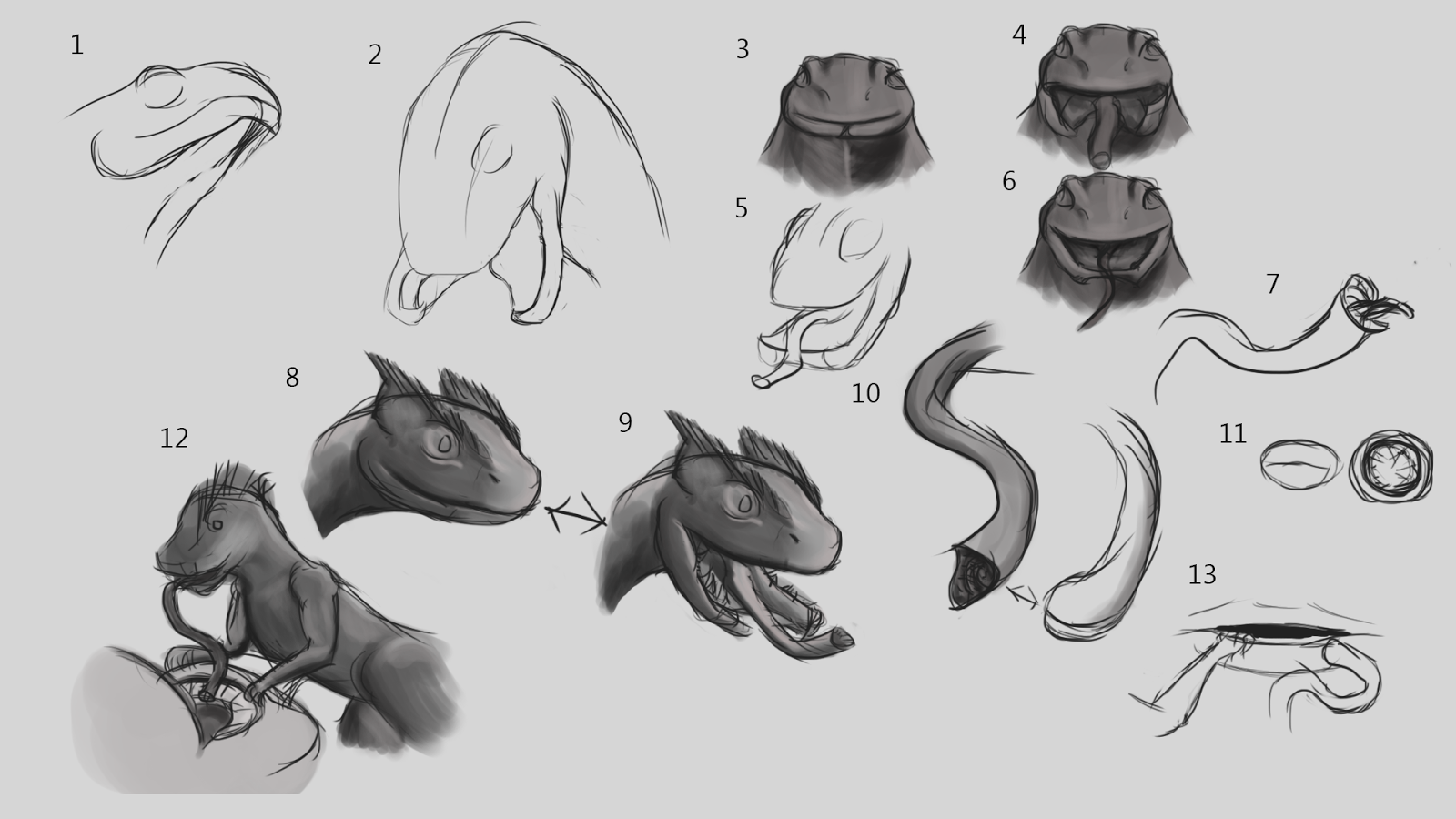
  Wednesday's stream was primarily an expression exercise. I wanted to understand this thing, as if it were truly alive. The beak and staring eyes make expression difficult, but conversely I got ideas for the cute facade from looking at pictures of small lizards, particularly one or two of a Gecko licking itself with its large, flat tongue. Which for 14 and 15 I twisted into an act of salivation. Something it would most likely do when it spots a victim.

Thursday, 3 March 2016

Adaptation B: A Better Beast

   With Friday's discussions coming up I set some time aside to secure Colo Colo's design. Taking in what I had learned over the past couple of weeks, I settled on creating a visual look that would also help determine the creature's colours. I think this has been a step up from my last attempts at digital painting, I'm getting the hang of using different brushes and the smudge and dodge tools to get the desired effect. The latter has helped a lot to correct visual artifacts where I needed to twist or shift the creature's body after correcting a feature with the warp tool.

  In terms of colour I kept to colours I felt were pallid, sullen, unhealthy, I wanted to give the impression that this thing was mangy, unkempt or diseased. I like the way I did that with 1 but I also like 7 and 8 for the way they manage it it. I'm feeling confident with the creature's progress, it may need some further work but I think something is definitely emerging this time.

Tuesday, 1 March 2016

Adaptation B: Colo Colo's Head


  Today I got thinking about Colo Colo's head. The first set of drawings (below) I was experimenting with head style, throwing out beak shapes as they came to mind, even a few snake/rat heads that could be shaped into beaks. At a glance, some of the heads look close in shape to a beak, which is whay had drawn me to designing a blend of rat and chicken skull in the first place.

  One of the key things I started considering today was maybe injecting a little snake, I needed to creepify this little guy so I looked into a lower jaw that opens in two parts like a snake's. If I'm going for a beak however, I might have to discard the idea there's a stretchable flap of skin over the lip (no. 9 and 4), which does make it look a lot scarier than the other version. With the tongue I looked at lampreys and leeches - jaw-less creatures that instead of two mouths like most animals, have rows and rose of teeth descending into the throat. Both lampreys and leeches sustain themselves by latching onto the flesh of a host and sucking out their blood. Colo Colo's tongue could work like a vacuum cleaner, sucking up saliva and mucus that lines the inside of the mouth, or it uses a mini-tongue while the bulk of the larger tongue acts as a hose for what the mini-tongue collects.

  I'm partially drawn the idea of the creature being sweet on the top and creepy underneath. Next stage will be to make a beaked version of this mouth idea and consider its texture. Either it'll be scaly, or it'll be emaciated, wrinkly and fleshy to go with the whole "undead creature" vibe that is hinted at in the legends.

Or maybe a mix of both - scaly back and thighs and a fleshy underside? This sort of thing might be better visualised with colour than line drawings.

Monday, 29 February 2016

Adaptation B: A Core Body


  I had a talk with Phil today on Colo Colo's direction after the advice Alan gave me on departing from the rat-chicken look, but this one (admittedly due to the creature it has taken influence from) may seem a little too 'cute', though I will look into head studies, where the ferocity could be brought back such as the use of the staring eyes of a chicken.

  We also got talking on the 'horror' aspect of the creature and the related story. We explored horror  coming from the abhorrent, discussing a lamprey for a tongue and I was shown a couple of stills from David Croenenberg's 1986 rendition of The Fly featuring Jeff Goldblum being turned into some...horrid...thing. It did however give me some thoughts on the creature. Being inspired by rats, what's to say that it doesn't look like its been reanimated. We talked about it being small enough that it could be to walk across its victim without much notice. So I think I have a basis, I just need to shore up the details: The crest, the texture, the tongue and the mouth. If rats can vary between looking adorable and vicious, then this creature also has a chance.

  If I go down this path, the final product could be both interesting and disturbing. Maybe tapping into some of that Roman Polanski vibe I had managed to invoke in my From Script To Screen project last year.

  Less gruesomely, I took some time to observe the motions of these running lizards ot get an idea of how they run. I have an idea looking at videos provided by nature documentaries as well as still references, so I think I can crack the creatures actually moving about.

Friday, 26 February 2016

Adaptation B: Developing The Deviation

  The discussion with Alan today helped me find a direction with my project. Departing from a rat was a good start, and one of the key pieces of advice I walked away with was that when it comes ot my source creatures, I should take away what makes them characteristic, hopefully left with something weird. Rats without their fur are quite wrinkly and chickens without their feathers look bizarre and strange.

  One thing that was touched on in the discussion was lizards. I considered adding some lizard-like features and I was recommended to look at running lizards. Which move quite differently and at a very different pace from the normal kind. One species, the basilisk, has such a speed and such a surface area on its feet that it can run on water. Most of these lizards are quite small, thin and agile. And such a creature might be more familiar historically to South America than either rats or chickens, creatures that have a more familiar history in Europe and Asia. Which ties into a thought I had recently that it's far more likely "white rat with a rooster's head" is the legend's way of describing what this thing looks like. Being a by-eye interpretation, it's possible the creature looks nothing like a giant rat. Which gives some design flexibility; for one I am intrigued at giving it legs like these running lizards (which have been described as moving like a bicycle, could be interesting to animate)

Thursday, 25 February 2016

Adaptation B: Approaching a New Direction

  With a tutorial coming on Friday, I decided some work needed to be done on Colo Colo. I took the time to paint up a possibly-finalised version of the creature. When I asked for Anderson Moshi's opinion however something hit me: One of the key principles of good hybrid creature design is the creature doesn't directly resemble the creatures it is made from. That it is to stand as its own thing and not a kit-bash of the creatures that make it up. I realised I wasn't doing enough: Colo Colo still looked like a combination of a rat and a rooster.

  After looking up some of the less chicken-like versions of a cockatrice I worked out what I probably needed to do, and considered ways to involve the two creatures, but at the same time make this creature look like its own thing. What I have considered so far is that instead of one frill, Colo Colo has two frills that serve as ears, its tail would perhaps be feathered and I would build on the hybrid skull I designed when studying rat and chicken skulls a little earlier in the project. As it was suggested to me that it was a good example of a creature's design standing on its own.

  When it came to the crest, I took inspiration from the ink stain experimentation I did, taking stains and working them into spiky frills on the head of a chicken (not true for 4 and 5, but this was jsut before I had the idea). From the frills I have designed, I mush prefer this method, as it gives much more interesting results than trying ot draw a spiky frill from pure imagination.

  While I feel like the first drawing on this post was a dead-end, it did give me the opportunity to try out designing a more savage looking looking creature, which includes testing out the decaying skin, deprived look and as a touch, a scary red eye. Though I'm more up for developing either 1, 2 or 3 with one of the head frills. 

Monday, 22 February 2016

Adapation B: More Concept Thumbnails

   Today I decided to get some concept work done and looked at fleshing up Colo Colo. Putting bodies over the skeletons I had drawn up. This also gave me room for experimentation with Colo Colo's form. Presently I am leaning towards 7 and 19, which for me feel more characterful. A peculiar outcome as these two were drawn with framework ,rather than full skeletons. 
  The tablet driver was playing up a little so I went to do some sketching. I decided to look at hands and feet, interested in somehow melding the anatomies of rat paws and chicken feet. But I also was curious to know what their paws actually looked like.

  When I did get around to some concept art for the hands and feet I realised something - Colo Colo is vampiric, It stinks the house it dwells in with the smell of rotting flesh, this thing is of the undead. So a healthy colour would look wring. In a previous level-three course I recall seeing some birds brought in, encased in glass, one of which was unfortunately suffering a little decay on its legs, which had turned slightly greenish. So maybe some discolouration would sell this thing as a disturbing, undead creature of the night. My preferences for the colouration are 24, 26, 33 and possibly 27.

Thursday, 18 February 2016

Adaptation B: Colo Colo Concept Design

  With some idea down I decided to move on to concept images for a proper look into the creature. The main aim was to look into combining the traits posessed by the animals I was using as a base reference. Looking at rats and roosters to see what shapes could fit where.

  It was brought to my attention that the creature looked a little stiff. And it was suggested to look into understanding the skeleton as something to build on, as is the purpose of a skeleton. It has helped give some idea and I suppose the next step would be to 'flesh up' for a pose sheet. From my attempts to create a coherent structure, I think I have narrowed odwn on a design. One thing that was of particular interest was that I found that the spine of a rat tends to arch upwards between the base of the shoulder blade and the hip when it is on all four legs, likely what gives the distinctive rear arch many rodents possess.

  One thing I considered investigating was the skull. I looked at images of rat and chicken skulls, drawing them in order to understand what forms or intricacies the two may have shared that could be useful in a combinaiton of the two structures. Some leements are indeed shared, but at the same time there are notable structural differences. The chicken skull has a number of large gaps and thin bridges, likely an evolutionary feature to help reduce the creature's weight, while the rat skull by comparison was a lot more block-like, with a more solid snout and a larger encased area for the brain (which might explain why rat eyes somewhat bulge out of the head).

  With all this in mind I moved on to try and merge features of the two, although I wonder if the head I created from the attempt looks like a hawk's. In hindsight I also recall that like in humans and other animals, the nose of a rat is spongy cartilage, not bone, and thus continues forward from the nasal openings. This differs from the beak of a bird, where the nostrils are holes in the skull and any cartilage present is used to reduce the size of these holes.

Monday, 15 February 2016

Adaptation B: Zeroing In On A Design.

   Today's focus was on the model for Mudbox, but I managed to do some sketching work that I think has solidified my idea for Colo Colo which I plan to explore with some more solid concept work.

  Inspired by the savagery that could be seen in the ink-stain work, I wanted to keep loose and expressive with these sketches to add a bit of style. But overall I think I am close to a final resolution.

Saturday, 13 February 2016

Adaptation B: Ink Stain Practice

  Yesterday evening, before streaming I investigated using ink stains to help get some idea for shapes to make the Colo Colo with. The set of images above were made on coarser paper than the images below, which were painted on cartridge paper. I plan to use these either to create a composite image or to combine these with the blackouts I created in previous sessions.

  I like the more spider-like qualities these ink stains have, and some of them I can see a vague shape that could relate to Colo Colo (5 could be used for a mouth while 13 could be a leg or a paw). The use of ink-stains gave me less control yes but also a greater sense of expressiveness.

Tuesday, 9 February 2016

Adaptaion B: Colo Colo Sketches and Silhouettes


   I spent a couple of hours today considering a design for Colo Colo, bearing in my mind it was some vicious, spiteful creature born from an egg nursed by a rooster. During my designs I struck upon the realisation that I do not need to stick to a feathered rat, and so looked at more bipedal designs alongside the mixture of rooster, rat and snake. My personal favourites though are 17, 19, 9 and 20.

  The idea for silhouettes came form some initial sketches done with pencil in my sketchbook. It was  by number 36 (I had done the sketches first) that I thought I could try a more bipedal route for the creature, with one possible idea being that it could alternate between standing on two legs and travelling on four. The main motivation for the silhouettes came from uncertainty as to whether give the creature a beak or a rat's snout. But I considered compromising by inserting a beak within its mouth.


Tuesday, 2 February 2016

Adaptation A: Character designs


  Provided are the planned characters for each of the scenes I have planned: Two general characters (1, 2), a surgeon (3), a policeman (4), a clerk (5), a teleportation technician (6), a bartender (7) and a squirrel (8). Each figure consists of multiple layers that can be used to as control systems for the various limbs and body parts. Nothing too complex, the policeman is probably the most complex with 7 controllable layers due to the peak of his cap.

Tuesday, 26 January 2016

Adaptation A: Investigating Character Silhouettes

  Because my infographic is very mobile-centric I considered looking into a simple, but bold look to the characters. The contact sheet above is a look for an 'average' appearance within the animation, because of the variety of scenarios I might be able to play with the shapes, such as giving more muscular characters a more triangular torso. About halfway though the creation os this sheet I wondered about looking into the mascot for Android as an inspiration. It's a basic, humanoid build, relates very closely to phones but has a flexibility to it.

  I took one of the Android-related designs and looked into how I could play about with body shapes to convey characteristics about any included characters. I think the use of an Android-themed character works well with the intended message of the infographic. So my next task would be, along with working otu a storyboard, how to distinguish characters.

Thursday, 21 January 2016

Adaptaion B: Looking Into Alternatives And More Drawings

  One of the discussions with Alan regarding the adaptation project was to look into alternatives for what I could work on. I decided tonight to return to the source material to see if I could find a location or event that more closely ties with the novel's themes of death, rebirth and a war between numerous VR versions of Hell.

  I went back to an earlier extract, that described the opera house as that is where a key character dies (spoiler alert, although does it count if it is at the end of chapter one?) and is reborn inside one of the Culture's ships, a vessel called "Sense Amidst Madness, Wit Amidst Folly", unfortunately despite the  rather interesting name, the character spends much of the chapter she wakes up in a simulation of a bedroom. There's an endless continental European landscape outside her window but the room itself, while described doesn't sound like it could keep me going. Same goes for the landscape and we see none of the rest of the ship.

  What these earlier chapters did affirm was my estimation of Veppers' position - the man is confirmed to be the Sichultian Enablement's richest, most powerful CEO: a rather nasty combination of the wealth of Bill Gates, the playboy attitude of Tony Stark and the aspirations and the "I can buy my way out of a prison sentence" mentality of Lex Luthor. I also looked into more architecture for Iobe and got intrigued by the mention of cantilevers. Give nthe terraced nature of the city I am now thinking about the lower half being a series of platforms jutting from the cavern wall, supported by buildings that rise through multiple levels.


  However I did find a possible alternative in the following video. It is a construction sequence connected to a 2004 art project book for a structure called a Globus Cassus. A megastructure built using the material of the Earth's interior to create a shell with an internal surface area twenty times greater than the Earth's surface


  It is an ambitious design, and the ending card makes me wonder about making an adaptation of Globus Cassus. The current issue I face with adapting Surface Detail is that the amount of story I'm covering in comparison to the entire book is very little, while I could potentially portray the full construction sequence of Globus Cassus as a narrative. Perhaps starting by showing rockets or shuttles deploying the four initial structures and then various perspective shots showing the different phases. But this project already has an animation and possibly some publicity tied  to it which might limit creative freedom.