Showing posts with label Colour Composition. Show all posts

Tuesday, 15 March 2016

Adaptation B: Colo Colo Concept

  Two thinks occupied my time today: the interim crit presentation and any assets that will be useful in it. So my afternoon was spent creating a more refined concept image of the creature, settling o na crest design and a colour scheme. I considered the above scheme because it resembles pallid skin, while with the darkened legs I tried to go for a colour resembling a blood-deprived (but still living) extremity. One of the key ideas for how the creature would be represented is by introducing it via its eyes. So a strong, intense pair of eyes felt essential.

  Another key feature that maybe doesn't come across so well is an attempt at a sickly skin look, inspired by images of bald rats (though I found a big difference between a bald rat and a naked mole rat). The pale colour and reddish tinges could help it fit but stand out in an earthy-colour environment. I have considered that much of the demonstration will take place during the night inside a shack located in a South American slum.

Thursday, 3 March 2016

Adaptation B: A Better Beast

   With Friday's discussions coming up I set some time aside to secure Colo Colo's design. Taking in what I had learned over the past couple of weeks, I settled on creating a visual look that would also help determine the creature's colours. I think this has been a step up from my last attempts at digital painting, I'm getting the hang of using different brushes and the smudge and dodge tools to get the desired effect. The latter has helped a lot to correct visual artifacts where I needed to twist or shift the creature's body after correcting a feature with the warp tool.

  In terms of colour I kept to colours I felt were pallid, sullen, unhealthy, I wanted to give the impression that this thing was mangy, unkempt or diseased. I like the way I did that with 1 but I also like 7 and 8 for the way they manage it it. I'm feeling confident with the creature's progress, it may need some further work but I think something is definitely emerging this time.

Monday, 16 February 2015

From Script To Screen: More Environment Concepts

    I'm mulling over what to do for the bench that will be the setting for the bulk of the composition. Because this is supposed to be within the imagination of the mother I want to convey a sense of surrealism about the location. At first I wondered about keeping it monochrome based on articles that suggested that the majority who grew up with black-and-white television (the transition to colour if I recall was in 1975) experienced monochrome dreams. I figured it would not be too much of a stretch to assume that as a daydream and being part of the generations that grew up with monochrome, Clarette would potentially envision the ordeal in black-and-white.

Regardless I experimented with some colour samples for the bench. Because of the mood that will dominate I'm still inclined to keep it a little washed-out. An alternative is that as the scene gets happier and more optimistic, it gets a little more colourful (perhaps though use of a filter on the camera?). Perhaps Clarette, her bag and the marionette are in colour while the bench is black-and-white in order to amplify the idea this is an unreal space.

Although I included a shaft of light only in thumbnails 1 and 2, I might consider using it for the final concept.

Bibliography

Sunday, 30 November 2014

Project 2: Key Concept development

   With deadlines coming up I suppose I have to work faster than this but I managed to get some production art done for my hero building. At first I was just going to do the core parts but when it come to the building on top I was struck with uncertainty as tr othe kind of material to clad it with. After coming up with ideas on how to tint the sail-like rooves I wondered if rather than some osrt of corrugated material, what about glass? I also had a thought about what pathways could be on the balconies varying from random to fluid to highly organised.

Saturday, 15 November 2014

Project 2 Development: Concept Piece Refinement

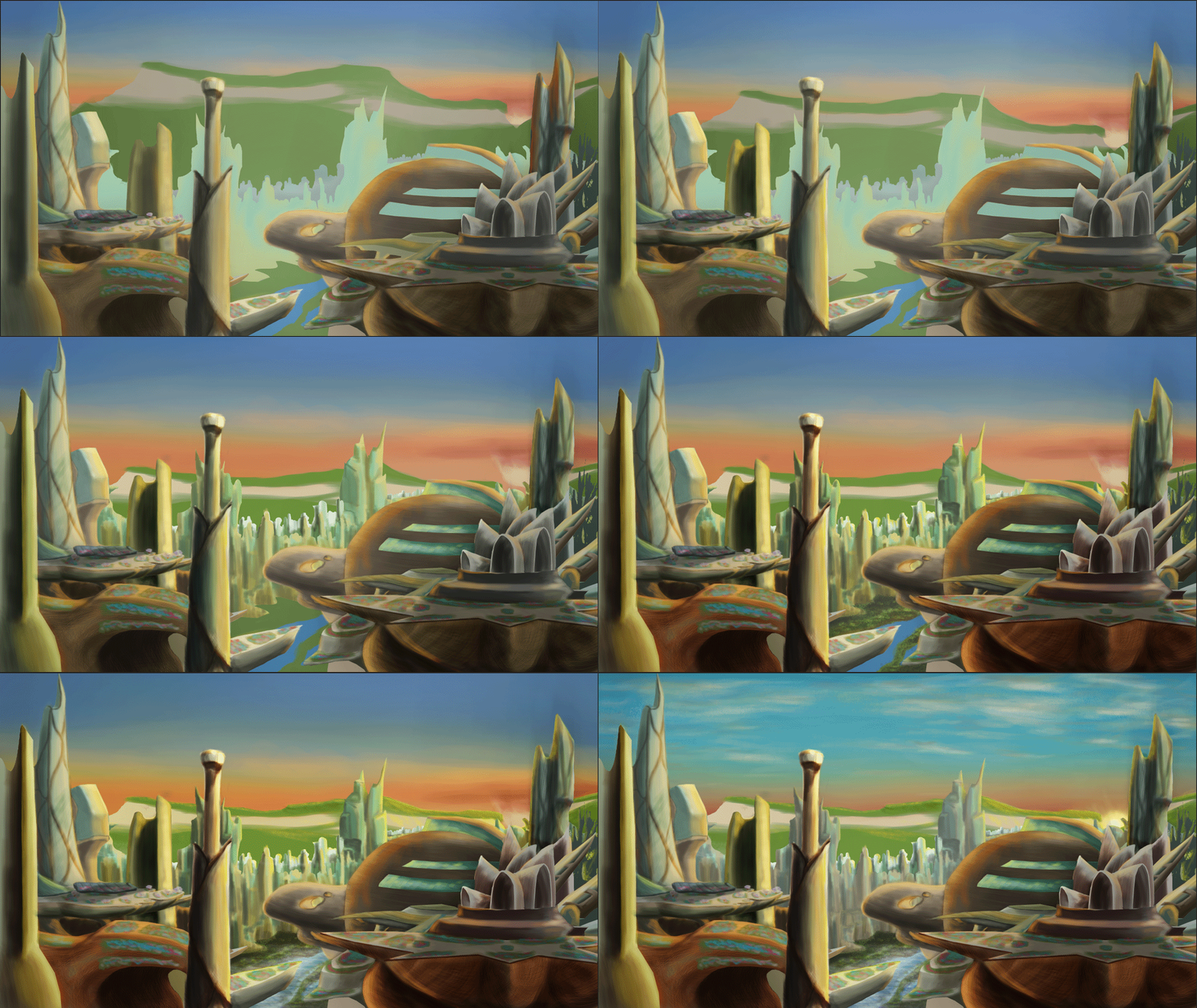
    I spent a good portion of the day improving on the piece and it's almost, almost finished. I have tried to balance speed and detail with this to improve on my last pieces but I have been getting a good amount of advice and feedback from Simon and Emma Morley while I was working on this during open day. Though the mountain is still perhaps not perfect (I have Sunday to fix that), it is the only object that I think needs much more attention.

    I'm probably setting myself a real challenge with all these buildings but I aim to impress and I've always had that admiration for grand scopes. I had to look at a few images of sunrises to get the sky right, as well as looking to see how light interacts with clouds at such a low angle and while the sun still looks a little cartoonish (one thing I noticed in a lot of these images is that no matter the brightness and no matter at what point it was, the sun always had this white spot in the centre generated by the photons that straight-up enter your eye) I was more focused on the clouds which I didn't want to look too cotton-ball-puffy as that would probably have offset the current feel of the environment.

The way I work it also shouldn't be too hard to adapt this for a matte painting: Hide most of the forward layers, add a little more detail to the layers I have left, (of which there should only be about four or five), clean up the hidden parts, job done probably.

Project 2 Development: The Mountain

    At present I am at something of a design crossroads in regards to the background. Here I have attempted to alleviate this by coming up with several variations of the overall elevation and tint of the the mountain behind the city and created the following contact sheet in an attempt to work out which combination may work best. Above the dividing line are different tint experiments and below the dividing line are various tests with the height of the mountain. Personally I am more inclined towards combining thumbnails 7/8 and 3 to get the right shape for the mountain
 
   Because the sun is rising up from behind the mountain I intend to add a golden highlight along the ridge that fades away the further the mountain line gets from the son location. The main reason I wanted to experiment with altitudes was because I was interested in the kind of skyline that could show within the cloud layer. To the right is another height test. This time trying to make the mountain a little more undulating and allowing for smaller buildings to appear taller as well as bringing them into the sky a little more.
 
   These changes may have a knock-on effect in terms of highlights due to the altitude of the sun in the image which I decided early on would be peeking between the cliffs of a distant valley.


Thursday, 13 November 2014

Project 2 City Progression: Fleshing out

    I think the city is coming together okay. In reflection of what was told to me on the last project's OGR I decided I needed to seriously pump-up the vibrancy so to match the sky I gave the city a nice yellow-orange tint to it to go with the sunrise/set in the background which I think has made the whole place look a lot more exotic. After discussion with feedback I realised that "Senbonzakura" didn't fit at all since apparently it's Japanese (one of my concerns when coming up with the name's local version), so after conducting research on an online dictionary (which I suppose I should try and verify with another source), the new name should probably be  "Yīqiān huābàn liúyù" (Yi-qian-hua-ban-liu-yu) which means "thousand petal valley" in Chinese. Admittedly the name is a bit of a mouthful but its more credible as Beijingfor example translates as "Northern capital". However the previous name was a Japanese name which culturally would be a big no-no given the history between the two countries.

    To live up to its name I finally added some rooftop gardens and some visible plant life! There is still a little more to do such as the landscape below the textured city but I think this is progressing a lot more promptly than my plast pieces as well as having fewer layers after I managed to get used to merging completed layers. Its feeling more solid as a concept but after this is done what remains will be orthographs and a redone travalogue.

Wednesday, 12 November 2014

Senbonzakura: Developing A Concept

     I felt satisfied with the blackout image I had done that I decided to start with colour tonight so I know I have made further progress with the project. I suppose it does not look too bad, I added a couple of light and shadow layers to give an impression of depth but for now I don't know if it feels solid enough yet. Further refinement and additions of shading could make the whole place more real however so I will keep at it. Maybe I sohuld extend the background illumination so it encapsulates the whole distant landscape? In keeping with Treacy's love of nature I'm planning to scatter these expansive rooftops with greenspaces; gardens, flowerbeds, maybe the odd cherry-blossom to return it to give reason as to the name "city of a thousand petals". I want to uphold the impression that peopel adore nature in this city located in some deeply remote Chinese valley. Maybe these rooftops are where activity also goes on? They seem good enough a site for parks.

    I suppose if I get stuck for now I can always move on to orthographic drawings. For this one I have a couple of key buildings scattered around the foreground. Particularly the one with the sails and the stalk-like building in the centre of the image that perhaps draws the viewer's eye.

    In progressing with this project however, I am being reminded why I considered architecture to sate my desire to build worlds: I wanted these places in my head to come alive, to make them real, to be able to touch them, visit them, perhaps wander around them using a method outside of my mental space. It might be escapism in some aspects but the idea of designing these worlds so that others could explore them and be as awestruck as I am at their vision is what drew me to this course and to a university education. It doesn't matter now if its my city or something someone else came up with. I am starting ot get a real joy out of helping to bring other peoples' creations to life. It makes me exited to press on with this project and towards the final outcome!

Wednesday, 5 November 2014

Project 1 Update: An Evolving Theme and Style

    I decided to make some thumbnails using Photoshop and I reaise now that I think I might have a detail concern probably because I'm working with a digital paintbrush rather than say paints or pencils on a traditional medium so I get this feel that I need ot add more detail all the time, but I think most of these thumbnails turned out okay despite how much time was spent making them. I'm getting more of an idea for my city and one idea did come to mind: Treacy's hats were often described to be whimsical so I thought "maybe the city is whitin a giant lotus flower?" so I experimented with that, and in 132 I experimented with a lotus flower that's not a standard colour (in 132 I tried to experiemnt with the idea this was a giant wood-clad lotus). I stuck to earthy and plant-related colours in respect to Treacy's influences and inspirations.
    I do kind of like the city-inside-a-plant idea and perhaps have exidence of industry outside of the flower's limits. I was also intrigued in the idea that - again, Treacy's interest in a building in China - the city was in the heart of a landscape found in Cambodia, China or Vietnam. So I was thinking lush forets, deep blue waters, high mountains and very rugged terrains and generally huge amounts of saturated colour.

    I have also talked to other students about giving my city a Chinese name, and right now I am looking into a translation into something along the lines of "valley of a thousand petals". Tumo helped me find a translation for "city of a thousand petals" (which might be closer to a city nickname) which apparently is "Senbonzakura" (Which sounds like "Sen-bon-zah-ku-rah" to me).

Wednesday, 22 October 2014

Project 1 progress - Establishing Shots WIP Entry 4


    So I have haven't given updates in a while. Its largely because I decided to crack on  with the low-angle shot and these past couple of days I had worked long on the shot so it was often late at night by the time I was ready for a progress update but my body wanted sleep. So this probably is something of a "where did all this come from?" situation and I used my artist's eye a lot for it. But by now everything is almost ready for the extras like disk art and one of the reasons I had spent so long was for this very reason - I wanted my images to be perfect for the disk cover even if I'd only be using a section because there are some pretty big gaps that needed filling on my desired frames.
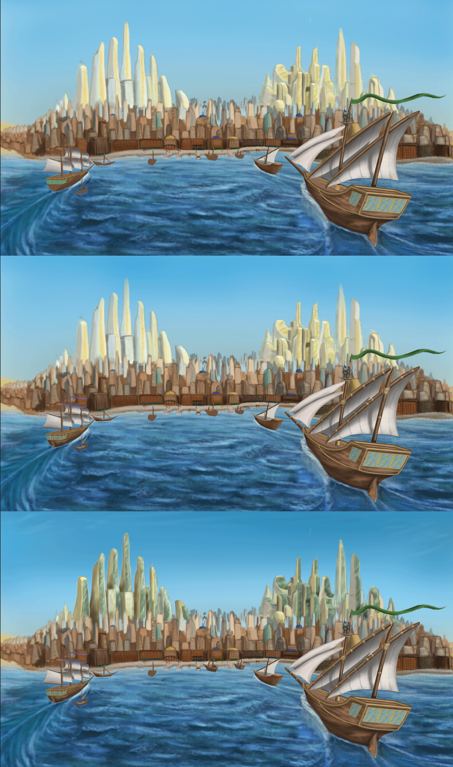
    I was up until about...2:20am completing these two last night and aside from one or two minor details I'd say the exterior establishing shot is just-about done. Changing the buildings from whitewash and gold glass to beige and green glass really brings out the skyscrapers. I think there was even a moment where the green glass and the blue sky made the ody of the megascrapers look darker and thus stood out more against the backdrop. I also added a bit of defenition and few wispy clouds to the sky to bring it out more. Have I really been working in such subtle tones all this time that only now does it come through? For the first time in I think a while, the features of my digital paintings appear recogniseable even as small-ish images.

Also on a side note: I changed the aspect ratio of the buildup to 16:9. Before I was working in 14:9 and I have to say the whole thing does feel grander in scope with the new aspect ratio.

Sunday, 19 October 2014

Project 1 progress - Establishing Shots WIP Entry 3

    Another  update on these two as I think they're getting quite close to completion now - jsut a few more details to add, some of which I admit should have been added a long time earlier but that's how I ended up developing things. Its annoying because these particular details - theupper skirting on the interior shot and the other boats i nthe exterior shot - as I said I have long-postponed to filling. At least now its possible to tell where the ships are heading and Despina looks more like a proper city than two skyscraper clusters set into something vaguely rocky. Funnily enough these buildings seem to add a certain...something as to the scale of these two clusters. I also wanted to show off some kind of roch-poor dynamic, the elegant look of the towers its understandable that some very rich people probbly live in them. I'm not sure but I wonder if I could getaway with making the city less well-defined i nthe distance. I also wonder if I should consider scaling down the megascrapers in the distance slightly. I will also see to perhaps a few features to the sky to bring it out a bit more. I recall reading and seeing in images that because deserts are very dry with very little precipitation, clouds are a rarity. Maybe I could add a few wispy cirrus clouds or darken the blue near the to pedge to give it a bit more defenition.

    As if things were not concerning enough, I realise that I have long yet to begin the low-angle shot all ready by Thursday. I've also let my tutorial schedule slip so I will see to that after I post this progress update. Its a texturing tutorial so I had best get the hang of that before moving on to more advanced things. But in general it appears that my focus on these pictures has been at the detriment of other assaigments (A 2001 review is currently in the works).

    On a more positive note, I think I am on the road to recovery as I have been less prone to coughing, sneezing and generally don't feel as horrible when I wake up in the mornings. I might make a full recovery in time for the crit if I'm lucky although given how things went the last I was ill I would definitely look forward the prospect of a couple of days' rest after I have completed everything. Until then however, I will persevere as best I can.

Friday, 17 October 2014

Project 1 progress - Establishing Shots WIP Entry 2


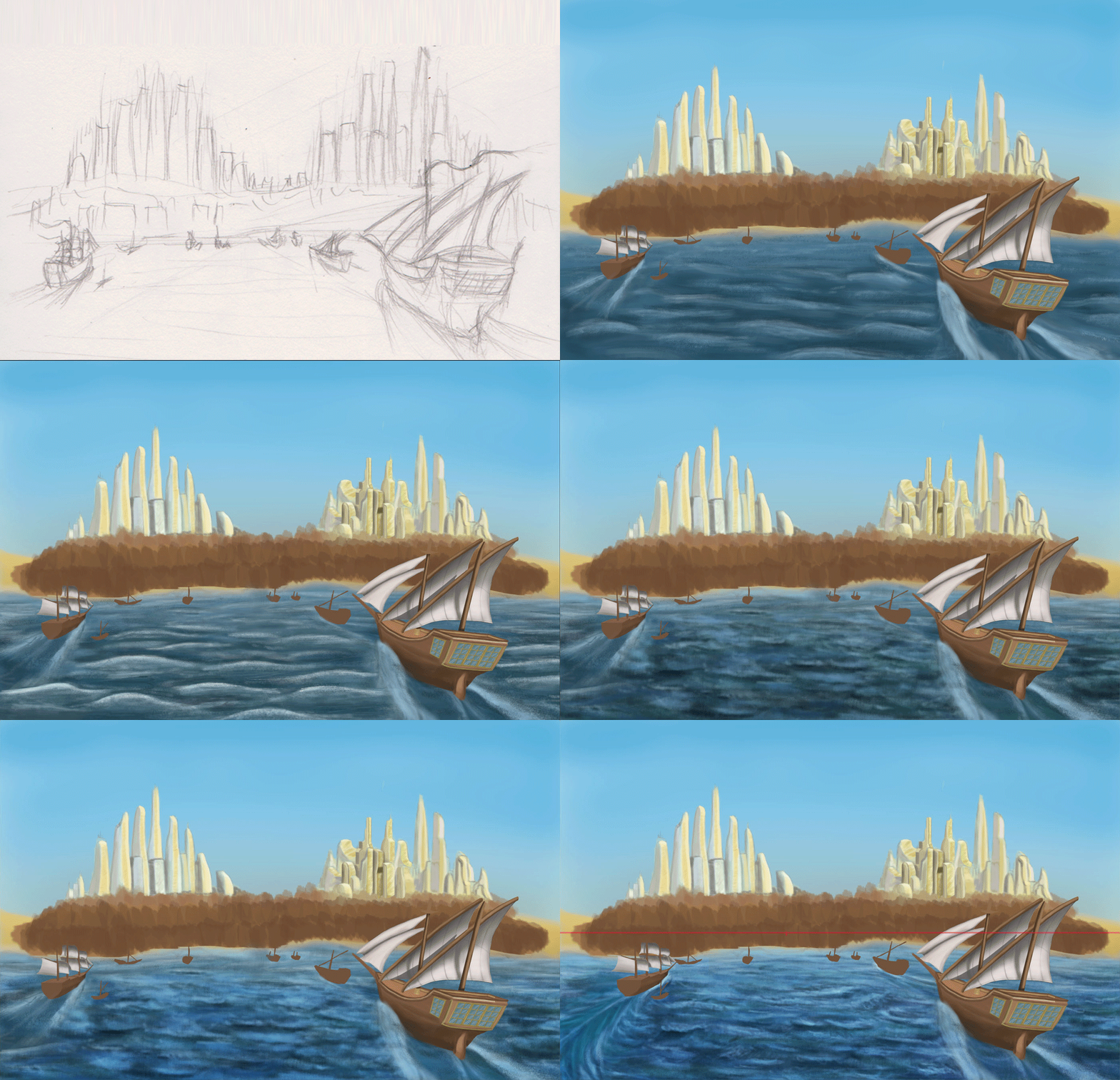
    I think I spent most of the morning as well as a chunk of last night getting the sea in the exterior establishing shot right in a way that looks good but thank you to @Stitch and @Simon for giving me suggestions and pointers, as well as suggestions from a couple of third-years. The current look was based on a reference (seen included in one of the frames to give me an idea of how to do it) as well as some in-depth look into ship wakes which unfortunately was not easy as my attempts with google heralded either the wakes from powered boats and ships, or shots of tallships themselves and not their wakes. Luckily I did come across one image that was intended to show the types of wakes that are made by the ships of various speeds and sizes. This has probably been the most annoying part so far but at the same time it was a rewarding challenge as it does look a bit more like something from an oil painting (I chould add a few highlights on the bodies of water on the left and right edges but at the same time their lack of detail does draw the eye towards the centre and the city itself.
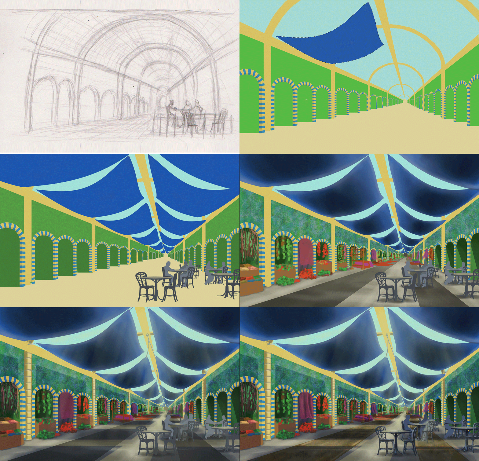
    I really needed to get myself moving so I spent this evening working on the interior establishing shot as well as some outfit designs for Despina's citizens. The interior establishing shot is still pretty flat as I will add depth later along with a wide variety of other goods on display which will include stuff in crates in the main aisle. Although so far this process of flat colouring has been good with working out what part of the images I don't need to give detail to. I added fabric canopies to the bazaar roof  for two reasons:
  • The first is that I realised one of the reasons that such bazaars might have opaque rooves is to provide shade and protect from gusts of sand, and a glass ceiling would have made the promenades unbearable i nthe middle of the day. The I wasn't quite sure about losing the glass ceiling so I compromised with canopies that provide shade but do not fully envolop the place in darkness.
  • The second reason, which was more of a convenience, is I can save time by using the canopies ot blot out sizeable areas of the ceiling, leaving only small patches to add detail to. I plan to make the canopies appear thin enough that they act as a blue filter for ligth shining though, adding a cool tone to the whole area to compliment the warm(ish) green and beige.

    For the outfits I was inclined on a mix of western and middle-eastern fashions to reflect that this is a city that is a melting pot of the two cultural identities. There's also the possibility that there is a sizeable tourist population in the city due to its attractiveness and its ameniaties. There's possibly some more Southern/Eastern asian influences in at least one or tw oof these outfits as well. GIven that the focus should be on the city, I might use these ideas to give outline rather than go all-out and make the people as brightly-coloured and as eye-catching as the city.

    I have also been going into some thought for the low-angle shot which could end up looking the busiest and would lead into the interior establishing shot by having part of the bazaar building open up int othe city streets. I definitely plan tp combine aspects my two considered thumbnails as well as considerations as to what kind of stories Despina's citizens will be telling via dress, body language and interaction with each other. I just need to keep mindful that I only have a little less than a week to finish this all up and make it presentable which I didn't unfortunately do last time.

    In preparation for the presenation I have thought a bit about the look of the document although this is still fairly early so I don't hav e much to say other than the tohught of the background being perhaps dark to bring out the bright colours that are predominant in the pieces I have done.

Wednesday, 15 October 2014

Project 1 progress - Exterior Establishing Shot WIP

Began work on the exterior establishing shot for my version of Despina which I started in Tuesday. So far I think I really like how the water has come out, the buildings...not sure. But I'm owrking on giving them more visual depth. This is still very much a work-in progress however - I still need to further refine the glitering skyline, fill out the lower city, add in the dockyards and refine the other boats. Also add a few small touches such as a man on the crow's nest of the ship right in front of the camera.

Aside from the ship wakes which I am unsure about I think the sea has come out fairly well, for the shot the sun is supposed ot be behind the ships and high in the sky so there are some short, but bold shadows cast from behind the viewer.

Monday, 13 October 2014

Production Foundations

    Quick post as I'm trying to cut down on the extreme late nights but I decided to have an attempt over the weekend to get everything set for creating these three final pieces. These were quick paints with minimal shading because I wanted to focus on the primary palette colours. I have a fairly solid idea for the exterior and interior establishing shots but the exterior low angle shot I'm currently still thinking on but I am drawn to doing a market street.

    These are not solid "I know"s, I might swap around and marge elements form each (the market stall arrangement in 3 inserted into the view from 1), although maybe I should angle shot 1 lower a little more as I get the impression the viewer appears to be standing on something in order to get the right view. 4 I plan to fill with all sorts of people and goods; dates, carpets, rugs, hanging produce, perhaps a jewelery stand. I have a little less than two weeks to create the needed scenes so I know I will have to crack on. So these thumbnails are perhaps a last bit of experimentation as I had originally planed to use them as guidelines with which to build up the final images. So stuff could end up added that is not on the original sketch - there are construction lines if one looks closely.

    This is the first time I have used the palette picker and I am in contemplation as to what is the right mix for the scenes I want. I want some nice bright, solid, vibrant colours but the exact configuration I am still trying to work out (hence the quick colour compositions above). Although I think I prefer palette 1. All the while I'm still not 100% healthy but I am getting there slowly.  It is merely a matter of getting my mind in the game and persevering. It took me a month to make that image I presented as a summer project so I would like that what I have learned can get me to the final stage much faster.

    Considering how thumbnail 2 came out when it only took me about 10-15 minutes (I wasn't fully looking at the time but it felt brief) to paint up the sketch, I guess I should feel confident about my chances.

Tuesday, 7 October 2014

Invisible Cities - project refinement


    Settling on Despina, I decided to work on some more refined thumbnails for its design. One of the ideas that struck me was perhaps soem kind of combination - I have always been fascinated with sail ships; behemoths of wood topped with billowing white silken sails like their own personal clouds to sail behind, and I have also been fascinated with art and aesthetics. I had wondered about combinding the two into some strange mishmash world where sailships and animal trains provide for ultramodern city centres. I'd wodnered that perhaps the street levels or perhaps the outskirts would be filled with older buildings of sandstone and perhaps the odd onion dome. For an interior, I recall being amazed by the look and te goods diversity of the covered Grand Bazaar in Istanbul, or perhaps I continue with the idea of a pub.

    Perhaps a combination of the two? A series of tables within the hert of a large-scale covered bazaar, the roof of which either being opaque or maybe tinted glass to reveal the modern city outside and bathing the interior in the desert sun but somehow still remaining cool within.

Friday, 3 October 2014

Space and Environment: Colour Composition practice

After trying to rest from battling this illness and staying up for two late nights in a row, I decided I'd take a small break from making thumbnails and practice a colour composition. The two practices I have done are of Isaura and Anastasia although I had considered an establishing shot of Anastasia as if one were arriving by ship. Or I try that with Despina since it fits Calvino's arrival description quite well.

WHen I finally sat down to work, I wanted to do four. However in making them 2 took a lot longer than I had hoped and its not exactly finished; all the buildings lack windows, the thumbnails had a crowd as well as canvas canopies. I'm more partial towards 1 because for a first time it came out rather well despite my attempt at sand dunes (note to self, use image referencing next time) and colouring with an overlay also came out decently despite giving me custard-yellow sand (although maybe I keep this for the real thing as a stylistic touch). Thinking about it, 1 does have a painterly feel to it, almost as if we are seeing the city's approach sylistically spring from Marco Polo's imagination as he describes it.