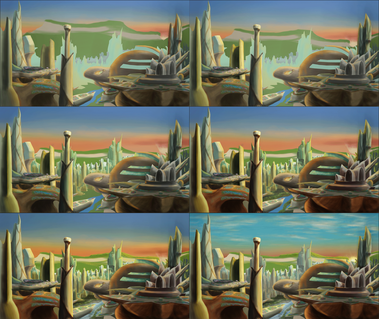
I was going to publish this last night but it got pretty late and close ot the deadline to do so. But after seven weeks of work I am glad I am finally finished and I like how it has turned out so well. For the most part I feel like all my time texture designing have paid off. One of the criticisms given on the crit was that because I had gone for such a realistic tone ot the city, the matte painting at the back didn't work quite as well.
I spoke with Stitch after the crit and he suggested I should consider using harder brushes to give a more solid feel to my work, which I can understand as I might have for the most part been using fairly soft brushes and I guess it does show with the matte painting. I was advised to go for a more photographic look (which I can achieve with photoreferencing and using real photographs as a guide), so it is a good thing I placed the city in the middle of China.
Showing posts with label what if. Show all posts
Friday, 12 December 2014
Thursday, 11 December 2014
Matte Painting
Didn't take long to make up a matte painting for the final presentation. The image on the right is what I will be using. I used the background of the original concept piece as a base but did some serious tidying up of it before adding the lower half. The image below is the painting as it was before I added the city at the back. I admit I may have gotten sloppy with keeping record during the crunch time however.
Wednesday, 10 December 2014
Long-Awaited Update
With some rendering on tutorials underway I thought an update of my project was long overdue. At least I am just about ready with my textures. However I regret one or two buildings may have to be left out of the final render due to pacing and a hint of me biting off more than I thought I could chew. But I digress, just about everything has had bumpmaps, specular maps and texture maps assembled and some of them are looking pretty good wraped around the models.
It did feel something of a slog getting to this point but now that I have (barring maybe one texture map) reached the point I can install everything and test the lighting and hopefully everything should be ready by Friday.
One thing all this texture mapping has aided me with is getting brisker with painting. While some of the painting surfaces started off confusing, there are times I ahve taken the work in my stride, other times I needed to push myself, but I feel like I am almost. ALmost over the crest of the hill, although it took a couple of late nights to manage it.
Of the current models I have, all the texture mapping I have left is the closest balcony (the one which in my concept art looks like a boat hull) and a dome to hide the joining of the sails on The Star. However given current circumstances I am contemplating perhaps dropping the boat-hulled balcony or moving it because the building it was supposed to connect to had not been built. And with the deadline approaching I am not sure if I can make it in time as well as doing all the peripheral things such as catching up on reviews, making the matte painting and assembling the presentation.
The positive outcome of this is that the whole scene could come out less cluttered.
As in the concept I had crammed buildings in based on the blackout I
had constructed with the ground only partially seen far down below. With
less buildings, more of the ground could possibly be seen, giving a
feeling of more space in this elevated world that has been constructed.Friday, 5 December 2014
Maya Progress Update: What If Metropolis
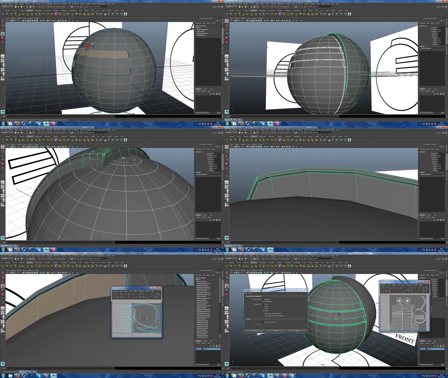
Chance has smiled upon me! I have made a ton of progress since my last update which I neglect keeping up-to-date. When I loaded up photoshop on the baseroom computers this afternoon it loaded up the screenshots I had made before Maya last crashed, which I was able to save and transfer to my memory stick. During this morning's CG Artist's Toolkit lesson I made progress with some of my smaller buildings, particularly the balconies that will connect to larger buildings which came together quite promptly.
I also made progress with another minor but notable building, the Arrowhead; designed to go between the star and the sphere This one made me feel comfortable as I managed to assemble and UV map it within the space of 3 to 4 hours. It's close in complexity to the Beak-shaped biulding but I feel confident that I am working more swiftly as much of the work is now done.
The slowness and a feeling of pressure came from me going back to the platform and correcting the geomertry as the "mirror geometry" function had made the whole thing a mess as a few of the itnersection points combined into one vertex (I have found I can alleviate this by duplicating the object and setting the X value to -1), making triangles out of quads. There were also issues with the vertices when it came to smoothing the while thing for rendering so I ended up going back to the model constantly to tweak and sew vertices and edges which became mentally straining.
However I have persevered and all these models now have had their UV maps arranged and exported ready for texturing and rendering. There are only a couple of buildings left to assemble but they are not too complicated in principle. Other than that I feel more on track for the coming Friday. All-in-all it felt like a very productive day and a pleasant change from the progress of the last few days.
I also assembled some simple disk art that would have gone on the front of my disk. I decided on something less busy compared what I made for Invisible Cities as I get the impression this is a concept art disk. So its purpose would presumably be more about looking tidy and professional than looking flashy and eye-catching. Because I have a printer at home I can work on the jewel case cover when I have the time.
Wednesday, 3 December 2014
Project 2 Modelling Update
Construction of the hero prop is taking shape. I have a solid idea for a texture map which I will need to go about refining however after having lunch I had a bit of a creative stumbling block after making three unsuccessful attempts to start construction of the beak - all of which resulted in a fatal error when I rener-previewed what I had without changing the render engine from Viewport 2.0. The deadline is closing in and the fesire is to finish this. So I wil lsee about pushing forward.
I have made some trial-and-error progress on the silk tower but I neglected to snapshiot as I went as I constantly alternated between Maya and Photoshop. But it's mainly due to the mesh I have so I hope this problem doesn't come up when it comes to rendering these other buildings which haver more confined meshes.
Tuesday, 2 December 2014
Project 2: Tuesday Design Updates
This morning I decided ot set to work o nthe diffuse map for one of the city's skyscrapers. Just before i started I recalled ot myself that rarely are the surfaces of even the most pristine and seamless skyscrapers ever a single uniform sheet. So I set about designing a more true to-life appearance where part of the resulting texture would come from the seams between the panes. For the final image I do plan to tone down the grooves so that they don't completely drown out the. look of the panes.
The hexagon idea may be a bit spur-of-the-moment and I might or might not not carry it though with the rest of the city, the idea being that this is an aesthetic city so your typical mass of square panes felt dull to the eye. Hexagons provide am ore intriguing look as they "slot in" to the sctructure far more easily and effectively and maintain a stronger structure than a square frame. Along with toning down the grooves, I plan to add some more visible framework to break up the current look and giving the windows a little glint.
Due to the highly reflective nature of glass, a blinn shader or chrome layer would be useful to bring out its scheen.
After watching Suspiria I headed dow nthe the baseroom to spend a couple of hours on The Star, reworking what I had doen so far, one of the majore features of the new model being a kind of balcony wall around the outside so peopel won't fall off. After UV mapping this one spoke, I duplicated it with the others and combined it all with the disk in the middle to create a single contiguous surface in which I will place the texture maps for the surface of it. After finishing these I moved on to the building at the back and after working on the balconies I think I should be able to quickly build up the shells on top of the biulding.
Monday, 1 December 2014
Project 2: Further Production Art
Creating these kepy production images has helped a fair bit in working out the right colour scheme for my buildings, as well as pinning down the finer details. It's hard to see but I also added a miniature figure next to what have nicknamed "the silk building" on account it reminding me of a fold of fabric. I'd considered a greenish/teal colour for the windows after looking back on my colour considerations for the star platform, while also maybe being inspired by jade - a precious form of rock that is both highly valued and closely tied to China and the surrounding countries. It rose to become treated as something akin to a combination of alabaster and gold in the Mediterranian; precious, beautiful, and carvable into all manner of wondrous shapes. Although I do wonder if I run the risk of the colour looking a little sickly.
I also wondered about incorporating a little organic into the structure, as the idea I have proposed for Huabanliuyu does make it sound like the residents were inspired by plant life just as Philip Treacy was inspired by nature's patterns and structures when it came to his hats. There's still a bit of work to do on the platform (the legs for instance) but I do feel like I am further cementing my visual image for the city. I might in fact go for the Silk Building to be my test prop, as it is both present as a foreground element and the design is a lot simpler in its geometry than the star or the platform.Sunday, 30 November 2014
Project 2: Key Concept development
With deadlines coming up I suppose I have to work faster than this but I managed to get some production art done for my hero building. At first I was just going to do the core parts but when it come to the building on top I was struck with uncertainty as tr othe kind of material to clad it with. After coming up with ideas on how to tint the sail-like rooves I wondered if rather than some osrt of corrugated material, what about glass? I also had a thought about what pathways could be on the balconies varying from random to fluid to highly organised.
Friday, 28 November 2014
What If Metropolis Project: Part 3
It feels embarrassing but I decided ot restart this tower again after trying what I considered doing in a previous blog post and it is all because of the focal point caused a few issues with the arrangement of the edges radiating outwards. This time I tried a new technique involving the cut faces tool to create something that resembles a Spirograph creation.
I became vastly more familiar with the "merge components" function during this session as some pieces were disconnected from the edges and I could more easily create what Maya's render preview function would recognise as a contiguous surface.
Using the extrude and edge loop functions I was able to extract the geometries that I needed for the top of the building. I also have to construct this bearing in mind that there are two similar buildings that will be in the composition; one that occupies the foreground and one that occupies the midground, meaning I may eventually have ot design a more detailed version of the building.
After mapping the UVs for this building, which is probably the best out of all attempts, I moved on to tackling the "star" prop of my composition. Working on prior buildings helped a long way to familiarise myself with the tools and skills that I would have beeded realising it but it is still far from done.
Utilising the skils I acquired from creating a symmetrical structure with the platform, I made use of the mirror geometry tools and mirror cut tools to create a ring of eight petal-shaped outcroppings to which more planters will be placed.
Production wasn't perfect, as I made four separate attempts to create a design with minimal clipping but I eventuall managed ot settle on a technique that involved a 24-spoke cylinder in the centre. Each petal would have two edges meeting it, I duplicated the petals (which unlike the main floor I did not scrap at any point), I would look for the line of intersection and, from the centre of the cylinder I extended a "cut faces" line that bisected the two petals. I then removed the clipping faces, neatened up with some careful application of the translation tool on the misaligned vertices.
I then removed half of the petals and mirroed the geometries. As luck would have it, the while thing snapped together beautifully.
There's still a good deal of work to do however. For one, when I preview the renders, all the petals split at the seams so I will need to connect them all up. I'm trying ot avoid crazy hours like 2 in the morning since often it caused me to wake up late. Despite how tempting it is to keep working.
Wednesday, 19 November 2014
Tuesday, 18 November 2014
Update: Travalogue Addendum
"...Yet for all the beauty that captivates the
eye. For every haute couture dessmaker’s, perfumery and tea shop. I cannot help
but wonder what I could see if I peel back the skin. What opinions must come
from spending all of the day in a garden high above the ground, walking about
in the likeness of Mother Nature while captivating all those around with a
stolen scent? Yiquanhuabanliuyu is certainly beautiful, I could spend all day
examining the outlandish dresses, hats and coats that line the shop front windows,
or indulging myself in the taste of the many brews of tea consumed by its
inhabitants every day, or sitting in the shade under a cherry-blossom within
one of the elevated gardens, soaking in the tranquility of organised ecosystem
around me while looking out on the city below. But for all the beauty, for
every flight of fancy this city satisfies for you, I see people who remain hollow,
feeling unfulfilled, and wonder if their emptiness is their doing, or the city’s.
Even as I leave, the magic of the city
travels with me. And every chrysanthemum, orchid and lotus flower I see draws me
back and fills my thoughts with its perfumed aromas. And reminds me of all the
sensations I left behind."
This is the planned addition I have considered to the travelogue that explores the "darker side" of Huabanliyu. That though tangent may have gone all philosophical. But I suppose part of what I have to consider is that no city is perfect. Even the idyllic fictional utopian cities of Coruscant, Theed and Rivendell have less pleasant aspects to them that draw them away from being perfect places to live. So I figured that in order to ground Huabanliyu it made sense to give a less perfect side to it.
Monday, 17 November 2014
Project 2: Master Concept Complete
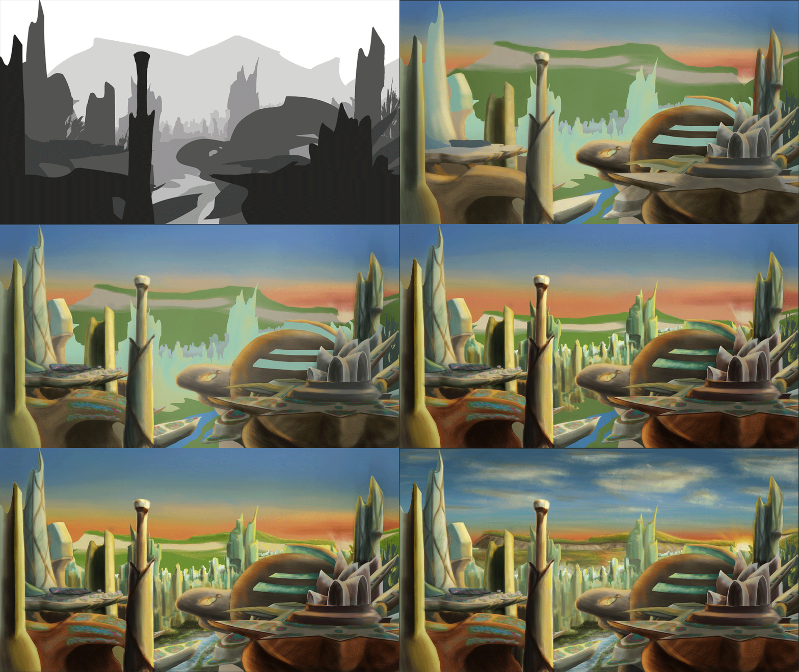
After much time and commitment my concept piece for Project 2 is at a stage I consider it complete. There was a minor setback in that I had discovered earlier this night that the work I had done after I got back from university on Saturday had vanished into thin air, meaning that my work on the sky I had done the night after open day had vanished without a trace since I remember browsing images of clouds and sunsets during the evening. This is a shame because I thought I had done great with the clouds in that one. All I had as evidence was a dithered GIF frame that I thought would be stupid to use given the extremely low resolution (both in scale and smoothness) of it compared to the piece itself. Although the replacement sky I think is more volumous and closer to being a sunset. Nevertheless, I think the concept piece at a good enough stage to be considered finished:
I largely spent most of today working on orthographic drawings of several key buildings. And have managed to put what are possibly the most complicated buildings into an orthographic blueprint ready to build within Autodesk Maya. I got to firm grips with Photosoph's shape tool while working on this, discovering I could make all kinds of amazing shapes by warping and combining circle and square shapes (when two shape layers are combined, Photoshop removes the borders of adjacant and overlaying shapes).
Some of the buildings I have yet to draw out I am debating whether to model them or keep them as a flat plane (such as was suggested to me with the two-section tower in the foreground) but other thn this I largely feel I am well on track towards the pitch this Wednesday and I feel confident I should have the essentials assembled and put into PDF form by then.
Saturday evening I also looked into reworking my travalogue due to the considerable redesign the city has goen though since my first OGR of this project. Unfortunately I am a little stuck and perhaps a paragraph or so short of 1000 words but the following is what I have for the city so far:
“After travelling through oriental jungle,
across undulating terrain and though humid valleys I arrived, for within the
valley below me was the city of Yiqianhuabanliuyu; “Thousand petal valley”
in the local Chinese dialect. Crossing over the ridge and entering the city for
the first time. my eyes were met with shining towers that glistened a beautiful
amber in the morning sunlight that peeked over the valley I had passed through.
While the wilderness I had passed though was wild and undulating, the outskirts
of the city still bore a sense of civilised life, the signs became clearer as I
approached for the locals still tended to terraced paddies, orchards of exotic
fruits and manned boats that cut the waters of the river that cut like a knife
though this geometric city, catching all varieties of fish. Further in from the
fringe of this pocket of civilisation, open paddies and blossoming orchards
gave way to twisting, curving shapes sat with sharp, geometric daggers down one
of the main roads I walked down.
It was almost like something from a dream,
perhaps one could suspect that pixies or elves or some other creature of the
fey to be the inhabitants of this place but no, one can see human beings on
every street corner, in every paddy and every boat gliding across the water.
The interior is perhaps more spectacular than the exterior, as entering the
promenade from the city’s entrance all nostrils are immediately filled with the
smell of spices, fried fish, shrimp and hundreds of perfumes. Buying from these
stalls were people dressed in outfits as committed to mimicking to the organic
forms as the buildings that surrounded them. Women walked the street wearing
hats with rims broader than their shoulders accented with feathers of various
birds that reached beyond the body itself, their bodies draped in silken
fabrics that were embroidered like delicate veins to create blossoming viny
patterns. And the men are just as extravagant with shirts of the most luxurious
lavender and hip-length cloaks of dazzling linen adorned with embroidered
floral patterns as exquisite as any Persian carpet. My eyes were drawn to the
shops they visited, further explorations revealed hundreds of herbalists,
doctors’ surgeries, tea shops, florists and above all perfumers who made
residence in the thousand-petal valley, taking every advantage of the region’s
namesake and using them to their fullest potential.
Every corner of the city could be likened to
a celebration to the tastes of mother Gaia. Cherry-blossoms lined high-culture
streets, which would flood the city in a tide of sugar pink come springtime. If
you were to look up, or if you were lucky enough, you could rise to the skyline
and discover that the inhabitants did not restrict their obsession with
horticulture to the soil, for even up high on rooftops plants blossom in
gardens and flowerbeds, neatly arranged, balconies that reached out of the
artificial cliffs and into the air formed shrines to nature’s beauty and were
homes to numerous cultures; peonies, roses, orchids, more cherry-blossoms, it
is as though the city was captivated by a flower’s delicate beauty and took
every effort to surround themselves. Building a city that was rife with the
hundreds of scents perfumers would make from these delicate little things to
fill the nostrils of anyone who walked the streets. But this is what surprised me the most, as on
occasion I found myself in a public space, talking to locals atop the roof of one
of the many structures. Rooftop gardens converted into public gathering points,
a garden many stories above the ground where below I could see a river cutting
though the city, flanked oddly enough by lush jungle. Perhaps the residents
decided that the river was too important to them to build up to? Perhaps on its
banks grew a flower or a plant so vital or beautiful it was left to grow
naturally? Local citizens still sailed out on boats to fish and to gather its
bounties.
The more the structures that flanked the
banks were looked at the more I began to notice on the closer buildings;
woodgrain veins, drapery, these were not the building materials for such large
buildings we are familiar with. These buildings were not cold or rigid, they
glowed with their own dynamism that is hard to explain, and they throbbed with
a feeling of life independent of their occupants. Some of them one would think
“perhaps the local flora inspired them?” It is not too much of a stretch given
what is already here. It became difficult to find an angle that wasn’t
accompanied by a curve, a point not joined by an arch somewhere on the
building. Or for that matter, any design made popular by the architects of old.”
I wondered about adding a little hint that Huabanliuyu (a possible shorthand name for the city. Literally "petal valley") isn't as idyllic as I have currently indicated that its inhabitants dress in extraordinary fashions, live in these exotic and possibly expensive buildings, wander rooftop parklands and cover themselves in the various perfumes made from the city's flowers so its possible that a number of its inhabitants are quite shallow or perhaps the entire city is a representation of the lotus flower as interpreted by certain Buddhist philosophies; pure and beautiful on the outside, empty or hollow on the inside. It might be a good balance ot add some negative ot this otherwise positive travalogue and could tie in to the explorations of "fear of the Other" I am recieving from certain film in the film studies group or certain Contextual Studies lectures.
Saturday, 15 November 2014
Project 2 Development: Concept Piece Refinement
I spent a good portion of the day improving on the piece and it's almost, almost finished. I have tried to balance speed and detail with this to improve on my last pieces but I have been getting a good amount of advice and feedback from Simon and Emma Morley while I was working on this during open day. Though the mountain is still perhaps not perfect (I have Sunday to fix that), it is the only object that I think needs much more attention.
I'm probably setting myself a real challenge with all these buildings but I aim to impress and I've always had that admiration for grand scopes. I had to look at a few images of sunrises to get the sky right, as well as looking to see how light interacts with clouds at such a low angle and while the sun still looks a little cartoonish (one thing I noticed in a lot of these images is that no matter the brightness and no matter at what point it was, the sun always had this white spot in the centre generated by the photons that straight-up enter your eye) I was more focused on the clouds which I didn't want to look too cotton-ball-puffy as that would probably have offset the current feel of the environment.
The way I work it also shouldn't be too hard to adapt this for a matte painting: Hide most of the forward layers, add a little more detail to the layers I have left, (of which there should only be about four or five), clean up the hidden parts, job done probably.
I'm probably setting myself a real challenge with all these buildings but I aim to impress and I've always had that admiration for grand scopes. I had to look at a few images of sunrises to get the sky right, as well as looking to see how light interacts with clouds at such a low angle and while the sun still looks a little cartoonish (one thing I noticed in a lot of these images is that no matter the brightness and no matter at what point it was, the sun always had this white spot in the centre generated by the photons that straight-up enter your eye) I was more focused on the clouds which I didn't want to look too cotton-ball-puffy as that would probably have offset the current feel of the environment.
The way I work it also shouldn't be too hard to adapt this for a matte painting: Hide most of the forward layers, add a little more detail to the layers I have left, (of which there should only be about four or five), clean up the hidden parts, job done probably.
Project 2 Development: The Mountain
These changes may have a knock-on effect in terms of highlights due to the altitude of the sun in the image which I decided early on would be peeking between the cliffs of a distant valley.
Thursday, 13 November 2014
Project 2 City Progression: Fleshing out
I think the city is coming together okay. In reflection of what was told to me on the last project's OGR I decided I needed to seriously pump-up the vibrancy so to match the sky I gave the city a nice yellow-orange tint to it to go with the sunrise/set in the background which I think has made the whole place look a lot more exotic. After discussion with feedback I realised that "Senbonzakura" didn't fit at all since apparently it's Japanese (one of my concerns when coming up with the name's local version), so after conducting research on an online dictionary (which I suppose I should try and verify with another source), the new name should probably be "Yīqiān huābàn liúyù" (Yi-qian-hua-ban-liu-yu) which means "thousand petal valley" in Chinese. Admittedly the name is a bit of a mouthful but its more credible as Beijingfor example translates as "Northern capital". However the previous name was a Japanese name which culturally would be a big no-no given the history between the two countries.
To live up to its name I finally added some rooftop gardens and some visible plant life! There is still a little more to do such as the landscape below the textured city but I think this is progressing a lot more promptly than my plast pieces as well as having fewer layers after I managed to get used to merging completed layers. Its feeling more solid as a concept but after this is done what remains will be orthographs and a redone travalogue.
Wednesday, 12 November 2014
Blackout Composition Tempaltes.
I figured it would help to understand how I got to my designs if I uploaded the templates I had used to make my silhouetted designs. They originated as follows:- 1: An orchid flower
- 2 and 6: A lotus flower
- 3, 4, 5, 14 and 15: Hats designed by Philip Treacy
- 7 and 8: Pheasant feathers
- 9 to 12: Abstract structure ideas I had come up with earlier in the project.
- 13: The tower idea.
Once I stamped them down I used the brush, transform (roatate, scale,warp and prespective) and eraser tools to tweak them to fit the situation, the shapes were further modified and cleaned up in my master image considerations to more fit the situations I would place them in.
Monday, 10 November 2014
Space and Environemnt 3: Blackout Thumbnails
I tried making some images where I blocked out my features to give them less form and less defenition so I could focus more on composition (I may not have completely moved away from my super-detail style but I think I'm getting there). I assembled these images from silhouettes of Treacy's various hats, various orchids and lotus flowers and a few of my thumbnails in order to experiment with different forms and landscapes. I'm still getting used to this technique but some of them don't seem so bad so far save for maybe the top three ones where depth is haphazardly portrayed due to the random assortent of shades.
Sunday, 9 November 2014
Project 2 Space and Environment Update: 09/11/2014
I'm starting to really hit a roadblock with this project. One of the suggestions I was given was to be less literal and more abstract in my city designs. I'm fairly set on the main building I want to include but the problem is filling in the gaps between major buildings. As a milliner, Treacy's designs are not intended to be combined with each other which means when I tried to arrange several shapes he'd design into a city block it but just looked mad and jumbled.
So I tried at more abstract shapes, curves, something fro ma modern art sculpture but I do not even know if it is Treacy-like what I have come up with. One thought I had considered involves putting the central building towards the back. However this decision made me feel as if I was going backwards as it meant more thumbnails, more location and composition arrangements and more building ideas so now I feel stuck in the thumbnail stage with the end (the the final concept image) feeling very far away.
When it came to 155 I think I snapped and underwent what is described in the video game Dwarf Fortress as a "strange mood" and drew almost under automation a collection of squiggles that I then tried again with subsequent thumbnails, filling in and shading the gaps to give structure to look like modern art sculptures. Starting with 164 I also considered making the building as more of a background element which led to this feeling of going in a circle that I mentioned earlier (even if that is the design process, what kept me from doing this on Invisible Cities was I had 19 different cities to choose from as inspiration. Here I've created over 165 thumbnails for just one city and from one root).
Friday, 7 November 2014
Space and Environment: Concept development of Treacy's City
After recieving feedback from my OGR I decided that I needed to try and break away (at least a bit) from being too literal with my designs. Simon helped me work out common shapes and patterns in Philip Treacy's designs, both of us eventually concluding that several of the hats, due to their size and shape actually draw attention away from or in some cases completely aobscure the peron's actual face. So we talked about form over function, and he helped me to work out that perhaps what I oculd try is a city that was highly aesthetic (a far cry from something I was told in my first term of Architecture at Canterbury, where I was advised that I should aim ot make every innch of the building useful), and indeed several of Treacy's designs looked as though they were sculptures atop their wearer's heads. Some surrounded, some accented, others drew the eye away from the face.
I was still keen on finding some way to use the lotus somehow, I don't normally delve this far into the fantastical (that I am aware of) and I did get a sense of enjoyment from exploring complately fantastical spaces. One thing I also had to get my head around was how Treacy's hats could be whimsical. To help me, I was shown a recent design by BMW known as the GINA; a car whose outer body was a gloss canvas stretched over wire, giving it a very organic and minimal shape with minimal seams, the opening doors worked by the material flexing, allowing the outer body to "bend" as the door opened. It was a neat and intriguing idea if a little impractical as I can't imagine such a material as very protective. Funnily enough this is how treacy makes a lot of his hats: stretching fabric over a frame, but using a liquid solvent to harden the structure.
(BMW's design director Chris Bangle talks about the car (BMW web TV, 2008)
So that is what I have to look for in my own designs: Something fanciful, beautiful, but in the end, more visual than functional; perhaps a popular trend in this city is that perhaps only a small amount of the volume is actually useable, most of it making way for sculpture or an addition to the facade.
Wednesday, 5 November 2014
Subscribe to:
Posts (Atom)