
Showing posts with label Space and Environment. Show all posts
Showing posts with label Space and Environment. Show all posts
Thursday, 11 December 2014

Wednesday, 10 December 2014
Long-Awaited Update

With some rendering on tutorials underway I thought an update of my project was long overdue. At least I am just about ready with my textures. However I regret one or two buildings may have to be left out of the final render due to pacing and a hint of me biting off more than I thought I could chew. But I digress, just about everything has had bumpmaps, specular maps and texture maps assembled and some of them are looking pretty good wraped around the models.
 It did feel something of a slog getting to this point but now that I have (barring maybe one texture map) reached the point I can install everything and test the lighting and hopefully everything should be ready by Friday.
One thing all this texture mapping has aided me with is getting brisker with painting. While some of the painting surfaces started off confusing, there are times I ahve taken the work in my stride, other times I needed to push myself, but I feel like I am almost. ALmost over the crest of the hill, although it took a couple of late nights to manage it.


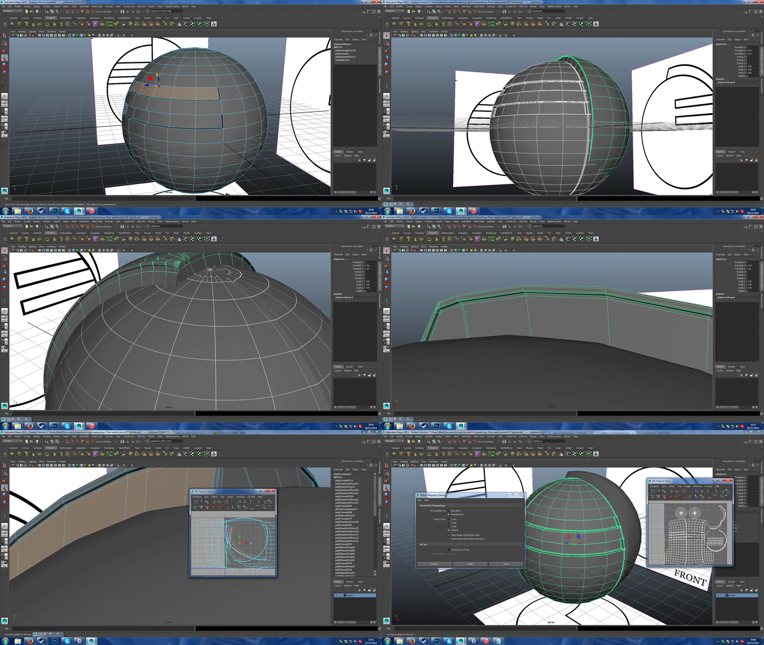
Of the current models I have, all the texture mapping I have left is the closest balcony (the one which in my concept art looks like a boat hull) and a dome to hide the joining of the sails on The Star. However given current circumstances I am contemplating perhaps dropping the boat-hulled balcony or moving it because the building it was supposed to connect to had not been built. And with the deadline approaching I am not sure if I can make it in time as well as doing all the peripheral things such as catching up on reviews, making the matte painting and assembling the presentation.
 The positive outcome of this is that the whole scene could come out less cluttered.
As in the concept I had crammed buildings in based on the blackout I
had constructed with the ground only partially seen far down below. With
less buildings, more of the ground could possibly be seen, giving a
feeling of more space in this elevated world that has been constructed.
The positive outcome of this is that the whole scene could come out less cluttered.
As in the concept I had crammed buildings in based on the blackout I
had constructed with the ground only partially seen far down below. With
less buildings, more of the ground could possibly be seen, giving a
feeling of more space in this elevated world that has been constructed.

Friday, 5 December 2014
Review: Black Narcissus
 |
| Figure 1: Release poster (Lonely Planet) |
- Native Title: Black Narcissus
- Primary Language: English
- Format: Techniolour
- Year of release: 1947
- Director: Michael Powell, Eric Pressburger
- Budget: est. £280,000
- Film Length: 100 minutes
- Production Company: Archer, Metro Goldwyn Meyer
Another dark drama. Black Narcissus is the tale of a group of nuns sent to establish a remote mountain parish deep in the Himalayas. Over the course of a year, the cohesion between them begins to break down as something about their new home (a former pleasure palace) and the environment around bring out deeply-buried feelings and desires of the nuns.
 |
| Figure 2: The palace of Mopu (Dufresne, Lebland, Vaillat, unknown) |
Its subtle but at many moments after about halfway though the film there appears to be a battle for dominance between red light and blue light, which gives a subtle feel that there are two atmospheres fighting for dominance in a given scene, these become more intense at strenuous moments but one of the most intense colour changes is near the climax when Sister Ruth faints, with the screen gets filled with an intense red that covers everything
While the nuns do make an attempt to turn the palace into a fitting house of asceticism, contemplation and charity, it is as if the world does not like this imported world and seeks to return to its old vibes of eroticism and excess, which seem in tune with the aforementioned battle between red and blue. "[Sister Clodgah] and the four sisters accompanying her are serene in their faith that they know what’s best, but they’re undone, one by one, by the altitude, the constant wind, the teeming jungle below, and by the presence of the local British land agent (David Farrar), a strapping atheist with a manly chest and short shorts" (Burr, 2010). In the beginning, the Old General offers them a constant supply of sausages. Not long after they move in, the local emissary for the general, Mr. Dean, wishes for the nuns to take in a local teenage girl who was dressing herself up in order to seek his hand in marriage. Another character, the Young General, is always seen in ravishing Indian outfits that would look more at home in the courts of the Raj than a remote mountain palace. In one scene he ends up stinking out the classroom with an imported perfume asking if the teacher likes the smell. Further in we have instances such as Mr. Dean joining a winter chapel chorus, drunk, I might add, and it is revealed two thirds though the film that SiIster Honey - who was put in charge of the house's vegetable garden - out of a supressed impulese she instead grew a variety of flowers while keeping the vegetable patch somewhere at the back of the palace.
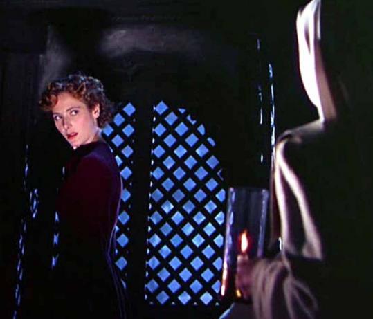
The apex of the tempting environment is the fall of Sister Ruth as she "eventually is overcome by her desire for an agnostic Englishman who
spurns her after she resigns from the Order of the Servants of Mary" (Pryor, 1947). Even when we meet her she is established though her performance as being the youngest and most naive as she makes her debut running into Sister-Superior Clodagh's office terrified and covered in blood, a mere "thank you" from Mr. Dean as he leaves begins a downward spiral of obsession that leads her to expressing herself in her room and desiring a repeat of the affections she thought Mr Dean showed for her. Her total change is into what might very well be one of the most frightening yet simplified costume changes in cinema. As at the climax, gone is her habit and we see her with permed hair and a scarlet dress. Aside from the starched shoulders this dress semms almost like everyday wear yet In terms of intimidation factor it is up there with Darth Vader's armour, and as she grows more insane the look only gets worse as her face becomes pale and her hair becomes black as night. The effect might not have been as strong or as frightening had she not spent the entire film unti lthen in a nun's habit - an outfit designed to be devoid of glamour or appeal. I suppose the effect is like spending an entire week eating nothing but porriage then on Sunday you are served pasta in sauce; it's not extravogent but because you've spent all that time experiencing something bland, your senses almost explode over even a minor taste change due to the change.
As I mentioned, Sister Ruth only gets worse "her final appearance in the film, gaunt and wraithlike, is still one of the scariest moments in British cinema history" (Bradshaw, 2005). Pale, crazed, her eyes staring with murderous intent as she sees her former superior ringing a bell. There exists a storytelling device where the villain is terrifying not only because of the atrocities they perform, but because they started off like any other person - calm, innocent, unremarkable. I suppose this connects with the "porridge and pasta" analogy from earlier, as Sister Ruth may not have been the most innocent-looking (that honour goes to Sister Honey) but she was quite unremarkable compared to everyone else and became almost like the wraith Bradshaw describes her as appearing to be; a fitting transformation to match the inner transformation from a young and ill woman into a jealous and vengeful wraith of a woman with murder on the mind.
Bibliography
While the nuns do make an attempt to turn the palace into a fitting house of asceticism, contemplation and charity, it is as if the world does not like this imported world and seeks to return to its old vibes of eroticism and excess, which seem in tune with the aforementioned battle between red and blue. "[Sister Clodgah] and the four sisters accompanying her are serene in their faith that they know what’s best, but they’re undone, one by one, by the altitude, the constant wind, the teeming jungle below, and by the presence of the local British land agent (David Farrar), a strapping atheist with a manly chest and short shorts" (Burr, 2010). In the beginning, the Old General offers them a constant supply of sausages. Not long after they move in, the local emissary for the general, Mr. Dean, wishes for the nuns to take in a local teenage girl who was dressing herself up in order to seek his hand in marriage. Another character, the Young General, is always seen in ravishing Indian outfits that would look more at home in the courts of the Raj than a remote mountain palace. In one scene he ends up stinking out the classroom with an imported perfume asking if the teacher likes the smell. Further in we have instances such as Mr. Dean joining a winter chapel chorus, drunk, I might add, and it is revealed two thirds though the film that SiIster Honey - who was put in charge of the house's vegetable garden - out of a supressed impulese she instead grew a variety of flowers while keeping the vegetable patch somewhere at the back of the palace.
 |
| Figure 3: Winner of the "1947 Most Terrifying Eveningwear" award. (Burr, 2010) |
 |
| Figure 4: From bad to worse; Ruth's final transformation and her most dreaded look ( |
Bibliography
- Bradshaw, P., 2005; Black Narcissus; The Guardian; available at http://www.theguardian.com/theguardian/2005/aug/05/3 (last accessed 6th December 2014)
- Burr, T., 2010; Faith, Lust, Madness, Humility - In Technicolour; Boston.com; available at http://www.boston.com/ae/movies/articles/2010/07/18/criterion_to_release_remastered_black_narcissus_and_other_classics/ (last accessed 6th December 2014)
- Lanthier, J., 2012; Black Narcissus; Slant Magazine; available at http://www.slantmagazine.com/film/review/black-narcissus (last accessed 6th December 2014)
- Pryor, T., 1947; Black Narcissus; New York Times; available at http://www.nytimes.com/movie/review?res=EE05E7DF173CE261BC4C52DFBE66838C659EDE (last accessed 6th December 2014)
- Figure 1: [Film poster]; unknown; Lonely Planet; available at http://www.lonelyplanet.fr/sites/default/files/20140523143517_29490.jpg (last accessed 6th December 2014)
- Figure 2: [Mopu Palace]; unknown; Dufresne, M., Lebland, R., Vaillat, J. ; The Red List; http://theredlist.com/media/database/settings/cinema/1940-1950/the-black-narcissus/037-the-black-narcissus-theredlist.JPG (last accessed 6th December2014)
- Figure 3: [Sister Ruth's Dress]; 2010; Burr, T.; Boston.com; available at http://cache.boston.com/resize/bonzai-fba/Globe_Photo/2010/07/16/1279309185_4841/539w.jpg (last accessed 6th December 2014)
- Figure 4: [Pale Sister Ruth]; 2011; B+ Movie Blog; available at http://bplusmovieblog.files.wordpress.com/2011/01/black-narcisuss-12.png (Last Accessed 6th December 2014)

Maya Progress Update: What If Metropolis

Chance has smiled upon me! I have made a ton of progress since my last update which I neglect keeping up-to-date. When I loaded up photoshop on the baseroom computers this afternoon it loaded up the screenshots I had made before Maya last crashed, which I was able to save and transfer to my memory stick. During this morning's CG Artist's Toolkit lesson I made progress with some of my smaller buildings, particularly the balconies that will connect to larger buildings which came together quite promptly.
 I also made progress with another minor but notable building, the Arrowhead; designed to go between the star and the sphere This one made me feel comfortable as I managed to assemble and UV map it within the space of 3 to 4 hours. It's close in complexity to the Beak-shaped biulding but I feel confident that I am working more swiftly as much of the work is now done.
The slowness and a feeling of pressure came from me going back to the platform and correcting the geomertry as the "mirror geometry" function had made the whole thing a mess as a few of the itnersection points combined into one vertex (I have found I can alleviate this by duplicating the object and setting the X value to -1), making triangles out of quads. There were also issues with the vertices when it came to smoothing the while thing for rendering so I ended up going back to the model constantly to tweak and sew vertices and edges which became mentally straining.
However I have persevered and all these models now have had their UV maps arranged and exported ready for texturing and rendering. There are only a couple of buildings left to assemble but they are not too complicated in principle. Other than that I feel more on track for the coming Friday. All-in-all it felt like a very productive day and a pleasant change from the progress of the last few days.


I also assembled some simple disk art that would have gone on the front of my disk. I decided on something less busy compared what I made for Invisible Cities as I get the impression this is a concept art disk. So its purpose would presumably be more about looking tidy and professional than looking flashy and eye-catching. Because I have a printer at home I can work on the jewel case cover when I have the time.
Wednesday, 3 December 2014
Project 2 Modelling Update

Construction of the hero prop is taking shape. I have a solid idea for a texture map which I will need to go about refining however after having lunch I had a bit of a creative stumbling block after making three unsuccessful attempts to start construction of the beak - all of which resulted in a fatal error when I rener-previewed what I had without changing the render engine from Viewport 2.0. The deadline is closing in and the fesire is to finish this. So I wil lsee about pushing forward.
I have made some trial-and-error progress on the silk tower but I neglected to snapshiot as I went as I constantly alternated between Maya and Photoshop. But it's mainly due to the mesh I have so I hope this problem doesn't come up when it comes to rendering these other buildings which haver more confined meshes.
Tuesday, 2 December 2014
Project 2: Tuesday Design Updates

This morning I decided ot set to work o nthe diffuse map for one of the city's skyscrapers. Just before i started I recalled ot myself that rarely are the surfaces of even the most pristine and seamless skyscrapers ever a single uniform sheet. So I set about designing a more true to-life appearance where part of the resulting texture would come from the seams between the panes. For the final image I do plan to tone down the grooves so that they don't completely drown out the. look of the panes.
 The hexagon idea may be a bit spur-of-the-moment and I might or might not not carry it though with the rest of the city, the idea being that this is an aesthetic city so your typical mass of square panes felt dull to the eye. Hexagons provide am ore intriguing look as they "slot in" to the sctructure far more easily and effectively and maintain a stronger structure than a square frame. Along with toning down the grooves, I plan to add some more visible framework to break up the current look and giving the windows a little glint.
Due to the highly reflective nature of glass, a blinn shader or chrome layer would be useful to bring out its scheen.

After watching Suspiria I headed dow nthe the baseroom to spend a couple of hours on The Star, reworking what I had doen so far, one of the majore features of the new model being a kind of balcony wall around the outside so peopel won't fall off. After UV mapping this one spoke, I duplicated it with the others and combined it all with the disk in the middle to create a single contiguous surface in which I will place the texture maps for the surface of it. After finishing these I moved on to the building at the back and after working on the balconies I think I should be able to quickly build up the shells on top of the biulding.
Monday, 1 December 2014
Project 2: Further Production Art

Creating these kepy production images has helped a fair bit in working out the right colour scheme for my buildings, as well as pinning down the finer details. It's hard to see but I also added a miniature figure next to what have nicknamed "the silk building" on account it reminding me of a fold of fabric. I'd considered a greenish/teal colour for the windows after looking back on my colour considerations for the star platform, while also maybe being inspired by jade - a precious form of rock that is both highly valued and closely tied to China and the surrounding countries. It rose to become treated as something akin to a combination of alabaster and gold in the Mediterranian; precious, beautiful, and carvable into all manner of wondrous shapes. Although I do wonder if I run the risk of the colour looking a little sickly.
 I also wondered about incorporating a little organic into the structure, as the idea I have proposed for Huabanliuyu does make it sound like the residents were inspired by plant life just as Philip Treacy was inspired by nature's patterns and structures when it came to his hats. There's still a bit of work to do on the platform (the legs for instance) but I do feel like I am further cementing my visual image for the city. I might in fact go for the Silk Building to be my test prop, as it is both present as a foreground element and the design is a lot simpler in its geometry than the star or the platform.
Friday, 28 November 2014
What If Metropolis Project: Part 3

It feels embarrassing but I decided ot restart this tower again after trying what I considered doing in a previous blog post and it is all because of the focal point caused a few issues with the arrangement of the edges radiating outwards. This time I tried a new technique involving the cut faces tool to create something that resembles a Spirograph creation.

I became vastly more familiar with the "merge components" function during this session as some pieces were disconnected from the edges and I could more easily create what Maya's render preview function would recognise as a contiguous surface.

Using the extrude and edge loop functions I was able to extract the geometries that I needed for the top of the building. I also have to construct this bearing in mind that there are two similar buildings that will be in the composition; one that occupies the foreground and one that occupies the midground, meaning I may eventually have ot design a more detailed version of the building.


After mapping the UVs for this building, which is probably the best out of all attempts, I moved on to tackling the "star" prop of my composition. Working on prior buildings helped a long way to familiarise myself with the tools and skills that I would have beeded realising it but it is still far from done.

Utilising the skils I acquired from creating a symmetrical structure with the platform, I made use of the mirror geometry tools and mirror cut tools to create a ring of eight petal-shaped outcroppings to which more planters will be placed.

Production wasn't perfect, as I made four separate attempts to create a design with minimal clipping but I eventuall managed ot settle on a technique that involved a 24-spoke cylinder in the centre. Each petal would have two edges meeting it, I duplicated the petals (which unlike the main floor I did not scrap at any point), I would look for the line of intersection and, from the centre of the cylinder I extended a "cut faces" line that bisected the two petals. I then removed the clipping faces, neatened up with some careful application of the translation tool on the misaligned vertices.
I then removed half of the petals and mirroed the geometries. As luck would have it, the while thing snapped together beautifully.


There's still a good deal of work to do however. For one, when I preview the renders, all the petals split at the seams so I will need to connect them all up. I'm trying ot avoid crazy hours like 2 in the morning since often it caused me to wake up late. Despite how tempting it is to keep working.
Review: Edward Scissorhands
 |
| Figure 1: Poster (Ebert, 1990) |
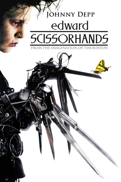
On the outside, Edward Scissorhands is a tale set in a colourful mid-century American suburb, about man with strange ways trying to fit in with the world. But the film holds a much darker tone when you look at it properly, with examinations of consumerist culture, prejudice and the pressure on those who are "different" that is backed by a haunting score by Danny Elfman.
The film starts with a kindly old woman tucking her granddaughter into a rather large and plush bed who tells her about where snow comes from. We are then given a rather strange and possibly creepy montage of working machinery, industrial themes, scissor blades and then... gingerbread cookies, culminating in a still of Vincent Price as the inventor the woman talks about In the beginning. After this we-hard cut to a picturesque American suburb of pastel colours and matching dresses where we are introduced to Peg (Dianne Wiest), the town's local door-to-door Avon representative. It is here where one of the chief themes of the movie comes in, as she is immediately rejected by the neighbor she visits because she is fine with what she was given last year and isn't that interested in "this year's line", and it turns out Peg visits every home around the suburb apart from one woman who lives in a house of burgundy who we are introduced to via seeing her play a synthesizer organ.
Desperate for sales, Peg decides to try the quite-obviously-creepy-and-unnervingly-contrasting mansion at the end of the road. At this point Peg does what the first person of every horror story seems to do and drives up to the front door of the creepy house and decides to explore without considering the fact she's trespassing or what awaits inside the creepy house - granted the front garden offsets this with an immaculate display filled with huge and beautiful topiary plants of such things as a sea monster and a giant hand complimented with colourful flowers. She continues the cliché by effectively entering without permission and goes up to a derelict room with part of the roof missing. Lowering her guard to see a collection of newspaper cuttings revolving around hands.
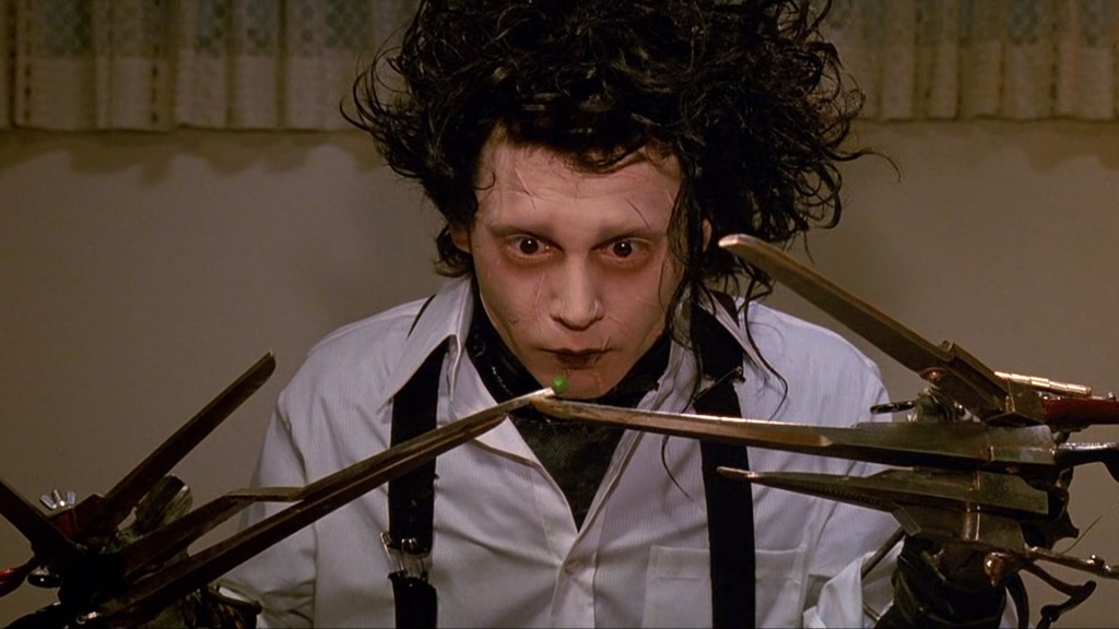
It is then we meet Edward, played by the master of eccentric characters Johnny Depp in his breakout lead role as the protagonist of the film. "Edward is a disarming waif with his white Kabuki makeup and wild nest of coal-black hair, and his mild-mannered temperament is directly at odds with his deformity" (Kempley, 1990), in short the kind of movie monster you just want to give a hug; His first physical interaction with Peg (letting her dab some makeup on his face to help cover up his scars) establishes him as a guy with a heart. Edward is described as being "almost complete", and it shows in more than just his hands. His movements are stiff, he speaks with a very calm and innocent demeanor and never raises his voice, when he stands its often with a slight backward arch in his posture and when his hands are not occupied there's this constant clicking and scraping as his blade-like fingers constantly twitch.
 |
| figure 2: innocent comic relief or Burton trying to guilt us about laughing at people who are different? (Le Blow) |
 |
| Figure 3: I swear Indiana Jones escaped somewhere like this via flying refrigerator. (Linekogirl, 2012) |
The film takes a much darker turn from there as Edward becomes very uneasy about how people begin treating him. Suddenly the entire neighbourhood aren't his best friends anymore - which for someone who I suppose never really had any friends until now, is a very big deal - He tries to make amends by showing off another talent - Making ice sculptures. Kim finds him brooding and performing stress-relief art and finds something magical in it, eventually getting noticed by Jim who went chasing after Kim. An accidental flick of his blades and he's on the run again which culminates in a period that is both frightening and heart-wrenching as a heartbroken Edward rampages though the suburb mutilating his topiaries and giving the only woman who hate him a good scare with a very frightening-looking topiary in her window box. There is a moment that shows he still has heart as he saves Peg's son from getting hit by the police car. In panic, the boy thrashes about as Edwards tries ot comfort him and ends up cutting his face several times, damning Edward in the eyes of the crowd around him and forcing him to run.
 |
| Figure 4: Jim's good-looking, possessive of his girlfriend, self- centred, cocky and a rebel. Our designated antagonist. (Sankles, 2014) |
In a film like this, to see a life being taken (even if it is that of an unlikable jerk like Jim) is so heart-wrenching it brings a tear to recall. Depp's innocence throughout as well as the possible accidental-way the coup de grace is done probably sells it the best, as well as the possible thought that despite his extremism, Jim was just a dumb kid who got too in over his head. I suppose he did have reason for these feelings; this fairtyale-like stranger effectively stole the heart of a girl he'd been romantically involved with for years, even if he didn't deserve her in the end he was probably too overcome with jealousy and heartbreak that he couldn't bring himself to step back and realise what he was doing.
Roger Ebert however, disagrees there was a place for such a death in this film largely due to how shoehorned it looked; "Burton and his writer, Caroline Thompson, go on autopilot [two thirds of the way through] and and paste in a standard Hollywood ending. You know what that is. The hero and the villain meet, there is a deadly confrontation, and no prizes for guessing who wins" (Ebert, 1990). It was perhaps the dissonance of the scene compared of the rest of the film as Edward had done nothing intentional to Jim to drive him to murder unlike in your standard action climax where the hero finally gets his/her chance to end the villain's reign of tyranny, madness or cruelty.
Bibliography
- Thompson, C., 2011; Edward Scissorhands 1990; Geek Speak Magazone; Published February 2011; http://geekspeakmagazine.com/archive/issue12/reviews/movies/marathon/edward_scissorhands.htm (last accessed 28th November 2014)
- Berry, J.; unknown; Empire's Edward Scissorhands Review; Empire magazone; http://www.empireonline.com/reviews/review.asp?DVDID=6549 (last accessed 28th November 2014)
- Kempley, R., 1990; 'Edward Scissorhands'; Washington Post; published 14th December 1990; http://www.washingtonpost.com/wp-srv/style/longterm/movies/videos/edwardscissorhandspg13kempley_a0a0bf.htm (last accessed 28th November 2014)
- Ebert, R., 1990; Edward Scissorhands; Roger Ebert.com, Published 14th December 1990; http://www.rogerebert.com/reviews/edward-scissorhands-1990 (last accessed 28th November 2014)
Image References
- Figure 1: [Edward Scissorhands Poster]; Roger Ebert;1990; http://static.rogerebert.com/uploads/movie/movie_poster/edward-scissorhands-1990/large_aK5Giop6mfyXhv3sFGgMZwVZqdh.jpg (last accessed 28th November 2014)
- Figure 2: [Edward eating a pea], Le Blow; http://leblow.co.uk/wp-content/uploads/2012/10/edward-Scissorhands-1024x576.jpg (last accessed 28th November 2014)
- Figure 3: [The suburb]; Linekogirl; Wordpress; 2011 http://lilnekogirl.files.wordpress.com/2012/08/edward-scissorhands-02.jpg?w=436&h=181 (last accessed 28th November 2014)
- Figure 4: [Jim]; Sankles; 2014 https://blogger.googleusercontent.com/img/b/R29vZ2xl/AVvXsEijMxADHmU5IkNOd2IsUKa2a2VCNzspH3pc4bce4S8mmddaf0HFffdeDfKqn5dhfCfg-uGUzJSPs6JjeQ4MJCl04TfW_WP7Et88iToq4FcbgurdeqVAm59YoFz1ECikKIGD_zoEGRu5ysE/s1600/edward+scissorhands55.jpg (last accessed 28th November 2014)

Thursday, 27 November 2014
What If Metropolis Progress: Modelling part 2

With the Zoatrope done I decided to move on with my projects and continue work on the final urban scene. WIth the platform msotly complete I decided to move on to the feet which will plant the building firmly (if possibly precariously) on the ground although that part won't be seen.

For the rear foot I decided trying a more composite shape, I cut a cylinder in half, cut the forward face off a cube and stiched them together, exploring the various tools to try and fix them together, eventually coming across the "combine" and "merge components" tools and after playing around with the settings and highlighting what I wanted, I managed to successfully sew them together, a trick I ocntinued with the platform later on as what I had created the other day was, in my mind, very messy; three different components slotted into each other, mirrored haphazardly and with all sorts of unneeded debris inside. Thiss took a couple of hours to which I familiarised myself with the snap-to function for the translation tool and altered a lot of geometry before finalyl creating the UV maps for the whole thing.

The building on top was, thankfully, relatively simple to make, it has no base and sits on top of the platform. When it comes to texturing I think I might have to include the roof with the exported UV map for the platform itself so that I know where this part of the building is when it comes to arranging the flowerbeds that are situated on top of it to for ma roof garden (which due to the distance from the final scene's camera I will kep it as a texture map).

The platform itself was still a little messy so to save myself time, after cleaning up the
interior and making sure the whole thing is one contiguous model I
sliced it in half and mirrored the geometry down the middle. Endsuring
for a perfectly symmetrical structure.

By about 7:30pm I figured that the Maya work for this platform was just-about done.
My next task for this would be extracting the UVs, creating texture
maps and then using those to create bump and specular maps to give it
depth. Then it will be roughly ready for installation.

Potential masochist that I am I decided on my way home that finishing this one building was not enough but in leaving i only realised part way back home that I had left my progress saved onto the network (which I can pick up tomorrow) so rather than continuing with the model I thought I'd try a different structure at home - namely the skyscraper behind the platform.

I must restarted about five times with this one due to the tricky shape of the gap i nthe middle. Starting with a cube then switching to a circle and experimenting with various ways I could slice it open. Eventualyl I did so, extruded out a hole i nthe middle and then cut out the bit I had extruded far below the model itself.

When it come to shaping the horizontal planes I think I screwed up somwhere because after shaping the front, Iended up shaping so the tower's interior also went inwards, which it doesn't on my orthograph. So after a couple of attempts to rectify I figured it might be best to work that bit from scratch. Fortunately I had yet to remove base of the model so my plan is to duplicate the geometries of that, extrude it, extend it and then morph it.
Monday, 24 November 2014
First Steps to CG Reality

Today I finally start modelling and, surprisingly it feels like it is taking solid shape already. After coming in and unsure how to start, I talked with Jordan and he suggested blocking out the basic shapes I need for my scene. I was initially worried about the number of models I have planned but not all of this shown is going to be a 3D model, particularly towards the back.

After Jordan showed me some basics when shaping the scene, I took a couple of steps to refine it ready for my first detail models. Before I moved on to such things though, it seemed best to work out a lighting setup first while the whole thing is still pretty low-poly. Thus it was very useful that this was on Monday and Simon gave us a lesson that went nto detail about lighting different times of day (in my case morning or evening lighting tips are probably best, but I've always figured learning how to do a midday scene was considered the first steps in lighting a digital scene.)

As I said I was worried about the level of detail but one of the beautiful things about such a distant shot is that I can probably get away with portraying smaller details such as lamp-posts, shrubs or street furniture as being textures or bump maps.

There is an ambient occlusion node here though I cannot quite recall if it was this last frame or if I had progressed further. When it comes ot texturing I may have t odial down the colour intensity of these lights so the whole thing doesn't by the end look like the city was drenched in orange juice.

Rather than building my hero prop first I thought it was probably best to create one of the other buildings to test out texturing, lighting and modelling rather than do it with my hero prop in case I mess up, Though I wonder if at the moment it's too complicated. I'm building it as an organic structure, certainly, but I suppose one question is how detailed should I get? Its not too fiddly a design as it is relatively flat at the top and there's not too mcuh going on underneath aside form some very organic curves, but it is still quite a chunky design at its heart.

From the wireframe Ican see it is farily complex, but I suppose that is what these test models are for. Though I concern myself slightly with the complexity of the UVs as the UV maps in the previous scenes I have done have been reasonably simple, and the most complex thing in the Old Alley ended up being coloured with a shader. One thing I have noticed is that probably due to my own inexperience the model hasn't come out exactly like the orthographic views. With all the curves I have in my city I wonder if I should add some curve guidelines so it is a little easier ot map out my curves in Maya when making future models (something that, in thinking about it, might help a lot for things like faces and limbs).

Subscribe to:
Posts (Atom)