Showing posts with label idea generation. Show all posts

Monday, 18 March 2019

Return to Architecture with the Fundamentals of Castle Design


  When I hit a rut with character design recently I took a new approach after some refresher time with one of my favourite genres of video game: The city/nation builder. It gave me time to reflect on what I was interested in with 3D design. While I am still willing to happily dabble with character design, I've realised that I've been deeply fascinated in architecture.

  Going back to those roots I continued a fantasy theme by taking on the design of a castle. These are quite fascinating buildings that entertain a passion I've had for cities. A castle is not simply a structure in and of itself. It is a form of settlement, with the lord's keep as a centrepoint but can host several other separate buildings like kitchens, stables, doctors, places of worship, gathering centres, armouries, barracks, prisons and guest houses.


  They were designed as places of power. Centers of control for a local lord and a headquarters for a local garrison. From the first castles of the 11th century to the chateau-forts that followed the dominance of the cannon and the subsequent obsolescence of their ability to protect. Their design varies wildly from location-to-location. Climates and availability of materials can greatly influence their design. But they also have a particular fondness in role-play gaming like the tabletop or computer RPGs as somewhere for players to call home. Not just because of the prestige of the structure and somewhere to receive guests, but the aforementioned fact they contained many facilities from stable to kitchens, putting everything an adventurer (or adventuring group) would need in once place.

  In short, nothing seems to make a player feel safer than to be within two or three layers of curtain wall and all the resources they could ever need to keep themselves supplied and prepared.


  At present, the only part of the current fort I dub "Castle Ridgewell" near completion is the curtain wall. As I wanted to balance between fantasy and realism (in a Game of Thrones kind of way), I pored through just what kind of tricks were used in the construction of the typical castle, and what architectural features were common as these were primarily fortifications.

  I've had to bear in mind the thickness of the walls, the use of machicolations (an afternoon's work by themselves), where any potential enemy might reach the walls. Layers of defence, how to funnel various forces, defensive tricks and the strategic location of various assets. This is still a home, but one that needs to be well protected.


  This particular example is imagined as something that has been held by a family for something like four generations. Not obscenely wealthy as the owner is something like a baron or a count, but with a home in a key position on the borders of the kingdom. Not luxurious, but definitely heavily reinforced. So my plan is to not go crazy with curtain walls even though further walls can be made by recycling the assets I have already designed. The towers for instance, can be switched form being enclosed towers to open at the top (though how this is done I should have programmed in before duplicating).


I have considered roadmap for the castle's development giving me an idea of what to do next:

  • Redesign the keep's layout.
  • Block out outer defenses.
  • Block out resource buildings (chapel, blacksmith, granary, armoury).
  • Resculpt rock face in Zbrush.
  • Block out possible props.
I plan to stream the project's progress for anyone interested in watching this come together. I've got the software for it and it's good to get what I'm working on out there. Star Drake Projects will make a comeback after a long while of inactivity in the near future.

External sites

Tuesday, 13 November 2018

Four Redone: Building a Better Base


  The last couple of weeks I have felt invigorated to return to developing my first proper story. Which so far has played out in the for mof a revision to the environments I had designed originally. With confidence I've found I am much more confident creating detailed models while also playing around with tricks to get the look just right. Right now the main work has been on the texturing for leather and some of the walls. Some of these kits were arranged to share textures for ease of rendering.


  It has also been a time for inspiration. Today came flooding with ideas on what the chambers such as the biolab could look like with a little bit of polish and planning. I had strong inspirations from 2001 A Space Odyssey with this approach, which could give a lot more character to Ceti Base's airlock and layout even if the design will also be staying mostly true to that 1960s and 1970s space aesthetic.

This time around I definitely plan to add a few more doors so the whole place doesn't feel like a series of tunnels. Maybe some furniture for the airlocks like spacesuit racks or some corridor furniture like trolleys or scattered cables. I'll look into that. For now the priority has been on a look for the rooms themselves.

I'm planning to keep at least some of the basic layouts.


Tuesday, 1 May 2018

First Week with Zbrush


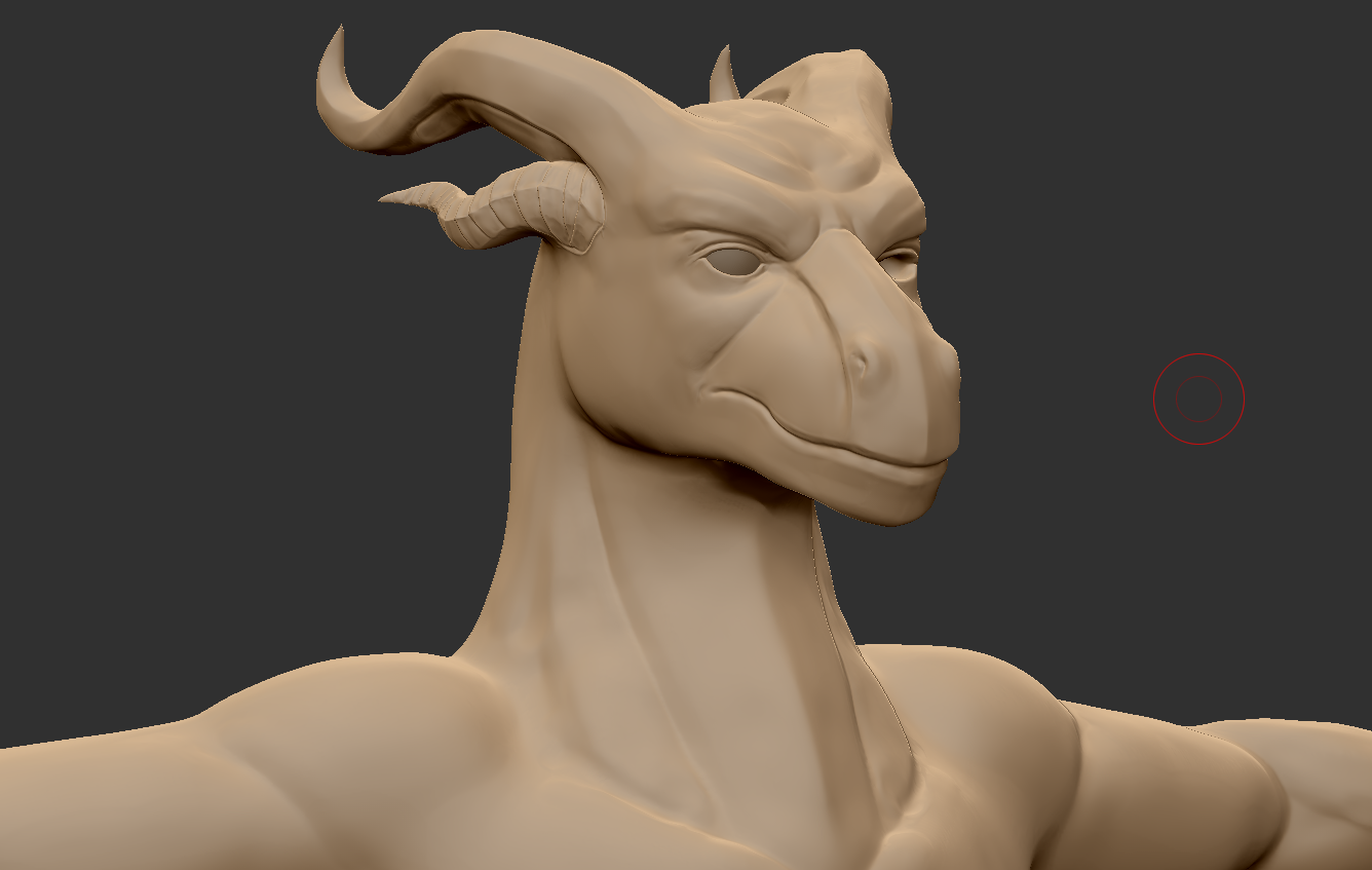
  The past week or so I've been experimenting with Zbrush. It's quite advanced compared to Mudbox and I can see why a lot of studios are asking for experience with it. It's versatile, complex, and I've found I can get an outline of something after about half a day of working.


  So for now I've mostly been trying to see what I can make out of a single ball. As I had hoped, my experience with Mudbox translated well. I've yet to try texturing, that's going to be something of a later stage experiment.


  Considering how long it has been since I last touched sculpting software I was slightly surprised at how well I was able to create a face I've had people describe as handsome and good-looking, That's likely a very good thing when this is my first attempt at human features and started out with a generic template head. The drawing classes  msut have contributed considerably to that.


  Overall, I've enjoyed the product so far. Really glad I invested in it. I've already been asked by friends if I could sculpt their own characters with this, which means I'm either appealing to eager friends or I might have a creative skillset I can really sell.

Friday, 30 March 2018

Personal: Monsters Misfits and Serpents


  I promised myself I'd try something a little more alien and out there and for the most part I think I'm on the right track.some of these still have that dinosaur DNA but others (my particular favourites of this being 3, 5 and 9) are more bizarre, more something unknown.

  I believe there is enough character in each of these to tell a story for each one. What they are like to speak with, what their tastes are, maybe even what they consider to be artful or in good taste. I've grown to like turning rough shapes into creatures, a few of these I had a clear picture in mind but others started off quite vague and abstract. 9 I believe was quite random to begin with and some unexpected things came out of 5's outline.

At a pinch, it is possible that all or most of these could exist within the same universe, perhaps under the same banner.

Friday, 5 January 2018

Crest Design Experiments


  Taking a minor break from writing I was sorely tempted to go back into logo design. What I had in mind was a bit more elaborate than a typical brand logo and more of a crest or insignia for a nation. You have to start with the basics, which in this case was the core element. For this insignia the core would be the arms of a galaxy, representing the nation's dominance or an assertion of supremacy.


  I went though a few revisions, settling on something less angular and blocky. The other core were the four great vassals of the nation, which would be represented by how they are bound to the galaxy in the centre - the core and the home realm. The gem at the top felt less cliche than two heads looking in opposite directions, and helped to congeal some of the other elements.


  This was all based on a drawing I had worked on ages ago that was supposed to be a coat of arms. I never really went back to it. This insignia could perhaps be depicted everywhere - against starships, on offical forms and declarations, letters, tanks, aircraft, pretty much something that could be stenciled or easily applied.


Saturday, 30 December 2017

Today's Post is Rated D for Dwarf


  Over the summer I had taken the interest in Dwarf Fortress, an indie game that despite the use of ASCII-based graphics is incredibly deep. With experimenting in fortress designs (the game encourages players to design everything from water systems to complex traps and even optimise architectural layout for maximum production of goods) I got inspired to bring my designs to life in Maya.


  I thought it would be a good chance to try out Maya Light 2018 after concluding that if I want to go commercial with anything, I need a proper license to make a commercially viable model. There might be some omitted components such as the water channels that bring water into and out of the fort and the road entering the construct itself.

  Important areas like the workshops or the temples and taverns could also be designed. Because this involves Dwarves it's all a primarily-underground structure; so it will all be cavity spaces. Today alone, I've only laid out the outline and some basic elements for the main concourse. From this chamber can be found ramped passages to the different levels and thoroughfares into the various annex chambers like the workshop main floor or the dormitories.


  Dwarf Fortress's grids are vague in how much space they occupy (a rat and a bronze titan both occupy one square, but can't occupy the same square, which means that a hydra which is presumably the size of a small house can fit though a Dwarf-made door) but there is a guideline that each square can be extrapolated as a 2x3x2 metres in the XYZ orientations used in Maya. So for ease of design each square in Maya's grid will be imagined as two metres in length and height.


 The game is also interacted with in a top-down view so there is absolutely no information when it comes to ceilings. For this, I have full freedom to create anything form flat slab rooves, beams and vaulted ceilings which can also add depth and scale to the structure.


    Alongside this I got back into more building work, another palace layout that will be inspired by the style introduced by the French Second Empire such as angled rooves


  I might tone down this structure compared to the last attempt. Working on Four I've developed a new appreciation for spatial awareness and designing structures proportioned to fit the inhabitant from the start rather than halfway though.


Friday, 29 December 2017

Badge and Emblam Ideas


  As the new year approaces, I have lately been pondering writing. It was one of my strengths at university and before and I've been really getting into writing regularly over the summer. Although I didn't quite live up to my "nulla dies sine linea" goal ("not a day without a line"), I appear to have taken a new motto: "not a day without a word."

 To accompany a possible publication (which is in a state of revision for final publication) I picked up a stylus and powered up Photoshop to do some drawing as I like to combine words and images. In this case the goal was a logo for an airborne military division that is the centrepoint of the story.


  I decided on something more elaborate to separate from more tried designs and try something distinct, the central idea being the wearers of this symbol, these badges, are heroic fighters who fall from the sky and turn the tide. "decisive" "falling" "speed" and "celebrated" were key words that rang though my head over and over while I was designing the emblam. The initial ideas for the design (above) just didn't feel right for the society portrayed in the story, so I moved away from sci-fi and looked at paratrooper badges for inspiration.

What I have may change over time as who knows what could come from this.


  I might go back for some character drawing as the t-shirt sales plan came back. Although thinking about it, this emblam could look nice on the front of one. Maybe accompanied with a phrase from the book "strike hard, strike fast, seize victory." (might revise this)

This could be why I've been quiet for a month.

Wednesday, 13 September 2017

Huabanyouliu: Revising an Old City


As I looked to the future I had a suspicion that I may be looking for a job for a little while, so to keep my skills sharp I went back to an old design, the city I built in my first year with fresh ideas to make it more convincing. Maybe more expansive or more true to something Philip Treacy would design, as while the key buildings are certainly Trracy-like, I feel the rest of the cityscape could do with a more true-to-his-work look.

It's only a blockout so far, but going back to my inspirations I have a few new ideas for the city's layout.


  I went back to my old inspiration, the Zhangjiajie Forest National Park in China where the city was nestled in the pillar-like mountains to look for ideas on layout and construction. Maybe the mountains form part of the city itself. The original city's design involved many platforms, elevated psaces for people to move and interact. The mountains provide a perfect preface for such vertical construction, a foundation as the city reaches out into the air, it's people rooted in the rock but living among the clouds.

  Key structures will be installed, of course - the opera house and some of the platforms will remain as they are symbolic features of the design as it was during my final submission. I might not get to populate it, or expand it as more than an empty city once vibrant, but it's a wonderful exercise to fill empty time.

Zhangjiaje, in particular some rock formations that might work very well in the revised city. (Amusing Planet, 2015)

References


Sunday, 26 March 2017

Four: Art Of Draft Page


I have started animating (more will some), basics but mindful of time I looked into creating a first draft master spread for the Art Of document.

The idea I have had discussed is that the Art Of resembles a dossier, a document on Four herself and the research on her, so I went with the idea of going for something that looked somewhat official. The stress David feels as the story progresses would manifest in this document as more hastily-constructed pages with more post-it notes, tilted images to reflect the pressure he is under.

Wednesday, 16 November 2016

Major Project: Four's Pretty Teeth.


  She feels so close to completion now. Using a few edging tricks I was able to give her antennae a bit of intrigue by giving the ma flat edge, which makes them a little less tentacle-like but I think it adds a small quality to it. Her eyes also have my tilt. I think I've hit the right angle this time around. Any further and she might start looking more like prey than predator.


  Today's main priority however was her mouth. Looking at canine teeth sets I made an attempt by adding teeth to her gumline. I'm not fully happy with the outcome, it feels a little rushed but it does lok rather nice when opened up like below.


  I might look at fish like piranhas and sharks for ideas on how ot arrange her teeth, although I sort of like the presence of prominent front fangs.


  I'd love to see how this will look when fully operable with the outer jaw but the model has yet to be rigged and skinned.


  Designing these teeth however  I got the impression her jaw was rather low. Duplicating the original mouth cavity just in case, and keeping a backup head on standby, I've raised the back of the mouth ,mainly around where it meets the corners. The gums will need raising but I think this will help the mouth feel fuller.than at first.


  The original jawline sans tongue. To me the bacl end felt a little too low down. Although in retrospect maybe the lips in the remodeling above could be moved down slightly. 


Thursday, 27 October 2016

Major Project: Final Designs In Sight


  Today's priority was getting a final idea for what Four looks like I looked back on fighting fish and, entranced by the draping silk-like tails they had looked into giving something like that to Four. As can be seen, there are shades of dilophosaurus in some of the drawings which I want to avoid (this is mostly due to possessing similar frilled crests.) the main difference I think is Four's is a lot more swept back. It would give her an edge in swimming. I don't want ot go too overboard with the frills - these will likely be animated as ncloth materials in the animation (so lots and lots of flow!). Too many frills and she might lose her shape in the action. But I believe the most successful adult form is 78. 83 and 85 I believe were fairly successful bust shots.

  Perhaps she can retract these sails. We see this shape in its full glory during her escape. It makes perfect sense that she escapes from captivity when she is in her most impressive. She is at her most beautiful and David sees this. As well as this, I looked at the juvenile, which will be a much dumpier and less attractive look. While the adult is inspired by Asian fish, otters and ferrets, the juvenile was strongly inspired by naked mole rats and axolotls.

What is probably needed now is a final concept piece. I have plenty of thumbnail material, now would be an extremely good time to set to work on the final design.

Tuesday, 25 October 2016

Major Project: Developing the Alien Forms


  Looking to get back into my stride, I have set to work on the finer points of Four's design. As well along with a contact sheet which explores the larva's anatomy, its skin folds and what could be done for the eyes and mouth, I also looked at some possible cocoon forms 


  Designing Four's adult form I have decided to splice the marine creature and the brown lizard creature from the previous thumbnails, I'm playing about with fronds however at the moment they look a little like dragon horns. This is a hurdle I have encountered due to the axolotl inspiration. It may pass when I look into drawing heads to get an idea of head structure and facial expressions.

  At some point during the week, once I have a better idea for Four's body, I will consider a contact sheet of colour tones. I've started getting ideas for the juvenile form from designs made today. But I feel the grub/larval form is at a state it can be signed off after a few other orthographic sheets are made for the other potential angles.

Wednesday, 12 October 2016

Major Project: Refining Concepts


  With some progress in finding voices for the project, and with the concepts for the base gradually crystallising, progress can be made on the finer details. Looking at floor plans from Space 1999 and 2001: A Space Odyssey I gained an impression that the 1970s were a period of open spaces and neatly organised furniture. Everything in the future was tidy and organised, with strong lines and an emphasis on comfort. I was told one fashion of the 70s in science fiction was padded leather panels. In hindsight a rather peculiar material to coat your walls in but then again the modern perception of the future promises walls made of either glass or plastic so I suppose it was a quirk of the times.


  Four's adult forms are coming along mentally but one priority is to work out what the grub looks like. I had considered there could be a degree of translucency to Four's body so I had a bit of fun working out where all her organs could go. It was then I struck a few ideas for a few anatomical elements to make Four alien. She could have her nostrils on her back or on the back of her neck while her skull has a bulbousness to it that could extend into a crest.

  Four's grub form got me thinking on the juvenile and adult anatomies. I'm thinking a touch of fox and a touch of otter into her genetics, so to speak: An elongated but bouncy hunter of small animals with a nice fat tail and plenty of agility. This is something I could explore with silhouettes as I develop the other forms. My primary goal with these drawings was to work out the simpler of Four's forms. The cocoon I realised could be more shaped by Four curling up.

  Researching an influence for Four's larval state I came across beetle grubs. Two things caught my attention. The first is that ground-dwelling species like the Goliath beetle and the Japanese beetle lay their larvae in the soil, where they live curled up until they mature. Once they develop into adults, they crawl out of the soil. The second is that some species, like the aforementioned beetle grow enormous as grubs. Some can be large enough to require both hands when being held.

References

Wednesday, 5 October 2016

Major Project: Early Base Thumbnails

  With the design of Four underway I decided to turn to the other key element - the base in which much of the story would take place in. To get an idea I kept to items rather than diving in and drawing rooms - chairs, tables, desks, computers, then moving on to doors and corridors.

  I was inspired by Moonbase designs of the 1970s and one inspiration that cropped up was Space 1999, A British science fiction show about a research station on the moon. Near to the end of the sketching session I came to a realisation about the moonbase shots I was looking at: They were all very clean. But they all felt a little too clean for a base that was supposed to away from Earth (the plot mentions a nuclear explosion sent the moon out into deep space); there was no clutter, no wear-and-tear, no panels kept loose for convenience, it was like the very white base was scrubbed and cleaned daily despite an omnipresence of huge panel lights.that dominated all the walls and the lack of regular supplies from Earth (The USS Voyager at least turned its cargohold into a greenhouse).

  One of the things that will occur early in the story is the viewer will receive a guided tour of the base, which could be when we see the showroom-clean version. But the base that we see throughout the story has a bit more of a lived-in look. Clutter, post-it notes, coffee stains, mugs, loose pens, whatever I can think of to give it a sense that people have stuff and that this place is their (at the very least temporary) home.

Tuesday, 27 September 2016

Major Project: More Logos More Creature Heads


  I got drawing more logos but I feel like I'm honing in on an idea. I was drawn to the W-X combinations like 29 and 37, but also the iconography of 25. I think I can make the W-X combo distinct. I tried playing around with alternatives all the while thinking of how other companies manage it. While the common theme is it's simple and straightforward, designs themselves vary wildly from monograms (Volkswagon,Uber, Virgin, AOL, First Great Western) to iconic (Monsanto, Lloyd's, Birdseye) to abstract (Amtrak,, Ubisoft, Legendary Pictures, Mercedes-Benz). Abstract icons are interesting as there is imagery in their logos. Maybe Smithston-Wessex could simply be something like "Wessex Frontiers" or "Wessex Frontier Interests".


  As suggested by Phil, I spent the afternoon watching Splice. I thought it was going ot be a standard Alien-esque haunted house film due to the marketing angle (the back of the jewel case for instance has such lines as "an uncontrollable mistake that's about to break loose and rip their world apart into tiny pieces"). But it wasn't, and chimed with my story much more closely than I expected. I might have taken inspiration as the creature in it started off quite alien, but over the course of the film developed into something much more human. Its almost a shame the creature developed the way it did as earlier instances such as its baby phase and the first creatures shown - the latter of which were practically blobby translucent slugs - were much more bizarre. But I can understand why it developed the way that it did, as the story had tones that related to parenthood and growing up.

  The themes were there, and I find myself likely to take inspiration away that will help a lot on this project to sell a convincing creature design.

Monday, 26 September 2016

Major Project: Initial Creature Design

  Today was my first minor project tutorial and the general gist was that while the script is getting there, it is coming up time to consider my world and my creature. While I had some early sketches, there was an issue that they all had some regality to them. Which is the opposite kind of response to the creature that I am after, as it is supposed to be only the scientist that admires it.

 Extending from the larval form, I looked into creatures like the Tardigrade or water bear. One of a number of micro-animals; creatures so small they can only be seen with a powerful microscope but this is to their benefit - they look incredibly alien and grotesque. As along with standard insect elements, the bodies of these creatures often feature large prominent hairs. The use of micro-animals also allows me to better explore any development of the grub phase as the grub elements can echo in the juvenile phase. I might be able to assemble a creature using bits of various micro-creatures, as they tend to be quite compact.

Friday, 23 September 2016

Major Project: Initial Influence Map


  With the script well underway I decided to assemble an influence map for it. I looked not just at visual influences, but story influences too. For the base itself I am tempted towards that 1970s moon-base vibe or maybe something a little more industrial. I'm still keeping away from the sterile iPhone-esque designs that are hallmarks of modern science fiction and felt the moon-base ideas of the 1960s and 1970s were an apt inspiration, as they echo the sort of enthusiasm for reaching away from Earth that Smithston-Wessex want to evoke with their goals.

  David's attitude towards the creature late in the story do echo how Ash from the 1979 film Alien felt about the alien creature brought aboard the Nostromo. Like David, Ash saw a beauty underneath the alien's horrific exterior. In Ash's case it was a twisted kind of appreciation (he considered the creature 'pure'; untainted by notions of morality). Though it feels coincidental David shares his name with the android from Prometheus (2012). For one thing the David in that film acted more like Pinocchio.

EDIT 23/09/2016: I moved one or two of the influences. I felt the way BioShock (2007) dressed its sets was more of an influence on my direction than sharks at the London Aquarium.

Thursday, 22 September 2016

Smithston Wessex Logo Experiments

  This morning one thing cycled though my mind: I started wondering about a logo for Smithston-Wessex (Theme-wise I suppose it makes some sense the art-of document looks a bit like a corporate brochure or report document. So this logo would appear on the corners of pages.

  There is a lot of experimentation with the W because David works more specifically for Wessex Biowonders. But I wonder if a renaming is in order as there's perhaps too much of a Weyland-Yutani vibe from the branding (1, 7 and 12 especially). Though I may keep the horizon line.

Major Project: Some Script Improvements

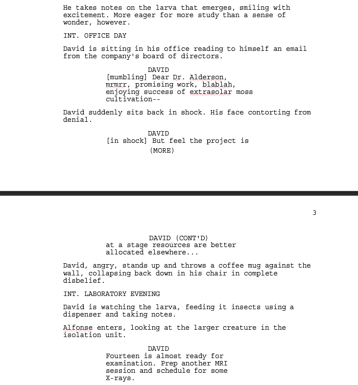
  With a script I feel is on the right track I decided to streamline some of it so that the text flows better and the actions sound like directions. The two pages above have the most major alternations to them as I also wanted to keep in mind the possibility that I would leave out human characters for the final presentation.

  I also made some modifications to the scene where David hears the news about having his funding being cut back. I believe this scene could be better conveyed with David's voice getting increasingly hostile rather than shouting "no no no!" repeatedly like a maniac. This more muted, tone-focused approach is a feature in when the third stage of the creature hatches from the cocoon. Like in the office, I'm inclined towards moving away from "no-no-no" type reactions.