 In this term's first character design lesson we were taught about characteristic shapes, colours and their meanings along with touching a little on posing when it comes to character design. The day before the lesson we were asked to bring in a picture of a character we liked. I was not sure on who to choose but my mind quickly set on Arcturus Mengsk from the Starcraft franchise.
The task we were given was to take our picture, discern the style of the character (styles being a spectrum of realism with Mickey-Mouse level iconic at one end and fine art level realistic at the other) and draw them differenty. I discerned that Mengsk's portrayal wobbled between realistic and heroic (a style where the character does not look very far from reality save for one or two features) as he was a character from a franchise that aims to resemble our own reality. I also exaggerated some of his features into a more cartoony look. Desptie aiming for an appearance closer to a disney villain, I was surpised how much I could retain on his outfit.
 It was convenient as the second exersise was on shapes used to distinguish characters, the three primary shapes and their connotations being:
- Circles: typically used to connotate friendliness or safety.
- Squares: Typically used to connotate strength and sturdyness
- Triangles: Typically used to connotate danger or a threat, generally something undesireable.
In the second half we were given two options for the task of drawing a character differently based on the shapes involved: Draw our character again but changing or exaggerating the shapes, or draw a character from a randomly-given piece of paper. Since I had already done something like what was asked with Mengsk, I accepted the luck of the draw and was given Daffy Duck.
I quickly realised that Daffy's characteristic cynicism, snark and lack of empathy are visually shown by having a very pointy body; his head, eyes and eyebrows are triangles, even the way he's standing with triangular legs create a triangle in the negative space. At first I tried making him more circle-filled, rounding off many features. Problem was, as was discussed in the lesson, that's really not Daffy. And I ended up with something that wasn't exactly amazing. So I went the other way and "sharpened him up" to create "Evil Daffy"; a pointier head, fingers, shoulder and beak. Compared to making Daffy cuter, making him more sinister was incredibly fun. Andy (who for the first half drew Goku and for the second half drew Dangermouse) gave me the idea of giving him a frown, which is another triangle - it works. I think I have created a scary Daffy.
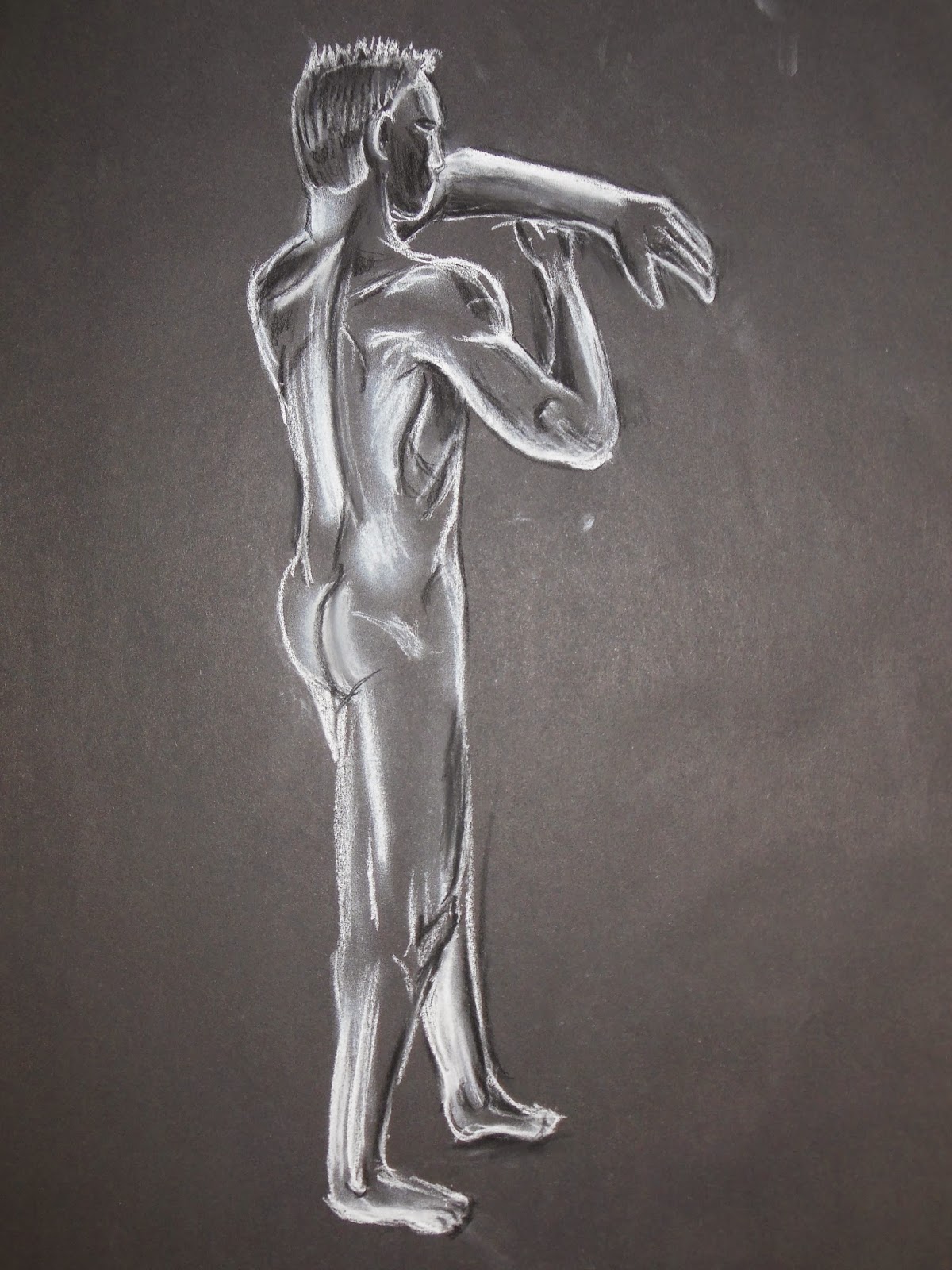
We had a new model for life-drawing classes today which is always interesting. This model has some great muscle defenition to him and on several poses I loved some of the shapes that came out, which can be seen especially on the chalk-and-charcoal drawings below. He stood next to a heating unit for each shot so his body was always highlighted with this warm orange glow which brought out an amazing, powerful look to him - which in hindsight I could have considered showing with coloured pencils or maybe watercolour pastels.


No comments:
Post a Comment