Showing posts with label life drawing. Show all posts

Thursday, 7 July 2016

Sketchbook: Birds Of The Natural History Museum


  Attending New Designers 2016 yesterday, I had arrived in London a few hours early to get the most out of my visit to the capital. One thing I decided to do, as I had brought my sketchbook, was to investigate the Natrual History Museum. As I had mentioned in a previous post, I was keen on drawing some birds for a change of pace, fortunately the museum has quite a nice collection of  them. And while the current display wasn't as impressive as a previous year's exhibition showcasing a display of around 100 taxidermied hummingbirds in flight,

  Granted these aren't as finely tuned as my previous drawings as I only had an hour or so and I wanted to focus on body shapes or profiles rather than fine detail drawings, but these sketches did give me insight into these animals, who all share common anatomical features that evolved with the express purpose to maximise their flight capabilities.


  I also took time to investigate how wings work, as it is something I want to improve on. Fortunately one of the museum's longstanding displays shows how a bird's feathers and muscle connect to the bone. And I was able to work out the primary shapes that are assembled to make wings in this case. There's still some variation to investigate this is a foundation, as wings - be they bat, bird or whatever other animal - are usually a form of arm in some shape or form.


  Stellar's Sea Eagle, a bird of prey found in Northeastern Asia was the crown of my visit. Asian hunter of the sky, as can be seen in comparison to the more familiar dodo, and the budgie-sized Ou, is enormous! A giant of the eagle world that took my breath away with its massive talons and grand wingspan.


  These photographs taken of the way bird wings are constructed were particularly inspiring. And I think they could go a long way to improving my anatomical understanding when it comes to drawing and designing wings.


Sitting in the same exhibit as other great birds, the humble tawny owl.


  Outside the bird exhibit, the Natural History Museum has a beautiful display of sea-monster fossils, most prominently the Pliesiosaur, and the dolphin-like Icthyosaur. I also took a visit to the dinosaur wing, took some photos but didn't do any sketches as the museum was roughly an hour from closing for the day when I visited.

Saturday, 2 May 2015

@Jackie @Phil Life Drawing Collection

First copy of my collected drawings this year. However I am questioning if I should also include my self-portraits and digital art studies in this document.

Friday, 27 March 2015

Life Drawing 26/03/2015


    The final life drawing class of the year was once more with Lydia, who used a piece of fabric and a large purple feather as a key prop. We were told that the final life drawing class would have a Moulan Rouge feel. The other key thing was a long series of quick drawings as long as three minutes and some as brief as 10 seconds, which required me to focus on the essential shapes, which was very fun as I gained an idea of some of the various flowing shapes that the human body can form, and working this rapidly helped me to realise that. I was intrigued by the shapes I saw and I believe I have gained a better understanding of how I could draw characters in future projects.

Monday, 23 March 2015

Photoshop Studies: Self Portraits

    Today was a very interesting Photoshop studies class. We were given a small mirror and tasked with creating self-portraits. Unlike the last studies we were not set a specific time. Instead responsible for timing ourselves to make four quick studies in the space of an hour. It was fun to get into skin and hair texturing in this lesson and I believe the final piece reflects this as it seems to have come out rather well despite my comparative lack of experience with faces.

    The next two hours of the lesson were then devoted to creating a detailed piece (above). Because I felt that one of my studies was quite successful I decided that instead of starting fresh I would build up on it, one of the key moments during its creation was advice about finding a way to make the skin appear less smooth, so I experimented with a few brushes to see which one would give me the best texture that I wanted.

    There is still a little distortion as the mirror I was given made my head taller than it really is, hence why a couple of the below drawings look like someone rather different.

Monday, 9 March 2015

Photoshop Studies: More Life Drawing and Master Studies

    I found today's photoshop lessons very useful as fot a while I've always had a little trouble with drawing hands in a way that made them look good. I find the colour values furthest left and right to be the least perfect (although the far right example I think is still a pretty good quality) but the best for me are the three in the centre, particularly the top-centre coloured value. I am not sure entirely but I think I used a pastel-type digital brush for it. Whatever I used, I' can remember the preset and will definitely consider it for further painting in the future.

    Feeling confident with the brushes, I had an attempt at replicating a painting by a Dutch realist. THere is still admittedly plenty to do but I am glad that for now I have the basic values in place. All I really need to do is work into them with the right brushes and keep an eye on my darks. While It's not quite perfect, I am rather happy however with how the buns - probably the most complete part of the piece - have turned out.

Wednesday, 4 March 2015

04/13/2015 Life Drawing

    Life drawing was interesting as we had the chance ot try paint, but using nontraditional implements. For the practice drawings at the start of each lesson I tried using pencil for my drawing - a slight deviation fomr my normal charcoal-based practice drawings because I wanted ot acquint myself with being comfortable with softer pencils..

    The painting sessions themselves: The first task (top-left) was to take a brush-tool (the less brushlike the better) and create a 20-minute picture with it. The tool I picked was a long toilet brush topped with a hemispherical fan of sponge "fingers", creating something remeniscent of  the work of Jackson Pollock. The second implement I used was a paintbrush taped to a pair of bamboo sticks that I controlled independently with both hands like a pair of chopsticks. I found it very fun painting this tool evel though I was using acrylic paints and thus I was a little limted due to the stickyness of it. The first picture I made (top-right) shows this clearly. The bottom-left picture was a group exercise where each of us were given three minutes ot paint a bit, then we would all move ot the drawing board ot the left of us and add something to our classmates' picture in three minutes. In the bottom-left picture, the smaller woman's red tone was my original picture while everything else was added by classmates.

Monday, 2 March 2015

Life Drawing Studies


    This morning's Photoshop studies were interestingly not in Photoshop, as we spent the lesson performing different life-drawing techniques. Most of the sketches are labelled with the associated technique that I practiced with. Drawing no. 2, drawn with my left hand instead of my right, looks as though the flowers have wilted and no. 7 (drawn by focusing on the detail of the woven stickball seen in no. 15 and not looking at my sketchbook) appears somewhat cosmic or unreal.

Thursday, 26 February 2015

25/02/15: Life Drawing

    I feel things might have been a bit rapid with this life model drawing session but nonetheless I got some interesting imagery out of it, particularly the image where he is sitting on or using a large ball (my favourite of the quick poses is him posing as Atlas with the world on his shoulders). Of particular note this session was my introduction to collage (top-right), two poses I assembled from the covers of a newspaper and a magazine, making focus on using the colouration of the paper to work in light and dark. To add hilight for the image of the subject lying down I used chalk and a PVA coating to give a "shine" to the body


Wednesday, 18 February 2015

18/02/2015 Life Drawing


    New model, new opportunities. Today's model Lydia (or Lilith, I spent the two hours after the session on my pre-vis so the name has faded a little) has an alluring grace to her figure, which is why I was termined to get her body as right as I could for the 40 minute drawing at the top. I am fairly proud of it; a combination of chalk, charcoal and a 4B pencil. The red, orange and yellow pastel drawings were inspired by the slightly yellowish tinge of the highlights the model had while she was posing. A real shame I wasn't quite fast enough on the top-right pose.

Saturday, 14 February 2015

Summary: Barcelona, February 2015

The Museu Nacional d'Art de Catalunya (National museum of Art of Catalonia) is one of my favourite buildings that for me draws forth images of the zenith.of the Spanish Colonial Empire. Such a legacy was bolstered by imported trees and parakeets flying in flocks particularly here.
    I have returned from the five-day trip to Barcelona, Catalonia, Spain. A beautiful city nestled along the coast of the Mediterranean and at the foot of the Spanish Alps. I fell in love with the city within the afternoon I had arrived due to the staggering abundance of large Italian-influenced neoclassical facades combined (for at least half od the city) with a well-planned Roman-like grid system. Tree-lined avenues (sadly leaves had not blossomed while I was there but I can almsot imagine what they look like in full bloom) crossed the city and were occasionally peppered with statues and gorgeous fountains. It is a shame that in my haste to leave for it I had left my camera behind because I do nto believe these sketches or my descriptions do the city full justice

     My days were very busy so I did not have much time for sketching. So I used much of friday to wander the city committing it to it to pencil in a new sketchbook. I got the chance to draw La Sagrada Familia and the Museu Nacional d'Art de Catalunya. The top two images ot the left were from two things I had seen outside the Salvidor Dali Theatre and Museum in Figueres, a town an hour or so outside of Barcelona. Even with most of the city being these stone-faced mid-rise buildings the metropolis still felt huge with blocks rising between seven and ten stories in the metropolitan area and between four and six in the older, more tightly-packed and warren-like Gothic District, with four-to-five metre-tall ground floor levels on many of the metropolitan buildings.
Theere were many large ornmaneted buildings like
above.
    This is a city I would definitely love to return to. Despite it's age i'd say it combines it's ancient history and historic architecture with the modernity of an organised modern metropolis (such as New York) very well as much of the city is quite spacious thanks it it's wide avenues. I was able to visit many places by keepign a relatively straight path and it was only in the more maze-like Gothic district where I felt the risk of getting lost.

    As I said above, it is  shame I did not bring a camera because I felt there was a wealth of inspiration here from the broad avenues to the canyon-like Gothic district and Barcelona's central cathedrals. It is a city that despite the 2008 recession is still one of the great cultural and commercial hearts of Europe. The elegant buildings make the entire city ooze wealth and influence even in this modern age of economy and minimalism.

Wednesday, 28 January 2015

Wednesday 28/01/15


    Today was another character design lesson where the importance and significance of camera angles were discussed. Directors are to treat cameras as the viewer's eyes so the position has to flow with the story as if you were there, darting around. For the workshop task we were given a genre and a situation. In my case I was given the genre of "steampunk" and the situation of an aggressive powerplay or a bullying situation. Designing the characters was kind-of fun and a nice break fro mwhat I feel may be generic characters in my current Script To Screen project due to its contemporary setting. Who knows, maybe I'll come back to this genre in the second or third years?


Thursday, 15 January 2015

Life Drawing 14/01/15

    I feel a little guilty that three out of these six images are unfinished (and two I could count as just-about finished). This guilt however is offset by the interesting shapes that came about drawing the subject. It was odd but interestingly different as I was tasked to draw a body shape quite unlike the two previous models. There were some points that look odd or unbalancing but at the same time some beautiful shapes came out of the curves.

    The two coloured images were created by smudging in red, yellow and brown soft pastels. The brown worked very well for bringing out dark folds or bold contours, and I was partially worried that the red areas would end up making the subject look like they were suffering a terrible rash at the time. To alleviate this feel I focused on balancing out the reds with yellows to create a more sun-kissed orange that gives the subject a beautiful bronzed tone.


Wednesday, 7 January 2015

New term: Character design and Life Drawing

    In this term's first character design lesson we were taught about characteristic shapes, colours and their meanings along with touching a little on posing when it comes to character design. The day before the lesson we were asked to bring in a picture of a character we liked. I was not sure on who to choose but my mind quickly set on Arcturus Mengsk from the Starcraft franchise.

    The task we were given was to take our picture, discern the style of the character (styles being a spectrum of realism with Mickey-Mouse level iconic at one end and fine art level realistic at the other) and draw them differenty. I discerned that Mengsk's portrayal wobbled between realistic and heroic (a style where the character does not look very far from reality save for one or two features) as he was a character from a franchise that aims to resemble our own reality. I also exaggerated some of his features into a more cartoony look. Desptie aiming for an appearance closer to a disney villain, I was surpised how much I could retain on his outfit.

    It was convenient as the second exersise was on shapes used to distinguish characters, the three primary shapes and their connotations being:
  • Circles: typically used to connotate friendliness or safety.
  • Squares: Typically used to connotate strength and sturdyness
  • Triangles: Typically used to connotate danger or a threat, generally something undesireable.
     In the second half we were given two options for the task of drawing a character differently based on the shapes involved: Draw our character again but changing or exaggerating the shapes, or draw a character from a randomly-given piece of paper. Since I had already done something like what was asked with Mengsk, I accepted the luck of the draw and was given Daffy Duck.

    I quickly realised that Daffy's characteristic cynicism, snark and lack of empathy are visually shown by having a very pointy body; his head, eyes and eyebrows are triangles, even the way he's standing with triangular legs create a triangle in the negative space. At first I tried making him more circle-filled, rounding off many features. Problem was, as was discussed in the lesson, that's really not Daffy. And I ended up with something that wasn't exactly amazing. So I went the other way and "sharpened him up" to create "Evil Daffy"; a pointier head, fingers, shoulder and beak. Compared to making Daffy cuter, making him more sinister was incredibly fun. Andy (who for the first half drew Goku and for the second half drew Dangermouse) gave me the idea of giving him a frown, which is another triangle - it works. I think I have created a scary Daffy.

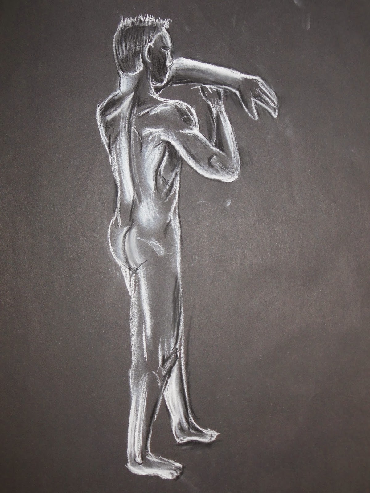
     We had a new model for life-drawing classes today which is always interesting. This model has some great muscle defenition to him and on several poses I loved some of the shapes that came out, which can be seen especially on the chalk-and-charcoal drawings below. He stood next to a heating unit for each shot so his body was always highlighted with this warm orange glow which brought out an amazing, powerful look to him - which in hindsight I could have considered showing with coloured pencils or maybe watercolour pastels.


Wednesday, 26 November 2014

26/11/2014 Life Drawing

     Today was an interesting life drawing session as we were introduced to integrating props into our compositions. In this case the two primary props were a sheet of light blue fabric and a plastic mannequin. Another feature was that Vicky used a projector to cast a sillhouette of a splatter painting on to the subject to create some very interestign light patterns

    I particularly enjoyed this session as not only do I find it interesting to draw draped fabric, the use of the material and the alabaster-white mannequin gave a strong classical feel to the entire scene; a period in history that I adore for its mythical feel.

    There was also a hint of the otherworldly as the shadows cast by the splatter painting projection gave both Alan (the subject) and the mannequin the look of having mottled skin markings; some sort of alien skin pattern. Which made me think of some of the aliens from Star Trek, particularly the ones with patterns on their skin. I was surprised how easily how well the lower-right image turned out as I was told by Vicky after finishing it that what I had done was not an easy pose to draw (perhaps due to the foreshortening) but for the most part had ended up doing rather well in capturing it.


Saturday, 22 November 2014

19/11/14 Life Drawing


 These are the life drawing images I managed to make on Wednesday. The bottom set was a basic study whiel the top two were to be done mroe quickly. The stick figure drawings top-right were made using a 10 second time limit so I had to be very quick and only got basic lines down. SOme of the poses did end up making some interesting shapes, the one on the far lower right reminds me of the poster art for Tron.