Friday, 29 July 2016

Year Three Project: Initial Ideas

  August will be a time where I will be preparing myself for my third year of this degree. I am excited, and a little anxious as this year will be the project that defines me. I arrived on this course as a worldbuilder, so after discussion with Phil, Alan and others I have considered settling on a project that will allow me to tell a story though the environment.

  The idea I have presently considered involves a scientist, recording his observations as a newborn alien specimen, brought in by explorers,  is cared for and matured. As time goes by, the scientist's backers, the company he works for, feels the project is not worth it. Either it is taking too long or there is so far nothing worthwhile coming from studying the creature. The scientist however grows attached to the creature, and when the company has finally had enough they try and shut the project down by force.

The first stage of this project will be to work out who this scientist is. In order to demonstrate character development he needs to warm up, so at the beginning he could be cold and jaded. His peers and juniors could be rockstar-type scientists working on far more interesting projects while he, approaching the end of his career is stuck with this project, which to begin with involves studying quite a simple specimen. He could be a career man: He has family but has sacrificed attachment to them in favour of fostering his career. His wife could have had enough ,frustrated as to why he is spending entire nights in the lab and never coming home. This specimen could be the one thing he has grown attached to for the first time in many years. It could be hideous, a monster on the outside but with the ability for compassion inside.

  The scientist himself, to keep things streamlined, could be only a voice within the animation. While the monster's final form is kept relatively mysterious until the very end.

  The scientist's recordings could be flawed; signs of stress, moments where he has to put the recorder down in order to handle a situation or has to answer a phone call from his bosses. Things are somewhat loose for now, but can solidify as progress with the script is made. Once I have a script, I can work out the true length of the animation, what period the lab would reflect and what the narrative of the laboratory will tell (which will have similarities and differences to what the scientist is saying in his recordings, telling two narratives within the animation).

  I have a basic idea of who this scientist is, what comes next is to make them something more cohesive.

Monday, 25 July 2016

Sketchbook: Plotting a Course for Year Three


  With the hot late-July Summers hitting the country I had the chance to explore and head out into the sun. During a trip into London I got back into sketching, The drawings on the left-hand side of the above image were life-drawing attempts on a miniature of a fountain commissioned sometime in the 18th century. The drawings on the right of the top picture were partially inspired by the kind of outfits that became popular at that point in time, a time when English dress (termed Côte Anglaise) was very popular on the continent.


  Later on I thought about refreshing my character design skills, building an understanding of humanoid forms that are not strictly human-like in proportion. The structural sketches, done today, were based on how I felt after last Friday's art-stream session. I tried a hand at map-making, as over the past two years I have found I like an analytical approach to designing something be it a character or a world. And city maps can demonstrate a location's character (I had the good fortune to talk about this in detail on the stream), something I may try developing further in my third-year project.


  However as the half-finished nature of both suggests, I lost steam during the broadcast. Whether or not I will work on them again will be something to decide, but the lack of momentum I felt has made me inclined towards finishing the Minotaur painting half-made on the stream before this one.


(Yes, sketch 14 is an attempt at Totoro. I am quite fascinated with Studio Ghibli's works)

Saturday, 16 July 2016

Artstream 15/07/2016: A Touch of Magic


  I feel I am getting a little faster at painting, that or the picture above is still relatively simple. Which took just under two hours. I felt this session was so brief I decided on a second picture, which admittedly isn't completed yet, but I feel the Minotaur I had in mind (below) is off to a good start despite only spending about 45 minutes on him. There's still a lot to do with him however.


  I considered making two separate videos, one for each picture, my current formula might be more suited to the time-lapses being compressions of my streaming nights.

Sunday, 10 July 2016

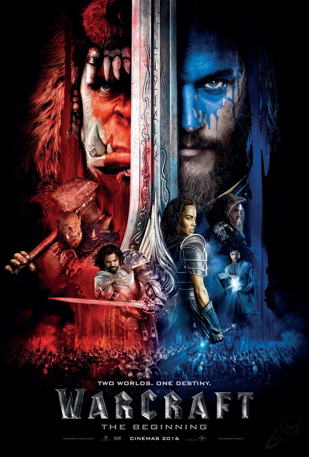
Film Review: Warcraft: The Beginning

Theatrical Poster (perculia, 2016)
  • Director: Duncan Jones 
  • Native Title: Warcraft: The Beginning
  • Primary Language: English
  • Format: Colour
  • Year of Release: 2016
  • Budget: $160,000,000
  • Film Length: 123 minutes
  • Production Company: Blizzard Entertainment, Legendary Pictures
  Based on the highly successful Warcraft franchise by Blizzard Entertainment and directed by Duncan Jones, Warcraft: The Beginning is a fantasy movie that recounts the invasion of the human kingdom of Stormwind by a faction calling itself the Orcish Horde. The orchish chieftain Durotan however has doubts over this invasion and sought to work with some humans to thwart the scheme of Gul'dan, fearing that the destruction of his homeworld would happen to Azeroth.

  Movies adapted from video games have always had a curse: Next to never approved by critics, often doing things to upset fans of the franchise they portray and often coming out as messy or unfocused as they try their best to compress a story of twenty hours into two. A common issue is that movies trade interactivity and action for story "most game adaptations – it is a smallish field with a poor reputation – attempt to cash in on popular properties by simply trading off the lure of interactivity for the delights of big action on a big screen. Jones’s much more intelligent and aesthetic approach to the problem is not entirely new |...| but it does make Warcraft visually interesting throughout." (Taylor, 2016) Duncan Jones understands his setting better than most directors do in projects like this, and focuses on Warcraft's comic aesthetic and grand narrative translate onto the silver screen better than most. But the attempt is not free of flaws.

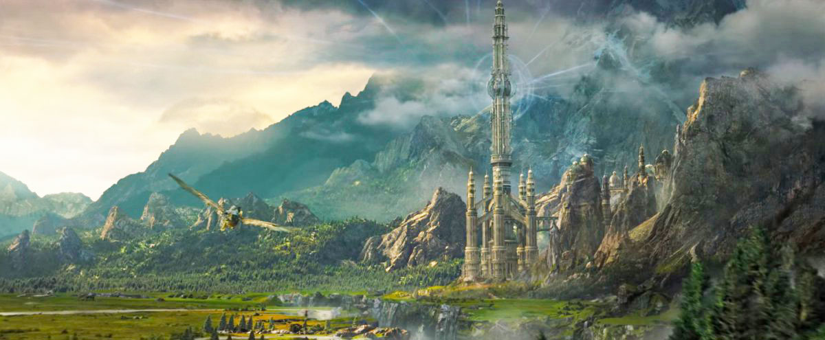
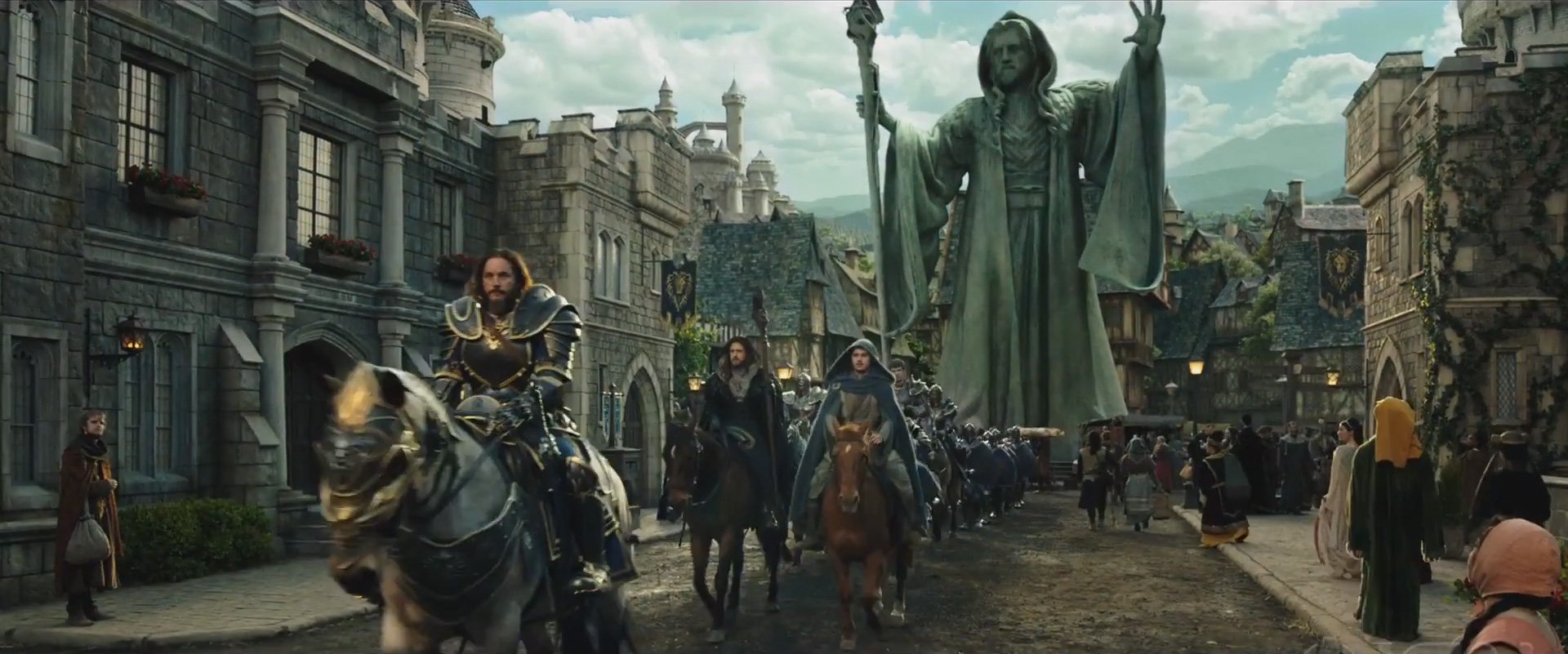
The locations have been lovingly crafted for fans and lore-buffs alike. Such as a city gate design the sole purpose of which was to hide a game engine limitation from 2004. (
  While this was quite a high-quality production, the opening summary of this analysis highlights one of the most noticeable issues with the film: As a franchise over 20 years old, Warcraft is a massive sprawling setting and the film suffers from a lumbering amount of exposition. For an expert of Warcraft lore, this might not be too big an issue but for someone unfamiliar with the franchise they will likely feel bombarded by names, places and characters. some of which they may miss. This barrage of names and places can make things confusing to one not too well versed in the lore. "Thanks to a go-between lady orc (Paula Patton) who has dainty she-fangs instead of tusks and hangs out with the humans, there could be peace between the two races, but only if the most hostile orcs and their snarly trouble-making wizard can be made to see reason. That’s my best guess for what’s going on, anyway" (Smith, 2016) It can be confusing to tell what's going on as we bounce from location to location introducing names left-right-and-centre like "Gul'dan", "Anduin Lothar" "Goldshire", "Dalaran", "Kharazan" "The Guardian" etc. it can be a struggle to keep up, fortunately a number of characters stand out visually so if "Khadgar" slips your memory "sexy young wizard" will help as an identifier, for instance.

"Onwards to--! Wait which location is this again? Did we miss somewhere?" is a potential hazard watching Warcraft. (Vincent, 2016)
  What we are shown however, is consistently stunning. "The Azerothians, |...| strut around in silly but not-wholly unattractive medieval-faire garb, while the heavily CGI-enhanced Orcs |...| are bulked-up in a repulsively fascinating way. They stomp around on their heavy, beefy feet, looking perpetually a bit forlorn and perplexed, thanks to the specific dental characteristic they all share: underbite fangs." (Zacharek, 2016) The Warcraft franchise could be described as "Lord of the Rings meets The Princess Bride": You have a story of humans vs monsters, good verses evil, mixed in with more pop culture references than what is thought humanely possible. The movie doesn't give us endless references to Spamalot or Star Wars, it may be rather serious for a fair bit of its running time but it does retain that tongue in cheek vibe. Late in the film for instance there is a fight between two primary characters. When one plays unfairly, it is met with the rest of the fight being perforated with random orcs shouting "He cheated!", "He's a cheater!" much in the same way the old lady from The Princess Bride jeered at a passing princess Buttercup (chants and phrases were in fact provided by attendees of Blizzcon 2014). The tongue-in-cheek nature of Warcraft is there, but it shares screentime with a lot of serious imagery such as the rather ghastly effects of the series' form of evil magic energy known as "the Fel."

Infodumping aside, it certainly looks like we're in a world where the Men of the West fight the orcs of the East and dread pirate kings are inconceivably polite. (Chaud, 2016)
All things considered Warcraft: The Beginning is not a bad film. While it's not a summer mastercraft to draw the millions (although it did gain a strong popularity in China), as far as video game adaptations it is a vast improvement from bombs like Hitman (2007), Tomb Raider (2001) and Max Payne (2008), it learned a lot from the failings of other adaptations and is something of a diamond in the rough. Compared to other 2016 it's mediocre, compared to other video game adaptations however and it might just be a curse-breaker. It doesn't try to bog itself down with translating game play into story and focuses primarily on the narrative. As this is adapting a strategy game with a lot of lore behind it and not an RPG or shooter, Warcraft: The Beginning's success might be a fair mix of choosing the right setting and the right genre to translate onto other silver screen. It's not perfect but then again neither was 2002's Spider-Man. And look at the success of comic book adaptation at the time of this review.

References

Image References

Thursday, 7 July 2016

Sketchbook: Birds Of The Natural History Museum


  Attending New Designers 2016 yesterday, I had arrived in London a few hours early to get the most out of my visit to the capital. One thing I decided to do, as I had brought my sketchbook, was to investigate the Natrual History Museum. As I had mentioned in a previous post, I was keen on drawing some birds for a change of pace, fortunately the museum has quite a nice collection of  them. And while the current display wasn't as impressive as a previous year's exhibition showcasing a display of around 100 taxidermied hummingbirds in flight,

  Granted these aren't as finely tuned as my previous drawings as I only had an hour or so and I wanted to focus on body shapes or profiles rather than fine detail drawings, but these sketches did give me insight into these animals, who all share common anatomical features that evolved with the express purpose to maximise their flight capabilities.


  I also took time to investigate how wings work, as it is something I want to improve on. Fortunately one of the museum's longstanding displays shows how a bird's feathers and muscle connect to the bone. And I was able to work out the primary shapes that are assembled to make wings in this case. There's still some variation to investigate this is a foundation, as wings - be they bat, bird or whatever other animal - are usually a form of arm in some shape or form.


  Stellar's Sea Eagle, a bird of prey found in Northeastern Asia was the crown of my visit. Asian hunter of the sky, as can be seen in comparison to the more familiar dodo, and the budgie-sized Ou, is enormous! A giant of the eagle world that took my breath away with its massive talons and grand wingspan.


  These photographs taken of the way bird wings are constructed were particularly inspiring. And I think they could go a long way to improving my anatomical understanding when it comes to drawing and designing wings.


Sitting in the same exhibit as other great birds, the humble tawny owl.


  Outside the bird exhibit, the Natural History Museum has a beautiful display of sea-monster fossils, most prominently the Pliesiosaur, and the dolphin-like Icthyosaur. I also took a visit to the dinosaur wing, took some photos but didn't do any sketches as the museum was roughly an hour from closing for the day when I visited.

Wednesday, 6 July 2016

Sketchbook: Bird Experimentation


  Lately I've been finding that one of the best times for me to pull out a sketchbook and doodle for a bit comes from train journeys to and from London. As the streams, creative writing, plans for next year and online networking have been taking their toll a little on my free time. Regardless, as these sketches from last Friday demonstrate, I thought I'd try mixing up my creature design skills by sketching some birds. Granted they still have features of other creatures I've drawn so what I might sketch next time I have time is more normal-looking birds; eagles, ravens, magpies, finches and so on. Mainly to diversify my design palette from quadruped mammals, lizards, dinosaurs and scary monsters, as I've been seeing magpies and squirrels more than I used to since moving to Kent.

And quite frankly I probably draw too much nasty so might do a bit more cute. Both to balance out and that such a path is a skillset all on its own.

Sunday, 3 July 2016

Stream Saturday 02/07/2016: Horror Creature Design


  It's time I started considering what I'm going to do for my third year of university. With that in mind I decided to dive back a little into creature design. Originally I wanted this thing to have an angler-fish-like head, something reminiscent of Colo Colo. But as the stream progressed the monster became a little more bat-like in form.

  A secondary reason for this piece is to practice on some dynamic lighting as well as refresh my memory on bounced light. There are three point lights in this scene, each illuminating the creature from a different direction. Although on reflection maybe the light shining off the creature's rear-end is a little too spread out. Or it might not be, his hip looks quite close to the light.


As usual, I created an accompanying time-lapse of its construction. The thing I kept thinking while working was that the more I work on the layers, the better it will turn out.