As mentioned in an earlier blog post, I spent time today developing the character project. Looking at what was needed I decided more stuff was needed for the environments that could be used within the setting. I don't consider the first attempt (above) very satisfying aside from maybe the fish fountain. It just didn't look right though even though I started out with basic blocks. The roofs just didn't' look right.
To resolve my dissatisfaction I looked online to see what villages in China looked like to discover they were something of a far cry from the stereotype of upward-sloping sky-blue roofs and whitewashed staccato walls. I was happy to find that they were more earthy and simple, but had their own degree of intrigue. I was partly inspired by the overhangs that these buildings had. On some buildings these could be tiered not too dissimilarity to the balconies found on more modern tower blocks.
I kept the pond from the first image because well I though it was a nice feature. Looking at the images below, I might have to look into making my village more 'messy'. There is a lot of string and junk about.
| Referene 1: Three-story house (Guidry, 2011) |
 |
| Reference 2: A waterfront village. Seems a little clean compared to Reference 1 (Wade, 2011) |
The other main thing I did today was work on the Sha. I kept expressive with the outlines to reflect the supernatural nature of these creatures. But while I was originally considering shapes like 1-3, 7 and maybe 14, I realised that maybe I could try something else after constantly giving the designs clouds for lower halves. COming up with a few more haunting-appropriate looks. The lack of faces on some of them is intentional - I played with the idea that these things had no faces in order to keep them inhuman.
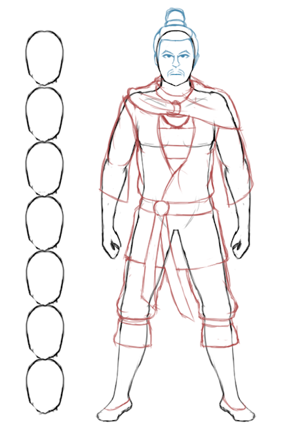
Before all this however I was working on developing my hero character. Drawing him in preparation for a turnaround. I found it useful to start of with an undressed figure, so I could get a better idea of what all the fabric would be doing and how it would hang over his body. Also I wanted to get the proportions right, hence the stack down the side.
Image References
- Reference 1: Guidry, A., 2011; [Three-story house]; China 19; available at http://stevegarufi.com/china19.jpg (last accessed 2nd November 2015)
- Reference 2: Wade, S., 2011; [A waterfront village. Seems a little clean compared to Reference 1]; Chinese Village by Yorick R.; available at https://chinadigitaltimes.net/wp-content/themes/cdt/timthumb.php?src=https://chinadigitaltimes.net/wp-content/uploads/2011/07/Chinese-Village.jpg&w=&h=600 (last accessed 2nd November 2015)


No comments:
Post a Comment