Monday, 8 December 2014

Review: The Shining

Figure 1: Theatrical Poster (IMDb)

  • Native Title: The Shining


  • Primary Language: English
  • Format: Colour
  • Year of release: 1980
  • Director: Stanley Kubrick
  • Budget: est. $19,000,000
  • Film Length: 142 minutes
  • Production Company: Warner Brothers


  •     Another Kubrickian classic based on a novel of the same name by Stephen King  The Shining is a dark, surreal and supenseful look the maddening effects of isolation along with maybe-or-maybe not supernatural atmosphere.

        The film starts off feeling like a King setting - mountains and pine forests in rural Colorado cut by a ribbon of asphalt as we see a Volkswagon beetle drive up to the magnificent-looking Overlook Hotel. A huge 1920s neoclassical hotel building built on the mountain slopes. After passing though it's doors Jack Torrance (Jack Nicholson) talks about a job offer he recieved as winter caretaker. The interviewer telling him of an unpleasant event that, according to Jack, his supervisors neglected to mention.

        When Jack agrees to the job, we cut to Danny (his son, palyed by Danny Lloyd) looking in the mirror talking to "Tony", an entity Danny claims lives in his finger that tells him things. And by "tells him things" the film means either Danny talking to himself in a raspy voice... or experiencing visceral images via hard-cut with the occasional jump to see Danny's reaction. All in all very disturbing thing for a child to expereince. We get a further glypse of this power when Dick Hallorann, the head chef, telepathically asks him "Do you want some ice cream, Doc?" Dick asks him later and Danny agrees, and we get more exposition - as Dick and apparently Danny are capable of "shining", a form of wordless communication between two people. Kubrick's version of the tale has less of a supernatural element to it than the original King novel so it could be that Dick is describing one possible interpretation of the kind of close bond some people form where discussions can be performed with expression and emotion rather than words, in a sense "knowing" what the other person is thinking based on how much you two know each other.

    Figure 2: Jack's reaction to Wendy accusing him of hurting
    Danny sells well that the family is breaking down and things are
    getting very strange. (Portilla, 2012
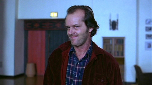
        Like with Beauty And The Beast, the film protrays the supernatural quality of certain moments with little flair to them; sudden transformations, telepathic acts, even the hotel's ghosts are all more tricks of the eye than some magical element due to the lack of overt special effects. "[Kubrick's] adaptation of The Shining, Stephen King's pulpy haunted-house novel, keeps forcing reasonable — or non-occult — interpretations on the behavior, variously bonkers and bloody, that his camera records with its customary elegance" (Schickel. 1980). There are still some very surreal moments thanks to camera and editing trickery: In one scene Jack walks over to a scale model of a maze outside, looks down and the camera closes in on what appears to be his wife and son as they reach the centre, as if he is seeing his family arrive at the centre of the tiny maze. This isn't magic but it is one example of what hallucinations are really like and Kubric does well in presenting hallucinations as real physical moments. There are even some moments that raise the question of whether or not one of these hallucinations was a real event. For instance, one midway scene shows Danny about to explore Room 237 (where Dick told him to avoid). We next see him walking into the main hall bleeding from scratchmarks his tweater torn at the shoulder. While Jack's wife Wemdy (Shelly Duvall) accuses him of hurting Danny despite the fact Jack was in the hall and with Wendy for a good amount of time beforehand, which brings up the question of "how did he get so badly injured?". Jack's clueless expression probably sells the confusing situation best


    Figure 3: One of Nicholson's...less terror-inducing crazyfaces.
    (Fan M, 2013)
        At it's heart this is a psychological horror the ghosts of the mansion's past tug at the trings of not just family unity, but personal sanity which - in a development method Kubrick is famous for - looks quite convincing even if a bit silly at times. "Jack played a very interesting role. "The crazier Nicholson gets, the more idiotic he looks. Shelley Duvall transforms the warm sympathetic wife of the book into a simpering, semi-retarded hysteric." (Variety Staff, 1979) As he progresses, Jack's increasing unhingement can be seen in his facial expressions, some frightening, some rather funny, while Shelly Duvall descends into a gibbering wreck begging for mercy from her crazed husband as she limply swings a baseball bat to keep him away. While some critics argue that Wendy was turned into a blubbering hysteric whe nthings started getting bad. Due to Shelley's experiences of Kubrick's method, it is possible that she gave a more authentic portrayal of trying to cope with a murderous husband in an isolated environment than is often shown in similar films; As mentioned Kubrick pushed his actors to breaking point with endless retakes and sneaky tricks to strain the cast, and we as humans can become very different when our minds are strained and we are pushed to the brink of what we can handle which is what exactly happened. Rather than trying to guess how the characters would behave under stress Shelley's and Jack's performances stem from a real feeling of stress, frustration and torment brought on by Kubrick's signature technique for making films.

    Figure 4: Four months in an empty mansion? Even a jerk like
    Dilbert Grady would make good conversation by then.
    (Cinematheia, 2014)
       At the barebones the film might not be that special when who made it is taken into account; Kubrick continued his pedantic desire to make things perfect, Jack Nicholson plays a guy losing his mind and the film is swelling with symbolism and metaphoric imagery. However it is a solid example of a film adaptation of a book done in a creative and interesting manner. Thanks to Kubrick's talents the descent into madness that Jack Torrance experiences in the original novel is portrayed in a more down-to-earth and very convincing manner, with most of the film indicating ambiguity on whether it's the house or the situation driving him insane as In the beginning for instance, the manager Jack talks to assumed the previous caretaker's homicidal rampage to be the result of cabin fever, a psychological condition caused by prolonged isolation and lack of stimulation in an interior environment. In the film's case I'd say "five months in an empty mountain hotel with downed phone lines and just his wife and daughters for company" could bring such a condition on. Anxiety, irritability, restlessness and distrust of others are common symptoms which Jack himself just so happens to end up suffering. While the film does return to the supernatural near the end, there's still some question as to whether they ar really being haunted or if their creeping mania is blurring what is real and what is a hallucenation. Maybe the appearance of the former caretaker was a combination of what he was told about Grady, what he thought about him, and a subconsious desire to interact with someone other than his wife and son?

    Bibliography
    Image Reference

    Friday, 5 December 2014

    Review: Black Narcissus

    Figure 1: Release poster (Lonely Planet)
    • Native Title: Black Narcissus
    • Primary Language: English
    • Format: Techniolour
    • Year of release: 1947
    • Director: Michael Powell, Eric Pressburger
    • Budget: est. £280,000
    • Film Length: 100 minutes
    • Production Company: Archer, Metro Goldwyn Meyer

        Another dark drama. Black Narcissus is the tale of a group of nuns sent to establish a remote mountain parish deep in the Himalayas. Over the course of a year, the cohesion between them begins to break down as something about their new home (a former pleasure palace) and the environment around bring out deeply-buried feelings and desires of the nuns.

    Figure 2: The palace of Mopu (Dufresne, Lebland, Vaillat,
    unknown)
        Many things about the location paint it as fantastical, mystical and largely otherworldly compared to the uniform and real-world feel of the nunnery in Calcutta where the film starts. The palace itself is filled with erotic imagery seen during a series of interior panning shots  The entire palace is.perched on a vertical cliff face, with the bell situated on its precipice to give anyone who resided there a view of the lush valley below and the view provided is stunning, "Vast cubicles of matte paintings seem both deep enough to get lost in and flat enough to echo screams of fright and pleasure for years; prosthetic bamboo trunks smart even more intensely than real ones when tripped over." (Lanther, 2012) but the images go on for many miles and gives the feel as though every exterior shot is filmed on-location. But we are shown that this is not the highest-up sign of life around, as even higher up from the palace lives an old man who we are told does nothing but sit and contemplate silently, not saying a word.

        Its subtle but at many moments after about halfway though the film there appears to be a battle for dominance between red light and blue light, which gives a subtle feel that there are two atmospheres fighting for dominance in a given scene, these become more intense at strenuous moments but one of the most intense colour changes is near the climax when Sister Ruth faints, with the screen gets filled with an intense red that covers everything

        While the nuns do make an attempt to turn the palace into a fitting house of asceticism, contemplation and charity, it is as if the world does not like this imported world and seeks to return to its old vibes of eroticism and excess, which seem in tune with the aforementioned battle between red and blue. "[Sister Clodgah] and the four sisters accompanying her are serene in their faith that they know what’s best, but they’re undone, one by one, by the altitude, the constant wind, the teeming jungle below, and by the presence of the local British land agent (David Farrar), a strapping atheist with a manly chest and short shorts" (Burr, 2010). In the beginning, the Old General offers them a constant supply of sausages. Not long after they move in, the local emissary for the general, Mr. Dean, wishes for the nuns to take in a local teenage girl who was dressing herself up in order to seek his hand in marriage. Another character, the Young General, is always seen in ravishing Indian outfits that would look more at home in the courts of the Raj than a remote mountain palace. In one scene he ends up stinking out the classroom with an imported perfume asking if the teacher likes the smell. Further in we have instances such as Mr. Dean joining a winter chapel chorus, drunk, I might add, and it is revealed two thirds though the film that SiIster Honey - who was put in charge of the house's vegetable garden - out of a supressed impulese she instead grew a variety of flowers while keeping the vegetable patch somewhere at the back of the palace.

    Figure 3: Winner of the "1947 Most Terrifying Eveningwear"
    award. (Burr, 2010)
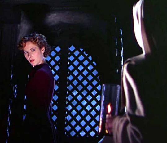
        The apex of the tempting environment is the fall of Sister Ruth as she "eventually is overcome by her desire for an agnostic Englishman who spurns her after she resigns from the Order of the Servants of Mary" (Pryor, 1947). Even when we meet her she is established though her performance as being the youngest and most naive as she makes her debut running into Sister-Superior Clodagh's office terrified and covered in blood, a mere "thank you" from Mr. Dean as he leaves begins a downward spiral of obsession that leads her to expressing herself in her room and desiring a repeat of the affections she thought Mr Dean showed for her. Her total change is into what might very well be one of the most frightening yet simplified costume changes in cinema. As at the climax, gone is her habit and we see her with permed hair and a scarlet dress. Aside from the starched shoulders this dress semms almost like everyday wear yet In terms of intimidation factor it is up there with Darth Vader's armour, and as she grows more insane the look only gets worse as her face becomes pale and her hair becomes black as night. The effect might not have been as strong or as frightening had she not spent the entire film unti lthen in a nun's habit - an outfit designed to be devoid of glamour or appeal. I suppose the effect is like spending an entire week eating nothing but porriage then on Sunday you are served pasta in sauce; it's not extravogent but because you've spent all that time experiencing something bland, your senses almost explode over even a minor taste change due to the change.

    Figure 4: From bad to worse; Ruth's final transformation and
    her most dreaded look (
        As I mentioned, Sister Ruth only gets worse "her final appearance in the film, gaunt and wraithlike, is still one of the scariest moments in British cinema history" (Bradshaw, 2005). Pale, crazed, her eyes staring with murderous intent as she sees her former superior ringing a bell. There exists a storytelling device where the villain is terrifying not only because of the atrocities they perform, but because they started off like any other person - calm, innocent, unremarkable. I suppose this connects with the "porridge and pasta" analogy from earlier, as Sister Ruth may not have been the most innocent-looking (that honour goes to Sister Honey) but she was quite unremarkable compared to everyone else and became almost like the wraith Bradshaw describes her as appearing to be; a fitting transformation to match the inner transformation from a young and ill woman into a jealous and vengeful wraith of a woman with murder on the mind.


    Bibliography
    Image References

    Maya Progress Update: What If Metropolis

         Chance has smiled upon me! I have made a ton of progress since my last update which I neglect keeping up-to-date. When I loaded up photoshop on the baseroom computers this afternoon it loaded up the screenshots I had made before Maya last crashed, which I was able to save and transfer to my memory stick. During this morning's CG Artist's Toolkit lesson I made progress with some of my smaller buildings, particularly the balconies that will connect to larger buildings which came together quite promptly.

        I also made progress with another minor but notable building, the Arrowhead; designed to go between the star and the sphere  This one made me feel comfortable as I managed to assemble and UV map it within the space of 3 to 4 hours. It's close in complexity to the Beak-shaped biulding but I feel confident that I am working more swiftly as much of the work is now done.

        The slowness and a feeling of pressure came from me going back to the platform and correcting the geomertry as the "mirror geometry" function had made the whole thing a mess as a few of the itnersection points combined into one vertex (I have found I can alleviate this by duplicating the object and setting the X value to -1), making triangles out of quads. There were also issues with the vertices when it came to smoothing the while thing for rendering so I ended up going back to the model constantly to tweak and sew vertices and edges which became mentally straining.

        However I have persevered and all these models now have had their UV maps arranged and exported ready for texturing and rendering. There are only a couple of buildings left to assemble but they are not too complicated in principle. Other than that I feel more on track for the coming Friday. All-in-all it felt like a very productive day and a pleasant change from the progress of the last few days.


        I also assembled some simple disk art that would have gone on the front of my disk. I decided on something less busy compared what I made for Invisible Cities as I get the impression this is a concept art disk. So its purpose would presumably be more about looking tidy and professional than looking flashy and eye-catching. Because I have a printer at home I can work on the jewel case cover when I have the time.


    Wednesday, 3 December 2014

    Project 2 Modelling Update

        Construction of the hero prop is taking shape. I have a solid idea for a texture map which I will need to go about refining however after having lunch I had a bit of a creative stumbling block after making three unsuccessful attempts to start construction of the beak - all of which resulted in a fatal error when I rener-previewed what I had without changing the render engine from Viewport 2.0. The deadline is closing in and the fesire is to finish this. So I wil lsee about pushing forward.

    I have made some trial-and-error progress on the silk tower but I neglected to snapshiot as I went as I constantly alternated between Maya and Photoshop. But it's mainly due to the mesh I have so I hope this problem doesn't come up when it comes to rendering these other buildings which haver more confined meshes.

    Tuesday, 2 December 2014

    Project 2: Tuesday Design Updates


        This morning I decided ot set to work o nthe diffuse map for one of the city's skyscrapers. Just before i started I recalled ot myself that rarely are the surfaces of even the most pristine and seamless skyscrapers ever a single uniform sheet. So I set about designing a more true to-life appearance where part of the resulting texture would come from the seams between the panes. For the final image I do plan to tone down the grooves so that they don't completely drown out the. look of the panes.
        The hexagon idea may be a bit spur-of-the-moment and I might or might not not carry it though with the rest of the city, the idea being that this is an aesthetic city so your typical mass of square panes felt dull to the eye. Hexagons provide am ore intriguing look as they "slot in" to the sctructure far more easily and effectively and maintain a stronger structure than a square frame. Along with toning down the grooves, I plan to add some more visible framework to break up the current look and giving the windows a little glint.

        Due to the highly reflective nature of glass, a blinn shader or chrome layer would be useful to bring out its scheen.

        After watching Suspiria I headed dow nthe the baseroom to spend a couple of hours on The Star, reworking what I had doen so far, one of the majore features of the new model being a kind of balcony wall around the outside so peopel won't fall off. After UV mapping this one spoke, I duplicated it with the others and combined it all with the disk in the middle to create a single contiguous surface in which I will place the texture maps for the surface of it. After finishing these I moved on to the building at the back and after working on the balconies I think I should be able to quickly build up the shells on top of the biulding.

    Monday, 1 December 2014

    Project 2: Further Production Art


        Creating these kepy production images has helped a fair bit in working out the right colour scheme for my buildings, as well as pinning down the finer details. It's hard to see but I also added a miniature figure next to what have nicknamed "the silk building" on account it reminding me of a fold of fabric. I'd considered a greenish/teal colour for the windows after looking back on my colour considerations for the star platform, while also maybe being inspired by jade - a precious form of rock that is both highly valued and closely tied to China and the surrounding countries. It rose to become treated as something akin to a combination of alabaster and gold in the Mediterranian; precious, beautiful, and carvable into all manner of wondrous shapes. Although I do wonder if I run the risk of the colour looking a little sickly.

        I also wondered about incorporating a little organic into the structure, as the idea I have proposed for Huabanliuyu does make it sound like the residents were inspired by plant life just as Philip Treacy was inspired by nature's patterns and structures when it came to his hats. There's still a bit of work to do on the platform (the legs for instance) but I do feel like I am further cementing my visual image for the city. I might in fact go for the Silk Building to be my test prop, as it is both present as a foreground element and the design is a lot simpler in its geometry than the star or the platform.

    Maya Tutorial Updates: Long Overdue


         I decided to get some tutorials doen this afternoon and also realised I had not uploaded my first house lighting tutorial. It was fun to do, getting acquainted to the universal manipulator, skydome and ramp shader.


         The sinset-period lighting I feel is going to be very important for my project so it was good to get this one done as I will feature a sunrise/set atmosphere for my scene for project 2. It also confirmed my suspicions that I had created an environment that was too orange (personally the lambert shaders I have for it at the moment look banana-yellow, which I figured I could correct once I got to installing my models in my main scene.
        I also used this time to get to grips with dirt mapping, which adds to the atmosphere of a place by grounding its objects in the dirt and gunk that builds up with years of existence. And with a location like the Old Alley - which feels like it was built in one of the industrial districts of London, Glasgow or Manchester, would be understandably fairly gritty. So I was a little surprised at how little dirt needed to be added to ground the whole scene. Although I did wonder why the tutorial shows to create the wood join and window dirt maps on different texture graphs when I at first thought it might be more efficient to map the dirt for them on the same image. However I now think that the tutorial's method has the advantage that modifying them is more compartmentalised and this is a very trial-and-error process. Itroes feel relatively simple though as all it entails is making an area of grime though black-and-white bumpmap style darkening.

        I also managed to finish the bump and specular maps before creating the dirtmaps. I talked with Simon on the problem and he believes that since I had created my bump and specular maps from a TIF file I may have forgotten to remove the Alpha channel. Although Mental Ray at the university had no problems reading it (though I did have to change the file paths as the duplicate I put on to the desktop retained the filepath on my home PC, hence why the first image the floor, crates and wood are completely black).
    And here is the final render.