A rather diligent cutting of the animation down to four minutes has been a struggle, as there is always that question of what to keep and what to remove. But after some thorough examination, and the sacrificing of a few details here and there which in a number of cases could be supplemented by visual information, the video flows a little more succinctly and fits within that alotted time frame.
Showing posts with label refinement. Show all posts
Tuesday, 20 June 2017
Four: An Adult With Polish
Wednesday, 7 June 2017
Four: Making Clutter and Props
The last few days the design priority has been in prop-making.to give the biolab a lived-in look.
There are still some props that need making - binders, dossier folders, perhaps a camera, Alfonse's experiment, post-it notes, perhaps items like used TV dinner trays or cups of soup. Built into the coffee cup is a particle emitter that when rendered would resemble steam. One of the rops I've entertained is an ash tray in David's office; this could be used as a means to convey that David is overworked, having to take cigarette breaks to get though the day. However, the idea of the decontamination unit that connects the lab to the corridor was to imply that the lab needed to be sterile and clean of foreign contaminants. Food might be passable but smoking in his room also feels like a stretch.
Making food to actually go on these trays might be too much. It might be that all I need to do to convey that the scientists have been eating is empty TV trays that have been stained by what was on them while they were eaten.
Looking at the time period, what might have best suited the lab in terms of lighting fixtures is a tube of flourescent light that circles the room. This differing setup shoudl contrast the room nicely with the corridor outside.
Wednesday, 15 March 2017
Four: Presenting Play and A New Adult
Written into the script, one idea was for Four to knock over the phone as Amelia is talking. This scene should be more interesting than Four simply wandering into David's office and giving the camera puppy-eyes.
Anyone with a pet cat knows they love playing with inanimate objects by giving them pokes, jabs and pushes to see what they do or how they fall over. As a creature of predatory heritage, Four might have similar instincts so this might be entirely in-character for her.
Preparing for the third act I went back to the adult model. While installing the spine to simplify control over Four, a slight problem came out in that when installing a curve to a spine, the joints will contract to fit the CV curve, which would make reattaching the blendshapes problematic. The solution so far (which has given freedom in correcting the skeleton) has been to essentially fix the skeleton then rebind the skin and paint the weights back on.
As I had done this before a couple of times now I might be able to re-paint the skin weights fairly promptly. That is the plan, as the deadline of mid-May is coming and I have to reserve a week or two for export to a render farm and post-processing.
Wednesday, 8 March 2017
Four: Branding, Fonts and Scripts
Taking a small break from modelling I took some time to try and refine the other elements of the project, particularly the art-of. For this, I needed a better logo for Smithston-Wessex.
I'm still trying ot decide but I am leaning to the likes of 20, 22 and 11, but one thing I am definitely certain so far is the logo is better off without any text in the graphic. Logos need ot be simple ,but meaningful, something that can be drawn quickly or recognised at a glance so I kept the graphics bold and simple, but not too simple to be too generic. the list just needs some narrowing down.
To accompany the logo I needed a suitably sci-fi title font. I looked on line for a few retro fonts (on the left) along with some that came with Windows (on the right). THe ones I like so far are 2, 4, 5, 9 and 12. Possibly 8, others like 6 are too horrid (the 'esse' section in 6 just blurs into one repeated letter due to the extreme stylisation).
The search for a new David continues. One thing the current voice helped with was that some of the lines David posessed were perhaps repeating themselves in some instances (such as David observing that the tubers ocntai nan egg, the moss providing nutrients that feed the egg as an embryo develops), while this might not have shortened the piece by any overall measure, I think it has halped improve the flow of the dialogue nonetheless, as there were a few moutgfuls that David was delivering.
Four Project Script V-04 by Mark Stamp on Scribd
Thursday, 23 February 2017
Four: Juvenile Almost Complete
Four's juvenile form is nearing its end. The last deformers have been modeled, the controls are in place, most of them are rigged up to their respective joints and the deformers have all been connected.
What remains are the finer controls - the channels for the digits, same for the fins and jaw, and the replacement of the eyes with a better model and texture.
I feel optimistic that I can sculpt out a base grub form and set up UVs and bones by Sunday.
Wednesday, 22 February 2017
Four: Improving Her Eyes
Speaking to Alan today I took a minor detour on rigging Four to work on her eye. I want ot try something less human-looking so to start with I experimented with a few eye forms. Currently I like 2 and 6, Speaking with Phil and asking Alan for help in how to install one, I also implemented the idea of a nictitating membrane. A third eyelid that some animals possess to protect their eyes. In Four's case, it would be used to allow her to see while swimming in water.
A texture still needs to be applied but the mechanics for the membrane currently work.
I plan to rework the geometry of the eye at some point but at the moment that is a secondary priority to finishing off the skinning process, which is almost halfway done.
Friday, 10 February 2017
Four: Retooling the Juvenile Skin
![]() |
| Basic displacement map |
Having some difficulty with the normal maps and the Mila shader I investigated another angle. Exporting a displacement map from Mudbox appears to have given Four definition where there was none before, and while it has added a fair degree to render times, an added benefit could be that when these regions fold, the sharper geometry in the compressed spaces will create a (somewhat) more realistic set of folds when it comes to lighting.
![]() |
| an occlusion map was added to bring out the darker regions |
![]() |
| The result of a normal map added alongside the displacement map |
One plan was to use a normal map alongside the displacement, as the image above shows however, this caused a couple of errors that annihilated some of the definition; the opposite of what I was after. The experiment concluded, the normal map was removed and definition was kept to the displacement map.
![]() |
| The specular was toned down and a highlight added to give translucency to the skin |
To od this, the displacement and ambient occlusion maps will be used as a template to work out where the folds are, crevices will be darkened to give colour. The image below is the model with this template, which looks somewhat horrifying as the poor creature is covered in yellow-green marks. After I'm done with the texture, something much cleaner should take this image's place.
Tuesday, 25 October 2016
Major Project: Developing the Alien Forms
Looking to get back into my stride, I have set to work on the finer points of Four's design. As well along with a contact sheet which explores the larva's anatomy, its skin folds and what could be done for the eyes and mouth, I also looked at some possible cocoon forms
Designing Four's adult form I have decided to splice the marine creature and the brown lizard creature from the previous thumbnails, I'm playing about with fronds however at the moment they look a little like dragon horns. This is a hurdle I have encountered due to the axolotl inspiration. It may pass when I look into drawing heads to get an idea of head structure and facial expressions.
At some point during the week, once I have a better idea for Four's body, I will consider a contact sheet of colour tones. I've started getting ideas for the juvenile form from designs made today. But I feel the grub/larval form is at a state it can be signed off after a few other orthographic sheets are made for the other potential angles.
Thursday, 22 September 2016
Major Project: Some Script Improvements
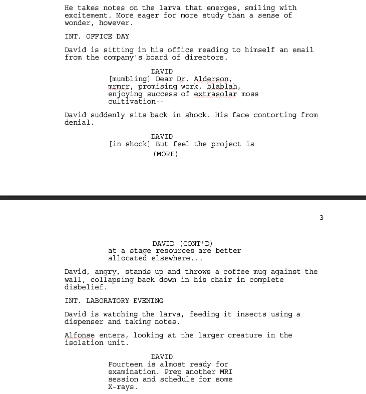
With a script I feel is on the right track I decided to streamline some of it so that the text flows better and the actions sound like directions. The two pages above have the most major alternations to them as I also wanted to keep in mind the possibility that I would leave out human characters for the final presentation.
I also made some modifications to the scene where David hears the news about having his funding being cut back. I believe this scene could be better conveyed with David's voice getting increasingly hostile rather than shouting "no no no!" repeatedly like a maniac. This more muted, tone-focused approach is a feature in when the third stage of the creature hatches from the cocoon. Like in the office, I'm inclined towards moving away from "no-no-no" type reactions.
Friday, 11 March 2016
Adaptation B: Friday Cleanups
Much of today was spent refining the head geometry of Colo Colo. I received some tips from Alan on cleaning up the geometry, and for the most part I don't think the geometry is too bad. So with some advice I moved ot add some depth to the crest to make it less flattened. The aim was to add definition, to resemble bone more than a flap of flesh (which is what a cockerel's crest consists of). THere could still be some more work to get the desired effect but I am confident at my progress so far.
With the crest roughly complete I looked into working on the interior of the mouth. To get the mirroring right, I worked on the mirrored version, which included extending the seam. So at present the three sections of the beak are of roughly the same length from the corner of the lip to the end, as they share the same loop that rounds out the lip's geometry.
Perhaps what the crest needs is a head ridge so that the features do not look completely flat across the highest point of the creature's head.
Subscribe to:
Posts (Atom)