Friday 27 February 2015

Fantastic Voyage: Research And Influence Map


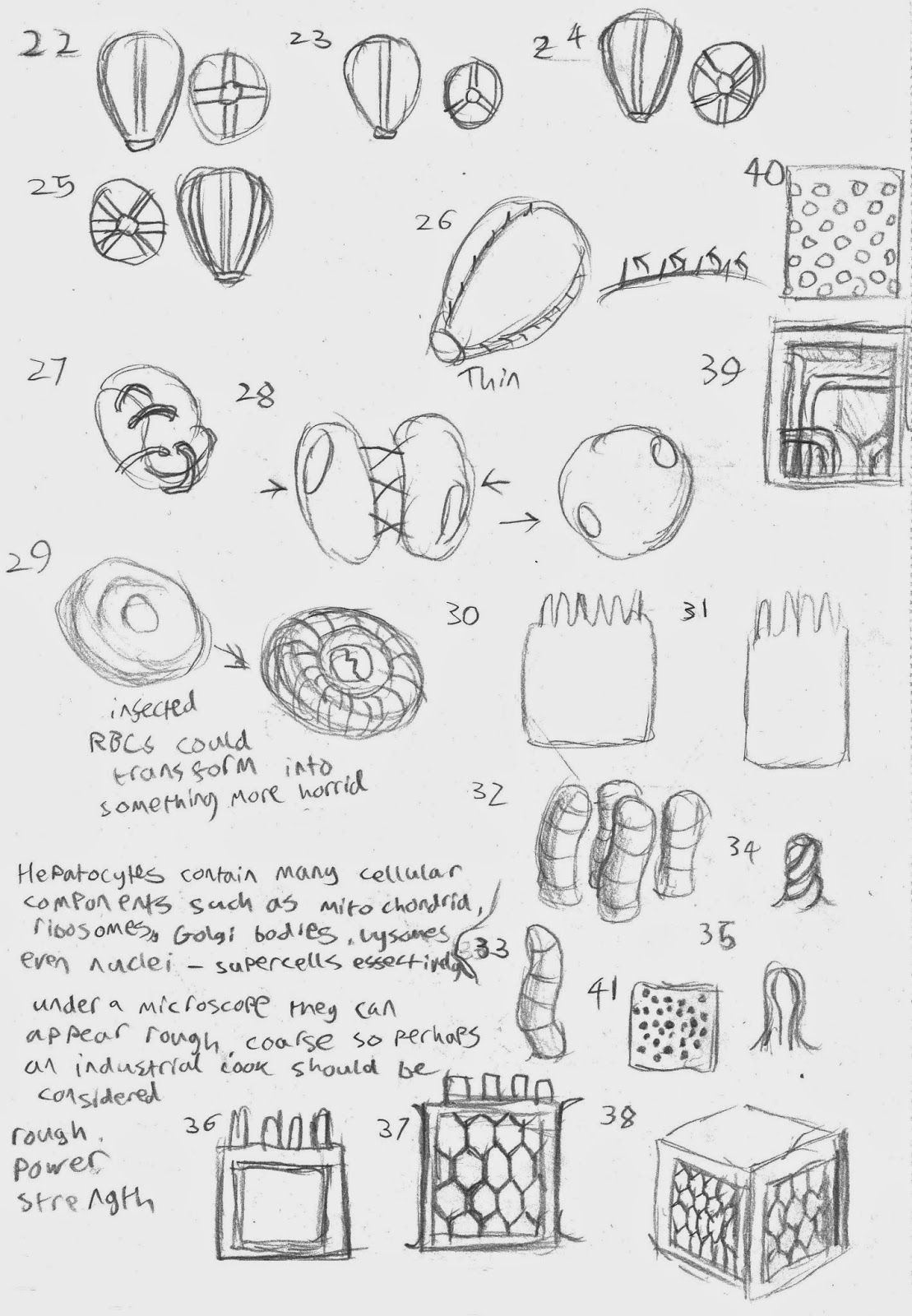
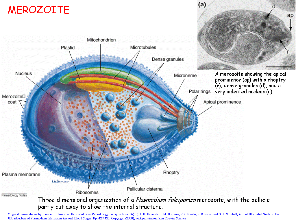
    After giving some thought, I have considered the target market for my project to be young boys aged between 13 and 21, particularly the kind of students who often find science boring  I have had my fair share of experiences where the content delivered in a science lesson may be lacking to some people and I recall that within such classes it often takes a practical lesson that involves spectacle such as a heart dissection or colouring the flame of a Bunsen burner to get such students exited.

    Science is all fields, but often when young people think of science the thing that often comes to mind is high-tech gadgets or billion-dollar projects from the realms of science fiction. The keywork for my project should logically be "spectacle".

    Call of Duty: Advanced Warfare, one of the latest release in the Call of Duty franchise is one of the most highly acclaimed of the series in recent years as well as topping 2014's sales charts (IGN, 2015, Allen, 2015). I'm looking at Advanced Warfare in particular because the near-future setting and - more pivotally the game's exosuits - correlate with the bio-mechanical theme I have been looking into. I don't think this is an isolated incident either. A previous near-future installment that also featured futuristic technology - Black Ops II - sold $500 million worth of copies the first day it was released (Tassi, 2014). While there might be significant atmospheric difference between the Alien and "Modern-era" Call of Duty franchise, they both share the use of an industrial setting featuring fancy technology, a gritty industrial look to the tech and environments and - importantly - robotics.

    Simon directed me towards the designs of Syd Mead, who worked on films such as Aliens, Blade Runner, Johnny Mnemonic, Tron and Elysium. His art style is grounded, functional, geometric and clean-ish (the degree of cleanness depending on the intended atmosphere).

    I also decided to look at other aesthetic hallmarks of the teenager sitting on the back-bench beyond Call of Duty such as smartphones and the staples of the kind of science fiction film and television popular among young teenage men. One of the things I discovered while looking for spaceship interiors was a photograph of London's Southwark Station, the interior of which, according to the photographer, looks like a spaceship (Tim, 2013)

Bibliography

27/2/15: Adobe Flash and Illustraator

    For a while I had wondered about using Adobe Illustrator and it feels good that I had the chance in this morning's CG art tools.class The task today was to use the knowledge of the pen tool that we had gained to trace over a logo found on the internet. The logo I selected  is one of the emblems of the Forerunners from the Halo franchise - although I am unsure which of the known Forerunners or AI that uses this one, The parent file was titled "Flood(1)" so it may be connected to The Flood.

    As usual, the doodle-page that comes with every new piece of software I encounter.

    In the animation class today we were given more bouncing balls to animate. Though I wonder if this clip might be a little too fast.

Thursday 26 February 2015

25/02/15: Life Drawing

    I feel things might have been a bit rapid with this life model drawing session but nonetheless I got some interesting imagery out of it, particularly the image where he is sitting on or using a large ball (my favourite of the quick poses is him posing as Atlas with the world on his shoulders). Of particular note this session was my introduction to collage (top-right), two poses I assembled from the covers of a newspaper and a magazine, making focus on using the colouration of the paper to work in light and dark. To add hilight for the image of the subject lying down I used chalk and a PVA coating to give a "shine" to the body


Fantastic Voyage: Storyboard Highlights and Concepts


    This afternoon was spent on brainstorming ideas for both object designs and a few storyboard ideas. I worked this out to be useful as the process in how the merozoite entered the blood cell proved pivotal to the merozoite's design (the aspects of which I have considered also using perhaps for the sporozoite). The hepatocyte - the liver cell - I enjoyed looking into. It's anatomy is unique amongst most cells in that it has large amounts of everything - Golgi organelles, mitochondria, endoplasmic reticulum, it's even common for them to posess two nuclei according to the University of Southern Illonois (King, 2011) - so designing one I had this image of them in the world of the animation being something industrial, heavy-duty and tough. A super-cell of some kind, which makes sense why sporozoites target them for the production of merozoites.


    I also looked back at potential environments. The liver region could be quite industrial, with tubes and cables connecting between hepatocytes, but should all the animation happen within the liver or do I include a more nondescript region of the body for the red blood cell phase? This is what I am considering for the moment.
    These are an extra set of thumbnails that were to go in-line with the previous set of thumbnails. With these I was exploring designs for the sporozoite (which woudl infect a hepatocyte), ookinate (the intermediate between the combining gametes), the gametes themselves and the schizont (the structure a merozoite turns into in order to reproduce). They may need a little refinement.

Speaking with Jackie I have considered the mechanical aesthetic of the different stages of malaria could look aggresive, brutal and hostile while the body cells have a more neutral maybe postmodern aesthetic (hence one or two ideas of the merozoite using spikes or barbed hooks to latch itself on to and enter a red blood cell), along with a passing idea that infected cells could themselves become more nasty-looking as malaria consumes them from the inside.

Bibliography

Wednesday 25 February 2015

Fantastic Voyage: Initial Thumbnails


   In order to get my head in the game I decided to consider some preliminary concept art, drawing inspiration from H. R. Giger's work alongside a few common patterns in ergonomic shapes to give a "technological" feel to the world. Revisiting Giger's designs and themes I might consider something less...squishy. The "mechanical" idea works for the mosquito, which given that it's an insect would already have a body covered in armour plating. With a few alterations I could make it visibly resemble some sort of jet.

Fantastic Voyage: More ideas

    My mind is becoming set on Malaria for the fascinating way it reproduces and the tricks it conducts in order to do this. While talking to one of my flatmates as well as Andy, the merozoite phase conjured up two inspirations: The Xenomorph and the Grey Goo scenario due to the way the merozoite surgically enters the blood cell, uses the cell's own body to replicate itself then reporduce to such a quantity that the host eventually bursts open, releasing thousands of merozoites to repeat the process in other blood cells.
Figure 1: The Merozoite enters a red blood cell much like a virus (Miller, 2011)

Figure 2: Merozoite close up, the construction could be like that of a single-purpose machine (Bannister, 2000)
     The Alien/Grey Goo combination has given me the thought of using a Gigeresque style, with the components looking somewhat like machines as at the subcellular level the difference between "organic" and "mechanical" begins to blur (I was once told to think of mitochondria as cell-scale power stations and the Golgi apparatus as a cell-scale sorting office). These things use their hosts to make more of themselves, which is Grey Goo in a nutshell.

    This might also give me a chance to build on the idea of using the shape profile.of a mosquito as the basis for something like an aircraft or a spaceship, to fit with the biomechanical theme.
Image References

Tuesday 24 February 2015

Fantastic Voyage: First Impressions

    A new project has been given to us by Prof. Klappa of the University of Kent. The task is to create an informative story/animation on the life cycle of one of four microscopic organisms: hookworms, influenza, malaria and slime mould. The two year Applied Science BTEC is currently acting as a big contributor to my enthusiasm

Looking over the videos provided by Professor Klappa, here are my initial thoughts on each. The overarching theme I got was that nature sure is lovely when it comes to survival tactics.
  • Influenza: Microbiology was part of my studies so it was intriguing to look into this. The nature of a virus indeed makes it hard to define it as "life" since viruses like influenza are essentially a protein/lipid shell containing several strands of RNA: No biological processes. Once it gets inside a cell and reprograms the host to make more of these carriers it works the host like a sweatshop and spitting out viruses like a machinegun until the cell dies of exhaustion. 
  • Slime mould: I got strong vibes of the hungry-hungry caterpillar, Terminator II and The Blob from this one: Spores mature into a kind of amoeba that eats bacteria until it starts starving; this "wave of famine" then causes them to combine into an aggregate mass of amoeba in the form of a slimy blob. The blob then grows fruiting buds that extend upwards, with a select few acting as "baby factories". The top of the bud explodes and the spores are scattered into the wind.
  • Hookworm: This one ties with malaria in the disgust factor as cycle of this one starts with pooh. Yay. When Klappa talked about the worms biting and getting into the bloodstream I got this image of blood cells being pushed aside by a massive worm that speeds all the way to the lungs. I thought it was clever how the larvae triggered a coughing reaction that had them capitalising on the natural tendency to swallow. Their preferred method of feeding (latching on and feeding on your blood) reminds me of vampires. The fact that the species that have adapted to humans are resistant to our stomach acids - tough little things, certainly.
  • Malaria: This one is certainly sticking in my mind even if the life cycle is quite extensive. When Klappa was talking about the method of reproduction (sporozoids infiltrating liver cells and multiplying until the cell swells until it bursts to release thousands of merozoites (larvae I guess) that do the same with red blood cells) is definitely viral and the exponential pattern is characteristic of a zombie apocalypse. The idea that the rarer gamete cells that swim around the blood (cell?) to be sucked up unintentionally by another mosquito is quite devious and makes it sound like infected become living incubators for the gamete cells that form a zygote in a mosquito's gut. Which, joy of joys, opens up to release sporeozites into the mosquito’s saliva for the whole cycle to begin again.
At first I can only envision the hookworm and slime mould being potentially cheerful and it is hookworm and malaria that are sticking in my mind the most.

I am a keen advocator of science and am one for believing that it is something that anyone can take an interest in. So for now I have a few initial considerations for the life form and target audience:

For the Hookworm:
  • Children: A happy story of a cute hookworm that finds its way into someone's body and lives a happy life cutely sucking blood. (Okay this one might be a challenge. Maybe it looks like it kissing the intestinal wall, or I look towards either squirrels or Japanese media).
  • Students: Perhaps another explorative story of a curious hookworm. Less cute than the one for kids, maybe something tech-y or informative.
  • Back-benchers: Connotations of vampirism could draw interest.
For Influenza:
  • Children: I got creeped-out by a student-level animation of a virus entering a cell when I was 12. Might want to stay away from this audience with this.
  • Students: Might require some thought. I've seen so many demonstrations on YouTube and TV that I get the "everything's been done" vibe.
  • Back-Benchers: Shouldn't be too hard to give a zombie-like or robotic aura to it. Showing a cell swarming with infant viruses like a flock of birds could be quite striking.
 For the Slime Mould:
  • Children: The aggregation phase could have a mood that the amoebas are getting together out of desire. If I were to have the animation showing the behaviour of the amoeba I should make sure to make it look like an act of cooperation. I should put emphasis on a charm factor for spores being scattered into the wind
  • Students: The scene in Terminator II where the T-1000 turns into a liquid and reconstructs itself could be an influence here.
  • Back-Benchers: Again, Terminator II. Although maybe combine it with an aggregate blob monster feel. Maybe the first stage could be somewhat game like: The player controls am amoeba as they hoover up smaller bacteria. 
Malaria
  • Children: Unless I aim for the kind of child that craves the disgusting, this might be harder to do and not scare the living daylights out of the audience.
  • Students: The viral multiplication phases could work like a map of a viral agent on a computer network where malaria "infects" connections on the network, spreading over the body. The video could also end how it began with a vector transferring the matured virus to a new network.
  • Back-Benchers: This microorganism has "zombie apocalypse" written all over its life cycle. The delivery system doesn't have to be organic - perhaps a dive-bomber or spaceship with the profile of a mosquito. It could be to the tone of science fiction (According to one recent art blog, at least one of the ship designs in Jupiter Ascending was inspired by the shape of a lobster, and it wasn't an isolated theme)
This project, depending on which direction I go, could end up quite fun to compose. While looking though my ideas I began to notice that perhaps some of the ideas for each audience could be swapped about.

Review: The Birds

Figure 1: Theatrical Poster (Angela, 2012)
  • Native Title: Alfred Hitchcock's The Birds
  • Primary Language: English
  • Format: Technicolour
  • Year of Release: 1963
  • Budget: est. $2,500,000
  • Film Length: 119 minutes
  • Production Company: Alfred J. Hitchcock Productions
    Another of Hitchcock's signature films The Birds is a horror-thriller that plays on connotation, symbolism and is one of the most recognisable films for it's use of the MacGuffin - In this film an attack on Bodega Bay, California by birds of all kinds.

    The film starts off in downtown San Francisco where Melanie Daniels (Tippi Hedren) encounters Mitch Brenner (Rod Taylor) in a pet shop. The two of them banter before Mitch drops the illusion where he thought Melanie was the store clerk but this is our first MacGuffin is introduced: The lovebirds. Although they are not in shot until the next day  they act as the catalyst that takes Melanie to the small fishing village of Bodega Bay 60 miles outside San Francisco.

    Melanie is introduced as a headstrong and rebellious character with a huge streak for deception: When fist in the pet shop she plays the game that she works there until Mitch calls her out and after he leaves the shop she notes down his license plate, calls a contact at her father's newspaper to find out who on the state DMV registrar owns the plate then pretends to half-remember Mitch's apartment number at the apartment block's reception desk. At every point from the apartment to Bodega Bay's post office, fishing wharf and even when speaking with, Annie Hayworth (The teacher of Mitch's younger sister Cathy) she pretends to be someone she isn't while still gaining information and, apparently, not rousing suspicion from the townsfolk.

Figure 2: Is this woman hysterically shouting at Melanie? Hitchcock?...or the audience?
(MovieClips, 2011)
    Not long after the lovebirds are delivered (by way of sneaking into Mitch's house while he's tending the nearby barn, no less), the second MacGuffin comes into play in the form of a seagull that swoops down and scratches Melanie in the temple. "Why are the birds attacking?" is the question on many peoples' minds, but the film gives no factual explanation. In one scene midway a woman  hysterically accuses Melanie (the camera positioned so she looks directly at the audience) of being the cause. "The Accusation points not simply to a supernatural cause, but an authorial one, as well. If there is no scientifically plausible reason for the attack of the birds, we are nonetheless constantly reminded that there is at least a reason for Hitchcock's staging of the attack" (Goldsmith, 2012). What's more, by looking directly at the viewer her words are in some respect directed towards the audience, perhaps the woman is not only shouting at Melanie, but perhaps Hitchcock himself for making the town suffer like this (this was right after a severe attack by the birds which led to a large fire in the town centre) and maybe, at a stretch, also condemning the audience for being willing to sit though this disaster for the sake of entertainment and to enjoy another classic choreographed by their tormentor to the detriment of the well-being of these fictional characters.

    Another thing that happens several times is the camera acts either as Mealie's eyes, or as an indicator of a danger she may be oblivious to and there are several key scenes that use this to promote shock value. During her return from the inflitration of Mich' house, we see him get into his car and drive around the lake. But "we see only only what she can see from the rowboat. Suddenly, near shore, the camera picks up a sea gull swooping down on our heroine. For just a second, the point of view is shifted, and we are permitted to see the bird before its victim does" (Sarris, 1963). The latter idea is then used again in a later and more iconic scene where crows cover the school playground. Melanie doesn't see any of them, too busy waiting and occupying herself, So the crows gather gradually in the playground and then, the audience itself gets treated the same way as after a number of crows gather the camera joins Melanie in following one flying for a while before it finally lands...on a climbing frame packed with crows. This time the shock value comes from simply how many birds have gathered. The audience saw the numbers building and building to practically ludicrous levels, as well as building the dread that these things are amassing for an inevitable attack.
Figure 3: Surely when filming this Hitchcock descended into rabidly
shouting 
"More birds! More birds!" (MrDisgusting, 2013)
    The film's ending is famous for being so...open. The screen fades to black as the car drives away from the farmhouse which had been swarmed by birds. The entire landscape screams of a zombie apocalypse (impressive seeing as this film predates Night of the Living Dead, arguably the world's first zombie horror). But there is a jarring lack of closure: They drive away from the farmhouse but we see nothing else beyond that. The controversiality was expressed by Cagey Films' Kenneth Godwyn who recalled that back in 1963 of his classmates complained that the theatrical showing had the ending cut off. Reciting that the boy had "Seen it before and that the army had come in, using the children for bait, and killed all the birds with flamethrowers" (Godwyn, 2012). This is a rather chilling and outlandish ending suggestion and something more in-line with the imagination of a teenager than Hitchcock himself which cements the outlandishness but nevertheless demonstrates that there were those who thought the true ending wasn't enough and that it had effectively finished on a cliffhanger.
Figure 4: Car drives away, birds stare on. The end. (Godwyn, 2012)
   The abrupt ending isn't the most extreme cliffhanger in cinema. The Italian Job finished with a coach full of gold hanging halfway off a mountain cliff and Michael Caine telling his partners in crime "Alright chaps. I've got an idea". What was his solution? We never see or hear. At least in The Birds there's a glimmer that the birds may have left the car alone afterwards.

Bibliography
Image References

Monday 23 February 2015

Maya Tutorials: Walk-cycle and rigging the legs


    Rigging and fine-tuning animation is a vital part of animating a character and after almost a month of anticipation I'm finally glad to take the first steps into this phase of bringing things to life. Aside from getting used to a compressed construction grid and some of the tools for customising joints, these lessons felt fairly smooth. While at a glance the mechanics are fairly simple, it certainly hit home all the minute details required ot make the act of walking believeable: The tilt and sway of the hips, the slight back-and-forth sway from the body trying to balance are all little details that make something believeable.

    When making figurines I always felt a little annoyed, and a teeny bit fascinated that in making humanoid figures they could never stand up unless propped up by something like a rock-solid cloak, full-length robe or or dress. One of the issues with presenting  my final project for my BTEC in Art and Design was that the model couldn't stand on his own and I had to either prop him up or have him held up by wire or string. It was intriguing to include a slight forwards-backwards wobble in the animation as it demonstrated that even when standing in a neutral position, the human figure is upright only though constant application of minute counter-sways in order to offset the lean caused by unbalanced weight since the human body is essentially a sack on two rods not within the ground and slightly bent in the middle. The means to readjust their standing position is something models don't have and supertall skyscrapers are beginning to have pendulum-like counterweights built inside them to stop them from toppling in a breeze. It is as they say, "you cannot fully appreciate something until you are deprived of it" - in this case, the ability to stand up without any external help. And one of the reasons the body tends to flop and collapse over itself when made unresponsive via death, sleep deprivation or getting knocked unconscious.

It really goes to show how minutely complicated the human (or indeed any living) body is.

First Master Studies Works

      Photoshop lessons have begun once again and the first session was on the art of the master study. Which overall felt like they went fairly well, some studies came out better than others but I feel happy that for most of them as the tonal range is still fairly close to that of the original. We were all informed at the beginning of the year that the reason old paintings were selected was because after decades, even centuries of scrutiny, the quality of these paintings still held up well in the eyes of generations of critics and I can understand the logic behind this. 

     Each of these were done under time constraints so some of them look barely started compared to the finsihed work. But even so I felt a little surpised at how skewed the top portrait is (The pictures are upside down out of recoomendation by Jordan, suggesting that by looking at the face upside down I might be less inclined to see it as a face and more a collection of shapes. It kind-of worked). I feel my composition of this man's face by the end seem a little jarring: His coat is fairly accurate, maybe a little loosely painted, but his face is definitely something that looks like it needs improvement. He also looks angry.

     The portrait and the picture just above were composed by John Singer-Sergeant. And this one due ot it's complexity I plan to further work on at some point. So an improved version will come soon. Especially since I had ended up going slightly off-track while painting, completing the woman before anything else.

Being a first lesson, Jordan wasn't expecting near-flawless replications and I'm both glad and understanding of that decision - these paintings probably took several hours, broken into several stints, and for each of these all I had was half an hour. Maybe a little more. ALthough then again I had it a little easier: No paint drying times and this was a copying effort isntead of creating something where only the eyes are the lens and the framing.

Thursday 19 February 2015

From Script To Screen: Final Presenation


High Aspirations Pre Vis 1 from Mark Stamp on Vimeo.
I present my animatic and pre-visualisation with audio for the From Script To Screen Project and the effort of seven weeks work, discussion and refinement. A long journey, I made some sacrifices and soem cutbacks, but in the end I have created something I am happy with.

Artist's Toolkit Updates


    These items were long overdue for upload but with final preparations for Friday's presentation being made tonight I took ten minutes to compose this. Above, as usual, are evidence of Maya tutorials, below is the second video I made in my first session with Adobe Flash. We were asked to make an animated line which, after getting into my stride came out fairly smoothly for 12FPS (or was it more?). The background did not take long to compose although I would have liked to improve it with moving light rays from the surface. 
    This is the other tutorial I had finished recently which was designed to teach how to travel and distort an object. The distortion I thought was quite clever: duplicating the ball, parenting it to the original, making the original transparent while giving the duplicate the skin and then turning the duplicate ball to face a random direction. The texture would then act as if it were applied at an angle.
    It is certainly more advantageous than creating a tilted texture (which for a sphere would have been quite complicated and there would be the matter of twisting the texture in another direction.

Wednesday 18 February 2015

18/02/2015 Life Drawing


    New model, new opportunities. Today's model Lydia (or Lilith, I spent the two hours after the session on my pre-vis so the name has faded a little) has an alluring grace to her figure, which is why I was termined to get her body as right as I could for the 40 minute drawing at the top. I am fairly proud of it; a combination of chalk, charcoal and a 4B pencil. The red, orange and yellow pastel drawings were inspired by the slightly yellowish tinge of the highlights the model had while she was posing. A real shame I wasn't quite fast enough on the top-right pose.

Tuesday 17 February 2015

@Simon From Script To Screen: Animatic and Pre-Vis construction

    Lacking audio but I have managed to complete an initial animatic. WIthout any sounds it is...eerie even if I havem ost of the story spent on actions instead of dialogue. Today has also been a little crash-course in moving the body parts of the pre-rigged characters being used in the scene. But for the most part I'd say the first scene is roundabout ready for animation.

    This is my current pre-vis setup. with 12 seconds done (I should look at my camera angles and animation lengths as theoretically I should he 20s on my animatic)
    This is the biggest obstacle I have encountered: it seems on copying the project onto my flash drive, Clarette's rig appears to have detached from her body so if there is a way I can reconnect it (I have yet to do the walk-cycle tutorial which I probably should consider for the second half of the animation) things can progress as planned. My current contingency is to work on her animations on the original file at university and then import that into the scene.

Monday 16 February 2015

From Script To Screen: More Environment Concepts

    I'm mulling over what to do for the bench that will be the setting for the bulk of the composition. Because this is supposed to be within the imagination of the mother I want to convey a sense of surrealism about the location. At first I wondered about keeping it monochrome based on articles that suggested that the majority who grew up with black-and-white television (the transition to colour if I recall was in 1975) experienced monochrome dreams. I figured it would not be too much of a stretch to assume that as a daydream and being part of the generations that grew up with monochrome, Clarette would potentially envision the ordeal in black-and-white.

Regardless I experimented with some colour samples for the bench. Because of the mood that will dominate I'm still inclined to keep it a little washed-out. An alternative is that as the scene gets happier and more optimistic, it gets a little more colourful (perhaps though use of a filter on the camera?). Perhaps Clarette, her bag and the marionette are in colour while the bench is black-and-white in order to amplify the idea this is an unreal space.

Although I included a shaft of light only in thumbnails 1 and 2, I might consider using it for the final concept.

Bibliography

From Script To Screen: Improved Storyboard


    Worked on a revised storyboard that includes the new panels as well as tweaks to the original panels so that there is a little less wasted space as some of the panels made the camera look very distant.

From Script To Screen: Storyboard Refinement Ideas


    In response to a suggestion that the camera felt too distant especially at crucial points I have created a few panels to replace current ones or fit within the established storyboard. I feel that while the panning series (second page, central image) may add to the time, I want it to feel immensely powerful as it leads on to the marionette drifting to freedom.
 
    I am now thinking that by the second camera position of that moment the marionette begins to float upwards While it looks like the camera looks at more of the marionette again, the 16:9 perspective of the animatic and pre-viz might mean the camera does not extend leftwards between point 2 and 3. Admittedly there is an anatomical error on Clarette's right arm In that moment which I will fix depending on whether or not it's understood on sight as an error and not Clarette gaining arm-morphing powers for this one moment.

Saturday 14 February 2015

Summary: Barcelona, February 2015

The Museu Nacional d'Art de Catalunya (National museum of Art of Catalonia) is one of my favourite buildings that for me draws forth images of the zenith.of the Spanish Colonial Empire. Such a legacy was bolstered by imported trees and parakeets flying in flocks particularly here.
    I have returned from the five-day trip to Barcelona, Catalonia, Spain. A beautiful city nestled along the coast of the Mediterranean and at the foot of the Spanish Alps. I fell in love with the city within the afternoon I had arrived due to the staggering abundance of large Italian-influenced neoclassical facades combined (for at least half od the city) with a well-planned Roman-like grid system. Tree-lined avenues (sadly leaves had not blossomed while I was there but I can almsot imagine what they look like in full bloom) crossed the city and were occasionally peppered with statues and gorgeous fountains. It is a shame that in my haste to leave for it I had left my camera behind because I do nto believe these sketches or my descriptions do the city full justice

     My days were very busy so I did not have much time for sketching. So I used much of friday to wander the city committing it to it to pencil in a new sketchbook. I got the chance to draw La Sagrada Familia and the Museu Nacional d'Art de Catalunya. The top two images ot the left were from two things I had seen outside the Salvidor Dali Theatre and Museum in Figueres, a town an hour or so outside of Barcelona. Even with most of the city being these stone-faced mid-rise buildings the metropolis still felt huge with blocks rising between seven and ten stories in the metropolitan area and between four and six in the older, more tightly-packed and warren-like Gothic District, with four-to-five metre-tall ground floor levels on many of the metropolitan buildings.
Theere were many large ornmaneted buildings like
above.
    This is a city I would definitely love to return to. Despite it's age i'd say it combines it's ancient history and historic architecture with the modernity of an organised modern metropolis (such as New York) very well as much of the city is quite spacious thanks it it's wide avenues. I was able to visit many places by keepign a relatively straight path and it was only in the more maze-like Gothic district where I felt the risk of getting lost.

    As I said above, it is  shame I did not bring a camera because I felt there was a wealth of inspiration here from the broad avenues to the canyon-like Gothic district and Barcelona's central cathedrals. It is a city that despite the 2008 recession is still one of the great cultural and commercial hearts of Europe. The elegant buildings make the entire city ooze wealth and influence even in this modern age of economy and minimalism.