Tuesday 30 December 2014

Review: Prometheus

Figure 1: Theatrical Poster (IMDb)
  • Native Title: Prometheus
  • Primary Language: English
  • Format: Colour
  • Year of release: 2012
  • Director: Ridley Scott
  • Budget: est. $130,000,000
  • Film Length: 124 minutes
  • Production Company: 20th Century Fox

  •     Not on the list of movies to review but I have been talking to several people about this, some saying it's good some saying it's bad (a lot saying it's bad) so I used my free time to discover for myself.

        Ridley Scott was a fan of the methods of Stanley Kubrick and there is a strong indicator he was a big fan of 2001: A Space Odyssey and it shows within the first ten minutes as we begin with a rather drawn-out flyover of mountains and canyons before we see the shadow of some spaceship that hovered above a rather athletic-looking white guy (and I mean white; his skin was chalk) with pitch-black eyes...who proceeds to kill himself with some odd substance.

        The Kubrickian sense of scale does not stop there as after the ritual suicide and a quick scene in the Scottish isles we get a pan-over of a very vibrant starfield as a ship - the Prometheus - sails though space. As well as echoing 2001, Prometheus also appears to echo Scott's first A amlien film as the camera wanders the ship with the android crewmember David (Michael Fassbender). Who apparently spent his days watching old movies and learning Proto-Indo-European.

    Figure 2: Seeing this a dozen times at different places was apparently
    enough to convince a scientist that the involved being is our creator
         I noticed straight away that this film has strong religious connotations, perhaps to the point of overbearing. David watches a memory of Elizabeth Shaw (Noomi Rapace) as her dad talks about where people go when they die (with a young Shaw being adorably curious). Shaw herself believed the aliens of the film to be humanity's creators based on the same image and the same constellation appearing in several ancient carvings and just that. There are no other indicators other than this repeating image to how these giant beings are so important to humans, which prompts derivative (and possibly understandable) laughter from the rest of the Prometheus crew when she announces her theory. Her belief in God and that the Engineers are humanity's creators are apparently what prompted Peter Weyland (Guy Vickers) to hire her for the Prometheus mission. When asked about what makes her so certain she says she has faith. She has faith in a complete hunch in my opinion. A proper scientist would have either considered all possible connotations or looked for more concrete indicators for her hypothesis.

        What can often crop up in Hollywood science fiction is a lack of scientific accuracy (something that 2001 avoided by having futurist and inventor Arthur C. Clarke as a screenwriter). In this film much of the "bad science" comes from bad scientific practice. I already outlined Shaw's faith in what is a complete guess but there are plenty of stupid actions in this film that bow to the cliché of plot-induced stupidity. Shaw refuses to let one of the crew bring a weapon to an unknown alien environment, every crewmember at some point removes their helmets because the atmosphere is declared breathable (but no word on pathogen-free), crew biologist Millburn (Rafe Spall) dies because he's too mesmerised by an alien snake thing to realise it could kill him (and it does, no surprise), quarantine apparently involves spraying something with CO2 (I think) until it is considered "clean" and the personal quarters of Meredith Vickers (Charlize Theron, a woman) contains a robotic surgery bed that can only autonomously work on male patients.

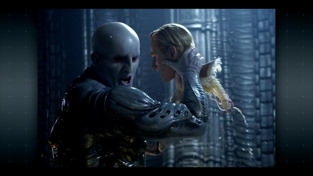
    Figure 3: Pretty sure something that shares our DNA to the last gene
    can't tear off an android's head like it was the lid of a jam-jar.
        There is also more typical bad science going on. It is revealed halfway though that the Engineer DNA is a 100% match to human DNA. 100% could have been a buzzword for "practically identical" were it not for Shaw saying it as if she is reading it off a screen - which it was. The Engineers however are 10ft tall chalk-white ebony-eyed supermen that can yank an Android's head from it's spine (in Alien, Ash's head was dislodged when Parker took a wrench to it but it was still connected to his body). That armour on the right also looks vaguely like it's part of his body; either he was genetically modified (which throws a wrench in the "100% match" idea as the sample came from an identical type of guy) or it's more Giger-inspired biomechanics. This super strength is also demonstrated by smacking several men across the rather large room. If these engineers were a 100% genetic match to us they could have perhaps been a teensy bit more human.

        As far as films go it was decent if a bit ambitious; a B-movie trying to be an epic saga that might be a bit too heavy-handed when it comes to its religious messages. Some transhumanists might find Shaw's answer of "you are a robot, you wouldn't understand" to David not quite understanding why she wants to meet the Engineers despite them wanting to destroy her to be offensive, made worse in that David spent the movie in an experience reminiscent of Pinnochio. I wouldn't rate this highly but it's not unwatchable if what you are after is cinematic spectacle and special effects. If you are after this century's 2001 however, Interstellar might be a better option.

    Image Reference

    Thursday 18 December 2014

    Maya Winter Stocktake

    Presented are links to all relevant blog posts to maya tutorials. The entries are listed chronologically from newest to oldest.
     Old Alley and Cartoon Characters


    Whimsey House


    Depth of Field and Software Shader

    Maya tutorials: Depth of Field and Software Render Layers

        I decided to push on with the tutorials and managed to complete the Depth of Field tutorial in a good amount of time, which gave me a slightly better understanding of Adobe After-Effects.

        The same however could not be said for the render passing tutorial. Smoothing the car the way I did came to bite me on the backside as can be seen below when it came to the matte render layer for the car. I discovered that single-selecting on a polygon had a chance to have its original non-smoothed wireframe selected and boundary-selecting the polygon not only meant I applied the surface shader to both polygons on the working render layer, but I also applied the shader to every render layer.

         At this point I think I'm going to stop. This is the last push but this is the third time tonight I've made a mistake and have had to remake the render layers mostly from scratch. The only other option I can think of is to render again and delete or isolate the non-smoothed wireframes as I go (for Old Alley I added them to a second invisible layer). But sa for fixing right now I have worked myself into a stressful state so for my sake it might be best to put it aside for now lest I blow a few nerves.


    Maya Tutorials: Rendering with Softaware

    UPDATE 18/12/2014: Disregard this problem. I discovered doing another tutorial that the reason I could not see anything was because I had created the layer in the wrong layering channel. It was in a display rather than a render layer

        Continuing from last night I decided to see what progress I could make with the Maya tutorails. Things did not go smoothly however, first minor issue was the smooth proxy system didn't like rendering the whole thing at once, I tried numerous settings and the settings advised but each time the software only smoothed out the rear left wheel. I eventually concluded the best solution was to render each primitive one-at-a-time.
        The other issue I had - which upon discovery has killed my momentum - was discovering how basic layer attributes had gotten compared to Maya 2013, including the checkboxes that Alan mentioned had been in Maya since version 1. I got hit with the blow that in this version Autodesk decided to remove an important feature that had been in their product for 16 years and what they left behind was...I don't know.

        I've become stuck on how to continue as it looks like virtually none of the parameters that will be useful are there and the ones that are there look basic to the point of being unhelpful.

        @Alan, @Simon or anyone, if any know how to get around this problem, please let me know because right now I do not know if I can progress any further with this tutorial. Until then I will see if I have better luck with the Depth of Field tutorial.


    Wednesday 17 December 2014

    Maya Tutorials: The Whimsey Kitchen


          Working on these I gained a newfound appreciation for lighting setups. What can be possible in Maya can be impressive and has helped me understand there is much more to light rays than the items it illuminates and the broader light rays that brighten up a room. I also believe I have developed a more solid understanding of area lights and their capabilities.


        The number of separate lights was a little staggering for a first time and the layout of the broader house does feel confusing as the door to the kitchen is connected to a corridor or room the outer wall of which does not appear to obstruct the light from the right-hand window despite the sunlighht being at a slight angle though either window, which throws off where exactly the sun is in the scene as all the installed directional light appears ot be illuminating is the windowsill pottery and the left-hand counter.

        The final image took half an hour to render on my PC. Had this been even a short scene I can see a render like this taking most of a day for just one second of 24fps footage. Then again given the room is illuminated by two sunlight sources (one of which must be getting obscured by the rest of the building) this might be an example of more-than-normal quantities of lighting for eductional purposes.

    Friday 12 December 2014

    Project 2: WHat If Metropolis: Final Render.

        I was going to publish this last night but it got pretty late and close ot the deadline to do so. But after seven weeks of work I am glad I am finally finished and I like how it has turned out so well. For the most part I feel like all my time texture designing have paid off. One of the criticisms given on the crit was that because I had gone for such a realistic tone ot the city, the matte painting at the back didn't work quite as well.

        I spoke with Stitch after the crit and he suggested I should consider using harder brushes to give a more solid feel to my work, which I can understand as I might have for the most part been using fairly soft brushes and I guess it does show with the matte painting. I was advised to go for a more photographic look (which I can achieve with photoreferencing and using real photographs as a guide), so it is a good thing I placed the city in the middle of China.

    Thursday 11 December 2014

    Correspondance Archive.

    Just an archive of the correspondance I'ce had with this project. Links to the relevant blog posts are provided while they are all listed chronologically fro mthe first post  onwards.

    OGR 06/11/2014

    Hi Mark,

    That's one sensual, luxuriant city you describe - I was quite swept away by your lavish descriptions of this 'petal city'! I enjoyed your travelogue very much! You've given yourself a richness of detail there in terms of inspiring your next thumbnails - and it appears as if you're moving towards those dominant towers as being among your 'key assets' in terms of working in Maya. The only thing I'd say is be sure to go back to the works of Treacy as a touchstone even as you've identified 'petals' as a preoccupation of the designer, and as you move towards developing your key assets. Don't let this world of 'flower-like' forms as inspired by Treacy become a world of architectural flowers; look again at the essential organic shapes favoured by Treacy and ensure you maintain that same level of 'abstraction'; for example, the idea of having actual globe artichokes as architectural elements is too literal; and the idea of the city 'being' a lotus flower - is also too literal; for example, if you were to look at the Sidney Opera House, it's suggestive of lots of organic elements, but is not quite any of them either:

    http://upload.wikimedia.org/wikipedia/commons/4/40/Sydney_Opera_House_Sails.jpg

    So, just don't take your eye of Treacy as you seek to take your city to the next level of refinement.
    Replies

    1. Hello Phil

      I can understand where I may have been a little too literal as some of Treacy's hats do appear like that and I think I became a little too preoccupied with mimicking these designs.

      http://i.telegraph.co.uk/multimedia/archive/02871/treacy1_2871104b.jpg
      https://blogger.googleusercontent.com/img/b/R29vZ2xl/AVvXsEjwWDb9ipb9uDGYOM3MosVAorWXu-3dII4JFDM652w9jK62Yh1X78xfTpGsP6NhEzUDXdskyuvtnyJdKMjMWT0f5feboTBqjlMOz9bRx9rsZQPmO-tNQMae1stZ0DM2_tP2hxqM_gEK2-w/s1600/P1090730d.jpg

      But true they are not his only forms, he is also known for abstract looping and folding designs as well as the usage of feathers. One idea I had earlier on was to take the shape and arrangement of the lotus petals but only as an outlining "sliced and laid out orange wedges" kind of shape. Some of his designs do appear as curved leaves, but they are also un-leaflike In terms of colour and pattern.

      http://i.dailymail.co.uk/i/pix/2011/05/04/article-1383648-0BD71EFB00000578-934_306x423.jpg

      I will look into making my buildings organic, but abstract. Part of the reason was perhaps I did not want to wander too far into the designs of Zaha Hadid who uses plenty of organic shapes but not in the same way Treacy does.


    Mark - I think you're drawing in a too-complicated way; think about working up from silhouettes - knock the detail out; my point about 'too literal' meant you'd started drawing flowers as flowers, as opposed to deriving sculptural/structural forms from flowers. Stop drawing for a moment - this method is clearly giving you nothing new - try something else: look at some natural flower forms, turn them into strong, crisp silhouettes and then 'assemble' architectural forms from the silhouettes; once you've got a strong silhouette, you can draw the detail back into the form in the knowledge that it's looking strong. Stop drawing - start assembling! And keep real architectural stuff as your reference: imagine the sidney opera house as just a silhouette - see:

    http://danadecals.com/blog/wp-content/uploads/2012/04/214.jpg

    simple, strong, organic, essentialised... this is what you need - not complex pencil drawings, but punchy forms; why not take Treacy's hats and turn them into an inventory of silhouettes for recombining?

    Time to change up your method!

    1. really like no 4, Mark! & 12 - this technique is working for you :)
      ReplyDelete
      Replies

      1. Once I got over the initial uneasyness of working with stamps (what this technique feels like) I think I managed ot get some good shapes out of it. I'd been debating to myself and had a brief talk with Simon about how much "me" should be i nthere given that I am confused as to whether i'm supposed to channel my designer or think of it as a collaboration.

        With the latter interpretation, I think such a combination may work as we both enjoy organic and nature-inspired styles and shapes. The brief felt quite brief on our intended relationship with our designers.

    2. Mind your spelling Mark - you have 'silhouettes of Treacy's various hates' there! That would probably be a different city altogether :)

      At the moment, numbers 4,5 and 8 appeal to me the most....

    3. Hi Mark, I think 4, 7 & 8 are my favourites as you've really managed to capture of feeling of depth in your thumbnails. They would also by good for layering up when it comes to putting together matte painting and Maya I think. :)
      Replies

      1. I think I have settled on 8 for my concept proposal as I can see a fair bit of flexibility in it. I think I also like it because it steps away from what could be perceived as perspective exercises although maybe I should do a refined silhouette of 7 as I had considered that one for the master concept as well due to the depth of it.


    1. For me, number 1 just doesn't feel quite right - I think it is the vary large, very centralised building. 2 does it for me, as it has the most depth.

      Just a thought, could you post your silhouettes of the hats that you are using to construct these cityscapes, if you haven't done so already? (I have had a look through, but I can't see them...) I think it would be useful for your viewer to see what the shapes are derived from :)
      Replies
      1. At the moment I am juggling between 2 and 3. 2 I like for the cityscape at the back and I could fit some sort of green space In the bottom-middle, 3 I like because I am interested in the idea of part of the city being a bridge over a canyon. It feels like an intriguing idea to explore especially with buildings on top.

        I'll see what I can do about posting my silhouette templates. I have a collection of the templates I used on my home PC so when I can I will see about pasting them on to a contact sheet.
        Delete
    2. *very !
    3. I really like 2 and 3 here, I love the distance cityscape in number 2, makes it really look like a metropolis.
      ReplyDelete
      Replies
      1. Yeah I'm leaning towards no. 2. The distant cityscape is more noticeable and the midground could be used for something like a park, rather than what could be yawning chasm in 3.
     
     
    Your rendering of your images has become a lot nicer in terms of not over working it, that's great! :^)

    Though..
    As Senbon Zakura is a Japanese term (I'm assuming from that one Hatsune Miku song...) would it be fitting to use it as a name for your city? Philip Treacy does do a lot with flowers and so cherry blossoms would be justified in that sense.. however he is Irish, not Japanese. That and you talked about your city perhaps being in a Chinese Valley. That could also be very contradicting. The same Kanji is used for "One Thousand Cherry Blossoms" in Chinese and Japanese but it is a different pronunciation. There's a clash of culture.

    Curious about your reasoning is all, sorry if this sounds a little rude, I don't mean to be! ^^
     
    You're not being rude it's fine.

    I asked Tumo the other week to find a Chinese translation for "city of a thousand petals" (which I thought fit a city deeply rooted in flowers given the importance of certain flowers in China's cultural heritage. A thousand-petalled lotus flower is also the metaphoric representation for the crown chakra in TIbetan Kundalini Buddhism) and apparently "Senbonzakura" was it - So Hatsune Miku's song wasn't my inspiration. I was worried that it would in fact be a Japanese translation or that it would actually mean something completely different so I plan to change it if neccessary.

    The China thing comes from an interview with Lux Magazine. Revolving around his Orchid Collection that was shown at the January 2000 Paris Fashion Week: http://lux-mag.com/2013/04/19/hats-off-to-the-preacher-man/

    Near the end he says “I have my own style of shape so I can adapt what I do to anything potentially. Designing a building would be fun, in Shanghai, China; they are very open to the future." That's what inspired me to put the city in China because it sounds like somewhere he'd be interested in working. Plus China is known for its crazy and often organic buildings. I found several examples of organic architecture in several locations within China.
    Replies

    1. Ah, that interview is a great find! I'm glad.

      I did some research trying to find the Chinese equivalent translation of "senbonzakura" and found "一千樱花" However, romanized it translates to "Yīqiān yīnghuā" which isn't as memorable unfortunately! (And perhaps not as accurate a term as you'd like)

      Speaking of memorability, when most people think about China a strong sense of historical, oriental buildings, and red is usually imagined. It would definitely be interesting to see how you can incorporate Philip Treacy's fashion with hints of China's culture. - If you can get the balance right!

      Good luck! :^)

    2. @Pin Buns: Thank you for your help. I stumbled across this site http://en.bab.la/dictionary/chinese-english/ while looking for the English meaning of the phrase you found and I got "thousand cherry-blossoms". I used the site to find "花瓣" or "huā bàn" which means "petal" and about seven different ways to say "city" in Chinese although "市" (shì) appears most frequently but is often part of another word. I decided to look into "valley" which was an alternative descriptive and got 流域 (liú yù).

      So my deduction is "thousand-petal valley" (based on how cities in Europe have names like Ox-ford, Ham-burg and Buda-pest) could be translated as 一千花瓣流域 "Yīqiān huābàn liúyù" (probably an apeish translation but its the best I can work out.)

      Again, not as smooth as Senbonzakura and it is a lot more of a mouthful but I feel good I managed to do some research on it. The site has Princeton copyrights in places so I really hope these translations are genuine.

    3. Woo! That's good news. It'll add some "legitimacy" if you can figure out an effective name to describe your city like you're doing. (Although try not to focus too much on that, at the least make sure to reflect the name in your city!! i.e A city with Cherry Blossoms would need to be more pink!)

      If we do a narrative-based project I'm sure you'll love that. :^3

    4. I'll see about adding some plant life on the rooftops and on balconies at some point. It would be wierd to name this city after an abundance of petals...when there are no petals.

      I think narrative-based projects come later. So I look forward ot the prospect.
    Looking great so far Mark, you have a nice composition going on here! I like how you clearly guide us through each step it's very useful in terms of being able to change things quickly. Though remember this is just a concept piece, I wouldn't get caught up in every tiny detail as these can be left for your key asset and orthographic sheets. Other than that keep going on with this! :)
    I might have gone a tiny bit overboard with the buildings in the foreground (what with them being the closest buildings in the shot) but I have been telling myself to spare the detail towards the back of the piece so I don't overdo it with detail and thus lose the focus.

    Hi Becky

    I really like 17 and 13 for their modern-yet-traditional feel. The use of turf for your first thumbnail set adds a nice modernist-yet-country charm to the whole feel. 18 looks like a huge fancy tent. It really works as a bungalow.
     
    That orthograph for the star-balconied hall is impressive!
    Thanks. I think that might be my hero prop. Either that or the spherical;building behind it.

    Very surreal. The floor from the midground and further back looks like it could be the patterns of a sprawling metropolis, with the gnarled outcropppings being megastructures. That's what I see anyway.

    The sun being a ring is a very surreal addition.

    Hi Mark!
    Looks like it's coming along well....Looking forward to seeing the final piece on Friday!
    My advice would be to put the film reviews on the back burner for now, and concentrate on getting the WIM done in time - you can wrap up any 'left-over' film reviews over the holiday :)
    Replied
    1. Hmm, if you're confident that it's fine to put off the film reviews for the holidays (when I have much more time) I might. Might. Be able to get another building done if I'm prompt enough. Or it gives me time to work on the matt painting

    That is looking really cool! I expect that will look magnificent once it's textured.
    Looking good Mark!
    Deep breath.... keep pushing on! :)

    your mayas looking good have you had prior experience
    Replies
    1. Jordan made the bulk of the blockout and I tweaked and lit it. The closest I have to prior experience is time spent toying with Google Sketchup and a couple of games that have featured model and map toolkits.

    Matte Painting

         Didn't take long to make up a matte painting for the final presentation. The image on the right is what I will be using. I used the background of the original concept piece as a base but did some serious tidying up of it before adding the lower half. The image below is the painting as it was before I added the city at the back. I admit I may have gotten sloppy with keeping record during the crunch time however.

    Project 2: What If Metropolis Crit Presentation

    Wednesday 10 December 2014

    Maya Tutorials Update: Whimsey House

         I now have all the exterior lighting tutorials completed. The last one of the set is the interior lighting test which should be interesting.
         After a couple of tutorials the final stage got pretty automated - copy the sky layer, move it up, select the house via the alpha channel, expand selection by one pixel, cut away the bit in front of the house, use a gaussian blur set to 1.0 pixels to give that effect that the environment light is reflecting off the edges.


    Long-Awaited Update

         With some rendering on tutorials underway I thought an update of my project was long overdue. At least I am just about ready with my textures. However I regret one or two buildings may have to be left out of the final render due to pacing and a hint of me biting off more than I thought I could chew. But I digress, just about everything has had bumpmaps, specular maps and texture maps assembled and some of them are looking pretty good wraped around the models.

        It did feel something of a slog getting to this point but now that I have (barring maybe one texture map) reached the point I can install everything and test the lighting and hopefully everything should be ready by Friday.

        One thing all this texture mapping has aided me with is getting brisker with painting. While some of the painting surfaces started off confusing, there are times I ahve taken the work in my stride, other times I needed to push myself, but I feel like I am almost. ALmost over the crest of the hill, although it took a couple of late nights to manage it.


         Of the current models I have, all the texture mapping I have left is the closest balcony (the one which in my concept art looks like a boat hull) and a dome to hide the joining of the sails on The Star. However given current circumstances I am contemplating perhaps dropping the boat-hulled balcony or moving it because the building it was supposed to connect to had not been built. And with the deadline approaching I am not sure if I can make it in time as well as doing all the peripheral things such as catching up on reviews, making the matte painting and assembling the presentation.

        The positive outcome of this is that the whole scene could come out less cluttered. As in the concept I had crammed buildings in based on the blackout I had constructed with the ground only partially seen far down below. With less buildings, more of the ground could possibly be seen, giving a feeling of more space in this elevated world that has been constructed.


    Monday 8 December 2014

    Review: The Shining

    Figure 1: Theatrical Poster (IMDb)

  • Native Title: The Shining


  • Primary Language: English
  • Format: Colour
  • Year of release: 1980
  • Director: Stanley Kubrick
  • Budget: est. $19,000,000
  • Film Length: 142 minutes
  • Production Company: Warner Brothers


  •     Another Kubrickian classic based on a novel of the same name by Stephen King  The Shining is a dark, surreal and supenseful look the maddening effects of isolation along with maybe-or-maybe not supernatural atmosphere.

        The film starts off feeling like a King setting - mountains and pine forests in rural Colorado cut by a ribbon of asphalt as we see a Volkswagon beetle drive up to the magnificent-looking Overlook Hotel. A huge 1920s neoclassical hotel building built on the mountain slopes. After passing though it's doors Jack Torrance (Jack Nicholson) talks about a job offer he recieved as winter caretaker. The interviewer telling him of an unpleasant event that, according to Jack, his supervisors neglected to mention.

        When Jack agrees to the job, we cut to Danny (his son, palyed by Danny Lloyd) looking in the mirror talking to "Tony", an entity Danny claims lives in his finger that tells him things. And by "tells him things" the film means either Danny talking to himself in a raspy voice... or experiencing visceral images via hard-cut with the occasional jump to see Danny's reaction. All in all very disturbing thing for a child to expereince. We get a further glypse of this power when Dick Hallorann, the head chef, telepathically asks him "Do you want some ice cream, Doc?" Dick asks him later and Danny agrees, and we get more exposition - as Dick and apparently Danny are capable of "shining", a form of wordless communication between two people. Kubrick's version of the tale has less of a supernatural element to it than the original King novel so it could be that Dick is describing one possible interpretation of the kind of close bond some people form where discussions can be performed with expression and emotion rather than words, in a sense "knowing" what the other person is thinking based on how much you two know each other.

    Figure 2: Jack's reaction to Wendy accusing him of hurting
    Danny sells well that the family is breaking down and things are
    getting very strange. (Portilla, 2012
        Like with Beauty And The Beast, the film protrays the supernatural quality of certain moments with little flair to them; sudden transformations, telepathic acts, even the hotel's ghosts are all more tricks of the eye than some magical element due to the lack of overt special effects. "[Kubrick's] adaptation of The Shining, Stephen King's pulpy haunted-house novel, keeps forcing reasonable — or non-occult — interpretations on the behavior, variously bonkers and bloody, that his camera records with its customary elegance" (Schickel. 1980). There are still some very surreal moments thanks to camera and editing trickery: In one scene Jack walks over to a scale model of a maze outside, looks down and the camera closes in on what appears to be his wife and son as they reach the centre, as if he is seeing his family arrive at the centre of the tiny maze. This isn't magic but it is one example of what hallucinations are really like and Kubric does well in presenting hallucinations as real physical moments. There are even some moments that raise the question of whether or not one of these hallucinations was a real event. For instance, one midway scene shows Danny about to explore Room 237 (where Dick told him to avoid). We next see him walking into the main hall bleeding from scratchmarks his tweater torn at the shoulder. While Jack's wife Wemdy (Shelly Duvall) accuses him of hurting Danny despite the fact Jack was in the hall and with Wendy for a good amount of time beforehand, which brings up the question of "how did he get so badly injured?". Jack's clueless expression probably sells the confusing situation best


    Figure 3: One of Nicholson's...less terror-inducing crazyfaces.
    (Fan M, 2013)
        At it's heart this is a psychological horror the ghosts of the mansion's past tug at the trings of not just family unity, but personal sanity which - in a development method Kubrick is famous for - looks quite convincing even if a bit silly at times. "Jack played a very interesting role. "The crazier Nicholson gets, the more idiotic he looks. Shelley Duvall transforms the warm sympathetic wife of the book into a simpering, semi-retarded hysteric." (Variety Staff, 1979) As he progresses, Jack's increasing unhingement can be seen in his facial expressions, some frightening, some rather funny, while Shelly Duvall descends into a gibbering wreck begging for mercy from her crazed husband as she limply swings a baseball bat to keep him away. While some critics argue that Wendy was turned into a blubbering hysteric whe nthings started getting bad. Due to Shelley's experiences of Kubrick's method, it is possible that she gave a more authentic portrayal of trying to cope with a murderous husband in an isolated environment than is often shown in similar films; As mentioned Kubrick pushed his actors to breaking point with endless retakes and sneaky tricks to strain the cast, and we as humans can become very different when our minds are strained and we are pushed to the brink of what we can handle which is what exactly happened. Rather than trying to guess how the characters would behave under stress Shelley's and Jack's performances stem from a real feeling of stress, frustration and torment brought on by Kubrick's signature technique for making films.

    Figure 4: Four months in an empty mansion? Even a jerk like
    Dilbert Grady would make good conversation by then.
    (Cinematheia, 2014)
       At the barebones the film might not be that special when who made it is taken into account; Kubrick continued his pedantic desire to make things perfect, Jack Nicholson plays a guy losing his mind and the film is swelling with symbolism and metaphoric imagery. However it is a solid example of a film adaptation of a book done in a creative and interesting manner. Thanks to Kubrick's talents the descent into madness that Jack Torrance experiences in the original novel is portrayed in a more down-to-earth and very convincing manner, with most of the film indicating ambiguity on whether it's the house or the situation driving him insane as In the beginning for instance, the manager Jack talks to assumed the previous caretaker's homicidal rampage to be the result of cabin fever, a psychological condition caused by prolonged isolation and lack of stimulation in an interior environment. In the film's case I'd say "five months in an empty mountain hotel with downed phone lines and just his wife and daughters for company" could bring such a condition on. Anxiety, irritability, restlessness and distrust of others are common symptoms which Jack himself just so happens to end up suffering. While the film does return to the supernatural near the end, there's still some question as to whether they ar really being haunted or if their creeping mania is blurring what is real and what is a hallucenation. Maybe the appearance of the former caretaker was a combination of what he was told about Grady, what he thought about him, and a subconsious desire to interact with someone other than his wife and son?

    Bibliography
    Image Reference