Monday 29 February 2016

Adaptation B: A Core Body


  I had a talk with Phil today on Colo Colo's direction after the advice Alan gave me on departing from the rat-chicken look, but this one (admittedly due to the creature it has taken influence from) may seem a little too 'cute', though I will look into head studies, where the ferocity could be brought back such as the use of the staring eyes of a chicken.

  We also got talking on the 'horror' aspect of the creature and the related story. We explored horror  coming from the abhorrent, discussing a lamprey for a tongue and I was shown a couple of stills from David Croenenberg's 1986 rendition of The Fly featuring Jeff Goldblum being turned into some...horrid...thing. It did however give me some thoughts on the creature. Being inspired by rats, what's to say that it doesn't look like its been reanimated. We talked about it being small enough that it could be to walk across its victim without much notice. So I think I have a basis, I just need to shore up the details: The crest, the texture, the tongue and the mouth. If rats can vary between looking adorable and vicious, then this creature also has a chance.

  If I go down this path, the final product could be both interesting and disturbing. Maybe tapping into some of that Roman Polanski vibe I had managed to invoke in my From Script To Screen project last year.

  Less gruesomely, I took some time to observe the motions of these running lizards ot get an idea of how they run. I have an idea looking at videos provided by nature documentaries as well as still references, so I think I can crack the creatures actually moving about.

Friday 26 February 2016

Maya Workshop: Instanced Dynamics

  Thursday's tutorials were primarily on instances and dynamics. These were interesting to do, however what really came to mind was how useful I felt this knowledge could have been while making Infiltrate Exploit Spread, particularly when it came to swarm models like the blood cells and the parasites themselves. This, combined with the use of gravity and turbulence mechanics could have made some very interesting and dynamic animation. It's part of the learning process I suppose.

hi

Adaptation B: Developing The Deviation

  The discussion with Alan today helped me find a direction with my project. Departing from a rat was a good start, and one of the key pieces of advice I walked away with was that when it comes ot my source creatures, I should take away what makes them characteristic, hopefully left with something weird. Rats without their fur are quite wrinkly and chickens without their feathers look bizarre and strange.

  One thing that was touched on in the discussion was lizards. I considered adding some lizard-like features and I was recommended to look at running lizards. Which move quite differently and at a very different pace from the normal kind. One species, the basilisk, has such a speed and such a surface area on its feet that it can run on water. Most of these lizards are quite small, thin and agile. And such a creature might be more familiar historically to South America than either rats or chickens, creatures that have a more familiar history in Europe and Asia. Which ties into a thought I had recently that it's far more likely "white rat with a rooster's head" is the legend's way of describing what this thing looks like. Being a by-eye interpretation, it's possible the creature looks nothing like a giant rat. Which gives some design flexibility; for one I am intrigued at giving it legs like these running lizards (which have been described as moving like a bicycle, could be interesting to animate)

Thursday 25 February 2016

Adaptation B: Approaching a New Direction

  With a tutorial coming on Friday, I decided some work needed to be done on Colo Colo. I took the time to paint up a possibly-finalised version of the creature. When I asked for Anderson Moshi's opinion however something hit me: One of the key principles of good hybrid creature design is the creature doesn't directly resemble the creatures it is made from. That it is to stand as its own thing and not a kit-bash of the creatures that make it up. I realised I wasn't doing enough: Colo Colo still looked like a combination of a rat and a rooster.

  After looking up some of the less chicken-like versions of a cockatrice I worked out what I probably needed to do, and considered ways to involve the two creatures, but at the same time make this creature look like its own thing. What I have considered so far is that instead of one frill, Colo Colo has two frills that serve as ears, its tail would perhaps be feathered and I would build on the hybrid skull I designed when studying rat and chicken skulls a little earlier in the project. As it was suggested to me that it was a good example of a creature's design standing on its own.

  When it came to the crest, I took inspiration from the ink stain experimentation I did, taking stains and working them into spiky frills on the head of a chicken (not true for 4 and 5, but this was jsut before I had the idea). From the frills I have designed, I mush prefer this method, as it gives much more interesting results than trying ot draw a spiky frill from pure imagination.

  While I feel like the first drawing on this post was a dead-end, it did give me the opportunity to try out designing a more savage looking looking creature, which includes testing out the decaying skin, deprived look and as a touch, a scary red eye. Though I'm more up for developing either 1, 2 or 3 with one of the head frills. 

Wednesday 24 February 2016

Pipeline Two: Normal Maps and Diffusion Maps Part One

   When I started this phase of the pipeline, I wondered about how I could make the normal maps required for this stage. The introduction of Xnormal however was a solid comfort. Overall I enjoyed the process that was put through in these tutorials but I also like how this has given me some practice in painting techniques in Photoshop, particularly a familiarisation with the burn, dodge, stamp and heal brush tools. to create a convincing texture for the stone platform. These techniques have given me a few thoughts on how to progress with the next stages of my current projects as well as thoughts back on previous work such as The What-If Metropolis.


Monday 22 February 2016

Adapation B: More Concept Thumbnails

   Today I decided to get some concept work done and looked at fleshing up Colo Colo. Putting bodies over the skeletons I had drawn up. This also gave me room for experimentation with Colo Colo's form. Presently I am leaning towards 7 and 19, which for me feel more characterful. A peculiar outcome as these two were drawn with framework ,rather than full skeletons. 
  The tablet driver was playing up a little so I went to do some sketching. I decided to look at hands and feet, interested in somehow melding the anatomies of rat paws and chicken feet. But I also was curious to know what their paws actually looked like.

  When I did get around to some concept art for the hands and feet I realised something - Colo Colo is vampiric, It stinks the house it dwells in with the smell of rotting flesh, this thing is of the undead. So a healthy colour would look wring. In a previous level-three course I recall seeing some birds brought in, encased in glass, one of which was unfortunately suffering a little decay on its legs, which had turned slightly greenish. So maybe some discolouration would sell this thing as a disturbing, undead creature of the night. My preferences for the colouration are 24, 26, 33 and possibly 27.

Thursday 18 February 2016

Adaptation B: Colo Colo Concept Design

  With some idea down I decided to move on to concept images for a proper look into the creature. The main aim was to look into combining the traits posessed by the animals I was using as a base reference. Looking at rats and roosters to see what shapes could fit where.

  It was brought to my attention that the creature looked a little stiff. And it was suggested to look into understanding the skeleton as something to build on, as is the purpose of a skeleton. It has helped give some idea and I suppose the next step would be to 'flesh up' for a pose sheet. From my attempts to create a coherent structure, I think I have narrowed odwn on a design. One thing that was of particular interest was that I found that the spine of a rat tends to arch upwards between the base of the shoulder blade and the hip when it is on all four legs, likely what gives the distinctive rear arch many rodents possess.

  One thing I considered investigating was the skull. I looked at images of rat and chicken skulls, drawing them in order to understand what forms or intricacies the two may have shared that could be useful in a combinaiton of the two structures. Some leements are indeed shared, but at the same time there are notable structural differences. The chicken skull has a number of large gaps and thin bridges, likely an evolutionary feature to help reduce the creature's weight, while the rat skull by comparison was a lot more block-like, with a more solid snout and a larger encased area for the brain (which might explain why rat eyes somewhat bulge out of the head).

  With all this in mind I moved on to try and merge features of the two, although I wonder if the head I created from the attempt looks like a hawk's. In hindsight I also recall that like in humans and other animals, the nose of a rat is spongy cartilage, not bone, and thus continues forward from the nasal openings. This differs from the beak of a bird, where the nostrils are holes in the skull and any cartilage present is used to reduce the size of these holes.

Mudbox Workshop: Final Character Design

   The final stage of the current series of Mudbox tutorials involves the creation of a 3D model using Mudbox. So far progress has been good, and I am enjoying sculpting and texturing.

  Even though mush of this model is likely to become far more blocky as most of this becomes a normal map,  it feels like an enormous step up from previous work in terms of visual quality.

   Wiith most of the scales done I plan to move on to the undersides soon, which will be a much more leather-like texture than what currently dominates the model. And after that would come colouring, this model has been PTEX-prepared and I feel enthusiastic for making further progress.


Monday 15 February 2016

Mudbox Workshop: Character Preparation

   My speculation that it would take me a lot less time to make the character independently than it did in the tutorials has proven true. As this is the total output after two evenings of work and all I have left to do are the hands and feet. A refresher conversation with Alan confirms that I will be UV mapping this with the PTEX mapping method that can be done in Mudbox.


   This might be the most glaring error but is easily fixable: I will need to invert the normals of the interior of the mouth
  One of the main reasons I went with making this model in particular is to familiarise myself with nonhuman bipedal design. There are a few elements of this model that could be transferred to Colo Colo's design such as the legs and the torso.

Adaptation B: Zeroing In On A Design.

   Today's focus was on the model for Mudbox, but I managed to do some sketching work that I think has solidified my idea for Colo Colo which I plan to explore with some more solid concept work.

  Inspired by the savagery that could be seen in the ink-stain work, I wanted to keep loose and expressive with these sketches to add a bit of style. But overall I think I am close to a final resolution.

Sunday 14 February 2016

Mudbox Workshops: Creature Design Preparation

  Much of today has been spent on things other than Adaptation B, primarily work regarding contextual studies. One thing I also planned was to try and design the above creature. However looking at the time now I might have to either cut back a few elements to save time.

  It took several days to make the character model in Maya but now I know what I'm doing this might in fact take something more like several hours. That and the model I plan to use in Mudbox will be quite basic and blocky compared to this.

Saturday 13 February 2016

Adaptation B: Ink Stain Practice

  Yesterday evening, before streaming I investigated using ink stains to help get some idea for shapes to make the Colo Colo with. The set of images above were made on coarser paper than the images below, which were painted on cartridge paper. I plan to use these either to create a composite image or to combine these with the blackouts I created in previous sessions.

  I like the more spider-like qualities these ink stains have, and some of them I can see a vague shape that could relate to Colo Colo (5 could be used for a mouth while 13 could be a leg or a paw). The use of ink-stains gave me less control yes but also a greater sense of expressiveness.

Friday 12 February 2016

Art Stream: Cityscape Concept

  The product of a three-hour stream. If anything this was an attempt to get my mind back into actual digital painting since aside from the concept art for Legends of the New Year, I hadn't picked up a stylus for Photoshop for anything more than silhouettes.

I suppose the buildings at the bottom could have a lot more done to them. There are still a number of rough edges and I might need to look a little into building layouts next time in order to make something a little more organised.

Wednesday 10 February 2016

Maya Tutorials: Emitter Types

  I used today to catch up with the Maya tutorials I had not completed. They took a little longer than planned due to the involvement of render times. Nonetheless I feel I have been able to catch up for tomorrow.


bla


Painting Practice


  I had some time while a Maya tutorial was rendering so I looked into a little master study practice. I looked on line and I found the rather fitting for the project "The Heart of the Andes", an 1859 painting by Frederic Edwin Church.Though given this took me about an hour I'd consider classifying it as a speedpainting.

Tuesday 9 February 2016

Adaptaion B: Colo Colo Sketches and Silhouettes


   I spent a couple of hours today considering a design for Colo Colo, bearing in my mind it was some vicious, spiteful creature born from an egg nursed by a rooster. During my designs I struck upon the realisation that I do not need to stick to a feathered rat, and so looked at more bipedal designs alongside the mixture of rooster, rat and snake. My personal favourites though are 17, 19, 9 and 20.

  The idea for silhouettes came form some initial sketches done with pencil in my sketchbook. It was  by number 36 (I had done the sketches first) that I thought I could try a more bipedal route for the creature, with one possible idea being that it could alternate between standing on two legs and travelling on four. The main motivation for the silhouettes came from uncertainty as to whether give the creature a beak or a rat's snout. But I considered compromising by inserting a beak within its mouth.


Mudbox Workshop: Images

  Today's Mudbox session was on using imported images for stamps, image planes and while it was not covered the same techniques can be used to make a stencil, as shown below.


Monday 8 February 2016

Review: Mary and Max

Figure 1: Theatrical Poster (Luker, 2014)
  • Director: Adam Elliot
  • Native Title: Mary and Max
  • Primary Language: English
  • Format: Colour
  • Year of Release: 2009
  • Budget: est. AU$8,000,000
  • Film Length: 90 minutes
  • Production Company: Melodrama Pictures
  An independent stop-motion animation released in 2009, Mary and Max is an Austrailian story about two long term pen-pals that looks heavily into long-distance friendship, loneliness, and mental conditions, primarily Asperger's Syndrome but also touches on others. Mary and Max mixes drama and dark humor to create a story about friendship between two lonely people on opposite sides of the world and a strong example that animation is not necessarily a medium suitable for children though the use of a mature subject matter and a peculiar, sometimes rather disturbing sense of humour.

  The film tells the story of Mary Daisy Dinkle, a sweet, lonely innocent child of the Melbourne suburbs and Max Jerry Horowitz, an equally lonely Jewish man living in New York City. While separated by the Pacific Ocean and most of the American continent, the two become firm pen-pals on a journey to learn friendship from each other.

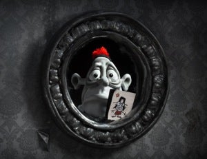
Figure 2: Max's world is very dull. So when Mary sends him gifts the colour difference is suitably alien. (Pond, 2019)
  One of the first things that stood out with Mary and Max was its animation style. The film's visual style is highly reminiscent of the works of Aardman (Wallace and Gromit, Creature Comforts). The film mixes between two distinct palettes; sepia for Mary's world and grey monochrome for Max's "All of this is rendered in almost completely monochromatic claymation – only occasional colours stand out, such as the red pompom Mary sends to Max at one point." (Pulver, 2010). This is more than separating the tone to show the locations: Mary frequently sends care packages to Max, and those objects retain their colour in his world. When she sends him a bright red pom-pom. In a way, this works to the advantage of the story ad to explain how Max lives and understands the world.

  We learn halfay though the film that Max suffers from Asperger's Syndrome, a neurological condition that can emerge as a developmental disorder. "Clues and contexts are explored (his behaviours and even the use of black and white footage used during scenes with Max; underlining his perspective of life)" (Newbutt). With Asperger's Syndrome, Max prefers a quiet, plain and organised life, and the use of a monochrome colour palette for Max's world rather beautifully highlights when strange or alien things to him emerge in his life, such as the aforementioned pom-pom, or more crucially the bright red lipstick worn by an attendee of "Over-eaters Anonymous" who happens to like him in a romantic sense - something Max does not quite understand.

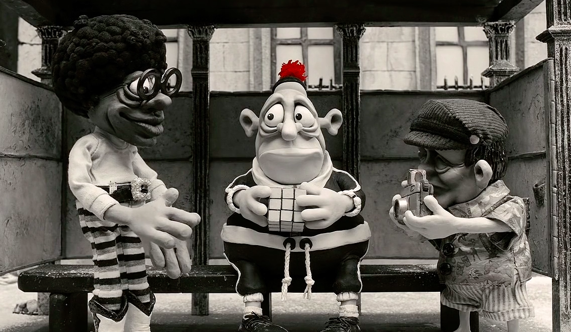
Figure 3: Max demonstrating his ability to solve complex tasks, much to the delight of his observers. (Newbutt 2014)
  But it is not just in colour; "The way that the animation (and type of animation; Claymation) deals with and picks these themes up is expressive and at times emotive. The use of exaggeration and other animation principles is well thought-out and utilized.." (Newbutt, 2014). For someone like Max, the exaggeration could be a way to portray how the world of a normal person seems to him, again a reflection on how the mind of someone with the condition may prefer quieter or more subtle experiences, and serves to highlight how chaotic New York City must seem to a man like Max.

Figure 4: Where babies come from according to Max's mother. A milder example of the kind of comedy that fills the film. (Azevedo, 2013))
 Somewhat fitting for the rather tense themes, the sense of humour the film has is definitely something to be acquired, as they can straddle into dark places but is occasionalyl sprinkeld with endearing moments. "The subject matter and tone of the film is often dark, sad and upsetting but Elliot skilfully balances such moments with dark humour and carefully timed endearing moments." (Caldwell, 2009) The story and animation skilfully weave both sweetness and dark comedy, and there are a number of cases where a viewer might end up simultaneously smiling at something lovely, reeling at the dark content that accompanies it but still laughing at the absurdity of it all. Three of the more notable examples include Mary's efforts to produce tears for Max by way of imagining Ethel getting run over by a lawnmower, a montage of ways in which Max's goldfish die - such as flying into a toaster - while under the care of the (almost) blind old lady who lives next door to him (who replaces each one she seems to kill), and Max's old imaginary friend Mr. Ravioli "leaving" him by rather cheerily saying bye jumping out of his apartment window to cause a car crash below.

  Despite the sometimes childish comedy, exaggerated animation and endearing story, Mary and Max is a very mature tale, a story for adults that enlightens on the effects of social isolation, the cruelty of the world and the effects of an oft-misunderstood condition. For this, it is a very worthwhile watch, and once you look past the charming animations, you are met with something that can easily be enjoyed by adults. Making this a fine example of how animation can be immensely entertaining and endearing for adults.

References

Image References


Maya Tutorials: Pipeline 2: High-Poly Models and Normal Maps

  I needed to perform some catching up today so I looked  int continuing Pipeline 2 and modelling the game asset. One thing I have learned in the first half is that in Maya 2016 the extract tool can be a little temperamental, but when it doesn't work the use of "separate then extract" works the same.


  The technique for creating these normal maps was rather enjoyable and the result has been .something I like the look of. Since for the past year I have discovered a personal adoration for detail modeling. Combined with Mudbox lessons, I could find definite use for these techniques to turn high-detail models into much more manageable designs during render sessions.

Wednesday 3 February 2016

Adaptation A: Initial Animation Sequence


  Creation of these scenes has so far taken a little longer than I expected.  But some progress is better than none at all, and this is 50% of the considered scenarios done yet admittedly without sound. There was a little time taken out of the process understanding how to make this possible, but this potentially means I can approach the next sequences faster.

This is only 17 seconds so far but with the extra scenes and transitions I might be able to approach closer to a minute with the complete sequence.

Tuesday 2 February 2016

Mudbox Workshop: Modeling Techniques, Masks and Exporting Normals


  Today's Mudbox workshop session provided a selection of techniques designed to help with modeling and texturing, particularly sculpting masks, layers and exporting high polys as normal maps - very handy for giving human or animal skin some realism without an intense polygon count in Maya. The main drawback, as shown below, is the exported normal map can be a little intense at a bump intensity of 1 (From my previous experiences this is somewhat normal; for a lot of previous models an intensity level of around 0.1 has worked very well).

This is still quite intense as it is about 0.3 in the column where the eye is. The below image is what the high-polygon model looked like in Mudbox before it was transformed into a reference for a normal map.


Adaptation A: Character designs


  Provided are the planned characters for each of the scenes I have planned: Two general characters (1, 2), a surgeon (3), a policeman (4), a clerk (5), a teleportation technician (6), a bartender (7) and a squirrel (8). Each figure consists of multiple layers that can be used to as control systems for the various limbs and body parts. Nothing too complex, the policeman is probably the most complex with 7 controllable layers due to the peak of his cap.

Adaptation A: Backgrounds

  I worked this afternoon on environments for the infographic project. When I realised I might need an extra scenario to fill time I went back to my list and picked out one of the more popular alternative choices. The one I selected was the situation "while being arrested", which would have the person taking the selfie wrestled against the front of a police car while he struggles to take a selfie of himself while 2-3 police officers try to push him down.

  While these environments were made with Photoshop, I plan to design the characters using vector graphics as the characters' heights in respect to the screen will change, and that will be the best way to maximise animation quality.
Scenario 1: In a queue
Scenario 2: Visiting a doctor

Scenario 3: Meeting wild animals

Scenario 4: During a pub brawl

Scenario 5: During an arrest

Scenario 6: In a teleporter accident
  Some of these scenarios involved characters going around or standing behind objects in the environment. To solve this, the related situations (below) involve multi-layered locations. Fortunately even the most complex of the scenarios only needed one or two extra layers for the scene to work with the characters, who will be developed soon after this post.

Scenario 1: In a Queue

Scenario 2: Visiting a doctor

Scenario 4: During a pub fight

Scenario 6: In a teleporter accident