Showing posts with label drawing. Show all posts

Tuesday, 29 May 2018

Back to Basics with Digital Drawing


  I've been going back to basics lately with my drawing skills. I've had a nagging feeling for honestly quite a while that my colour depth palette has been rather muddy. I've noticed I get lost in getting the shade just right at the expense of how clear the composition is. So, back to basics; getting familiar with the essentials of blocking colour first before moving on to tackling light and shadow.

  After all, many projects are 20% crunch, 80% cruft. You want to get that 20% foundation right or the whole thing just doesn't work.


  This new approach I feel has also given me a chance to back away from relying on dark lines to delineate shape. The pictures I have been drawing lately have been moderately popular on Reddit which is good for exposure. I'm getting plenty of feedback and starting plenty of conversations about what I've been working on. It could be some time before I'm back to full-shade digital painting like I've been doing before: I'm taking this one step at a time, so when I am ready to start adding shade again I am definitely ready.


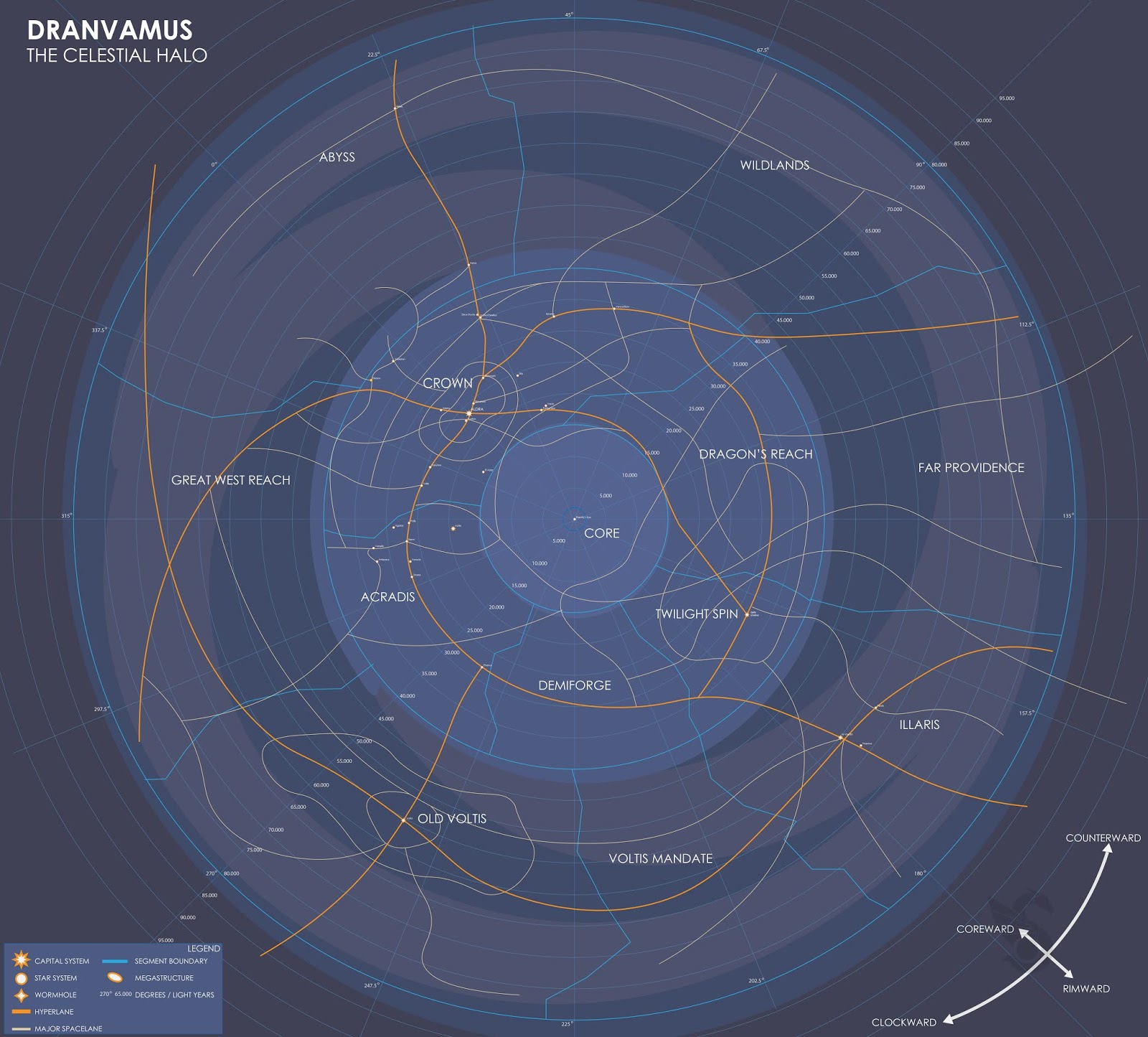
  Moving away from the same old character subject, I've experimented with map design using Adobe Illustrator. I've found it and PDFs amazing for condensing enormous images into something I can easily send to clients. When I tried buildign something like this on Photoshop, it would slow my computer down as the images, plus layers, might be over a gigabyte in size. Which my computer did not like.

  But it was mostly fun to try map-making, which I have found to be an amazing way to build a setting as they say you can tell a lot about a place by reading into how the local inhabitants drew their maps.

Friday, 5 January 2018

Crest Design Experiments


  Taking a minor break from writing I was sorely tempted to go back into logo design. What I had in mind was a bit more elaborate than a typical brand logo and more of a crest or insignia for a nation. You have to start with the basics, which in this case was the core element. For this insignia the core would be the arms of a galaxy, representing the nation's dominance or an assertion of supremacy.


  I went though a few revisions, settling on something less angular and blocky. The other core were the four great vassals of the nation, which would be represented by how they are bound to the galaxy in the centre - the core and the home realm. The gem at the top felt less cliche than two heads looking in opposite directions, and helped to congeal some of the other elements.


  This was all based on a drawing I had worked on ages ago that was supposed to be a coat of arms. I never really went back to it. This insignia could perhaps be depicted everywhere - against starships, on offical forms and declarations, letters, tanks, aircraft, pretty much something that could be stenciled or easily applied.


Monday, 2 October 2017

Personal: A few Posing Designs


  While I may be going back to an old subject, I've been thinking lately on using my ideas. To build a lifestyle. The one thing I was told on thinking of such a direction was whether or not there was a market. I intend to use these images to look for that market. While dragons are perhaps a rather saturated direction, preliminary research always intrigued me that dragons and armour had almost two constants beyond the "anthro" communities, which unlike my ideas used human torsos and human spines:
  • Armour featured scale patterns, scallops and thorns, reminiscent of Gothic plate amour
  • Reptiles of any kind are frequently draped in all kinds of Mesoamerican motifs and designs
Some of it could be explained in how scales can sometimes (especially on much larger reptiles) be depicted as an armour of its own.But the Mesoamerican connection for any reptiles always confused me as to why this was the principle.


  I believe i could go further with these, I will be doing research in the coming days on whether there is a market for this kind of thing.


  It can't be all boyhood fantasies, one thing I'm aiming for with my research is variety, something to build off of. So it's not just warriors and swords and all that, what other avenues could be explored?

Wednesday, 2 November 2016

Major Project: Grub and Juvenile Orthographic Layouts

  Some of today was spent on the Orthographic drawings for Four's juvenile state. This one is a little more detailed than the previous one as in its juvenile state Four is quite dumpy and rounded compared to what she grows into later in the story. This is the stage that she begins to start looking cute and endearing. It is the moment this one opens her eyes for the first time that David is struck with awe over her beauty.


  The grub itself in retrospect isn't that complicated. But I believe working out it rough shape is still worthwhile as the grub's form is indicative of the shape Four will take on when she develops within the cocoon. cocoon is simple enough that an orthographic drawing is not needed. The grub curls up inside so its shape is determined by this u-shape. Similar would be the case for the tuber as well.

Thursday, 27 October 2016

Major Project: Final Designs In Sight


  Today's priority was getting a final idea for what Four looks like I looked back on fighting fish and, entranced by the draping silk-like tails they had looked into giving something like that to Four. As can be seen, there are shades of dilophosaurus in some of the drawings which I want to avoid (this is mostly due to possessing similar frilled crests.) the main difference I think is Four's is a lot more swept back. It would give her an edge in swimming. I don't want ot go too overboard with the frills - these will likely be animated as ncloth materials in the animation (so lots and lots of flow!). Too many frills and she might lose her shape in the action. But I believe the most successful adult form is 78. 83 and 85 I believe were fairly successful bust shots.

  Perhaps she can retract these sails. We see this shape in its full glory during her escape. It makes perfect sense that she escapes from captivity when she is in her most impressive. She is at her most beautiful and David sees this. As well as this, I looked at the juvenile, which will be a much dumpier and less attractive look. While the adult is inspired by Asian fish, otters and ferrets, the juvenile was strongly inspired by naked mole rats and axolotls.

What is probably needed now is a final concept piece. I have plenty of thumbnail material, now would be an extremely good time to set to work on the final design.

Thursday, 13 October 2016

Major Project: Developing Ceti 821


  I've been nursing a minor cold lately which I believe has slowed me down a little. When I got around to work, my focus was on the base, now that Four has come along quite nicely. I looked back on the various themes I had collected, the main thing I wanted to take away when designign the three primary rooms was that each one had to feel distinct. Each room required its own atmosphere, its own feel. The biolab (2) and office (4) are empty mainly because I wanted to pace myself and not get bogged down in the detail.

  I also want each room to feel part of a greater whole: Sterile and mechanical for the biolab, comfortable and oozing importance for the adminsitrator's office, and familiar for David's room (I realised today and yesterday that as a senior scientist, David's quarters on the station would be more luxurious than the small "bed and a desk" rooms I was drawing initially. Given David's personality however, at least at the animation's beginning it would still be quite a stark and aescetic home. There would be little clutter with everything organised, which would become less so as the story moves on.

  To help understand what I need to build, I looked into creating an inventory list. Most of it is small props; pens, mugs, sheets of paper with some larger props like chairs and tables.

Biolab

  • Test tubes
  • Computers
  • X-ray photographs
  • MRI photographs
  • Centrifuge
  • Pens
  • Experiment reports
  • Computers
  • Stools
  • Tables
  • Coffee mugs 

Dormitory

  • Desk 
  • Table
  • Computer terminal
  • Phone
  • Pens
  • Rug?
  • Coffee mug
  • Photograph

Office

  • Executive desk
  • Executive chair
  • Office chairs
  • Pens
  • Computer terminals
  • Rug
  • Computer banks?
  • Financial reports
  • Mug?

Wednesday, 12 October 2016

Major Project: Refining Concepts


  With some progress in finding voices for the project, and with the concepts for the base gradually crystallising, progress can be made on the finer details. Looking at floor plans from Space 1999 and 2001: A Space Odyssey I gained an impression that the 1970s were a period of open spaces and neatly organised furniture. Everything in the future was tidy and organised, with strong lines and an emphasis on comfort. I was told one fashion of the 70s in science fiction was padded leather panels. In hindsight a rather peculiar material to coat your walls in but then again the modern perception of the future promises walls made of either glass or plastic so I suppose it was a quirk of the times.


  Four's adult forms are coming along mentally but one priority is to work out what the grub looks like. I had considered there could be a degree of translucency to Four's body so I had a bit of fun working out where all her organs could go. It was then I struck a few ideas for a few anatomical elements to make Four alien. She could have her nostrils on her back or on the back of her neck while her skull has a bulbousness to it that could extend into a crest.

  Four's grub form got me thinking on the juvenile and adult anatomies. I'm thinking a touch of fox and a touch of otter into her genetics, so to speak: An elongated but bouncy hunter of small animals with a nice fat tail and plenty of agility. This is something I could explore with silhouettes as I develop the other forms. My primary goal with these drawings was to work out the simpler of Four's forms. The cocoon I realised could be more shaped by Four curling up.

  Researching an influence for Four's larval state I came across beetle grubs. Two things caught my attention. The first is that ground-dwelling species like the Goliath beetle and the Japanese beetle lay their larvae in the soil, where they live curled up until they mature. Once they develop into adults, they crawl out of the soil. The second is that some species, like the aforementioned beetle grow enormous as grubs. Some can be large enough to require both hands when being held.

References

Sunday, 2 October 2016

Major Project: Creature Design Ideas

  I've had a look into some possible creature designs. Phil and I have spoken that this creature could be from swamps or marshes. One creature that came to mind looking at pictures of micro-animals was the mosquito. Which fits the brief of something horrid and something that could fit the marshy biome that the moss grows. Thumbnail 15 shows three possible stages of maturity based on a diagram of how a wasp pupa becomes an adult, where it seems to 'grow' into the adult shape from your typical grub.

  One key thing I might include: This creature is intelligent, and needs to open the door. Because it is much larger than your standard insect, normal insect feet might not provide enough support. So I've looked into perhaps giving it digits to help spread the weight and as a tool for communication.

Monday, 26 September 2016

Major Project: Initial Creature Design

  Today was my first minor project tutorial and the general gist was that while the script is getting there, it is coming up time to consider my world and my creature. While I had some early sketches, there was an issue that they all had some regality to them. Which is the opposite kind of response to the creature that I am after, as it is supposed to be only the scientist that admires it.

 Extending from the larval form, I looked into creatures like the Tardigrade or water bear. One of a number of micro-animals; creatures so small they can only be seen with a powerful microscope but this is to their benefit - they look incredibly alien and grotesque. As along with standard insect elements, the bodies of these creatures often feature large prominent hairs. The use of micro-animals also allows me to better explore any development of the grub phase as the grub elements can echo in the juvenile phase. I might be able to assemble a creature using bits of various micro-creatures, as they tend to be quite compact.

Thursday, 22 September 2016

Smithston Wessex Logo Experiments

  This morning one thing cycled though my mind: I started wondering about a logo for Smithston-Wessex (Theme-wise I suppose it makes some sense the art-of document looks a bit like a corporate brochure or report document. So this logo would appear on the corners of pages.

  There is a lot of experimentation with the W because David works more specifically for Wessex Biowonders. But I wonder if a renaming is in order as there's perhaps too much of a Weyland-Yutani vibe from the branding (1, 7 and 12 especially). Though I may keep the horizon line.

Wednesday, 6 July 2016

Sketchbook: Bird Experimentation


  Lately I've been finding that one of the best times for me to pull out a sketchbook and doodle for a bit comes from train journeys to and from London. As the streams, creative writing, plans for next year and online networking have been taking their toll a little on my free time. Regardless, as these sketches from last Friday demonstrate, I thought I'd try mixing up my creature design skills by sketching some birds. Granted they still have features of other creatures I've drawn so what I might sketch next time I have time is more normal-looking birds; eagles, ravens, magpies, finches and so on. Mainly to diversify my design palette from quadruped mammals, lizards, dinosaurs and scary monsters, as I've been seeing magpies and squirrels more than I used to since moving to Kent.

And quite frankly I probably draw too much nasty so might do a bit more cute. Both to balance out and that such a path is a skillset all on its own.

Monday, 23 May 2016

Post-Colo Colo Sketchbook Doodles


  With no university projects on top priority and much of my time spent working on a project for the studio  Butch Auntie, I admit this page has gone a little quiet. When I haven't been building and tweaking in Maya, or when renders are on the go, or when I have ten minutes such as at lunch, I try a bit of sketching. Colo Colo was still fairly fresh on my mind so I made couple of sketches relating to how the body could be improved. When it comes to making a better version this summer, I might try polishing him up in Mudbox.


After the design success of Nian and Colo Colo, I've considered focusing on creature design. Though of course that's not deterred me from sketching other subjects. The human form takes time and dedication to master. And sometimes these creatures need somewhere to live.


My hand-drawing skills have gotten a little rusty, and the technique I learned in 2015 regarding facial structure still needs time to embed, but I might be getting somewhere.


I reached the end of this year's sketchbook a few days ago, so I got a new one. I think I prefer 20cm2 layout sketchbooks, they're not as narrow as an A5 and they're not as cumbersome to carry around as an A4, but they're perhaps the best of both worlds. So on Friday I christened my new sketchbook with a pair of alien bugs. They're lacking in your typical bulbous abdomen because for a man-sized bug it seemed redundant; why store all your organs in a bulb emerging from your backside when your torso is now large enough to fit them all comfortably?


Tuesday, 1 March 2016

Adaptation B: Colo Colo's Head


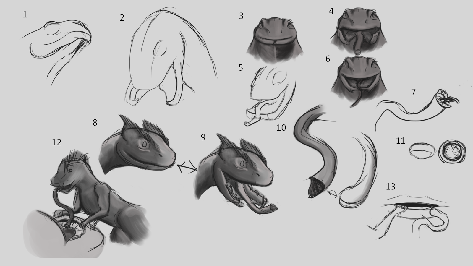
  Today I got thinking about Colo Colo's head. The first set of drawings (below) I was experimenting with head style, throwing out beak shapes as they came to mind, even a few snake/rat heads that could be shaped into beaks. At a glance, some of the heads look close in shape to a beak, which is whay had drawn me to designing a blend of rat and chicken skull in the first place.

  One of the key things I started considering today was maybe injecting a little snake, I needed to creepify this little guy so I looked into a lower jaw that opens in two parts like a snake's. If I'm going for a beak however, I might have to discard the idea there's a stretchable flap of skin over the lip (no. 9 and 4), which does make it look a lot scarier than the other version. With the tongue I looked at lampreys and leeches - jaw-less creatures that instead of two mouths like most animals, have rows and rose of teeth descending into the throat. Both lampreys and leeches sustain themselves by latching onto the flesh of a host and sucking out their blood. Colo Colo's tongue could work like a vacuum cleaner, sucking up saliva and mucus that lines the inside of the mouth, or it uses a mini-tongue while the bulk of the larger tongue acts as a hose for what the mini-tongue collects.

  I'm partially drawn the idea of the creature being sweet on the top and creepy underneath. Next stage will be to make a beaked version of this mouth idea and consider its texture. Either it'll be scaly, or it'll be emaciated, wrinkly and fleshy to go with the whole "undead creature" vibe that is hinted at in the legends.

Or maybe a mix of both - scaly back and thighs and a fleshy underside? This sort of thing might be better visualised with colour than line drawings.

Monday, 29 February 2016

Adaptation B: A Core Body


  I had a talk with Phil today on Colo Colo's direction after the advice Alan gave me on departing from the rat-chicken look, but this one (admittedly due to the creature it has taken influence from) may seem a little too 'cute', though I will look into head studies, where the ferocity could be brought back such as the use of the staring eyes of a chicken.

  We also got talking on the 'horror' aspect of the creature and the related story. We explored horror  coming from the abhorrent, discussing a lamprey for a tongue and I was shown a couple of stills from David Croenenberg's 1986 rendition of The Fly featuring Jeff Goldblum being turned into some...horrid...thing. It did however give me some thoughts on the creature. Being inspired by rats, what's to say that it doesn't look like its been reanimated. We talked about it being small enough that it could be to walk across its victim without much notice. So I think I have a basis, I just need to shore up the details: The crest, the texture, the tongue and the mouth. If rats can vary between looking adorable and vicious, then this creature also has a chance.

  If I go down this path, the final product could be both interesting and disturbing. Maybe tapping into some of that Roman Polanski vibe I had managed to invoke in my From Script To Screen project last year.

  Less gruesomely, I took some time to observe the motions of these running lizards ot get an idea of how they run. I have an idea looking at videos provided by nature documentaries as well as still references, so I think I can crack the creatures actually moving about.

Monday, 22 February 2016

Adapation B: More Concept Thumbnails

   Today I decided to get some concept work done and looked at fleshing up Colo Colo. Putting bodies over the skeletons I had drawn up. This also gave me room for experimentation with Colo Colo's form. Presently I am leaning towards 7 and 19, which for me feel more characterful. A peculiar outcome as these two were drawn with framework ,rather than full skeletons. 
  The tablet driver was playing up a little so I went to do some sketching. I decided to look at hands and feet, interested in somehow melding the anatomies of rat paws and chicken feet. But I also was curious to know what their paws actually looked like.

  When I did get around to some concept art for the hands and feet I realised something - Colo Colo is vampiric, It stinks the house it dwells in with the smell of rotting flesh, this thing is of the undead. So a healthy colour would look wring. In a previous level-three course I recall seeing some birds brought in, encased in glass, one of which was unfortunately suffering a little decay on its legs, which had turned slightly greenish. So maybe some discolouration would sell this thing as a disturbing, undead creature of the night. My preferences for the colouration are 24, 26, 33 and possibly 27.

Monday, 15 February 2016

Adaptation B: Zeroing In On A Design.

   Today's focus was on the model for Mudbox, but I managed to do some sketching work that I think has solidified my idea for Colo Colo which I plan to explore with some more solid concept work.

  Inspired by the savagery that could be seen in the ink-stain work, I wanted to keep loose and expressive with these sketches to add a bit of style. But overall I think I am close to a final resolution.

Wednesday, 27 January 2016

Adaptation A: Storyboard


  The bulk of today was spent assembling the storyboard. I've worked out that in the rate I usually design, 30 frames is about maybe a minute but it can vary depending on what is going on..This feels like one of my shorter storyboards however, and I worked to keep the action snappy.

  The inclusion of the squirrel at the end came from a previous iteration, it was commented that the squirrel appeared at the end, referring to when the squirrel pops up in a post-transition snapshot. I figured I could include it at the end so that the ending card is not total blackness and simple text.

Thursday, 21 January 2016

Adaptaion B: Looking Into Alternatives And More Drawings

  One of the discussions with Alan regarding the adaptation project was to look into alternatives for what I could work on. I decided tonight to return to the source material to see if I could find a location or event that more closely ties with the novel's themes of death, rebirth and a war between numerous VR versions of Hell.

  I went back to an earlier extract, that described the opera house as that is where a key character dies (spoiler alert, although does it count if it is at the end of chapter one?) and is reborn inside one of the Culture's ships, a vessel called "Sense Amidst Madness, Wit Amidst Folly", unfortunately despite the  rather interesting name, the character spends much of the chapter she wakes up in a simulation of a bedroom. There's an endless continental European landscape outside her window but the room itself, while described doesn't sound like it could keep me going. Same goes for the landscape and we see none of the rest of the ship.

  What these earlier chapters did affirm was my estimation of Veppers' position - the man is confirmed to be the Sichultian Enablement's richest, most powerful CEO: a rather nasty combination of the wealth of Bill Gates, the playboy attitude of Tony Stark and the aspirations and the "I can buy my way out of a prison sentence" mentality of Lex Luthor. I also looked into more architecture for Iobe and got intrigued by the mention of cantilevers. Give nthe terraced nature of the city I am now thinking about the lower half being a series of platforms jutting from the cavern wall, supported by buildings that rise through multiple levels.


  However I did find a possible alternative in the following video. It is a construction sequence connected to a 2004 art project book for a structure called a Globus Cassus. A megastructure built using the material of the Earth's interior to create a shell with an internal surface area twenty times greater than the Earth's surface


  It is an ambitious design, and the ending card makes me wonder about making an adaptation of Globus Cassus. The current issue I face with adapting Surface Detail is that the amount of story I'm covering in comparison to the entire book is very little, while I could potentially portray the full construction sequence of Globus Cassus as a narrative. Perhaps starting by showing rockets or shuttles deploying the four initial structures and then various perspective shots showing the different phases. But this project already has an animation and possibly some publicity tied  to it which might limit creative freedom.

Monday, 18 January 2016

Adaptation B: Solidifying Iobe's look

   Over the weekend I looked into some ideas for city architecture or layout for Iobe Cavern city, with further drawings being made today. What I know of the planet itself is that it is a desert on the surface, light comes in from the cavern ceiling and some of the areas are indicated to be grand locations. So over the weekend I looked around the internet for images of ballrooms, facades, row houses, skyscrapers, near-equatoral cities, modern cities and boom towns like Dubai, Abu Dhabi and Shanghai.

  There might be something here. I was intrigued while drawing by the image of buildings that had entrances at different heights; one foyer on a ground floor, and then another to open out to a street on a higher platform. Perhaps there are buildings that rise though cantilever platforms.

  Veppers' bedroom might be another  key environment to model. In the story he heads there during his visit in order to secretly travel by shuttle to a station hidden within the system's Oort cloud (a shell of icy rocks around a solar system, the source of comets). I imagine it to be lavishly decorated in a high-class style, with the large circular bed positioned prominently due to Veppers' opinion of himself.

  ALso tried thinking of some possible logos for the Veprine corporation. As a mega-conglomerate I might go for something simple, comparable to the Nike tick or Apple's part-bitten apple.

Wednesday, 13 January 2016

Adaptaion B: Preliiminary Sketchbook Work

  I had some basic ideas for how the city might be laid out. I have discussed with Alan about taking a hybrid approach to designing the city; combining  scientific deduction with artistic creativity. I feel tempted when it comes to the model design to plan out other caves, to see what other parts of the city are doing in relation to the cave in the establishing shot.

   The city's architecture was a little more tricky. I will look into influences but so far I wondered about moving down South Asian or Arabic influences. Veppers is just one example of the species, and by the sounds of it he's the sport of person who desires a perfect body. But what I can tell is that he has golden skin and a large silver mane. Chances are other Sichultians also possess manes, maybe even other feline features. This, and the description of the planet being akin to a desert made me wonder about looking at more equatorial cultures for architectural inspiration.

  After all he features in the chapter, it proved difficult not to draw the man himself. Vain, wealthy,  arrogent, confident, possibly paranoid with good reason. He's a perfectionist too. Possessing gaunt features achieved with cosmetic surgery and even an artificial voice box. The Sichultian in 23 and 25 is Jasken, recognisable by the sunglasses he's wearing. I'll need to find out more about him but he's Vepper's right-hand man and is hardly ever seen away from the Veprine director's side. He also seems a little laid back, in chapter 18 when Veppers is going straight to business with Huen, Jasken is more willing to join in on the game Huen's child is playing, if only a little. But looking into these two does give me insight into Sichultians, their cultural opinions and their tastes (I doubt Veppers would dress his private hotel room in a style he didn't feel keen on).