Tuesday 30 September 2014

Space and Environment 1 Influence Map 1

So that I do not lose track of thoughts I decided to make up an influence map. Admittedly its not the tidiest thing in the world and the largest influences are more like 2x3 than 3x3.
From top-left and meandering down we have:
  • Ashgabat, Turkmenistan
  • Topkapi Palace, Istanbul, Turkey
  • Stephen Baxter
  • Venetian interiors
  • M.C. Escher
  • George Orwell's 1984 (novel)
  • Venice, Italy
  • The statue of Athena
  • Rennaissance Milan, Italy
  • New York City
  • Dubai, United Arab Emirates
  • The Temple of Zeus
  • Charles Sheeler
  • The Silver Cities from Heroes Of Might and Magic V (video game

Monday 29 September 2014

Maya Tutorials - session 2

More work with tutorials, this time I had a go with the character-making tutorial. Amssing a total of 17 screenshots of the progression (admittedly I missed some of the first moments) I figured it was better to present the progression of the model creation as a slow-moving slideshow rather than 17 images uploaded to a single post. To save on upload volume I did have to comrpesse it from 1980x1080 to 800x450 but I can always upload a larger version. Once I got into it I did enjoy the time I spend modelling.

One thing I did learn that I should remember: When using the bevel tool, the "offset" parameter does not work fin Maya 2015. But I discovered that adjusting the "fractioning" parameter works just fine and does the same thing. It was especially interesting making the tongue.

Sunday 28 September 2014

Invisible Cities Sets 9 and 10

    I feel like both of these took longer and were more strain than they should have been since after Friday I began developing a dry throat and blocked nose. So I had to push myself to make these. I had hoped that my year in Canterbury could have prepared me for this but it turns out I was wrong. Anyway I guess here's another reflective set, Fedora actually is an interested one. Its described as dull via the term "grey metropolis" with the only building of note being a museum to various idealised Fedoras. The description of Fedora itself did remind me of the description of London in some adaptations of George Orwell's 1984, depicting it as a city of monolithical high-rises with features that leave little to the imagination with the really important buildings (in 1984's case the ministries and Fedora's; the museum) standing out due to features of their architecture. Although I am lured to 133 as a focus subject for an interior image, a large globe containing a miniature city, hovering in immense halls for huge crowds.
    A combination of these symptoms and a deadline of October 8th for these thumbnails convinced me to unfortunately cut down on quantity since it took me all week to complete 11 out of 20+ cities described by Calvino. But I have tried my best to uphold the degree of representation I have shown in previous thumbnail sets. So set 10 features both Isaura (145-154) and Armilla (155-160) within its frames. I also wanted to experiment more with different brush types, particularly in images 146, 147 and 150. I imagined Isaura to be a vibrant city with waters everywhere, inspired by the idealised images of Arabic and North African trading cities where flowing water was everywhere even in the middle of a desert, fountains, wells and norias acted as gathering spots for communities, surrounded by whitewashed buildings decorated with mosaics and topped with brilliantly-coloured domes, something I think I tried to capture the most in both 147 or 151. 153 I think came out decently as a thumbnail for a lighting experiment, the contrast might be a bit too sharp but I might leave the features of the statue to the imagination for the time being.

    I was rather drained by the time I started Armilla so I tried getting out what mental images I could, the thing striking me most, obviously ,was the string. But I wanted to try different styles of architecture for one city. 159 may be a start in capturing the mountainside described and the feasibility yof constantly moving the city to soemwhere else, as one of the drawbacks to 156 is that its scale alone suggests it took a long time to build (either this version of Ermilla lasted fairly long before migration or it would be abandoned before it is finished). Although 156 does potentially indicate this has been going on for a long time, which can be extrapolated by the umber of people that would need to inhabit a city with such construction..

    Part of my mind worried I might not get the full set done, and then there are other things to do for this project alone all the while my body wants ot sleep. So I really hope I can kick this cold quickly before I end up with something more serious like last year and end up with a sub-par result for a project I was really looking forward to.

Saturday 27 September 2014

Character and Animation: First Stop-frame animatoin.


This was the end-result of the work that half of my class did for our first 'Animation and Character lesson. A relatively simple morph animation with each transformation from one person to another being made up of twelve frames each at 12fps, so each transfomration lasts for about a second. Each person made a 12-frame scene of a partner transforming into them. Made with Dragonframe for Mac. My frames are the last set on the reel and the idea was the reel and were intended ot link up with another reel made by the other half of the class so the film would lop around.

Admittedly there was a bit of a hiccup when compiling where I had effectively arranged my slides backwards to what the original plan was, although after some coordination fro mthe lecturer it was eventually sorted and isntead of being second on my group's reel I was last.

The border of the film does change halfway through as during filming one of the students adjusted the zoom on the camera when he didn't need to.

EDIT 05/10/2014: I think I have worked out what I did wrong with the video upload. Since it was a quicktime video and I uploaded it as an image the code must have got confused on what do do with it. I'll try not to make that mistake again.

Friday 26 September 2014

Invisible Cities Set 5 to 8

 With these four sets I feel like I am starting to get an idea of which cities I might be interested in, although given how I have only done eight thumbnails so far out of a possible 20+ it may still be early doors as to which city I will short-list for my three artworks. With these images I decided to experiment with silhouettes, viewing angles and perhaps looking more closely at interiors.
Argia was somewhat challenging to visualise, as Calvino's descriptions indicated the city was potentially entirely filled in with dirt. Sky, streets and houses were stuffed to bursting with clay and rock so I wondered how to express it. I did consider elaborating perhaps the citizens having a relationship with the roots or the worms, and like Armilla I didn't restrict myself to humans being human-sized; roots of colossal proportions could inhabit caves and tunnels that make up the city. Perhaps the people have an innate ability to move the earth somehow?
     One mental image that surfaced when imagining this place came from the 2005 Steven Baxter novel Transcendant. In one chapter the protagonist visits a subterranian hive of near-humans that live and communicate llike members of an ant colony, complete with a queen, drone castes and a lack of individual independant thought among members. Those other than the queen that interacted with outside influences were rather harshly euthenised by the collective as their minds would struggle to bear the magnitude of the world outside their colony.
    Despina was one of the fist cities I exaimed when I read Calvino's extracts and was the one which at first stuck in my head the most. Perhaps it was the contrast of the fleet-like skyscrapers from the desert and the dual camel humps from the oceon. I figured this was a description of the skyline so I tested that idea as well as considering other portside aspects such as tavern interiors  Its probably the most intriguing and out of the earlier ones it is not bearing a potentially-bleak-looking population (something I felt reading about the lives of the people in Argia and Anastasia), and it seemed like a generally thriving and largely enjoyable place to live for the common man.
  One of the other investigations I tried was colour contrast. With Anastasia there was emphasis on coloured stones such as agate, onyx, chalcedony and chrysoprase and a possible culture revolving around cutting and polishing these stones. So what I tried to imagine is that while the city is colourful and beautiful, perhaps walls studded, it hides an ethic where the only pleasure comes from work. So there is perhaps a colourful and drab side of the city that exists side by side with each other - perhaps colourful stones at street level and more drab colours at higher levels where the eyes of the city's residents are less likely to look. Or perhaps the other way around, coloured stones inlaid in upper-floor walls where visitors are more likely to look on their travels though the city while residents keep their gaze to the more drab ground and first floors of buildings.

One trhing I have gotten the impression of regarding these cities - the people. In several of them the people sound like listless entities; daily routines, uncomfortable living conditions, being content with a bleak metropolis. It was as if Maro Polo wanted his listener to be both mystified and wary of these cities inhabited by strange shades of human beings. I might be looking too much into this though

Wednesday 24 September 2014

Invisible Cities Thumbnail Set 4

    At first glance I think I may be going backwards with these images - back to Photoshop, back to digital work, back to work that looks  presentation-grade than brainstorming than sketch grade and back to camera shots. There is a wealth of media I would like to explore beyond this (for one I have a box set of inks that have been sitting in my toolbox for i-don't-know-how-long that I might contemplate using again) which I might explore as these first four sets were part of my Photoshop workshops. With these done, I'll look at other media for the other cities.

    One thing that caught my imagination with Armilla was in looking beyond the literal. At first I thought "how do I make a cityscape out of what is described as nothing but water pipes with no other part of the buildings?" I then started getting ideas when Calvino began talking about Nymphs inhabiting the water and got the idea that perhaps it is the nymphs and dryads (water spirits in Greek mythology) that were the city's real residents. Maybe the pipes themselves were the city superstructure with the water spirits living inside them? With homes, shops, venues and parks everywhere inside the pipelines? Although as I tried to finish I think my sense of imagination started to wear down near the end so I came to the thought of "lots of water everywhere"

    Probably not the pinnacle of what I can come up with for this project but I guess I could consider some of these aspects for other cities.

Review: The Cabinet of Dr. Caligari

Source
Springer, M; Open Culture:

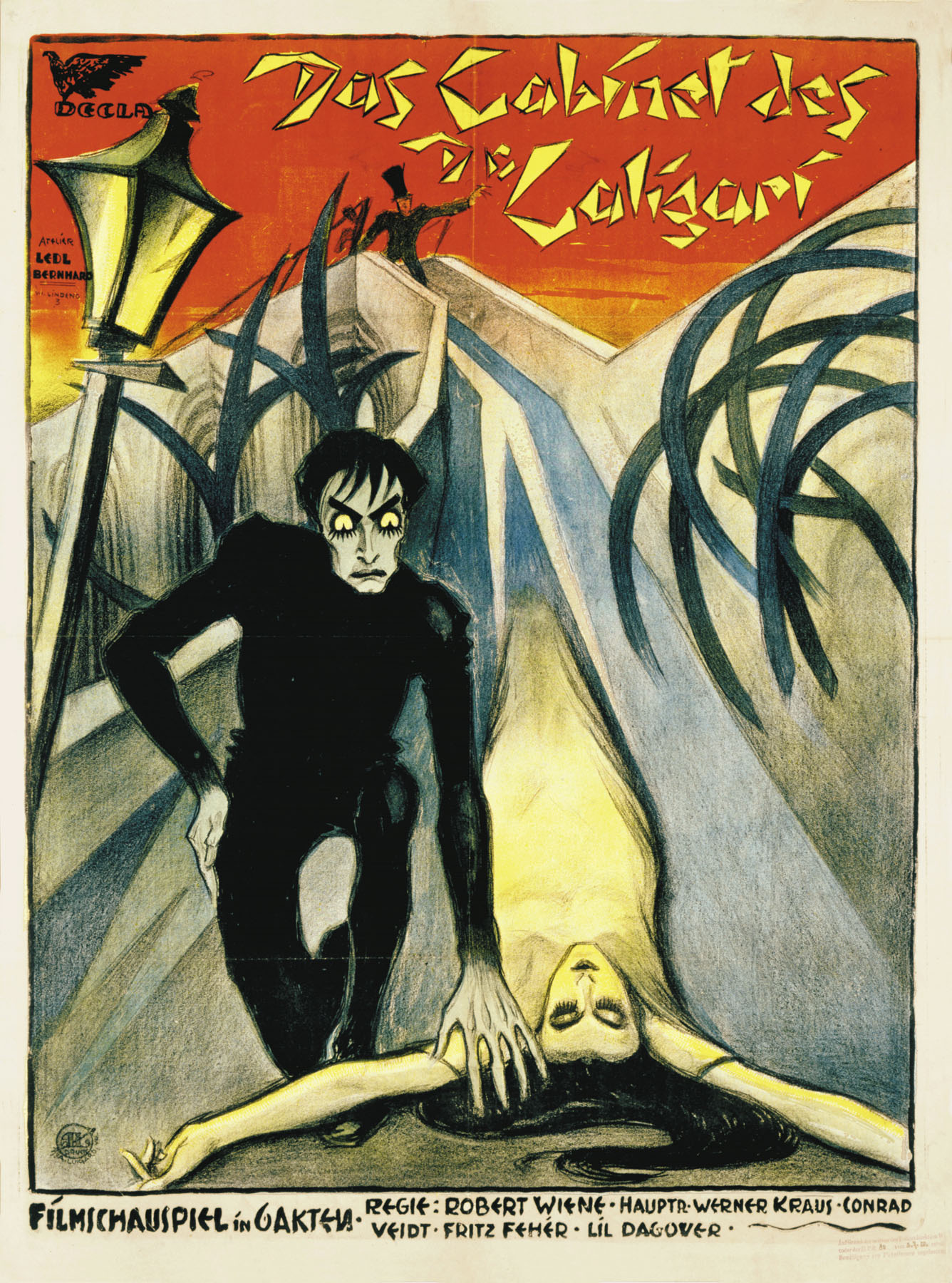
  • Native Title: Das Cabinet des Dr. Caligari (The Cabinet of Dr. Caligari)
  • Primary Language: German (silent)
  • Format: Black and White with tinting
  • Year of release: 1920
  • Director: Robert Weine
  • Budget: est. $US 18,000
  • Film Length: 71 minutes 
  • Production Company: Decla-Bioscop AG
   The Cabinet of Dr. Caligari is a German expressionist film made in the 1920s, the general synopsis is that it is a frame story told from the perspective of a German man named Francis, who initially speaks to an older gentleman as he rambles on about spirits.
    Francis speaks of a Dr. Caligary, an elderly gentleman who has comes to show a display of Cesare the Somnambulist (or sleepwalker) at an expedition in the town Francis grew up in and to which his story takes place. After the death of his friend the night after visiting the local carnival, Francis declares that he will not rest until he finds his friend's killer, his movements perhaps the first sign of his descent into a spiralling madness.
"I found myself pleasantly surprised and inspired by this film – despite the lack of voice acting, i was engaged throughout the film. I found the mood and atmosphere extremely dark and sinister, for which main credit goes to the setting design and score" (Letchford, 2014)
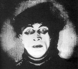
The first time Cesare wakes up is a solid
establishment that he is the most disturbing
character of the entire film.
   Cabinet is a psychological horror that plays off themes of discordance and the surreal. As a silent film Cabinet lacks any spoken dialogue outside of text frames with many visual cues performed by a cello to create a dissonant tone throughout the film. The film bears a strong reflection of the image of psychology at the time; Early psychologist Sigmund Freud popularised the idea of psychology as a science and the common image of a psychologist at the time was as a detached, analytical and disturbing figure who was often more interested in probing the workings of a patient's brain than the welfare of the patient themselves. This is perhaps hinted at by Caligari himself who, upon receiving Cesare at the asylum he worked in, proceeded to run his hands over and fondles Cesare's body gleefully as if the man had been given to Caligari as the best Christmas present ever. The film also reflects not just the mentality of psychology at the time but also perhaps the mindset of psychological disorders: Cesare is merely diagnosed as a sleepwalker, yet despite one scene indicating he had been conditioned to kill against his will there was no indication that he was anything but a creepy pariah-type who could not function in normal society. As Francis grows more and more psychologically wrecked his movements became more and more outlandish. Hunching over, grinning childishly or leaning forward a lot.
"Robert Wiene has made perfect use of settings designed by Hermann Warm, Walter Reimann and Walter Roehrig, settings that squeeze and turn and adjust the eye and through the eye the mentality." (Erbert, 2009, quoting the 1920 review in Variety magazine)
The theatre-like sets include jagged edges, angled walls and
their own shadows and even light patterns painted onto their
surfaces, creating an illusion when characters own shadows
are not the same as the ones portrayed on-set.
   Many of the sets in the film are jagged and offset to what they would be, with walls ascending inwards and furniture and wall features arranged in awkward and twisted positions, lacking any euclidean uniformity natural in many artificial landscapes and appearing as an expressionist painting in reality. In some cases such as the interiors of Jane's house and the courtyard of the mental asylum there are indications by the sets and the furniture that they are more grounded locations, as unlike most of the sets they bear symmetry and a sense of uniformity. Weine likely used the arrangements of the sets as an indicator of Francis' (Or perhaps Caligari's) mental state, portraying a man who was losing his grip on reality however who's mind we're viewing the film from (either Francis or Dr. Caligari) is not made entirely clear. Even the dialogue is portrayed disturbingly, as the text for speech is printed in a text format reminsicent of hastily marked paint stains footed by an abstract line and set to an expressionist background of jagged boxes. The text is messy, floaty, it doesn't keep to any particular uniformity which adds to the idea that the mind of the narrator is a mess.
Caligari and Cesare at Caligari's exhibition
   The use of make-up on the faces of several characters amplify their expressions. One of Caligari's establishing moments in the film is approaching the camera and grimacing at the audience, which depending on the person indicates he's quirky at best and downright crazy at worst. Several close-up shots indicate how sinister he is by showing him glaring intensely at whatever is in his focus.
   One of the pinnacle moments of the film's explanation for Caligari's sinister motive as well as his insanity is when the words "Du musst Caligari werden" (German: You must become Caligari) appear in front and around him over and over again, eventually almost flooding the screen, driving home that Caligar is somehow compelled though his obsession to become this man that he has read about, originally to understand how this Caligari figure achieve what he managed according to legend, eventually spiralling to a point where pursuit of knowledge became reliving the character. Again this could be a reflection of psychologists at the time who were thought to go questionable lengths in the name of science.
"The film draws on the eerie, occult experience of early cinema itself, whose flickering ghostly images – such as Caligari's cabinet, and all kinds of fashionable table-rapping and fortune-telling – were often to be presented in fairground tents." (Bradshaw, 2014)
   Cabinet is a surreal and compelling film with an ending that can leave the viewer shocked and questioning what was real and who's mind the story was expressed from the perspective of. A disturbing example of 1920s filmmaking and the loutlook on the emerging science of psychology. It also shows that an immense budget is not required to make an incredible and timeless film as the quality of the sets and the cardboard-like nature of the sets and the modest on-location scene of the park when compared to other big films of the day (such as Charlie Chaplain's 1921 film "The Idle Class" and Marcel L'Herbier's 1929 film "L'Argent") are an indicator of how lavish the buget was but this is not a direct correlation on quality as despite this, the film can be considered a classic of film history.

Bibliography:
  • (Lechford, S., 2014): The Cabinet of Dr Caligari Film Analysis; Context is Everything, Wordpress; published 16th February 2014; http://samletchfordfilm.wordpress.com/2014/02/26/the-cabinet-of-dr-caligari-film-review/ (last accessed 24th September 2014)
  • (Springer, M., 2013): The cabinet of Dr. Caligari: See the Restored Version Of The 1920 Horror Classic With Its Original Colour Tinting; Open Culture; published 31st October 2013; http://www.openculture.com/2013/10/the-cabinet-of-dr-caligari-see-the-restored-version.html; (Last Accessed 24thSeptember 2014)
  • (Jesperson. M.) The Cabinet of Dr. Caligari (1920), IMDb http://www.imdb.com/title/tt0010323/ (last accessed 23rd September 2014)
  • (Ebert, R., 2009): The Cabinet of Dr. Caligari; Roger Ebart.com; published 3rd June 2009; http://www.rogerebert.com/reviews/great-movie-the-cabinet-of-dr-caligari-1920 (last accessed 24th September 2014)
  • (Bradshaw P., 2014): The Cabinet of Dr. Caligari review - occult scary-movie touchstone from 1920; The Guardian; published 28th August 2014; http://www.theguardian.com/film/2014/aug/28/the-cabinet-of-dr-caligari-film-review (Last accessed 24th September 2014)
  • (Donati, R., 2008); Caligari and Hellraiser: A Lineage, Off Screen; published October 2008; http://offscreen.com/view/caligari_and_hellraiser (Last accessed 24th September 2014)
  • (Holmes, M., 2007) The Cabinet of Dr. Caligari: Suffering Creates Art?; What Culture; published 10th August 2007; http://whatculture.com/film/55-the-cabinet-of-dr-caligari-1920-robert-wiene.php (last accessed 24th September 2014)
  • (Hutchinson, P., 2014); 10 Great Films Se in the Roaring 20s; British Film Institute; published 10th June 2014; http://www.bfi.org.uk/news-opinion/news-bfi/lists/10-great-films-set-roaring-20s (last accessed 24th September 2014)

Update: Impossible Cities sets 2 and 3


 Managed to get some work done on these thumbnails. I think I am really getting into this project, its clear that Calvino's attempting to express the beauty and magnificence of each city to Kublai Khan and the reader as both these cities are described to be inhabited by people who have all they need or all they desire to be satisfied. Its this sort of thing that drew me to this course, the idea of worldbuilding or crafting beautiful cities that may or may not be possible to build.

With Baucia I began to veer off the idea of houses on sticks and imagine fields of gigantic wheat stalks, perhaps reflecting the bounty that the citizens have and require in order to never return to the ground. perhaps the city is filled with gardens filled with delicious fruits and vegetables (something I could include another thumbnail set perhaps?) The trickiest thing so far is perhaps interiors as Calvino only gives vague hints as to what the interiors of homes and venues look like.

Tuesday 23 September 2014

Invisible Cities First Thumbnails

I worry about procrastinating for my first project so I figured I may as well upload the only set of sixteen that I have completed. The two other sets are currently a work-in-progress mostly because I was unfamiliar with drawing using the lasso tool and combining copied images with ideas each one in the space of a single minute so while I understand that thumbnails are supposed to be rough, most of them could be considered either rather abstract or really crude.
I've gotten to at least halfway with each of the other two so hopefully I can complete those soon, but since its almost 3/4 done here is set two. I had a complete breakdown trying to get though set three due to time pressure and ended up with something perhaps barely presentable. But At least I managed to get a couple of images down, there may be some hidden value in them....

Looking at what I've done, I do like some of the imagery conveyed in the second set as well as the first, the city of canals has some kind of quaint charm to it (possibly from a passion of mine for the city of Venice itself, a beautiful marvel that almost floats on the lake in which it is located).

Its a plan for the week of mine to get more of these thumbnails done.

Familiarising myself with Maya

Tonight was feeling a bit more productive than last night so, after getting Maya installed on my home computer I thought I'd have a go at using it and seeing how well I got on with it. So I browsed the CG artists' toolkit provided by Alan and decided to have a look at some of the tutorials. Since I was in a bit of a pickle in class on how to do anything but pull the shapes or make the bad kind of random mind-expanding geometry I decided to look up the tutorials to see if I could get better.
By the end of my first Maya session this was probably the best I could do...


Originally a rundown on the difference between NURBS, polygons and subcompoonents, I decided to follow the step-by-step guide of how to make a cup with a polygon.

So the simplest of acts aside from creating a basic shape was using the "insert edge loop" tool. That combined with double-clicking on lines to create the framework did feel somewhat therapeutic.

 Next step was transformations and scaling, which sometimes got a little fiddly. But I pushed on and worked out what to do.
 
Shape is coming along nicely for my first ever proper Maya model. I think I was getting the hang of it by this point.

...Then I went back into perspective mode. I felt like I had screwed up and didn't know somewhere along the line. After a bit of tweaking I realised I must have mis-moved a few transformations so somehow the neck ended up stretched really far. Still, it was only on one axis that it happened so I figured I could fix it. Double-click the furthest edge ring and drag it back. Once in line with the next ring I shift double-click to select the rings and pull them too.
Then I realised the neck had only been shaped from one side, so the front and back were fine but the sides were still essentially tube-like save for a concave bit in the middle. So I came up with a plan: I would copy the model, rotate it 90 degrees then go back into orthographic view and use the duplicate as a template to move the wireframe nodes to the right position, and as can be seen by the cup forward and right, it worked! I had a circular cup with ap roper neck. I found out later the best way to get a result and nto get that was to scale from the box in the centre and nto the arrows, which guarantees an equally-scaled shape.
This was the part I had messed up in class. Simon had showed the class then showed me again the trick to smoother and less doughy edges and I had one of those moments where I understood it...then forgot it when I tried it myself. Now I realise the best method is to extrude fro mthe edge, which took a bit of working out how to do properly, but now I know how to do so: Click the top parameter of the model in the menu on the right, scroll down to "offset", click the word, hold the Control Key and push left or right with the middle-mouse-button held down to pull the extrusion space inwards.
After a few practices and one translation later I'm starting to get hole where the liquid or the egg would go. Then Once its at the right level, I click the "scale" button and drag it out slightly to match the angle of the outer edge, then repeat the extrude process. What I found interesting was after a couple of extrusions the drop was almost automatic, fairly lucky that the exterior faces were relatively equidistant, so I scaled then extruded again.
After repeating the extrusion process on the base, I have something that does look rather cup-like and I quite like what I have managed. It took a bit of time and analysis of the tutorial to get right but I think I am getting the hang of Maya.

FInal touch was giving mroe volume to the rim, made by using the "insert edge loop tool" and then translating up the Z axis to create a wedge around the rim. I didn't need the duplicate cup any more so to save clutter and file size I deleted it, even if this is only a relatively simple structure.
And I hit the Render key and et voilĂ ! One egg cup. Took me a couple of hours and a few repeats of certain moments in the tutorial but the basic shape of my first Maya model is complete.
 Now that I have tried using Maya for something proper rather than some basic geometric shapes I feel a lot more confident with it than when I started. And once I got into the tools it got more comfortable,  I was willing to keep going even if one or two points felt slightly tedious and some modelling moments I wasn't sure where I went wrong but in the end I am satisfied with my end result. I was also surprised that I managed to create quite a decent model from a single polygon shape. It feels like an entire world of opportunity has opened up for me, that first-accomplishment euphoria is certainly kicking in by now.

Friday 19 September 2014

Update: Summer project Brainstorming

 Following the advice of my mentor I have numbered my worksheets. The detail of the third picture I posted may or may not be simple enough to not warrant numbers (first scale is on top, second scale is on bottom).

Thursday 18 September 2014

Invisible Cities

I took some time today to read though extracts of Italo Calvino's "Invisible Cities", which described a number of bizarre and specialised city concepts. While each one had a bizarre quality, I was breathtaken as my mind began to visualise portions of each one, or what they would look like upon approach. Each one was strange, sometimes mindbending in its visualisation. But each of those extracts I read I was captivated by.the imagery of the city it was trying to portray no matter how impossible the reality would have been such as fixings and baths suspended in the air by nothing but the pipes that supply them with water.

Some cities were beautiful, some were haunting, none of them could be considered perfect as each one had perhaps some measure of flaw. Perhaps because for some of them, they were designed to fit only a specific human need, but they do hint as to how vast and complex real cities can get.

Monday 15 September 2014

Summer project compromise

I was rather misinformed of what I had to do over the summer, possibly a communication issue, so I was left uninformed of the summer project and never managed to do anything pertaining to the brief by the time I was informed of it. Luckily, possibly as a consolation, after discussing it with Phil I have a possible compromise that I conveniently assembled over August as a skill-building exercise in shading, lighting storytelling and the use of a graphics tablet.

The construction of the image started in July, ran through august as I was working on-and-off and finished within the first week of September. I also have a pair of sketchbook pages that were intended as brainstorming exercises which I have provided below. The one on the right was merely a brainstorming exercise into possible fashion ideas but it helped me to come up with a suitable outfit for the dragon on the left..

Below is an anatomical study I did almost a year ago from now that serves as a study of the dragon creatures that dominate the scene in the picture above. My intention was to create a life-form that was both impressive and believable, studying the anatomical features of bats, humans, horses, theropodal and raptor-like dinosaurs in order to get a convincing look.