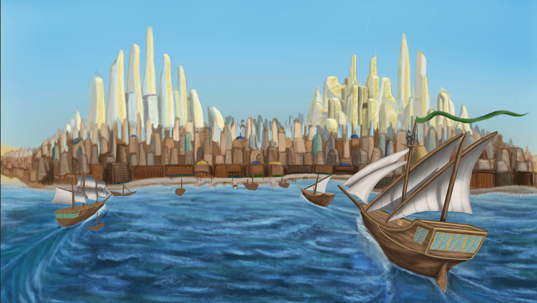
Showing posts with label Invisible Cities. Show all posts

Monday, 27 October 2014

Who's Who: Charles Sheeler

(Bellwood, 2012)
Full Name: Charles Rattew Sheeler Jr.
Nationality: United States
Occupation: Photographer, Artist
Born: Philadelphia, 1883
Died: New York State, 1965

Charles Rattew Sheeler Jr. was an American artist and photographer who played a leading role in the rise of Precisionism (an art movement in the 1920s and 30s that expressed landscapes with sharp geometric forms inspired by the uniformity of the increasingly modernised urban landscape). Sheeler was vastly interested in how old buildings such as barns and Victorian townhouses could be appealing despite being built purely for function.

Criss-Crossed Conveyors, River Rouge
Plant, Ford Motor Company, 1927.
(MOMA, 2009)
Much of his early work originated from photographs that he took on jobs for companies such as Ford as well as collectors and galleries. Throughout the 1920s and 1930s he gained an admiration for functional structures, seeing beauty in their precision and the effectiveneness of their function rather than any superficial aesthetic appeal. He spent most of his life living close to New York City, which at the time became famous as one of the first skyscraper cities in the world (Fritz Lang's vision for Metropolis was also greatly inspired by the growing city) and greatly influenced his outlook. In his later years his work became more abstract, with paintings becoming basic blocks and geometric shapes to represent buildings. Sheeler did not just simply take snaps, he liked to set up his photographs in a way that captured scale and depth as well as giving a hint through cut framing that what was beyond the frame was as significant as what was in the frame and telling the viewer that what was shot was only a tiny part of the whole.

On Shaker Theme 2, 1956
Precisionism bears a strong link to cubism due to the simple geometric and abstract shapes of some pieces, especially evident in Sheeler's work after 1950 where buildings lack any texture or in some cases definable features such as bricks and windows, appearing to only be blocks. One of Sheeler's other characteristic styles of this period (as demonstrated left) involved laying two photographs of different angles one atop the other and then painting the resulting image that he saw.

Sheeler continued working until suffering a stroke in 1959 that left him debilitated and unable to work in the way he did, effectively forcing him into retirement. Six years later, a second stroke attack ended his life in 1965. The Precisionist movement that he had helped to spur served as an American foothold to the modernist movement in a time where the modernist art scene was dominated by primarily European movements and figures such as French Cubism and Impressionism, Italian Futurism and German Expressionism. His interest in the functional and the idea of seeing beauty in function are reflected in the German Bauhaus school of design, which while no longer an institution since 1933 is still an influential art style throughout the world such as in Tel Aviv, Israel - an entire city of Bauhaus-derived buildings.

Bibliography:

Thursday, 23 October 2014

Disk Art

I was unable to get art for my disk printed onto its surface so I decided to upload what I would have put on it had the situation worked more in favour.  Another use of my art, I wasn't sure about adding my thumbnails to finaal art so I decided to use my final work instead.

Project 1 - Invisible Cities Final presentation

Wednesday, 22 October 2014

Project 1 - Composition Lineup.

     It was a tough journey, I spent long hours and a few rather late nights (including this one) but the pictures of Despina are complete. Wile working on the computers in the baseroom I did notice that my interior shot could use a little mroe colour so I upped the saturation a little to give it that air of thick, bold colour and vibrancy. I also thought, considering the climate the city is located in is quite sunny I should tweak the saturation of that one as well.


    Now I just need to add them to a presentation document along with all accompanying material: my thumbnails, my concept work, my development sequences (each one of these three I reckon has at least twelve recorded stages attached to it) so that will be my task for Thursday. In regards to burning this all to a DVD there is no serious priority on when I apply them on Thursday as my home PC comes with a rewrite-capable disk drive.

    Speaking of which, I spent a couple of hours this evening creating a cover. I wasn't sure what exactly would go on the back so I left it blank but if a text box is included I imagine the text box could go over an out-of-focus version of the rear box-art so the reader isn't distracted by the busy background. I have even tested it withi nthe DVD case I acquired. Somehow the spacing of the text and the length of each word allowed me to fit the title in such a way that it could appear as though the title was separated by the intrusion of one of the city's megascrapers.


Left: the front of the jewel case.
Right: The case opened out. When the case is closed, the glint of the clear plastic cover along the edge helps immensely in disguising the blur along the edjes of the spine; something I added to try and maintain coherency with the two sections of the cover. As I said I was clueless at the content on the back I needed to add which means I did not know how large a text box I needed so I felt it easier to leave it blank for now.


The inside of the case with the DVD labelled via marker pen.


Project 1 progress - Establishing Shots WIP Entry 4


    So I have haven't given updates in a while. Its largely because I decided to crack on  with the low-angle shot and these past couple of days I had worked long on the shot so it was often late at night by the time I was ready for a progress update but my body wanted sleep. So this probably is something of a "where did all this come from?" situation and I used my artist's eye a lot for it. But by now everything is almost ready for the extras like disk art and one of the reasons I had spent so long was for this very reason - I wanted my images to be perfect for the disk cover even if I'd only be using a section because there are some pretty big gaps that needed filling on my desired frames.
    I was up until about...2:20am completing these two last night and aside from one or two minor details I'd say the exterior establishing shot is just-about done. Changing the buildings from whitewash and gold glass to beige and green glass really brings out the skyscrapers. I think there was even a moment where the green glass and the blue sky made the ody of the megascrapers look darker and thus stood out more against the backdrop. I also added a bit of defenition and few wispy clouds to the sky to bring it out more. Have I really been working in such subtle tones all this time that only now does it come through? For the first time in I think a while, the features of my digital paintings appear recogniseable even as small-ish images.

Also on a side note: I changed the aspect ratio of the buildup to 16:9. Before I was working in 14:9 and I have to say the whole thing does feel grander in scope with the new aspect ratio.

Sunday, 19 October 2014

Project 1 progress - Establishing Shots WIP Entry 3

    Another  update on these two as I think they're getting quite close to completion now - jsut a few more details to add, some of which I admit should have been added a long time earlier but that's how I ended up developing things. Its annoying because these particular details - theupper skirting on the interior shot and the other boats i nthe exterior shot - as I said I have long-postponed to filling. At least now its possible to tell where the ships are heading and Despina looks more like a proper city than two skyscraper clusters set into something vaguely rocky. Funnily enough these buildings seem to add a certain...something as to the scale of these two clusters. I also wanted to show off some kind of roch-poor dynamic, the elegant look of the towers its understandable that some very rich people probbly live in them. I'm not sure but I wonder if I could getaway with making the city less well-defined i nthe distance. I also wonder if I should consider scaling down the megascrapers in the distance slightly. I will also see to perhaps a few features to the sky to bring it out a bit more. I recall reading and seeing in images that because deserts are very dry with very little precipitation, clouds are a rarity. Maybe I could add a few wispy cirrus clouds or darken the blue near the to pedge to give it a bit more defenition.

    As if things were not concerning enough, I realise that I have long yet to begin the low-angle shot all ready by Thursday. I've also let my tutorial schedule slip so I will see to that after I post this progress update. Its a texturing tutorial so I had best get the hang of that before moving on to more advanced things. But in general it appears that my focus on these pictures has been at the detriment of other assaigments (A 2001 review is currently in the works).

    On a more positive note, I think I am on the road to recovery as I have been less prone to coughing, sneezing and generally don't feel as horrible when I wake up in the mornings. I might make a full recovery in time for the crit if I'm lucky although given how things went the last I was ill I would definitely look forward the prospect of a couple of days' rest after I have completed everything. Until then however, I will persevere as best I can.

Friday, 17 October 2014

Project 1 progress - Establishing Shots WIP Entry 2


    I think I spent most of the morning as well as a chunk of last night getting the sea in the exterior establishing shot right in a way that looks good but thank you to @Stitch and @Simon for giving me suggestions and pointers, as well as suggestions from a couple of third-years. The current look was based on a reference (seen included in one of the frames to give me an idea of how to do it) as well as some in-depth look into ship wakes which unfortunately was not easy as my attempts with google heralded either the wakes from powered boats and ships, or shots of tallships themselves and not their wakes. Luckily I did come across one image that was intended to show the types of wakes that are made by the ships of various speeds and sizes. This has probably been the most annoying part so far but at the same time it was a rewarding challenge as it does look a bit more like something from an oil painting (I chould add a few highlights on the bodies of water on the left and right edges but at the same time their lack of detail does draw the eye towards the centre and the city itself.

    I really needed to get myself moving so I spent this evening working on the interior establishing shot as well as some outfit designs for Despina's citizens. The interior establishing shot is still pretty flat as I will add depth later along with a wide variety of other goods on display which will include stuff in crates in the main aisle. Although so far this process of flat colouring has been good with working out what part of the images I don't need to give detail to. I added fabric canopies to the bazaar roof  for two reasons:
  • The first is that I realised one of the reasons that such bazaars might have opaque rooves is to provide shade and protect from gusts of sand, and a glass ceiling would have made the promenades unbearable i nthe middle of the day. The I wasn't quite sure about losing the glass ceiling so I compromised with canopies that provide shade but do not fully envolop the place in darkness.
  • The second reason, which was more of a convenience, is I can save time by using the canopies ot blot out sizeable areas of the ceiling, leaving only small patches to add detail to. I plan to make the canopies appear thin enough that they act as a blue filter for ligth shining though, adding a cool tone to the whole area to compliment the warm(ish) green and beige.

    For the outfits I was inclined on a mix of western and middle-eastern fashions to reflect that this is a city that is a melting pot of the two cultural identities. There's also the possibility that there is a sizeable tourist population in the city due to its attractiveness and its ameniaties. There's possibly some more Southern/Eastern asian influences in at least one or tw oof these outfits as well. GIven that the focus should be on the city, I might use these ideas to give outline rather than go all-out and make the people as brightly-coloured and as eye-catching as the city.

    I have also been going into some thought for the low-angle shot which could end up looking the busiest and would lead into the interior establishing shot by having part of the bazaar building open up int othe city streets. I definitely plan tp combine aspects my two considered thumbnails as well as considerations as to what kind of stories Despina's citizens will be telling via dress, body language and interaction with each other. I just need to keep mindful that I only have a little less than a week to finish this all up and make it presentable which I didn't unfortunately do last time.

    In preparation for the presenation I have thought a bit about the look of the document although this is still fairly early so I don't hav e much to say other than the tohught of the background being perhaps dark to bring out the bright colours that are predominant in the pieces I have done.

Wednesday, 15 October 2014

Project 1 progress - Exterior Establishing Shot WIP

Began work on the exterior establishing shot for my version of Despina which I started in Tuesday. So far I think I really like how the water has come out, the buildings...not sure. But I'm owrking on giving them more visual depth. This is still very much a work-in progress however - I still need to further refine the glitering skyline, fill out the lower city, add in the dockyards and refine the other boats. Also add a few small touches such as a man on the crow's nest of the ship right in front of the camera.

Aside from the ship wakes which I am unsure about I think the sea has come out fairly well, for the shot the sun is supposed ot be behind the ships and high in the sky so there are some short, but bold shadows cast from behind the viewer.

Monday, 13 October 2014

Production Foundations

    Quick post as I'm trying to cut down on the extreme late nights but I decided to have an attempt over the weekend to get everything set for creating these three final pieces. These were quick paints with minimal shading because I wanted to focus on the primary palette colours. I have a fairly solid idea for the exterior and interior establishing shots but the exterior low angle shot I'm currently still thinking on but I am drawn to doing a market street.

    These are not solid "I know"s, I might swap around and marge elements form each (the market stall arrangement in 3 inserted into the view from 1), although maybe I should angle shot 1 lower a little more as I get the impression the viewer appears to be standing on something in order to get the right view. 4 I plan to fill with all sorts of people and goods; dates, carpets, rugs, hanging produce, perhaps a jewelery stand. I have a little less than two weeks to create the needed scenes so I know I will have to crack on. So these thumbnails are perhaps a last bit of experimentation as I had originally planed to use them as guidelines with which to build up the final images. So stuff could end up added that is not on the original sketch - there are construction lines if one looks closely.

    This is the first time I have used the palette picker and I am in contemplation as to what is the right mix for the scenes I want. I want some nice bright, solid, vibrant colours but the exact configuration I am still trying to work out (hence the quick colour compositions above). Although I think I prefer palette 1. All the while I'm still not 100% healthy but I am getting there slowly.  It is merely a matter of getting my mind in the game and persevering. It took me a month to make that image I presented as a summer project so I would like that what I have learned can get me to the final stage much faster.

    Considering how thumbnail 2 came out when it only took me about 10-15 minutes (I wasn't fully looking at the time but it felt brief) to paint up the sketch, I guess I should feel confident about my chances.

Tuesday, 7 October 2014

Invisible Cities - project refinement


    Settling on Despina, I decided to work on some more refined thumbnails for its design. One of the ideas that struck me was perhaps soem kind of combination - I have always been fascinated with sail ships; behemoths of wood topped with billowing white silken sails like their own personal clouds to sail behind, and I have also been fascinated with art and aesthetics. I had wondered about combinding the two into some strange mishmash world where sailships and animal trains provide for ultramodern city centres. I'd wodnered that perhaps the street levels or perhaps the outskirts would be filled with older buildings of sandstone and perhaps the odd onion dome. For an interior, I recall being amazed by the look and te goods diversity of the covered Grand Bazaar in Istanbul, or perhaps I continue with the idea of a pub.

    Perhaps a combination of the two? A series of tables within the hert of a large-scale covered bazaar, the roof of which either being opaque or maybe tinted glass to reveal the modern city outside and bathing the interior in the desert sun but somehow still remaining cool within.

Sunday, 5 October 2014

Space and Environment Influence Maps - Interior and Exterior


    In preparation for the final compilation for the greenlight I decided to organise some more influence maps; one for a city exterior and one for an interior. It took some considerable thought over the afternoon after I narrowed down my selection to Diomira, Anastasia, Despina, Isaura, Fedora and Baucis as all these cities were interesting. I took thought into the exteriors, the interiors and the feel of each city which made it difficult to choose.

    I perhaps chose Despina of that feel as a port city. Marco Polo's descriptions included mentioning "he thinks of all the ports , the foreign merchandise, the cranes unload at the docks, the taverns where crews of different flags break bottles over each others heads" remind me strongly of the Colonial period, the golden age of sail where port towns became the gateways to lands beyond description. The desert theme and the camels also made me think of Dubai, a shining modern city in the middle of the desert. I also distinctly recalled the Manhattan Island skyline being vagfuely reminsicent of two humps on a camel. It feels slightly cheap that I chose one of the early cities I did but at the same time I feel like I have a lot of flexibility as to what my final images of Despina could end up like.

Saturday, 4 October 2014

Invisible Cities Set 14 and 15

    Found time for thumbnails for the last of the invisible cities. Although I have to say Zenobia was an interesting city to look into as one built on stilts. I felt I had a lot off reedom of arrangement; was each house on a stilt? Were thehouses arranged onto cluster like platforms? I figured this was a fisherman's city given the use of corrosion-proof zinc in building construction and the large ocllections of fishing poles and water barrels that the description indicates to be everywhere. There are probably plenty of fishmongers' shops as well as weavers, coopers and maybe the odd ironworker. Maybe the barren ground underneath it was once a dried-up body of water (or its dry periodically). Zenobia is definitely a surprise exploration as I was coming up with it while wrapping up my thumbnails only for it to show itself as an intriguing place to explore.
    I got some strong Caligari vibes from examining some parts of Zirma, particularly talks of a man going mad in his apartment. Another thing that came to mind with the city was the idea of generalisations, where the presence of the uncommon or the peculiar gets perceived as the norm. Polo mentioned that he recalled women with pet pumas everywhere and subway cars filled with fat ladies while his friends only recalled the one during their visits. Perhaps the city exerts a vibe (as Polo was suggesting) of sorts that the strange or the rare gets seen as the norm to either all or specific visitors? Maybe something in the air? in the water? on billboards? On local radio stations? Who knows.
    Phyllis was a peculiar city to put it lightly. There was so much about the city's aesthetic, as if it was put together by an army of experimenting architects; various diferent bridges, columns, doors, windows etc. that it does potentially exude a feeling of appearing messy. I wanted to extend this to the interiors as well; various models of furnituare; clocks, chairs, tables, curtains, none of it matching, none of it making sense. I thought about extending it to the streets too, with all varieties of tarmac and cobblestone, eve nthe arranagement, the rooves to to explore a vibe that this city takes architecture and styles from everywhere and explores it all at the same time.

Friday, 3 October 2014

Space and Environment: Colour Composition practice

After trying to rest from battling this illness and staying up for two late nights in a row, I decided I'd take a small break from making thumbnails and practice a colour composition. The two practices I have done are of Isaura and Anastasia although I had considered an establishing shot of Anastasia as if one were arriving by ship. Or I try that with Despina since it fits Calvino's arrival description quite well.

WHen I finally sat down to work, I wanted to do four. However in making them 2 took a lot longer than I had hoped and its not exactly finished; all the buildings lack windows, the thumbnails had a crowd as well as canvas canopies. I'm more partial towards 1 because for a first time it came out rather well despite my attempt at sand dunes (note to self, use image referencing next time) and colouring with an overlay also came out decently despite giving me custard-yellow sand (although maybe I keep this for the real thing as a stylistic touch). Thinking about it, 1 does have a painterly feel to it, almost as if we are seeing the city's approach sylistically spring from Marco Polo's imagination as he describes it.

Tuesday, 30 September 2014

Space and Environment 1 Influence Map 1

So that I do not lose track of thoughts I decided to make up an influence map. Admittedly its not the tidiest thing in the world and the largest influences are more like 2x3 than 3x3.
From top-left and meandering down we have:
  • Ashgabat, Turkmenistan
  • Topkapi Palace, Istanbul, Turkey
  • Stephen Baxter
  • Venetian interiors
  • M.C. Escher
  • George Orwell's 1984 (novel)
  • Venice, Italy
  • The statue of Athena
  • Rennaissance Milan, Italy
  • New York City
  • Dubai, United Arab Emirates
  • The Temple of Zeus
  • Charles Sheeler
  • The Silver Cities from Heroes Of Might and Magic V (video game

Sunday, 28 September 2014

Invisible Cities Sets 9 and 10

    I feel like both of these took longer and were more strain than they should have been since after Friday I began developing a dry throat and blocked nose. So I had to push myself to make these. I had hoped that my year in Canterbury could have prepared me for this but it turns out I was wrong. Anyway I guess here's another reflective set, Fedora actually is an interested one. Its described as dull via the term "grey metropolis" with the only building of note being a museum to various idealised Fedoras. The description of Fedora itself did remind me of the description of London in some adaptations of George Orwell's 1984, depicting it as a city of monolithical high-rises with features that leave little to the imagination with the really important buildings (in 1984's case the ministries and Fedora's; the museum) standing out due to features of their architecture. Although I am lured to 133 as a focus subject for an interior image, a large globe containing a miniature city, hovering in immense halls for huge crowds.
    A combination of these symptoms and a deadline of October 8th for these thumbnails convinced me to unfortunately cut down on quantity since it took me all week to complete 11 out of 20+ cities described by Calvino. But I have tried my best to uphold the degree of representation I have shown in previous thumbnail sets. So set 10 features both Isaura (145-154) and Armilla (155-160) within its frames. I also wanted to experiment more with different brush types, particularly in images 146, 147 and 150. I imagined Isaura to be a vibrant city with waters everywhere, inspired by the idealised images of Arabic and North African trading cities where flowing water was everywhere even in the middle of a desert, fountains, wells and norias acted as gathering spots for communities, surrounded by whitewashed buildings decorated with mosaics and topped with brilliantly-coloured domes, something I think I tried to capture the most in both 147 or 151. 153 I think came out decently as a thumbnail for a lighting experiment, the contrast might be a bit too sharp but I might leave the features of the statue to the imagination for the time being.

    I was rather drained by the time I started Armilla so I tried getting out what mental images I could, the thing striking me most, obviously ,was the string. But I wanted to try different styles of architecture for one city. 159 may be a start in capturing the mountainside described and the feasibility yof constantly moving the city to soemwhere else, as one of the drawbacks to 156 is that its scale alone suggests it took a long time to build (either this version of Ermilla lasted fairly long before migration or it would be abandoned before it is finished). Although 156 does potentially indicate this has been going on for a long time, which can be extrapolated by the umber of people that would need to inhabit a city with such construction..

    Part of my mind worried I might not get the full set done, and then there are other things to do for this project alone all the while my body wants ot sleep. So I really hope I can kick this cold quickly before I end up with something more serious like last year and end up with a sub-par result for a project I was really looking forward to.

Friday, 26 September 2014

Invisible Cities Set 5 to 8

 With these four sets I feel like I am starting to get an idea of which cities I might be interested in, although given how I have only done eight thumbnails so far out of a possible 20+ it may still be early doors as to which city I will short-list for my three artworks. With these images I decided to experiment with silhouettes, viewing angles and perhaps looking more closely at interiors.
Argia was somewhat challenging to visualise, as Calvino's descriptions indicated the city was potentially entirely filled in with dirt. Sky, streets and houses were stuffed to bursting with clay and rock so I wondered how to express it. I did consider elaborating perhaps the citizens having a relationship with the roots or the worms, and like Armilla I didn't restrict myself to humans being human-sized; roots of colossal proportions could inhabit caves and tunnels that make up the city. Perhaps the people have an innate ability to move the earth somehow?
     One mental image that surfaced when imagining this place came from the 2005 Steven Baxter novel Transcendant. In one chapter the protagonist visits a subterranian hive of near-humans that live and communicate llike members of an ant colony, complete with a queen, drone castes and a lack of individual independant thought among members. Those other than the queen that interacted with outside influences were rather harshly euthenised by the collective as their minds would struggle to bear the magnitude of the world outside their colony.
    Despina was one of the fist cities I exaimed when I read Calvino's extracts and was the one which at first stuck in my head the most. Perhaps it was the contrast of the fleet-like skyscrapers from the desert and the dual camel humps from the oceon. I figured this was a description of the skyline so I tested that idea as well as considering other portside aspects such as tavern interiors  Its probably the most intriguing and out of the earlier ones it is not bearing a potentially-bleak-looking population (something I felt reading about the lives of the people in Argia and Anastasia), and it seemed like a generally thriving and largely enjoyable place to live for the common man.
  One of the other investigations I tried was colour contrast. With Anastasia there was emphasis on coloured stones such as agate, onyx, chalcedony and chrysoprase and a possible culture revolving around cutting and polishing these stones. So what I tried to imagine is that while the city is colourful and beautiful, perhaps walls studded, it hides an ethic where the only pleasure comes from work. So there is perhaps a colourful and drab side of the city that exists side by side with each other - perhaps colourful stones at street level and more drab colours at higher levels where the eyes of the city's residents are less likely to look. Or perhaps the other way around, coloured stones inlaid in upper-floor walls where visitors are more likely to look on their travels though the city while residents keep their gaze to the more drab ground and first floors of buildings.

One trhing I have gotten the impression of regarding these cities - the people. In several of them the people sound like listless entities; daily routines, uncomfortable living conditions, being content with a bleak metropolis. It was as if Maro Polo wanted his listener to be both mystified and wary of these cities inhabited by strange shades of human beings. I might be looking too much into this though

Wednesday, 24 September 2014

Invisible Cities Thumbnail Set 4

    At first glance I think I may be going backwards with these images - back to Photoshop, back to digital work, back to work that looks  presentation-grade than brainstorming than sketch grade and back to camera shots. There is a wealth of media I would like to explore beyond this (for one I have a box set of inks that have been sitting in my toolbox for i-don't-know-how-long that I might contemplate using again) which I might explore as these first four sets were part of my Photoshop workshops. With these done, I'll look at other media for the other cities.

    One thing that caught my imagination with Armilla was in looking beyond the literal. At first I thought "how do I make a cityscape out of what is described as nothing but water pipes with no other part of the buildings?" I then started getting ideas when Calvino began talking about Nymphs inhabiting the water and got the idea that perhaps it is the nymphs and dryads (water spirits in Greek mythology) that were the city's real residents. Maybe the pipes themselves were the city superstructure with the water spirits living inside them? With homes, shops, venues and parks everywhere inside the pipelines? Although as I tried to finish I think my sense of imagination started to wear down near the end so I came to the thought of "lots of water everywhere"

    Probably not the pinnacle of what I can come up with for this project but I guess I could consider some of these aspects for other cities.

Update: Impossible Cities sets 2 and 3


 Managed to get some work done on these thumbnails. I think I am really getting into this project, its clear that Calvino's attempting to express the beauty and magnificence of each city to Kublai Khan and the reader as both these cities are described to be inhabited by people who have all they need or all they desire to be satisfied. Its this sort of thing that drew me to this course, the idea of worldbuilding or crafting beautiful cities that may or may not be possible to build.

With Baucia I began to veer off the idea of houses on sticks and imagine fields of gigantic wheat stalks, perhaps reflecting the bounty that the citizens have and require in order to never return to the ground. perhaps the city is filled with gardens filled with delicious fruits and vegetables (something I could include another thumbnail set perhaps?) The trickiest thing so far is perhaps interiors as Calvino only gives vague hints as to what the interiors of homes and venues look like.

Tuesday, 23 September 2014

Invisible Cities First Thumbnails

I worry about procrastinating for my first project so I figured I may as well upload the only set of sixteen that I have completed. The two other sets are currently a work-in-progress mostly because I was unfamiliar with drawing using the lasso tool and combining copied images with ideas each one in the space of a single minute so while I understand that thumbnails are supposed to be rough, most of them could be considered either rather abstract or really crude.
I've gotten to at least halfway with each of the other two so hopefully I can complete those soon, but since its almost 3/4 done here is set two. I had a complete breakdown trying to get though set three due to time pressure and ended up with something perhaps barely presentable. But At least I managed to get a couple of images down, there may be some hidden value in them....

Looking at what I've done, I do like some of the imagery conveyed in the second set as well as the first, the city of canals has some kind of quaint charm to it (possibly from a passion of mine for the city of Venice itself, a beautiful marvel that almost floats on the lake in which it is located).

Its a plan for the week of mine to get more of these thumbnails done.