

Sunday, 30 November 2014
Project 2: Key Concept development
Friday, 28 November 2014
What If Metropolis Project: Part 3

It feels embarrassing but I decided ot restart this tower again after trying what I considered doing in a previous blog post and it is all because of the focal point caused a few issues with the arrangement of the edges radiating outwards. This time I tried a new technique involving the cut faces tool to create something that resembles a Spirograph creation.

I became vastly more familiar with the "merge components" function during this session as some pieces were disconnected from the edges and I could more easily create what Maya's render preview function would recognise as a contiguous surface.

Using the extrude and edge loop functions I was able to extract the geometries that I needed for the top of the building. I also have to construct this bearing in mind that there are two similar buildings that will be in the composition; one that occupies the foreground and one that occupies the midground, meaning I may eventually have ot design a more detailed version of the building.


After mapping the UVs for this building, which is probably the best out of all attempts, I moved on to tackling the "star" prop of my composition. Working on prior buildings helped a long way to familiarise myself with the tools and skills that I would have beeded realising it but it is still far from done.

Utilising the skils I acquired from creating a symmetrical structure with the platform, I made use of the mirror geometry tools and mirror cut tools to create a ring of eight petal-shaped outcroppings to which more planters will be placed.

Production wasn't perfect, as I made four separate attempts to create a design with minimal clipping but I eventuall managed ot settle on a technique that involved a 24-spoke cylinder in the centre. Each petal would have two edges meeting it, I duplicated the petals (which unlike the main floor I did not scrap at any point), I would look for the line of intersection and, from the centre of the cylinder I extended a "cut faces" line that bisected the two petals. I then removed the clipping faces, neatened up with some careful application of the translation tool on the misaligned vertices.
I then removed half of the petals and mirroed the geometries. As luck would have it, the while thing snapped together beautifully.


There's still a good deal of work to do however. For one, when I preview the renders, all the petals split at the seams so I will need to connect them all up. I'm trying ot avoid crazy hours like 2 in the morning since often it caused me to wake up late. Despite how tempting it is to keep working.
Review: Edward Scissorhands
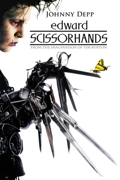 |
| Figure 1: Poster (Ebert, 1990) |
On the outside, Edward Scissorhands is a tale set in a colourful mid-century American suburb, about man with strange ways trying to fit in with the world. But the film holds a much darker tone when you look at it properly, with examinations of consumerist culture, prejudice and the pressure on those who are "different" that is backed by a haunting score by Danny Elfman.
The film starts with a kindly old woman tucking her granddaughter into a rather large and plush bed who tells her about where snow comes from. We are then given a rather strange and possibly creepy montage of working machinery, industrial themes, scissor blades and then... gingerbread cookies, culminating in a still of Vincent Price as the inventor the woman talks about In the beginning. After this we-hard cut to a picturesque American suburb of pastel colours and matching dresses where we are introduced to Peg (Dianne Wiest), the town's local door-to-door Avon representative. It is here where one of the chief themes of the movie comes in, as she is immediately rejected by the neighbor she visits because she is fine with what she was given last year and isn't that interested in "this year's line", and it turns out Peg visits every home around the suburb apart from one woman who lives in a house of burgundy who we are introduced to via seeing her play a synthesizer organ.
Desperate for sales, Peg decides to try the quite-obviously-creepy-and-unnervingly-contrasting mansion at the end of the road. At this point Peg does what the first person of every horror story seems to do and drives up to the front door of the creepy house and decides to explore without considering the fact she's trespassing or what awaits inside the creepy house - granted the front garden offsets this with an immaculate display filled with huge and beautiful topiary plants of such things as a sea monster and a giant hand complimented with colourful flowers. She continues the cliché by effectively entering without permission and goes up to a derelict room with part of the roof missing. Lowering her guard to see a collection of newspaper cuttings revolving around hands.
It is then we meet Edward, played by the master of eccentric characters Johnny Depp in his breakout lead role as the protagonist of the film. "Edward is a disarming waif with his white Kabuki makeup and wild nest of coal-black hair, and his mild-mannered temperament is directly at odds with his deformity" (Kempley, 1990), in short the kind of movie monster you just want to give a hug; His first physical interaction with Peg (letting her dab some makeup on his face to help cover up his scars) establishes him as a guy with a heart. Edward is described as being "almost complete", and it shows in more than just his hands. His movements are stiff, he speaks with a very calm and innocent demeanor and never raises his voice, when he stands its often with a slight backward arch in his posture and when his hands are not occupied there's this constant clicking and scraping as his blade-like fingers constantly twitch.
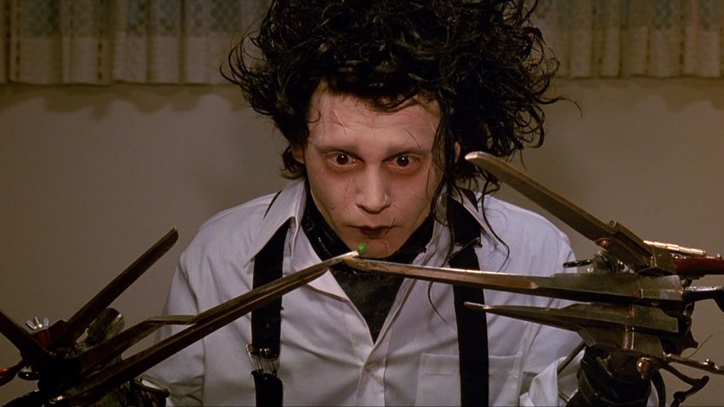 |
| figure 2: innocent comic relief or Burton trying to guilt us about laughing at people who are different? (Le Blow) |
 |
| Figure 3: I swear Indiana Jones escaped somewhere like this via flying refrigerator. (Linekogirl, 2012) |
The film takes a much darker turn from there as Edward becomes very uneasy about how people begin treating him. Suddenly the entire neighbourhood aren't his best friends anymore - which for someone who I suppose never really had any friends until now, is a very big deal - He tries to make amends by showing off another talent - Making ice sculptures. Kim finds him brooding and performing stress-relief art and finds something magical in it, eventually getting noticed by Jim who went chasing after Kim. An accidental flick of his blades and he's on the run again which culminates in a period that is both frightening and heart-wrenching as a heartbroken Edward rampages though the suburb mutilating his topiaries and giving the only woman who hate him a good scare with a very frightening-looking topiary in her window box. There is a moment that shows he still has heart as he saves Peg's son from getting hit by the police car. In panic, the boy thrashes about as Edwards tries ot comfort him and ends up cutting his face several times, damning Edward in the eyes of the crowd around him and forcing him to run.
 |
| Figure 4: Jim's good-looking, possessive of his girlfriend, self- centred, cocky and a rebel. Our designated antagonist. (Sankles, 2014) |
In a film like this, to see a life being taken (even if it is that of an unlikable jerk like Jim) is so heart-wrenching it brings a tear to recall. Depp's innocence throughout as well as the possible accidental-way the coup de grace is done probably sells it the best, as well as the possible thought that despite his extremism, Jim was just a dumb kid who got too in over his head. I suppose he did have reason for these feelings; this fairtyale-like stranger effectively stole the heart of a girl he'd been romantically involved with for years, even if he didn't deserve her in the end he was probably too overcome with jealousy and heartbreak that he couldn't bring himself to step back and realise what he was doing.
Roger Ebert however, disagrees there was a place for such a death in this film largely due to how shoehorned it looked; "Burton and his writer, Caroline Thompson, go on autopilot [two thirds of the way through] and and paste in a standard Hollywood ending. You know what that is. The hero and the villain meet, there is a deadly confrontation, and no prizes for guessing who wins" (Ebert, 1990). It was perhaps the dissonance of the scene compared of the rest of the film as Edward had done nothing intentional to Jim to drive him to murder unlike in your standard action climax where the hero finally gets his/her chance to end the villain's reign of tyranny, madness or cruelty.
Bibliography
- Thompson, C., 2011; Edward Scissorhands 1990; Geek Speak Magazone; Published February 2011; http://geekspeakmagazine.com/archive/issue12/reviews/movies/marathon/edward_scissorhands.htm (last accessed 28th November 2014)
- Berry, J.; unknown; Empire's Edward Scissorhands Review; Empire magazone; http://www.empireonline.com/reviews/review.asp?DVDID=6549 (last accessed 28th November 2014)
- Kempley, R., 1990; 'Edward Scissorhands'; Washington Post; published 14th December 1990; http://www.washingtonpost.com/wp-srv/style/longterm/movies/videos/edwardscissorhandspg13kempley_a0a0bf.htm (last accessed 28th November 2014)
- Ebert, R., 1990; Edward Scissorhands; Roger Ebert.com, Published 14th December 1990; http://www.rogerebert.com/reviews/edward-scissorhands-1990 (last accessed 28th November 2014)
Image References
- Figure 1: [Edward Scissorhands Poster]; Roger Ebert;1990; http://static.rogerebert.com/uploads/movie/movie_poster/edward-scissorhands-1990/large_aK5Giop6mfyXhv3sFGgMZwVZqdh.jpg (last accessed 28th November 2014)
- Figure 2: [Edward eating a pea], Le Blow; http://leblow.co.uk/wp-content/uploads/2012/10/edward-Scissorhands-1024x576.jpg (last accessed 28th November 2014)
- Figure 3: [The suburb]; Linekogirl; Wordpress; 2011 http://lilnekogirl.files.wordpress.com/2012/08/edward-scissorhands-02.jpg?w=436&h=181 (last accessed 28th November 2014)
- Figure 4: [Jim]; Sankles; 2014 https://blogger.googleusercontent.com/img/b/R29vZ2xl/AVvXsEijMxADHmU5IkNOd2IsUKa2a2VCNzspH3pc4bce4S8mmddaf0HFffdeDfKqn5dhfCfg-uGUzJSPs6JjeQ4MJCl04TfW_WP7Et88iToq4FcbgurdeqVAm59YoFz1ECikKIGD_zoEGRu5ysE/s1600/edward+scissorhands55.jpg (last accessed 28th November 2014)
Thursday, 27 November 2014
What If Metropolis Progress: Modelling part 2

With the Zoatrope done I decided to move on with my projects and continue work on the final urban scene. WIth the platform msotly complete I decided to move on to the feet which will plant the building firmly (if possibly precariously) on the ground although that part won't be seen.

For the rear foot I decided trying a more composite shape, I cut a cylinder in half, cut the forward face off a cube and stiched them together, exploring the various tools to try and fix them together, eventually coming across the "combine" and "merge components" tools and after playing around with the settings and highlighting what I wanted, I managed to successfully sew them together, a trick I ocntinued with the platform later on as what I had created the other day was, in my mind, very messy; three different components slotted into each other, mirrored haphazardly and with all sorts of unneeded debris inside. Thiss took a couple of hours to which I familiarised myself with the snap-to function for the translation tool and altered a lot of geometry before finalyl creating the UV maps for the whole thing.

The building on top was, thankfully, relatively simple to make, it has no base and sits on top of the platform. When it comes to texturing I think I might have to include the roof with the exported UV map for the platform itself so that I know where this part of the building is when it comes to arranging the flowerbeds that are situated on top of it to for ma roof garden (which due to the distance from the final scene's camera I will kep it as a texture map).

The platform itself was still a little messy so to save myself time, after cleaning up the
interior and making sure the whole thing is one contiguous model I
sliced it in half and mirrored the geometry down the middle. Endsuring
for a perfectly symmetrical structure.

By about 7:30pm I figured that the Maya work for this platform was just-about done.
My next task for this would be extracting the UVs, creating texture
maps and then using those to create bump and specular maps to give it
depth. Then it will be roughly ready for installation.

Potential masochist that I am I decided on my way home that finishing this one building was not enough but in leaving i only realised part way back home that I had left my progress saved onto the network (which I can pick up tomorrow) so rather than continuing with the model I thought I'd try a different structure at home - namely the skyscraper behind the platform.

I must restarted about five times with this one due to the tricky shape of the gap i nthe middle. Starting with a cube then switching to a circle and experimenting with various ways I could slice it open. Eventualyl I did so, extruded out a hole i nthe middle and then cut out the bit I had extruded far below the model itself.

When it come to shaping the horizontal planes I think I screwed up somwhere because after shaping the front, Iended up shaping so the tower's interior also went inwards, which it doesn't on my orthograph. So after a couple of attempts to rectify I figured it might be best to work that bit from scratch. Fortunately I had yet to remove base of the model so my plan is to duplicate the geometries of that, extrude it, extend it and then morph it.
Wednesday, 26 November 2014
26/11/2014 Life Drawing

I particularly enjoyed this session as not only do I find it interesting to draw draped fabric, the use of the material and the alabaster-white mannequin gave a strong classical feel to the entire scene; a period in history that I adore for its mythical feel.
There was also a hint of the otherworldly as the shadows cast by the splatter painting projection gave both Alan (the subject) and the mannequin the look of having mottled skin markings; some sort of alien skin pattern. Which made me think of some of the aliens from Star Trek, particularly the ones with patterns on their skin. I was surprised how easily how well the lower-right image turned out as I was told by Vicky after finishing it that what I had done was not an easy pose to draw (perhaps due to the foreshortening) but for the most part had ended up doing rather well in capturing it.


Update 2: Santa And The Naughty Boy

It's still there in a couple of frames (just less noticeable), and since I still possess previous versions of the slideshow in GIF format I can always extract the line from certain frames and add it back in as I had blended then merged the withfoundation layers for each frame.
Tuesday, 25 November 2014
Santa and the Naughty Boy: Update

I am thinking of giving hi ma stool given the way that he is sat. Most shopping centre Santas I've seen sit in a big chair, with maybe a christmas tree nearby but that may make it a little busy of an image. So For now I am thinking a stool and abasic backgound will suit the background I desire.
I also wonder if I could do with cleaning up the back, like removing the line that keeps emerging from the right.
Monday, 24 November 2014
Zoatrope - Santa And The Naughty Boy
On Friday I managed to get the final frames for my zoatrope animation completed and I'd say I'm about 2/3 of the way there. My next plan is to colour these frames in on Photoshop which should not take as long with the right application of layers and a brush but this being my first photoshop animation not built completely out of screenshots, I cannot say for certain. Another feature I plan to add into the photoshopped clips is a stool. Which theoretically I only need to make one frame for as Santa barely moves from his spot.

Because of the way the Blogger video player works, I thought it might help to convert it into a GIF. The actual thing might end up possibly twice as fast as this though, so the details I see disappearing from notice are the boy's arms and possibly Santa's expression when the beard snaps back.
Santa msut have infinite patience for this though.
First Steps to CG Reality

Today I finally start modelling and, surprisingly it feels like it is taking solid shape already. After coming in and unsure how to start, I talked with Jordan and he suggested blocking out the basic shapes I need for my scene. I was initially worried about the number of models I have planned but not all of this shown is going to be a 3D model, particularly towards the back.

After Jordan showed me some basics when shaping the scene, I took a couple of steps to refine it ready for my first detail models. Before I moved on to such things though, it seemed best to work out a lighting setup first while the whole thing is still pretty low-poly. Thus it was very useful that this was on Monday and Simon gave us a lesson that went nto detail about lighting different times of day (in my case morning or evening lighting tips are probably best, but I've always figured learning how to do a midday scene was considered the first steps in lighting a digital scene.)

As I said I was worried about the level of detail but one of the beautiful things about such a distant shot is that I can probably get away with portraying smaller details such as lamp-posts, shrubs or street furniture as being textures or bump maps.

There is an ambient occlusion node here though I cannot quite recall if it was this last frame or if I had progressed further. When it comes ot texturing I may have t odial down the colour intensity of these lights so the whole thing doesn't by the end look like the city was drenched in orange juice.

Rather than building my hero prop first I thought it was probably best to create one of the other buildings to test out texturing, lighting and modelling rather than do it with my hero prop in case I mess up, Though I wonder if at the moment it's too complicated. I'm building it as an organic structure, certainly, but I suppose one question is how detailed should I get? Its not too fiddly a design as it is relatively flat at the top and there's not too mcuh going on underneath aside form some very organic curves, but it is still quite a chunky design at its heart.

From the wireframe Ican see it is farily complex, but I suppose that is what these test models are for. Though I concern myself slightly with the complexity of the UVs as the UV maps in the previous scenes I have done have been reasonably simple, and the most complex thing in the Old Alley ended up being coloured with a shader. One thing I have noticed is that probably due to my own inexperience the model hasn't come out exactly like the orthographic views. With all the curves I have in my city I wonder if I should add some curve guidelines so it is a little easier ot map out my curves in Maya when making future models (something that, in thinking about it, might help a lot for things like faces and limbs).

Saturday, 22 November 2014
19/11/14 Life Drawing


These are the life drawing images I managed to make on Wednesday. The bottom set was a basic study whiel the top two were to be done mroe quickly. The stick figure drawings top-right were made using a 10 second time limit so I had to be very quick and only got basic lines down. SOme of the poses did end up making some interesting shapes, the one on the far lower right reminds me of the poster art for Tron.

Maya Tutorials Update
 I understand that I have been neglecting updating my blog since the OGR, so due to the fact I will be starting Maya modelling this coming week I figured i'd finish the tutorials I have been set. I had completed the colour map tutorials earlier in the week but due to the frantic pace I had neglected to upload them.

I worked on the bump and specular maps last night but after readying themaps for the windowsill and the wood and graphing them in the hypershade, Mental Ray began playing up on my computer and kept failing to render, something I will have to look into but other than that I do feel I have an understanding of how to make bump and specular maps. I have the scene save up to date so I can investigate it at some point. It may have been Mental Ray decided to play up only for that evening and I might have better luck now that my computer has had a rest. One of the things that changed from when I did the colour maps was I remade the maps for the bricks and the cobbles into TIFF files, which oddly didn't appear to bother Mental Ray when I rendered them..

Wednesday, 19 November 2014
Tuesday, 18 November 2014
Update: Travalogue Addendum
"...Yet for all the beauty that captivates the
eye. For every haute couture dessmaker’s, perfumery and tea shop. I cannot help
but wonder what I could see if I peel back the skin. What opinions must come
from spending all of the day in a garden high above the ground, walking about
in the likeness of Mother Nature while captivating all those around with a
stolen scent? Yiquanhuabanliuyu is certainly beautiful, I could spend all day
examining the outlandish dresses, hats and coats that line the shop front windows,
or indulging myself in the taste of the many brews of tea consumed by its
inhabitants every day, or sitting in the shade under a cherry-blossom within
one of the elevated gardens, soaking in the tranquility of organised ecosystem
around me while looking out on the city below. But for all the beauty, for
every flight of fancy this city satisfies for you, I see people who remain hollow,
feeling unfulfilled, and wonder if their emptiness is their doing, or the city’s.
Even as I leave, the magic of the city
travels with me. And every chrysanthemum, orchid and lotus flower I see draws me
back and fills my thoughts with its perfumed aromas. And reminds me of all the
sensations I left behind."
This is the planned addition I have considered to the travelogue that explores the "darker side" of Huabanliyu. That though tangent may have gone all philosophical. But I suppose part of what I have to consider is that no city is perfect. Even the idyllic fictional utopian cities of Coruscant, Theed and Rivendell have less pleasant aspects to them that draw them away from being perfect places to live. So I figured that in order to ground Huabanliyu it made sense to give a less perfect side to it.
Monday, 17 November 2014
Project 2: Master Concept Complete
After much time and commitment my concept piece for Project 2 is at a stage I consider it complete. There was a minor setback in that I had discovered earlier this night that the work I had done after I got back from university on Saturday had vanished into thin air, meaning that my work on the sky I had done the night after open day had vanished without a trace since I remember browsing images of clouds and sunsets during the evening. This is a shame because I thought I had done great with the clouds in that one. All I had as evidence was a dithered GIF frame that I thought would be stupid to use given the extremely low resolution (both in scale and smoothness) of it compared to the piece itself. Although the replacement sky I think is more volumous and closer to being a sunset. Nevertheless, I think the concept piece at a good enough stage to be considered finished:

I largely spent most of today working on orthographic drawings of several key buildings. And have managed to put what are possibly the most complicated buildings into an orthographic blueprint ready to build within Autodesk Maya. I got to firm grips with Photosoph's shape tool while working on this, discovering I could make all kinds of amazing shapes by warping and combining circle and square shapes (when two shape layers are combined, Photoshop removes the borders of adjacant and overlaying shapes).
Some of the buildings I have yet to draw out I am debating whether to model them or keep them as a flat plane (such as was suggested to me with the two-section tower in the foreground) but other thn this I largely feel I am well on track towards the pitch this Wednesday and I feel confident I should have the essentials assembled and put into PDF form by then.


“After travelling through oriental jungle,
across undulating terrain and though humid valleys I arrived, for within the
valley below me was the city of Yiqianhuabanliuyu; “Thousand petal valley”
in the local Chinese dialect. Crossing over the ridge and entering the city for
the first time. my eyes were met with shining towers that glistened a beautiful
amber in the morning sunlight that peeked over the valley I had passed through.
While the wilderness I had passed though was wild and undulating, the outskirts
of the city still bore a sense of civilised life, the signs became clearer as I
approached for the locals still tended to terraced paddies, orchards of exotic
fruits and manned boats that cut the waters of the river that cut like a knife
though this geometric city, catching all varieties of fish. Further in from the
fringe of this pocket of civilisation, open paddies and blossoming orchards
gave way to twisting, curving shapes sat with sharp, geometric daggers down one
of the main roads I walked down.
It was almost like something from a dream,
perhaps one could suspect that pixies or elves or some other creature of the
fey to be the inhabitants of this place but no, one can see human beings on
every street corner, in every paddy and every boat gliding across the water.
The interior is perhaps more spectacular than the exterior, as entering the
promenade from the city’s entrance all nostrils are immediately filled with the
smell of spices, fried fish, shrimp and hundreds of perfumes. Buying from these
stalls were people dressed in outfits as committed to mimicking to the organic
forms as the buildings that surrounded them. Women walked the street wearing
hats with rims broader than their shoulders accented with feathers of various
birds that reached beyond the body itself, their bodies draped in silken
fabrics that were embroidered like delicate veins to create blossoming viny
patterns. And the men are just as extravagant with shirts of the most luxurious
lavender and hip-length cloaks of dazzling linen adorned with embroidered
floral patterns as exquisite as any Persian carpet. My eyes were drawn to the
shops they visited, further explorations revealed hundreds of herbalists,
doctors’ surgeries, tea shops, florists and above all perfumers who made
residence in the thousand-petal valley, taking every advantage of the region’s
namesake and using them to their fullest potential.
Every corner of the city could be likened to
a celebration to the tastes of mother Gaia. Cherry-blossoms lined high-culture
streets, which would flood the city in a tide of sugar pink come springtime. If
you were to look up, or if you were lucky enough, you could rise to the skyline
and discover that the inhabitants did not restrict their obsession with
horticulture to the soil, for even up high on rooftops plants blossom in
gardens and flowerbeds, neatly arranged, balconies that reached out of the
artificial cliffs and into the air formed shrines to nature’s beauty and were
homes to numerous cultures; peonies, roses, orchids, more cherry-blossoms, it
is as though the city was captivated by a flower’s delicate beauty and took
every effort to surround themselves. Building a city that was rife with the
hundreds of scents perfumers would make from these delicate little things to
fill the nostrils of anyone who walked the streets. But this is what surprised me the most, as on
occasion I found myself in a public space, talking to locals atop the roof of one
of the many structures. Rooftop gardens converted into public gathering points,
a garden many stories above the ground where below I could see a river cutting
though the city, flanked oddly enough by lush jungle. Perhaps the residents
decided that the river was too important to them to build up to? Perhaps on its
banks grew a flower or a plant so vital or beautiful it was left to grow
naturally? Local citizens still sailed out on boats to fish and to gather its
bounties.
The more the structures that flanked the
banks were looked at the more I began to notice on the closer buildings;
woodgrain veins, drapery, these were not the building materials for such large
buildings we are familiar with. These buildings were not cold or rigid, they
glowed with their own dynamism that is hard to explain, and they throbbed with
a feeling of life independent of their occupants. Some of them one would think
“perhaps the local flora inspired them?” It is not too much of a stretch given
what is already here. It became difficult to find an angle that wasn’t
accompanied by a curve, a point not joined by an arch somewhere on the
building. Or for that matter, any design made popular by the architects of old.”
I wondered about adding a little hint that Huabanliuyu (a possible shorthand name for the city. Literally "petal valley") isn't as idyllic as I have currently indicated that its inhabitants dress in extraordinary fashions, live in these exotic and possibly expensive buildings, wander rooftop parklands and cover themselves in the various perfumes made from the city's flowers so its possible that a number of its inhabitants are quite shallow or perhaps the entire city is a representation of the lotus flower as interpreted by certain Buddhist philosophies; pure and beautiful on the outside, empty or hollow on the inside. It might be a good balance ot add some negative ot this otherwise positive travalogue and could tie in to the explorations of "fear of the Other" I am recieving from certain film in the film studies group or certain Contextual Studies lectures.
Saturday, 15 November 2014
Project 2 Development: Concept Piece Refinement
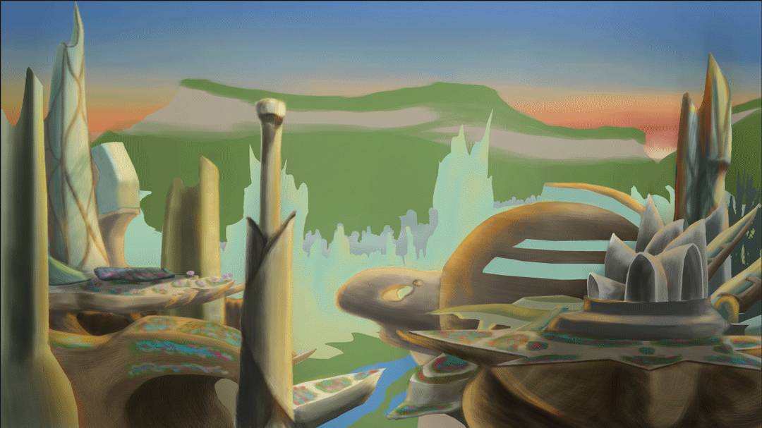
I'm probably setting myself a real challenge with all these buildings but I aim to impress and I've always had that admiration for grand scopes. I had to look at a few images of sunrises to get the sky right, as well as looking to see how light interacts with clouds at such a low angle and while the sun still looks a little cartoonish (one thing I noticed in a lot of these images is that no matter the brightness and no matter at what point it was, the sun always had this white spot in the centre generated by the photons that straight-up enter your eye) I was more focused on the clouds which I didn't want to look too cotton-ball-puffy as that would probably have offset the current feel of the environment.
The way I work it also shouldn't be too hard to adapt this for a matte painting: Hide most of the forward layers, add a little more detail to the layers I have left, (of which there should only be about four or five), clean up the hidden parts, job done probably.
Project 2 Development: The Mountain
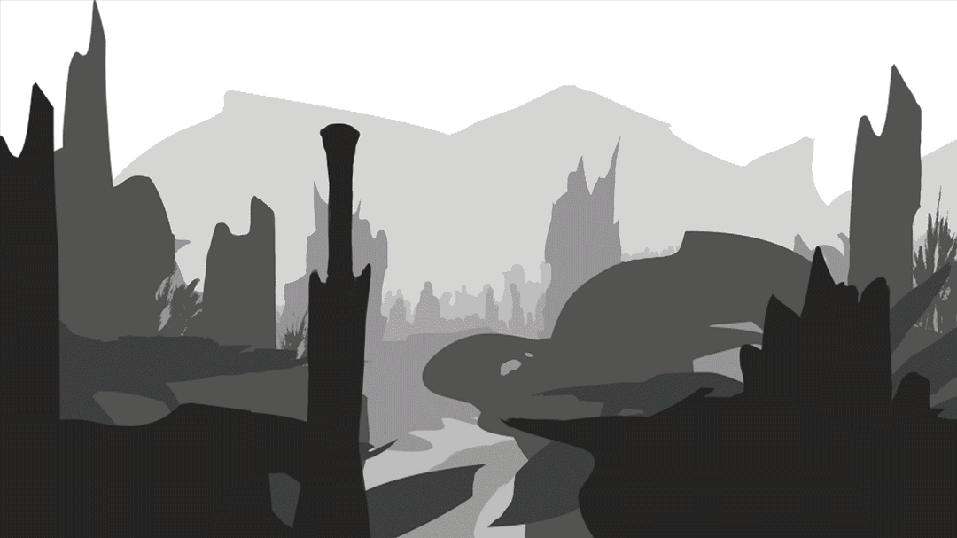
 At present I am at something of a design crossroads in regards to the background. Here I have attempted to alleviate this by coming up with several variations of the overall elevation and tint of the the mountain behind the city and created the following contact sheet in an attempt to work out which combination may work best. Above the dividing line are different tint experiments and below the dividing line are various tests with the height of the mountain. Personally I am more inclined towards combining thumbnails 7/8 and 3 to get the right shape for the mountain
 Because the sun is rising up from behind the mountain I intend to add a golden highlight along the ridge that fades away the further the mountain line gets from the son location. The main reason I wanted to experiment with altitudes was because I was interested in the kind of skyline that could show within the cloud layer. To the right is another height test. This time trying to make the mountain a little more undulating and allowing for smaller buildings to appear taller as well as bringing them into the sky a little more.
These changes may have a knock-on effect in terms of highlights due to the altitude of the sun in the image which I decided early on would be peeking between the cliffs of a distant valley.
Subscribe to:
Comments (Atom)