
Showing posts with label charcoal. Show all posts
Showing posts with label charcoal. Show all posts
Saturday, 2 May 2015
@Jackie @Phil Life Drawing Collection
First copy of my collected drawings this year. However I am questioning if I should also include my self-portraits and digital art studies in this document.

Thursday, 26 February 2015
25/02/15: Life Drawing


I feel things might have been a bit rapid with this life model drawing session but nonetheless I got some interesting imagery out of it, particularly the image where he is sitting on or using a large ball (my favourite of the quick poses is him posing as Atlas with the world on his shoulders). Of particular note this session was my introduction to collage (top-right), two poses I assembled from the covers of a newspaper and a magazine, making focus on using the colouration of the paper to work in light and dark. To add hilight for the image of the subject lying down I used chalk and a PVA coating to give a "shine" to the body

Wednesday, 18 February 2015
18/02/2015 Life Drawing


New model, new opportunities. Today's model Lydia (or Lilith, I spent the two hours after the session on my pre-vis so the name has faded a little) has an alluring grace to her figure, which is why I was termined to get her body as right as I could for the 40 minute drawing at the top. I am fairly proud of it; a combination of chalk, charcoal and a 4B pencil. The red, orange and yellow pastel drawings were inspired by the slightly yellowish tinge of the highlights the model had while she was posing. A real shame I wasn't quite fast enough on the top-right pose.
Wednesday, 28 January 2015
Wednesday 28/01/15


Today was another character design lesson where the importance and significance of camera angles were discussed. Directors are to treat cameras as the viewer's eyes so the position has to flow with the story as if you were there, darting around. For the workshop task we were given a genre and a situation. In my case I was given the genre of "steampunk" and the situation of an aggressive powerplay or a bullying situation. Designing the characters was kind-of fun and a nice break fro mwhat I feel may be generic characters in my current Script To Screen project due to its contemporary setting. Who knows, maybe I'll come back to this genre in the second or third years?


Wednesday, 7 January 2015
New term: Character design and Life Drawing
 In this term's first character design lesson we were taught about characteristic shapes, colours and their meanings along with touching a little on posing when it comes to character design. The day before the lesson we were asked to bring in a picture of a character we liked. I was not sure on who to choose but my mind quickly set on Arcturus Mengsk from the Starcraft franchise.
The task we were given was to take our picture, discern the style of the character (styles being a spectrum of realism with Mickey-Mouse level iconic at one end and fine art level realistic at the other) and draw them differenty. I discerned that Mengsk's portrayal wobbled between realistic and heroic (a style where the character does not look very far from reality save for one or two features) as he was a character from a franchise that aims to resemble our own reality. I also exaggerated some of his features into a more cartoony look. Desptie aiming for an appearance closer to a disney villain, I was surpised how much I could retain on his outfit.
 It was convenient as the second exersise was on shapes used to distinguish characters, the three primary shapes and their connotations being:
- Circles: typically used to connotate friendliness or safety.
- Squares: Typically used to connotate strength and sturdyness
- Triangles: Typically used to connotate danger or a threat, generally something undesireable.
In the second half we were given two options for the task of drawing a character differently based on the shapes involved: Draw our character again but changing or exaggerating the shapes, or draw a character from a randomly-given piece of paper. Since I had already done something like what was asked with Mengsk, I accepted the luck of the draw and was given Daffy Duck.
I quickly realised that Daffy's characteristic cynicism, snark and lack of empathy are visually shown by having a very pointy body; his head, eyes and eyebrows are triangles, even the way he's standing with triangular legs create a triangle in the negative space. At first I tried making him more circle-filled, rounding off many features. Problem was, as was discussed in the lesson, that's really not Daffy. And I ended up with something that wasn't exactly amazing. So I went the other way and "sharpened him up" to create "Evil Daffy"; a pointier head, fingers, shoulder and beak. Compared to making Daffy cuter, making him more sinister was incredibly fun. Andy (who for the first half drew Goku and for the second half drew Dangermouse) gave me the idea of giving him a frown, which is another triangle - it works. I think I have created a scary Daffy.
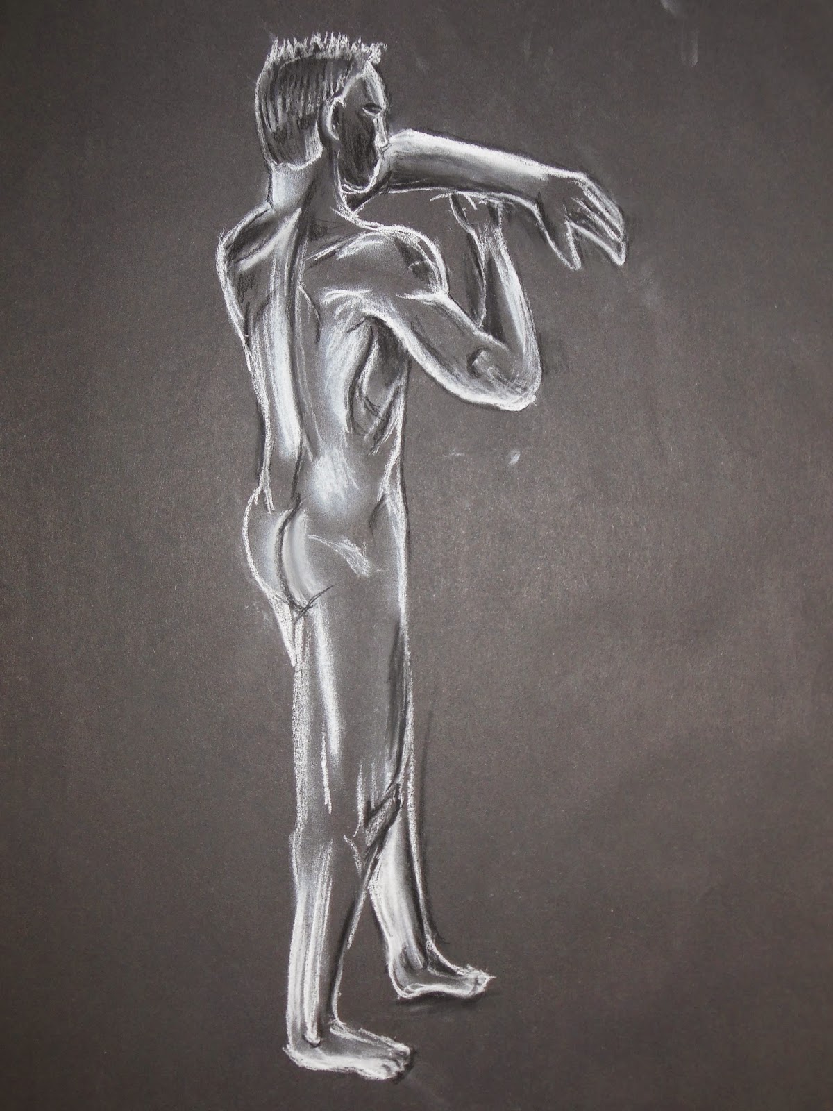
We had a new model for life-drawing classes today which is always interesting. This model has some great muscle defenition to him and on several poses I loved some of the shapes that came out, which can be seen especially on the chalk-and-charcoal drawings below. He stood next to a heating unit for each shot so his body was always highlighted with this warm orange glow which brought out an amazing, powerful look to him - which in hindsight I could have considered showing with coloured pencils or maybe watercolour pastels.



Wednesday, 26 November 2014
26/11/2014 Life Drawing

I particularly enjoyed this session as not only do I find it interesting to draw draped fabric, the use of the material and the alabaster-white mannequin gave a strong classical feel to the entire scene; a period in history that I adore for its mythical feel.
There was also a hint of the otherworldly as the shadows cast by the splatter painting projection gave both Alan (the subject) and the mannequin the look of having mottled skin markings; some sort of alien skin pattern. Which made me think of some of the aliens from Star Trek, particularly the ones with patterns on their skin. I was surprised how easily how well the lower-right image turned out as I was told by Vicky after finishing it that what I had done was not an easy pose to draw (perhaps due to the foreshortening) but for the most part had ended up doing rather well in capturing it.


Saturday, 22 November 2014
19/11/14 Life Drawing


These are the life drawing images I managed to make on Wednesday. The bottom set was a basic study whiel the top two were to be done mroe quickly. The stick figure drawings top-right were made using a 10 second time limit so I had to be very quick and only got basic lines down. SOme of the poses did end up making some interesting shapes, the one on the far lower right reminds me of the poster art for Tron.

Wednesday, 12 November 2014
Life drawing 12/11/2014

Some more life drawing done today. The bottom-left image was a
practice in negative space and the "inner-subject" as I could call it
was drawn with a combination of green and red coloured pencils. The idea to use these came from seeing a
green tint in the highlights on the subject's back and legs which was probably a result of light reflected on bundles of green plastic tape that were behind the subject that reflected the light onto his back. At certain angles however human skin does posess faint greenish/blue tints
to it particularly under yellow light due to the blueish colouring of near-surface veins. The bottom-right drawing was very
interesting to do due to the lightboxes in the picture which created
some interesting shadows and highlights especially on his stomach, right
shoulder and legs.
The bottom-right drawing was also drawn in the dark with only the lightboxes for illumination in order to bring out the highlights and shadows cast onto the subject's form. The top half of the right leg may not entirely be perfect as it could do with a bit of thickness on the top and the face could use definite improvement, it was a bit fiddly with the charcoal stalk I had on me. I used a putty rubber to add some of the highlights and clean up some of the shadows. For instance there was a very crisp shadow under his right thigh from the cushion he was sitting on which I cleared up after drawing in and smudging in the tone using the putty rubber to get a nice near-clean line which would primarily have been broken up by the minute roughness inherent in the makeup of human skin.


Wednesday, 5 November 2014
Life Drawing - First nude model


Today I had my first drawing session in a while with a naked subject. All of this was done in charcoal with the first two being done in the span of 20 minutes while the collection of figures on the third image were quick-draw subjects ranging from 3 minutes to tart with decreasing to 30 seconds nearer to the end of the session and I just-about managed to fit all poses on a single sheet of A1 paper. The fourth image took 10 minutes to draw and it involved the model sitting on the bench provided for him. Although looking back at it I think I skewed the proportions for the fourth picture horribly considering the length of the arms, torso and the size of the head. It was only a 10 minute drawing so it probably was not going to come out visual perfection when I started.
Thursday, 23 October 2014
Life Drawing - Classes 1 and 2


Subscribe to:
Posts (Atom)