Showing posts with label pencil. Show all posts

Wednesday, 6 July 2016

Sketchbook: Bird Experimentation


  Lately I've been finding that one of the best times for me to pull out a sketchbook and doodle for a bit comes from train journeys to and from London. As the streams, creative writing, plans for next year and online networking have been taking their toll a little on my free time. Regardless, as these sketches from last Friday demonstrate, I thought I'd try mixing up my creature design skills by sketching some birds. Granted they still have features of other creatures I've drawn so what I might sketch next time I have time is more normal-looking birds; eagles, ravens, magpies, finches and so on. Mainly to diversify my design palette from quadruped mammals, lizards, dinosaurs and scary monsters, as I've been seeing magpies and squirrels more than I used to since moving to Kent.

And quite frankly I probably draw too much nasty so might do a bit more cute. Both to balance out and that such a path is a skillset all on its own.

Monday, 23 May 2016

Post-Colo Colo Sketchbook Doodles


  With no university projects on top priority and much of my time spent working on a project for the studio  Butch Auntie, I admit this page has gone a little quiet. When I haven't been building and tweaking in Maya, or when renders are on the go, or when I have ten minutes such as at lunch, I try a bit of sketching. Colo Colo was still fairly fresh on my mind so I made couple of sketches relating to how the body could be improved. When it comes to making a better version this summer, I might try polishing him up in Mudbox.


After the design success of Nian and Colo Colo, I've considered focusing on creature design. Though of course that's not deterred me from sketching other subjects. The human form takes time and dedication to master. And sometimes these creatures need somewhere to live.


My hand-drawing skills have gotten a little rusty, and the technique I learned in 2015 regarding facial structure still needs time to embed, but I might be getting somewhere.


I reached the end of this year's sketchbook a few days ago, so I got a new one. I think I prefer 20cm2 layout sketchbooks, they're not as narrow as an A5 and they're not as cumbersome to carry around as an A4, but they're perhaps the best of both worlds. So on Friday I christened my new sketchbook with a pair of alien bugs. They're lacking in your typical bulbous abdomen because for a man-sized bug it seemed redundant; why store all your organs in a bulb emerging from your backside when your torso is now large enough to fit them all comfortably?


Wednesday, 13 January 2016

Adaptaion B: Preliiminary Sketchbook Work

  I had some basic ideas for how the city might be laid out. I have discussed with Alan about taking a hybrid approach to designing the city; combining  scientific deduction with artistic creativity. I feel tempted when it comes to the model design to plan out other caves, to see what other parts of the city are doing in relation to the cave in the establishing shot.

   The city's architecture was a little more tricky. I will look into influences but so far I wondered about moving down South Asian or Arabic influences. Veppers is just one example of the species, and by the sounds of it he's the sport of person who desires a perfect body. But what I can tell is that he has golden skin and a large silver mane. Chances are other Sichultians also possess manes, maybe even other feline features. This, and the description of the planet being akin to a desert made me wonder about looking at more equatorial cultures for architectural inspiration.

  After all he features in the chapter, it proved difficult not to draw the man himself. Vain, wealthy,  arrogent, confident, possibly paranoid with good reason. He's a perfectionist too. Possessing gaunt features achieved with cosmetic surgery and even an artificial voice box. The Sichultian in 23 and 25 is Jasken, recognisable by the sunglasses he's wearing. I'll need to find out more about him but he's Vepper's right-hand man and is hardly ever seen away from the Veprine director's side. He also seems a little laid back, in chapter 18 when Veppers is going straight to business with Huen, Jasken is more willing to join in on the game Huen's child is playing, if only a little. But looking into these two does give me insight into Sichultians, their cultural opinions and their tastes (I doubt Veppers would dress his private hotel room in a style he didn't feel keen on).

Wednesday, 6 January 2016

Personal Work: Sketching a Skyscraper City

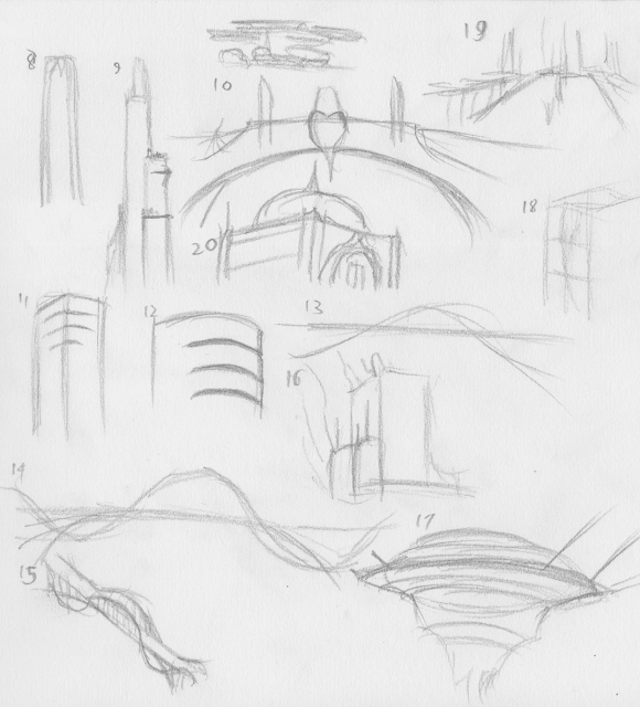
   Currently playblasting what I can make for the Narrative project. Since I neglected to add update screenshots, I decided tonight's update could be some more sketchbook work.

  Currently exited for the Adaptation project that I will receive a brief for tomorrow. Thinking about what the project could focus on I have considered maybe looking at a cityscape. These drawings were for an idea, long ago for a city partially inspired by Coruscant from Star Wars. However one of the focuses I put on this idea was a case of "could it work", so I considered the tier system to allow sunlight to reach the lower levels and reduce stress on the foundations. These elevated ground planes could be used for farms and parks in order to make the city more livable.

Monday, 19 October 2015

Character Project: Nian Design Elements

  After doing some work on the adventurers I decided to look back at Nian, the monster lion spirit that is the central antagonist of the game. I took into account what Justin said about shape. This is a powerful, monstrous, spiteful creature so I thought to myself that the design needs to have a lot of squares and triangles to accentuate the creature's strength and hatefulness. I looked back on how the mane could be represented as an artistic form of smoke to either make it seem more frightening or link it to the Sha. I also looked into how I could make the eyes terrifying. In colour I imagine them to be quite bold, golden or silver. But I wanted eyes that would chill a viewer but also link with the elements of the character. So as well as detail around the eyes I also looked into how I could make the pupil intimidating; spirals, concentric circles and even a 4-point star.

  Just to see how it would fit with the rest of the character I did a little experimentation with a forked tongue. 3 is not to bad but I think I exaggerated the tongue too much on 4. The more chaotic manes (11, 4 and 10 for instance) I think make the creature look more threatening whereas the orderly nature of 21 makes him look regal rather than imposing.

Tuesday, 13 October 2015

Character and Game Workshop: Shadows, Pandas and Foxes

Character Design

  Today's character workshop was about key points in a character: colour, theme, shapes and emotion. We were set two tasks over the session. The first was to take an established character that we were each assigned and rework them to fit with one of the cards we were given for the character project. The second was to draw silhouettes of a given character archetype in order to get the hang of character outlines. 
  For the first task I was given Fox McCloud. The card I had that stood out most for me was "collecting". I had a bit of flexibility as Fox is cast as your typical brave and confident hero. So I took the word and decided to draw him as a scavenger. Who would travel the galaxy collecting parts for the Arwing or trinkets that interested him. I think what I have came off rather well, the other thing that changed thematically was that as a scavenger he's probably be a bit dirtier and scruffier than the real Fox McCloud.
  I had a bit of time left on the task so I decided to have a go at fitting him into the "numeracy" theme. This one was a little trickier to pull off, I first thought of other words that related like "logic" and "scientist" but decided to have a go at drawing him as a cyborg. I don't think this one turned out as well as Scavenger Fox because looking at it now, he looks more like Wolf O'Donnel so the character's essence is therefore lost.
  With the second task I was assigned the archetype of Ninja and I generally had fun with this. I got the hang of outlines and I had the most fun defining the flow of the body and in some cases the body shape. The one thing that was suggested to me however was that the forms were too similar to each other so what I have is 13 outlines of possibly the same individual.

Games Workshop

  Soon after the character design workshop Justin (our lecturer) broke out the board and card games. I spent the evening in a group of five led by Justin that included me, Vlad, Lewis and Andy. The first game we played was Takenoko, a game where the task was to collectively construct and manage a bamboo garden of an Asian emperor while completing three types of task: Grow bamboo stalks, create garden layouts and feed the resident giant panda said bamboo.

  The thing I loved most about the game was the sense of cooperation and competition. We were all building one garden but we were competing for the highest score. Vlad won the game, achieving enough tasks to trigger endgame and I came a few points behind in second place. But the intrigue going on was so engrossing that I didn't mind that I came second. I was able to get some good-scoring tasks done especially late into the game.

  The second game was Revenge Of The B-Movie, a rapid-fire but hilarious card game where we were all (again) competing and cooperating to see who could make the best B movie names. Some of the names we were devising were hilariously silly like "Day of the Alien Priest Woman" (one of mine) or "[something] and the 50 Foot Lawyer From Down the Road" (one of Lewis's). Once again I came second, with Justin winning the game. It was an exiting game that reminded me a little of Cards Against Humanity by the way people play for laughs in a way that is either wholeheartedly funny, or so bad its good (Justin proposed that a rule where movies that fell into that category got bonus points).

Monday, 12 October 2015

Character Project: More Sketchbook Work

    I looked at doing more thumbnails today, this time focusing on the character or characters the players would use to play the board. This idea came about on Tuesday when my character design lecturer expressed that he loved using figures in board games due to their innate interactiveness. Players can use these icons to wander about the village (that makes up the board) to hunt down cards and chase after bad spirits. The use of multiple figurines brings up the question of how many players, whjich means how many distinct figurines are needed.

    4 feels like a fairly balanced number to me, but the number of players won't make the game unplayable if there are only 2 playing the heroes of the story. It might affect how many cards players can gather before Nian show up (still not specific) but in the legends there was only one stranger. 4 is also a good balanced number for the number of characters. 

    I wanted to give the adventurers an enigmatic feel; they'd have been wanderers, Someone unfamiliar to the village so I looked into designing them with a bit of mystery. All four (or maybe not all) could/would be characterised by a bright red cloak to identify them, which could be fun when it comes to designing images of the character in action.

    I also did some passing thumbnails for villagers that would be vulnerable to the spirits and Nian. This contribution to the story provides a window to include them as figurines into the game. What is evident when looking up costume, hairstyle and dress for the ancient Chinese on the internet is there is a lot of preference for bright, well-trimmed or elaborate clothing even in demonstrations of Chinese art. But I'm designing peasants, who most definitely would not be wearing long hair in elaborate buns or walking around in multicoloured robes. Which while great designs if the game was set in the streets of Beijing's administrative district but doesn't exactly fit with the image "rural village in China".

    Now there were cases in the colonial period where natives of foreign cultures were portrayed as dressing in highly elaborate clothing and positively covered in jewelry but that was to point out how "other" these cultures were to contemporary European ideas in regards to what is proper. I don't want to go there.

Tuesday, 6 October 2015

Character Project: Further Art Inspiration

Figure 1: Sketchbook work
    I drew some sketches today for the character project to investigate possible player figurines, peasants and a few Sha designs as well as an initial idea for the layout for the village.

    For the designs for the villagers I looked a little at how Chinese artists portrayed the human form for ideas on costume, fashion and even faces to get a feel for the setting. WHile they do convey a level of realism, there is also a degree of stylism, the two people pictured below achieve depth though interacting with 3D objects and perspective but while the objects they use are shaded and given depth, they are not.
Figure 2: "An Ancient Chinese Poet"
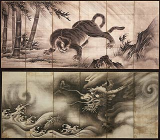
Figure 3: Animal portrayals in ancient China
    These two animals are likely for ma different era of Chinese art but what struck me was the very distinct eyes that look like they belong on other animals. However looking at these two artworks, Chinese artists appear to give an animation or posing to their subjects that might be rare or uncommon in real life.

Image References

Friday, 18 September 2015

Summer Sketchbook

I was putting it off for a while due to recent circumstances but I have finally gotten around to publishing my current sketchbook. I discovered that an A5 sketchbook was much more portable and easy to hold while on the move since I have come to realise that one of the advantages of a sketchbook is the ability to pull something out to draw sudden flashes of ideas down. I started this book in the summer and decided I'd number sketches in batches, currently determined by when I do them and what they are related to.  

Page 1 batch 1

Page 2 batch 2
    The picture on the left is really all I managed to do for "Lair of the Samphire King". I can't recall exactly what I did at the time to warrant not progressing further but I vaguely recall it was during the month I was house-hunting.
Page 3 batch 3
    The sketches of batch 5 were inspired by by the science fiction novel "Time's Eye" by Arthur C. Clarke and Stephen Baxter. The setting is (being a time travel story) a little complicated to summarise quickly but the gist is that strange silver orbs appear in various points and locations in history and whisk away portions of the world to create an anachronistic pieced-together Earth made up of not just portions of human history but practically every point in Earth's geological history exists on this patchwork Earth.
Page 4 batch 4 and 5

Page 5 batch 6 and 7

Page 6 batch 8
    Batch 10 was brainstorming for my interplanetary colonies personal project, and drawing them in town was a test of how easy it is to pull out a portable enough sketchbook to draw down a bunch of ideas and it worked out okay.
Page 7 batch 9 and 10
    The following two spreads were on a trip to London on Friday the 11th of September. Still not sure why I dedicated an entire page to squirrels, could have been inspired by sketches in one the how-to-draw books I have. I also find them quite versatile animals to anthropomorphise because of the way they stand when holding something (#1 batch 11). Batch 12 was a brainstorm on logos used mainly as a way to explore the methodology behind them.
Page 8 batch 11 and 12
Page 9 batch 12

Tuesday, 12 May 2015

Personal: Character Experiments

Not long after the final critI considered wanting to keep my skills sharp. Thus, I set a self-imposed charaacter design challenge. My aim was to create characters with forms that reflected their inner personalities.

I am promising myself however to try something other than dragons in the future, but these happen to be prior characters I devised with some friends outside the course. They are also all related to each other so there was another test of creating characters that could appear distinct but also linked to wach other.
Jenvimira
Intended traits: Seductive, teasing, silver-tongued, vain, delusions of grandeur

Karnus
Intended traits: Serious, military-minded, disciplined, respectable

Merilana
Intended traits: Compassionate, modest, sly, caring

Ediaravus
Intended traits: Vain, self-centred, overconfident

Tyrus
Intended traits: Immature, bratty, childish, short-tempered, selfish, young

Saturday, 2 May 2015

@Jackie @Phil Life Drawing Collection

First copy of my collected drawings this year. However I am questioning if I should also include my self-portraits and digital art studies in this document.

Friday, 27 March 2015

Life Drawing 26/03/2015


    The final life drawing class of the year was once more with Lydia, who used a piece of fabric and a large purple feather as a key prop. We were told that the final life drawing class would have a Moulan Rouge feel. The other key thing was a long series of quick drawings as long as three minutes and some as brief as 10 seconds, which required me to focus on the essential shapes, which was very fun as I gained an idea of some of the various flowing shapes that the human body can form, and working this rapidly helped me to realise that. I was intrigued by the shapes I saw and I believe I have gained a better understanding of how I could draw characters in future projects.

Tuesday, 17 March 2015

Thumbnail Updates


 These are thumbnails I had been meaning to upload for several designs for the Fantastic Voyage project. The two bottom pages include designs that I had considered post-pitch for the legs of the mosquito jet although I am settling for fold-out legs with pincers on the foot in order for the machine to secure itself ot its host before feeding.

These legs will fold into compartments that I have included on the sides of the mosquito's body on the recent concept piece.

Saturday, 7 March 2015

Fantastic Voyage: Mosquito Thumbnails

    More thumbnails, this time primarily focusing o nthe mosquito. I started off by trying ot strip it back and quickly noticed how jet-like it largely looked. So I decided ot build on this. One of the other thigns that came up in my research was that it's abdomen, as it feeds, swells to accomodate the collected blood. Although this goes against one of the common things about a jet which is there are little to no soft parts. It is also a very soft area as when it's empty it is hidden by the carapace. But when it fills up, depending on the species it can either be seen between the emrging gap the dorsal and ventral abdominal plates, or the entire abdomen becomes a bright red. WHich I believe is t odo with how thick the chitin is over the abdomen.

    For the details of the project however, this is inconsequential - the mosquito is basically filling up an elastic fuel tank. So this is perhaps a minor detail.

Wednesday, 4 March 2015

04/13/2015 Life Drawing

    Life drawing was interesting as we had the chance ot try paint, but using nontraditional implements. For the practice drawings at the start of each lesson I tried using pencil for my drawing - a slight deviation fomr my normal charcoal-based practice drawings because I wanted ot acquint myself with being comfortable with softer pencils..

    The painting sessions themselves: The first task (top-left) was to take a brush-tool (the less brushlike the better) and create a 20-minute picture with it. The tool I picked was a long toilet brush topped with a hemispherical fan of sponge "fingers", creating something remeniscent of  the work of Jackson Pollock. The second implement I used was a paintbrush taped to a pair of bamboo sticks that I controlled independently with both hands like a pair of chopsticks. I found it very fun painting this tool evel though I was using acrylic paints and thus I was a little limted due to the stickyness of it. The first picture I made (top-right) shows this clearly. The bottom-left picture was a group exercise where each of us were given three minutes ot paint a bit, then we would all move ot the drawing board ot the left of us and add something to our classmates' picture in three minutes. In the bottom-left picture, the smaller woman's red tone was my original picture while everything else was added by classmates.

Wednesday, 18 February 2015

18/02/2015 Life Drawing


    New model, new opportunities. Today's model Lydia (or Lilith, I spent the two hours after the session on my pre-vis so the name has faded a little) has an alluring grace to her figure, which is why I was termined to get her body as right as I could for the 40 minute drawing at the top. I am fairly proud of it; a combination of chalk, charcoal and a 4B pencil. The red, orange and yellow pastel drawings were inspired by the slightly yellowish tinge of the highlights the model had while she was posing. A real shame I wasn't quite fast enough on the top-right pose.